Friday, 29 June 2018

5 Ways to Instantly Improve Your Sales Prospecting Results

Prospecting is difficult. There’s no denying it. In fact, one study revealed that 40% of salespeople said prospecting is the most challenging part of the sales process.

Why is it so hard?

There are a lot of reasons. It’s hard to capture buyer attention and to stimulate interest and desire. It’s difficult to persuade buyers into action. Many sellers don’t have the right mindset around prospecting.

If you’re looking to step up your game and achieve greater prospecting success, here are five ways to instantly improve your results.

1. Lead with Content that Captures Buyer Attention

In order to break through and secure meetings with buyers, you have to find a way to capture their attention. Buyers are sold to all day. That’s why it’s even more important that you do your homework and provide buyers with useful content that impacts their business. If you can do this, you have the best shot at buyers accepting a meeting with you.

In the latest Top Performance in Sales Prospecting research report, 488 B2B buyers revealed the top five offers that are most likely to sway them to accept a meeting or connect with you.

Those include:

  1. Primary research data relevant to the buyer’s business
  2. Content 100% customized to the buyer’s specific situation
  3. Descriptions of the provider’s capabilities
  4. Insight into the use of products or services to solve business problems
  5. Best practice methodology based on the provider’s area of expertise

Of the buyers studied, they shared that only 42% of sales meetings are valuable to them. Buyers want value in their meetings, but most sellers aren’t delivering it. They want your insights and expertise. At the same time, they want to hear about your products and services and how you can help them reach their goals. If you want that meeting, bring your content “A” game.

2. Leave Bulk Emails Behind and Send Customized Messages

80% of buyers say they prefer to be contacted by sellers via email. While email is the No. 1 way buyers prefer to be contacted, sellers must be careful about how they use email to communicate. If buyers prefer email, then you can get away with sending mass emails, right?

Wrong.

Only 5% of sellers say sending bulk email is effective. Buyers don’t want stock emails. Instead, they want tailored, 1-to-1 emails that pertain to their company and industry. Take the time to create high-quality, customized emails and send them individually. This should significantly improve the chances of your emails not only being read but also responded to.

3. Cold Calling Lives and the Phone Still Matters

The notion that cold calling is dead isn’t anything new. There’ve been numerous articles claiming that it’s history. Some sellers simply despise cold calling and hopped on this bandwagon. Unfortunately for those sellers, or fortunately for their competitors, they’re missing out on sales opportunities.

Of the 15 outreach methods studied in terms of effectiveness in prospecting, three of the top five involved the telephone:

  • Making phone calls to existing customers
  • Making phone calls to prior customers
  • Making phone calls to new contacts (i.e. cold calling)

Whether it’s cold calling or warm calling, the phone is very much alive and a crucial part of the prospecting process. In fact, 69% of buyers say they have accepted a phone call from a new provider in the last 12 months. Given that it takes on average eight touches to generate a meeting or conversation with a targeted buyer, one or several of these touches should be made via the phone.

4. Convert Cold Meetings Into Sales with Value

It typically takes a lot of work to land that first conversation. Once you do, your next big challenge is to win the sale. Buyers make purchases for different reasons. However, we found that there are four key factors that influence if a buyer purchases from you.

  1. Provider focuses on the value they could deliver to buyers
  2. Provider collaborates with buyers
  3. Provider educates buyers with new ideas and perspectives
  4. Provider offers valuable insight related to the buyer’s industry or market

If you want to convert more meetings into actual sales, sell the way buyers want you to. Given that buyers report that 58% of their sales meetings are not valuable, there’s a huge opportunity to improve here.

5. Make a Great First Impression on LinkedIn

One of the most surprising results was the sheer number of buyers using LinkedIn. Consider this: 82% of buyers look up providers on LinkedIn before replying to their outreach efforts.

That’s the vast majority of buyers.

A response from a buyer likely hinges on your LinkedIn profile. Put your best foot forward and make a good first impression with these tips for optimizing your profile.

Prospecting doesn’t have to be the most challenging part of your job. You can overcome this hurdle, but it’s going to take the right mindset and you’ll likely have to tweak how you’re currently doing it.

Before you make your next outreach, find content that’s going to resonate and make the buyer want to meet you, customize your messages so the buyer knows they’re not just another one of the 200 emails you blasted out, don’t be afraid to pick up the phone, focus on the value you have to offer, and make sure your LinkedIn profile is all-star status. Following these tips will pay off in the end.

The post 5 Ways to Instantly Improve Your Sales Prospecting Results appeared first on Marketo Marketing Blog - Best Practices and Thought Leadership.


from Marketo Marketing Blog https://blog.marketo.com/2018/06/5-ways-instantly-improve-sales-prospecting-results.html

How to Find Out Why You Didn’t Get the Job

You send in a stellar resume. You blow the recruiter away in the phone screen. And you wow everyone you speak with during your in-person interview. And yet, you still don’t get the job. Worst of all, you don’t know why you didn’t get it -- you either didn’t hear back at all, or received feedback so vague that it’s virtually useless (e.g. “We decided to go with another candidate who was a better fit.”) Is there anything worse?

It’s incredibly frustrating when a recruiter or hiring manager doesn’t share a concrete reason why you were passed over, but if it happens to you, don’t worry. Often, there’s still a way to figure out what went wrong -- here’s how.

1. Reach Out to the Decision Maker

If you have the contact info of the hiring manager, it’s best to chat with them rather than a recruiter or HR representative, says Ren Burgett, career coach and owner of 3R Coach.

“An HR manager or recruiter is more likely to give you a programmed HR response such as, ‘We found a candidate that was a better fit for our needs.’ The hiring manager is more likely to give you a candid response,” she explains.

If you haven’t already been in touch with the hiring manager, though, you may want to reach out to someone who can point them in your direction.

“If you don’t have their contact details, you need to get in touch with whoever your point of contact was throughout the recruitment process. Even if they can’t provide feedback themselves, they will be able to pass your query onto someone who can,” says Steve Pritchard, HR Manager at Cuuver.com.

When you haven’t been given the hiring manager’s contact information, it can be tempting to bypass your point of contact and look them up on LinkedIn or Google their email address, but this is a mistake, Pritchard says: “They may not feel too comfortable with you contacting them using a number/email they didn’t provide you with.”

2. Express Gratitude

Nobody wants to engage with a candidate who sounds demanding or presumptuous, so make sure to open your message with a note of thanks.

“Thanking someone for [taking the] time to interview you and provide the opportunity can always start the conversation in a positive manner,” says Shanalee Sharboneau, President and Technical Recruiter at Staffing Science, LLC.

In particular, you should express gratitude for the fact that they are going out of their way to read your note. After all, they don’t have to share feedback with you.

“Show in your request for feedback that you appreciate the recruiter or hiring manager is likely to be busy. This way, you don’t sound too pushy or demanding,” Pritchard adds.

3. Be Positive

You may be upset that you didn’t get the job, but remember: you catch more flies with honey than with vinegar. It’s okay to acknowledge that you’re disappointed with the outcome, but don’t express resentment or aggression.

Show “that you are understanding of their decision not to hire you, otherwise, you may sound bitter about not getting the job rather than someone looking for honest feedback to help them with their job search,” Pritchard continues.

And instead of taking a self-deprecating approach like “How did I screw up” or “Where did I go wrong”, frame the conversation as a quest for personal growth.

“Don’t make your question about ‘why’ you didn’t get the job, make your question about ‘how’ you can improve. People are more likely to respond to someone that seeks out growth as opposed to someone that just wants answers,” Burgett says.

4. Keep it Short and Specific

When reaching out for feedback, “make your email no more than one paragraph,” Burgett recommends. After all, they are probably plenty busy with their day-to-day tasks, so you want to make sure to honor their time.

You can save them even more time by avoiding general questions like “Why didn’t I get the job?” and instead drilling down into a few precise issues. Burgett recommends including “two to three specific questions [that] you would like feedback on from the interview process.”

One question that Laura Handrick, Career Analyst at FitSmallBusiness.com, recommends asking is “what might you have done, said or provided differently that would have made the company choose YOU instead of the other candidate.”

5. Open the Door for Future Opportunities

Just because you were rejected from a job doesn’t always mean that you can never apply there again -- you may have been a close second. At the end of your message, reiterate your interest in the company (if you are truly interested) and consider adding something like “if anything changes, I’d love to connect regarding future opportunities.”

“That will go far, and many times, new hires fail in the first few months. They’ll remember your graciousness,” Handrick says.

You can also see if they might be willing to refer you to another opportunity.

“Always end the email by asking if they know of anyone else you can reach out to as you continue your job search. If you didn’t get the job, perhaps you can get a lead [for] another job. Use this as an opportunity to network,” Burgett says.

6. Be Patient and Ready to Take No for an Answer

If the person you reach out to fails to respond, don’t ping them every day until they do.

“Giving feedback, particularly constructive feedback, is hard, so allowing time for preparing will likely get you more thoughtful responses,” points out Dr. Dawn Graham, Career Management Director at the Wharton School and host of Career Talk.

Even if they never respond, you shouldn’t pester them, Graham adds.

“Companies tend to avoid giving candidates feedback to avoid opening themselves up to risk,” she explains. “In addition, many hirers have trouble putting their fingers on a clear definition of ‘fit’ or likability, which are two powerful aspects of hiring decisions that can be challenging to put into words. Therefore, they may pass on giving feedback to a rejected job seeker for the sheer reason that even they are unable to verbalize their final decision in a way that will be meaningful to the overlooked applicant.”

Sample Message

Want an example of what exactly you could say to a hiring manager? Burgett recommends the following:

Hi (Hiring Manager),

I wanted to thank you for the amazing opportunity to interview for the position of (job title) with your company. I really enjoyed learning about (company name) and getting to know you and your team during the interview process. I understand you have decided to move forward with another candidate that better fits your current needs.

As I continue my job search, I would love to get your feedback on how I can improve as a candidate. When you have a minute, could you provide insight into what I can improve upon to help me stand out and progress in my career? Specifically, I would appreciate feedback on the following:

1. What is the one skill I can improve upon to help advance my career that may be holding me back?

2. If I had the opportunity to redo my interview, what is the one thing I should have done differently?

I appreciate any candid feedback you can offer as it will help me understand the areas I need to improve. Additionally, if you know of any companies that may be hiring for similar positions or anyone else I should reach out to as I continue my job search, please let me know.

Again, thank you for the opportunity to interview for the position. I wish you and your team continued success.

Sincerely,

Your Name

There’s no doubt that getting rejected from a job you were interested in is upsetting, and it can be doubly so if you don’t hear actionable feedback from the hiring team. But odds are, it’s nothing personal, so try not to take it that way. And remember -- the right job is out there. It’s only a matter of time until you find it.

This article originally appeared on Glassdoor and was re-published with permission.


from Marketing https://blog.hubspot.com/marketing/find-out-why-you-didnt-get-the-job

Here's What Playing With a VR Headset Is Actually Like

Virtual reality (VR) is one of those technologies, it seems, that will be eternally "emerging."

Don't get me wrong -- it's certainly becoming more of a household topic. Twenty years ago, one might only come across VR in museums, science fairs, and laboratories. Now, they're available for purchase by anyone who has an internet connection ... and the budget to pay for one.

Several major tech players are trying to make VR a mainstream technology. Maybe the hardware needs to be less clunky and a wireless, lightweight headset is the answer.

Or maybe the obstacle is price point -- to which Facebook's answer (to both issues) was the wireless, $199 "affordable" Oculus Go.

Truthfully, I've always been a bit skeptical of VR. I remember being quite fascinated with it at a west coast science museum at the age of 13, and since then, my only real exposure to it has been by way of any VR-related news I've covered, or different demos I've tried at industry events. Even after receiving a complimentary Oculus Go as a token of thank-you swag for attending F8 in May, the headset sat on my desk, neglected an unopened for over a month.

I'm in the small percentage of people who talk about technology on a near-daily basis -- and yet, I was less than enamored with the idea of giving my very own Oculus Go for a spin.

But then -- I did. And everything changed.

Because I'm a nerd, I've always wondered what prevents VR from becoming a mainstream technology as quickly as some of the businesses behind it wish it would. People have paid more for less practical tech tools -- things like the first edition of any new iPhone, for instance, for which masses are willing to pay the initial price.

So, at the end of the day, maybe VR isn't as practical -- but it is plain cool. You can watch documentaries in an immersive, 360-degree way. You can play sports. You can visit other countries.

Maybe -- just maybe -- what's standing in the way of VR's market permeation is the small percentage of people who actually get to experience it.

To test this hypothesis, I passed around my Oculus Go to several members of my team. After spending a day engaging in various VR experiences -- and accomplishing little else -- here's what we learned.

(P.S. Here's a sneak preview of a short film I like to call, "Amanda Tries a VR Roller Coaster.")

Here's What Playing With a VR Headset Is Actually Like

On VR's Market Permeability

Before we took the headset for a spin, I asked Paul Mealy, author of Virtual & Augmented Reality For Dummies, for his thoughts on VR's potential -- if any -- to go mainstream. But that's not easy, he said, considering that "mainstream" is often a subjective concept.

If "mainstream" means "millions of devices purchased," Mealy explains, "then VR is already mainstream" -- though that figure still falls short of Facebook (which owns Oculus) CEO Mark Zuckerberg's ultimate goal of one billion people using VR ... eventually.

But what will the composition of those one billion users look like? Will they be using VR for fun, business, or both?

"If the definition of mainstream is, 'Will I find myself going to the office and donning a VR headset for all my work, and going home and putting on my VR headset for all my entertainment,'" says Mealy, "then we still have a ways to go."

Arguably, the "fun" use cases for VR are growing more rapidly than the B2B ones -- though the latter is slowly making progress. Take the example of Tobii Pro, a tech company that pairs VR with eye-tracking technology to help retailers learn where a shopper pays the most visual attention and plan store layout accordingly. I took it for a spin at SXSW in March:

"Very similar to an in-store shop-along or in-depth interview research, this is another tool that can be added on top of that," said Amanda Bentley, Tobii Pro's Director Of Commercial Sales (whose voice can be heard in the background of the video above). "You can get another layer of understanding not only how shoppers feel ... but also, what information do they actually process? What are they attending to as they're making the decision to purchase products?"

But, it's early, Mealy says -- and it's not a question of "if" VR will go mainstream, but "when."

"It is important that we take a step back and look at the full picture for VR. Most VR hardware is still in the first generation of devices," he explains. "And these first generation devices are serving as the canary in the coal mine to manufacturers, helping them refine what consumers actually want in order to become a mass-consumable device."

So, when will VR finally win over the masses?

"Three to five years out seems like an appropriate time to truly evaluate where VR is landing in the grand scheme of things," Mealy says. "If, by then, manufacturers have still been unable to solve the price and experience points ... that is the time to question VR's future. But, as of now, consider me bullish on the future of VR."

Our Team's Experience

Now, for the fun part: our team taking VR for a spin.

For most of us, this experiment was the first instance of using VR -- which made for low expectations as to how realistic, engaging, or nauseating the experience would be. (In full disclosure, I experience motion sickness with VR, and apparently, I'm not alone.)

But for the most part, the technology was well-received ... and, perhaps, even more fun to watch than to actually experience.

Caroline Forsey, Staff Writer, HubSpot Marketing Blog

The experience:

Bear Island

The video:

The summary:

"VR is different than watching something on a screen, because it’s all around you ... and behind you, and in your peripheral vision. Despite how 'logically' smart I am at understanding what VR is, I still think it can trick my brain into somewhat believing I’ in a different place. For instance, when the bear came towards me I couldn’t help but flinch. It’s bizarre but impressive that a piece of technology can influence your physiological reactions."

Clifford Chi, Junior Staff Writer, HubSpot Marketing Blog

The experience:

Cloudlands: VR Minigolf

The video:

The summary:

"VR mini golf was better than real mini golf. That was my first VR experience, and I felt like I was in a different world. After my first putt, I tried to walk toward the ball. I ended up running into a pillar in the office. And when I looked down at my feet and saw that the golf course was on a cliff, I thought I was going to fall for a split second. The Oculus and VR are super realistic and impressive. I definitely want to try it again."

Braden Becker, Senior Staff Writer, HubSpot Marketing Blog

The experience:

Epic Roller Coasters

The video:

The summary:

"I was really surprised how easily VR takes over your peripheral vision. The experience literally surrounds you, to the point where I actually felt like I was on a roller coaster. I'm also not the biggest fan of heights, and that particular Oculus Go game definitely played right into my senses."

Karla Cook, Section Editor, HubSpot Marketing Blog

The experience:

Cloudlands: VR Minigolf

The video:


The summary:

"The environment was clearly not realistic, but it still felt like I was there. The whole experience was surprisingly disorienting. I was playing mini-golf on a platform floating in the clouds, and I dangled my leg off the platform, and freaked out. The process of using the remote to interact with the environment didn’t feel intuitive to me. It’s worth trying out for the novelty factor, but I definitely wouldn’t buy it."


from Marketing https://blog.hubspot.com/marketing/what-vr-headset-is-actually-like

Thursday, 28 June 2018

The Evolution of Graphic Design

Graphic design has a rich and varied history. The word “graphic design” didn’t appear on the scene until 1922, when William Dwiggins created the word to describe the art of designing with graphics. In the earliest days of graphic design, professionals drew by hand. However, in the last 60 years graphic design has forged ahead, advancing rapidly since the addition of today’s digital art tools.

Earliest Graphic Design

Even though the term wasn’t yet coined, some of the earliest designs included typography for books and newspapers. One could also argue drawings on cave walls represent a form of ancient graphics.

Fast forward to the 1900s when posters became a form of expression. During the 1940s, graphic design appeared in propaganda posters of the era, such as the “We Can Do It” poster with Rosie the Riveter. Slogans were short, to the point, and added to a graphic that set the tone.

As technology began to change and become available to more people, the entire industry that would become known as graphic design began to emerge.

The 1960s

At one time, only wealthy people had televisions in their homes, but by the 1960s and into the 1970s, TVs became as commonplace as radios. The face of design changed because of the influence of television advertising.

The political protests of the time also inspired the re-emergence of poster art. This time the art focused on civil rights and the Vietnam War. Everyday Americans began to use flyers with these designs to get their messages out.

MIA SCLC Graphic Design Example 1960s

Although computer-generated graphics were not as readily available as they would be in the future, the influence of a balance between positive and negative space can be seen in this 1965 flyer created by the Montgomery Improvement Association about the Selma to Montgomery march.

The 1970s

In the 1970s, influences from other cultures began to filter into designs all over the world. Japan recovered from WWII and quickly became a major player in the industry. As the rest of the world influenced Japan, Japan also changed the rest of the world.

Some of the elements from Japanese art that became more common were things such as symmetry, colors that meshed well together and icons in the center of the design. Although psychedelic designs continued into the 70s, designs also began to include people touting various products and the use of icons.

Ray Charles Example Ad 1970s

One example of the use of famous faces to advertise a product appears in the 1977 Craig Stereo ad above, which uses an image of the iconic musician to promote the stereo. Note that the tagline is short, but the image of Charles is large. Then, more details are added below the main ad.

The 1980s

The 80s were all about bold, bright colors that grabbed people’s attention. Personal computers became affordable for everyone, putting design tools into the hands of all. In 1985, Microsoft introduced Windows, which meant people no longer had to learn MS-DOS to operate a computer. You just clicked on a few buttons and it was easy to design anything.

The decade was also known for its big, blocky text. Imagine cartoon text reminiscent of graffiti art and you’ll get a feel for some of the typography of the decade. In 1984, Apple released MacPaint for Macintosh computers, allowing designers to use computer graphics in an effortless way, such as with a mouse or graphics tablet. Postscript language allowed designers to place type and graphics on the same page and send it to print, rather than using a drafting table to assemble designs.

License to Drive 1980s example

The 1988 movie poster above for License to Drive is neon noir style. The style includes fonts with partial script in a bright, neon color and dark backgrounds that allow the neon colors to pop. The designs also frequently included elements such as palm trees, sports cars, and sunsets.

The 1990s

In 1990, Photoshop 1.0 arrived on the scene. Back then, you could only use Photoshop with Macintosh computers. The birth of this new tool again changed designers’ ability to experiment with new techniques, including overlapping text, faded elements, and digital overlays.

Grunge was also born in the ’90s, which showed up in movie poster designs, book covers, and album covers with dark looking images and simple color palettes, such as white on black, perhaps with a pop of red. A few grunge typefaces even came about—gritty and raw-looking text.

Fight Club 1990s Example

The movie poster for Fight Club uses grunge typography that makes one think of street art. Note how the background of the poster is dark and grainy, while the text is bright but raw. This combination creates the overall grunge effect from the decade.

The 2000s

The 2000s began an entirely new frontier for graphic designers. In addition to tools becoming even more powerful, people were suddenly designing on portable devices, such as smartphones. On top of that, designers began to realize the importance of designing in a way that looked good across all device types.

Movement became more of a focus, with designers looking for ways to make even static logos look like they’re in motion.

AT&T 2000s Example

One example of a logo that appears to almost be in motion is the AT&T logo of a globe. Because of the mix of blue and white along with the angles of the logo, one can imagine that the image is spinning slowly just as the earth does. They debuted the logo in 2005.

Recent Changes

There isn’t one method that dominates graphic design today, but a mix of design techniques and styles. Trends emerge from year to year—and sometimes month to month. In 2017, the use of cutout text that meshed with strong images allowed designers to create unique looks for websites and logos.

Other trends included flat icons and the addition of videos across marketing channels. Websites need to be mobile responsive more than ever before, so simplicity is the order of the day, along with speeding up overall rendering. Print advertising meshes with mobile devices, bringing a new experience to users that is more immersive.

Evolution of Graphic Design

Where graphic design will go in the future is anyone’s guess, but the user experience is sure to remain at the forefront. Designs will become more personalized and more interactive over time. One example of this type of technology and personalization appears at Walt Disney World in Orlando. As riders stroll past digital posters, a sensor picks up the signal from a magic pass armband, and the guest’s name comes up on the poster, welcoming them.

Regardless of where design goes next, expect to see increasingly more personalized designs that enhance user experience in your daily life.

Are there any graphic design trends you hope will come back around? Tell me about them in the comments.

The post The Evolution of Graphic Design appeared first on Marketo Marketing Blog - Best Practices and Thought Leadership.


from Marketo Marketing Blog https://blog.marketo.com/2018/06/the-evolution-of-graphic-design.html

Google Doc Resume Templates

Creating a resume from scratch can be a pain, particularly when you have limited design experience and your resume doesn’t extend beyond Times New Roman 1-inch margins in terms of flair.

You want your resume to appear professional, but you also don’t need it to look exactly the same as every other resume in the stack.

Fortunately, you don’t need to attempt any tricks you learned in a Photoshop 101 class to create a sleek and attention-grabbing resume.

Google Docs offers five templates with impressive design elements to help you portray a level of professionalism and originality in your resume. Even if you have the design all set, these templates provide formatting inspiration and fill-in-the-blank sections to ensure you don’t forget critical information, like your address or prior awards.

Take a look at these five Google Doc resume templates to choose one best suited for your desired role, or to get some inspiration before designing your own.

1. Swiss

The Swiss resume template is mostly traditional in style, but the color and bold lines make it appear more modern and impressive. The dark lines above and below each segment organize your sections effectively, and the small lines above each section title add some unique style. The simple color, right below your name, suggests you’re someone who pays attention to detail. This template is a solid option if you need a resume for a conservative role but also want to showcase some personality.

2. Serif

The colors used for each headline, and the two parallel columns with plenty of white space in between, suggest that you're someone who's organized and creative. This resume template is a good option for high school or recent college graduates with less work experience, since the template provides categories to showcase accolades and accomplishments outside the workplace.

3. Coral

The color used in the coral template isn’t overbearing or immature, but still spices up an otherwise basic resume. The formatting, with all the information left-indented in one column, looks clean and straightforward. This option is ideal if you’re applying for a corporate job but still want to seem fresh and unique.

4. Spearmint

With the bold green line at the top of the page, this template conveys someone who’s spirited and artistic. The consistency of the title colors is appealing and polished. Spearmint is a fantastic option for anyone who’s applying for a creative role, such as a web designer or creative director.

5. Modern Writer

You’ll only want to choose the statement-making Modern Writer as your template if you’ve got a good reason for it -- for instance, if you’re applying for a web developer role, the font (which looks a bit like code) makes sense. The bold pink and Source Code Pro font are less ideal for a traditional role, but Modern Writer is a good option if you’re applying for a role that applauds uniqueness.


from Marketing https://blog.hubspot.com/marketing/google-docs-resume-template

Wednesday, 27 June 2018

Why Decision Trees Are Terrible for Omni-Channel Marketing

If you’re in B2C marketing—especially email marketing—you’ve likely seen an incredibly complex decision tree at some point.

Decision trees are often the web of interconnected steps that define how buyers receive email marketing messages. If this, then that. If this other option, then that other option. The more complex the decision tree—the thinking goes—the more “personalized” your marketing strategy.

But personalized customer experiences need to be led by data, and many marketers struggle to create truly personalized campaigns because of siloed customer data. In fact, 31% of senior leaders believe integrating customer data is the greatest challenge their company faces.

Decision trees and flow charts may seem like a way around this challenge, but they can quickly become overwhelming and confusing. Most decision trees are built on assumptions and gut feelings rather than data. And because they’re nearly impossible to measure, optimization is a significant challenge.

Even worse, these legacy workflow diagrams are almost impossible to integrate into a full omni-channel marketing strategy. A shocking 86% of ecommerce marketers still have not implemented a full omni-channel marketing strategy because of the same inability to access and utilize customer data effectively.

Put simply, decision trees make it difficult to effectively measure and optimize B2C marketing.

In this blog, I’ll cover four reasons you should ditch the decision tree and improve your chances of truly connecting with customers—no branches required.

Out-of-Control Complexity

Every marketer remembers their first decision tree. You probably initially created it as a simple flowchart with a few branches you could easily use and decipher. But then, as you considered each option and all the different outcomes, the flowchart slowly became bigger, more complex, and unwieldy.

For example, here’s the logic you might think through as you create a decision tree for your buyers: 

  • If a buyer doesn’t open an email in 3 days <then> send them an email on a different topic entirely.
  • If they opened the email but didn’t click <then> send them an email with a different CTA.
  • If they respond to that message <then> you add them to a re-engaged customer flow that lasts for one month.
  • …and so on.

It takes a lot of time and effort to determine this myriad of outcomes and decide where and when to split up your audience based on their behaviors, demographic information, and more. Some of those decisions may be based on logic, but others may be based on an idea you think may work.

And as your decision tree grows in complexity, it becomes increasingly difficult for other people on your team to understand it. Since only you really get the logic behind it, it’s complicated to help others wade through the many branches and explain why you chose that path. The general rule is that the more decisions you include in a tree, the more difficult it is to understand and the more your own biases and personal preferences can slowly creep in.

Lack of Cross-Channel Visibility

Not only can decision trees be tough to manage, they’re also incredibly limited. Every B2C marketer realizes that email alone is not enough to engage buyers and drive sales. You have to be where your buyers are—including social media, Google search, and more. If you want to implement a true omni-channel marketing strategy, you need to manage campaigns across channels so you can deliver a seamless experience with consistent messaging.

Unfortunately, decision trees rarely provide the necessary visibility for omni-channel. With decision trees, you’re often restricted to email alone or forced to create entirely separate paths for individual channels. While your email campaigns may be doing well, they might perform even better if you swapped out a transactional email for a push notification or a message on Facebook messenger instead. But if you’re relying on a decision tree, you’ll probably never be able to test that hypothesis. Without cross-channel visibility, decision trees can’t help you experiment and optimize campaigns.

Less Accurate Analytics

Experimentation and testing is also a huge part of B2C marketing and a huge miss for decision trees. You need a sizable dataset to be able to accurately come to conclusions and make decisions. However, the more branches you add, the fewer people there are in each branch, and the less data you have to analyze. You’ll eventually reach the point where the data set is too small to reach any reliable conclusions.

And because you can’t easily create campaigns across channels, you also can’t quickly measure and A/B test those campaigns either. As a marketer, you want to make informed decisions about which channels are performing well, which campaigns you should focus on and which need a change of strategy.

For example, you can’t understand: 

  • The conversion rate of that push notification message;
  • The open rate of the latest email campaign; or
  • How that conversion rate changes if you swap the order of the two steps.

With a decision tree, you have no way to measure a campaign like this because it includes two different marketing channels and requires a large data set.

Omni-Channel Campaign Management Eliminates Decision Tree Complexity

Instead of building and managing campaigns in a decision tree, marketers should rely more heavily on segmentation, dynamic content, and machine learning to simplify the campaign flow and more easily measure its impact. Instead of complicated branches for each individual marketing channel, marketers should focus on coordinating cross-channel touchpoints in one simple “trunk” campaign. And performance metrics should be visible in the same UI where marketers create campaigns—instead of many separate branches.

For example, a marketer should be able to create a single campaign flow that includes:

  • An initial email
  • A related push notification
  • A similar paid Instagram ad
  • A final email message

And instead of having a separate “branch” for each new decision, the work of personalization is handled by machine learning, dynamic content, and dynamic segmentation. This makes your life as a marketer far easier and simplifies how you measure marketing results. By streamlining multiple touchpoints in a single UI, you can focus on more strategic decisions about the campaign flow and leave the optimization of smaller, more tactical choices to automation.

Decision trees may have been a fact of life for marketers for years, but they haven’t adapted to the challenges and opportunities B2C marketers face today. By keeping it simple with an omni-channel campaign management approach, you can leverage customer data to create personalized campaigns that can be managed and measured across a variety of channels.

The post Why Decision Trees Are Terrible for Omni-Channel Marketing appeared first on Marketo Marketing Blog - Best Practices and Thought Leadership.


from Marketo Marketing Blog https://blog.marketo.com/2018/06/decision-trees-terrible-for-omni-channel-marketing.html

Here's Exactly How We Got 105k+ People Using Our Chatbot

It’s not impossible for humans and even a lot of software to do exactly what chatbots do.

It’s how bots do it that matters.

When we work alongside bots, they make life easier. They help us do things faster and with more efficiency. They give us more time to do “human stuff” — and do it even better.

Bots don’t have to be as ubiquitous as searching the web. That’s not the point.
Bots do have to carve out a space as a different but equal resource that takes humans where they want to go more easily than ever before.

Chatbots can and will change business and marketing as we know it, if given a fighting chance.

But right now, they must win over naysayers crying “trend!” and comparing the budding technology to channels that have had decades to develop.

It’s easy to get wrong. And when we do get it right, it’s all too easy to run it utterly into the ground as we have with many marketing opportunities in the past.
This time around, we’ve pledged to use this powerful element of change for good instead of evil.

Here’s how we’re making a sales, marketing, and biz-building chatbot that doesn’t suck: GrowthBot.

Apps build a silo, bots fill a niche.

null

Source

Apple’s “There’s an app for that” has been the rallying cry for the past decade.
As such, it’s left the tech battlefield littered with millions of apps that do everything from letting you solve crime with your favorite celebrity avatar to ordering delivery with an emoji (OK, that one is kind of useful).

There’s more than just an app for that; there’s a name for that. It’s called app fatigue.

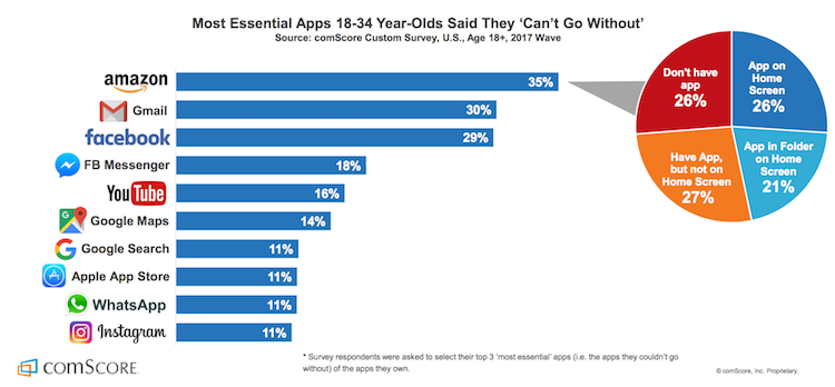
In 2016, comScore found almost half of all smartphone users in the U.S. downloaded a whopping average of zero apps per month. Yet in 2017, the Google Play store added more than 1,300 apps every single day.

null

Credit

Why so many apps? Mostly because it’s what everyone else is doing. Marketers aren’t exactly known for having a lot of chill when it comes to the tech du jour.
That’s not to say apps are dead in the water, but we are starting to see a trend which indicates people are using far fewer apps than are being put on the market daily.
App Annie’s 2017 research shows people use the same nine apps per day and no more than 30 over the course of a month. On average, users only touch as few as one-third of the apps they’ve downloaded.

Millennials especially are using utilities like maps and search engines along with apps for social networking, messaging, entertainment, and retail.

null

Source

When users do open an app, it’s no surprise it’s rarely that one that lets you drink beer … without the beer.

Bots don’t add to the onslaught of app, decision, or fake beer fatigue. Instead, they live right inside and actually enhance the functionality of some of the most popular messaging apps.

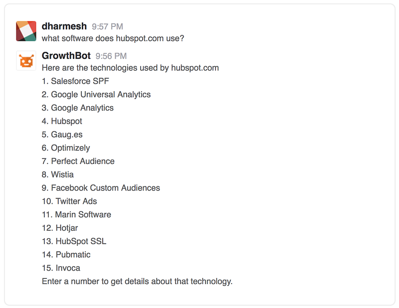
For example, GrowthBot helps users access tons of marketing and sales data using an app they probably already have open all day — Slack.

null

We have to agree with data scientist and software developer P. Daniel Tyreusin this case:

“I’m willing to speculate that it’s easier to acquire a user if the user doesn’t have to download a new app to use a service. I’m also willing to speculate that users are more likely to continue using a service that’s integrated into an app they already use.”

In the words of Seth Godin: If your target audience isn’t listening, it’s not their fault — it’s yours.

null

Before we even began building our chatbot, we focused on exactly how it would create value in a way no other tool could for our audience.

We work consistently to grow GrowthBot’s natural language processing (NLP) skills because we know our audience and we know how much easier it makes their lives when they’re able to access and compare tons of data by typing a few quick phrases into Slack.

NLP enables chatbots to understand what a user is looking for. It also allows consumers to enjoy personalized conversation instead of interacting with the same tired “intuitive” menu in a vacuum.

That’s important when your bot functions as a customer service rep, personal shopper, or research partner and conversation is the ideal way to answer a request.
Dennis Thomas, CTO at AI-powered consulting firm NeuraFlash, knows the importance of understanding how users interact with your chatbot.

“Another place where NLP is a big win is when the bot’s objective is focused on helping users with the discovery phase of products or shopping. Finding the right item via conversation helps to drive the user’s goal, as well as the product criteria to match to the company’s inventory.”

By the same token, NLP could actually be a detriment in cases where text-based chatbots can make the process simpler.

“When you have a visual medium and buttons can accomplish the task in a couple clicks (think easy re-order), open-ended natural language is not making the user’s life easier.”

We didn’t throw everything we’ve learned about our audience out the window when developing new bot software. Instead we implemented that knowledge to make GrowthBot just useful enough without being overwhelming.

We believe chatbots should be useful first and useful always.

null

NLP only accounts for half the conversation — the input part.

Output is just as important in terms of usefulness.

Your bot might have the personality of The Most Interesting Man in the World, but it will still suck if it can’t answer a user’s query.

You don’t need to build an entire search engine from scratch. You don’t even need to build an app. All you have to do is make sure your chatbot has access to enough data to prove useful in the niche you’ve chosen.

If it can’t do that, it’s no better than the aforementioned beer-simulating apps of the world.

GrowthBot has solid conversational skills, but it would be nothing without the marketing and sales data that help it achieve its goal — providing value to people who are growing businesses.

There are already tons of pieces of software and far too many apps for sales and marketing professionals. Useful chatbots don’t mimic, they empower users to find exactly what they’re looking for using a natural instinct: Simply asking.
Not spending hours customizing dashboards and poking through tens of different workflows just to uncover their own data. Simply asking.

Everytime we link a new database to GrowthBot, it gets more valuable for users. Right now it can pull information from dozens of sources; including HubSpot (of course), Google Analytics, MailChimp, social networking sites, and so on.

Bots are first and foremost data scanning machines. They take input, provide relevant feedback, and do so in a way that is easier to manage than any other platform.

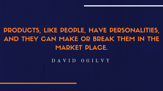
“Products, like people, have personalities…”

null

David Ogilvy famously understood the importance of personality in products. We believe that’s also the case for brands and bots. That’s why we made GrowthBot sound like someone we know and like.

If your brand already has a solid personality, translate that into the voice and tone your bot uses when interacting with people.

If not, there’s no time like building a chatbot to determine whom you want to be in the online world.

Because there are so many tools out there that take the technical aspect out of building a bot, creating a great conversational flow might just be the greatest challenge you’ll face.

null

The messaging framework you build into your chatbot will influence the way people perceive the value of your brand, so give it some personality.

MailChimp is famous for its distinctly helpful personality that manages to be playful and humble at the same time. If your cat is wearing its very own monkey-themed knit hat right now, you know exactly what I mean.

null

Source

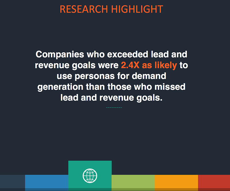
Cintell’s 2016 benchmark study on B2B buyers found that companies who exceed lead and revenue goals are two and a half times as likely to use personas than companies who miss lead and revenue goals.

null

Source

Today’s consumers have nearly countless brands to choose from. And they know it.
A well-defined voice that aligns with your ideal customer is an effective and low-cost way to develop return buyers and bot users.

For example, GrowthBot sounds like Dharmesh Shah — founder and CTO at HubSpot and loving father to the chatbot itself.

That means it’s light-hearted, respectful, and just a tad quirky all while being truly helpful.

We’ve found that a truly helpful voice in a world of chatter is more powerful than you might think.

Bots make life so simple, search feels painful

null

Google search has made an impact. There’s no denying that.

It’s almost a force of habit to visit a search engine to find what you’re looking for. Habits are notoriously hard to change, especially the more gratifying and automatic they are.

Current studies show it takes an average of 66 days for a behavior to become “unchangingly automatic.”

Because search behavior is second nature to us now, bots must do what a search can’t:

  • Provide customer service conversations and solutions without the wait
  • Deliver the information a user is looking for in just seconds, on the first try
  • Make recommendations based on powerful personalization
  • Aggregate information from a variety of sources right inside the apps we’re already using

That last point is what GrowthBot is founded on. We make growing your business easier by using the power of a chatbot to put information at your fingertips — not siloed in more apps and interfaces than you can count.

That’s just the tip of the iceberg of what AI-enabled bots can do with enough data and well-planned conversational flow.

But things can still go wrong if you aren’t aware of and managing your users’ expectations.

Where Facebook’s Assistant M Got It All Wrong

null


RIP

Chatbots are relatively new and their capabilities are varied. If you want people to love your bot, it’s important they understand why they need it and how to use it.
It’s not that Facebook’s Assistant M chatbot didn’t work. It’s that expectations weren’t managed; which overwhelmed the system and underwhelmed its users all at once.

“The first thing chatbots should do is quickly introduce their core competencies. Not only should chatbots start within a specific scope, they should always firstly tell you how they can help you and what they can do best.”
Instabot

Clarify upfront exactly what your bot is capable of. Provide specific examples and invite the user to try out a few practice questions. Don’t make them learn any new tricks right away.

Using your chatbot for the first time should feel like starting an online chat with a new friend or customer service agent.

There will inevitably be times when users ask your bot to do something it can’t do yet. Offer them an alternative, but don’t let that learning opportunity slip away.
Scan your chat logs regularly, they’re the most valuable market research you’ll ever get on what people want your chatbot to do.

Wait, have I mentioned value already?

null

Be on the lookout for every chance you can find to provide extreme value to your users.

Go above and beyond what people expect your chatbot to provide. Delight them with thoughtful little extras that make their days better.

Extreme value doesn’t have to stop when a user leaves your bot interface.

Offer to send customers an alert when their size is back in stock. Tell readers where they can find more articles like the one they just read on your website. Or, like us, celebrate with them every time you connect another tool that will make their jobs easier.

These kinds of interactions don’t just provide extreme value, they keep you top of mind and keep your customers coming back for more.

Nobody needs another app for this, that, or anything.

Instead, people need smart ways to accomplish more within the tools they already know and use regularly. When our chatbots deliver that level of service, we’re sure to start changing behavior and creating better automatic habits.

Fight back against bad bots. Build yours to be delightful to interact with, provide extreme value, and just not suck.

Originally published at blog.growthbot.org.


from Marketing https://blog.hubspot.com/marketing/how-we-got-105k-people-using-our-chatbot

Unriddled: "Not a Media Company" Facebook Launches a Quarterly Publication, Apple Fights Election Interference, and More Tech News You Need

Welcome one, welcome all to another Wednesday: the day that marks the halfway point -- almost -- to the weekend.

The tech industry has seen quite a busy week, so we're bringing you another edition of "Unriddled": the HubSpot Marketing Blog's mid-week digest of the tech news you need to know. 

It's our Wednesday tech news roundup, and we're breaking it down.

Unriddled: The Tech News You Need

1. Facebook Launches Grow: A Print Quarterly Publication for Business Leaders

Despite repeated insistence from its leaders that it is not a media company, Facebook has launched a print quarterly publication in the UK -- Grow by Facebook -- which it describes as "a thought leadership platform shining a light on people, companies and trends that challenge the status quo." According to the Grow website, a permanent online "home" for the publication (which Facebook won't call a magazine) will launch soon, and feature content like niche brand case studies, as well as profiles of business leaders that achieved seemingly impressive feats. The Press Gazette's Charlotte Tobitt has more. Read full story >>

2. Apple's Fight Against Election Interference

Apple News -- which was rumored to be experimenting with products competing with those of Google News in April -- will now have a dedicated section for the 2018 U.S. Midterm Elections.

With a mission of "providing a new resource for timely, trustworthy midterm election information," Apple is drawing attention to a key factor that differentiates it from other tech giants who are fighting election interference, like Facebook: human editors.

(Twitter, too, announced on Tuesday new efforts to combat the spread of fake content and platform abuse -- largely through machine learning.)

According to its official statement, Apple will employ a "team of editors focused on discovering and spotlighting well-sourced fact-based stories," which will include exclusive pieces from the likes of the Washington Post and Axios, as well as coverage from televised news sources. Read full statement >>

3. The Less-Than-Successful Meeting of Big Tech and Intelligence Officials

Within the realm of preventing election interference, several representatives from eight tech giants -- including Facebook (which hosted the summit and recently published an update on its efforts to fight fake news), Apple, Google, and Twitter -- met with representatives from the U.S. Department of Homeland Security and the FBI to discuss how they can better fight election interference in the months leading up to November's midterm elections.

(Facebook, meanwhile, announced yesterday that it has removed 10,000 fake Pages, Groups, and accounts in Mexico and across Latin America because they violated Community Standards -- though it is unclear if the removal is related to possible election interference.)

The desired outcome, it seems, was to compare potential meddling activity each company had witnessed on its own platform to what U.S. intelligence has been monitoring and intercepting, as well. But those hopes were all but thwarted, with the U.S. government officials sharing no intelligence and leaving the business leaders assuming they would have to fight election interference without any federal intervention or assistance.

It's a particularly interesting outcome considering April's congressional hearings, in which Facebook CEO Mark Zuckerberg was challenged with questions about the potential regulation of the company, as well as its Big Tech peers. But that potential regulation -- should it materialize -- does not appear as though it will play a role in the company's efforts to cease the weaponization of social media sites by foreign actors. Sheera Frenkel and Matthew Rosenberg of the New York Times share more. Read full story >>

4. New Metrics Emerge for Time Spent on Social Media

According to new data from SimilarWeb, the average Instagram user spends about 53 minutes on the app each day, trailing closely behind an average 58 minutes on Facebook. (Snapchat, evidently, isn't too far behind, with an average of 49.5 minutes.)

The data comes at an interesting time, after recent announcements from Apple that it will include a Screen Time app in the next version of iOS to help users manage the time they spend using their phones. Not long after that feature was unveiled, Instagram confirmed it was testing a "time well spent" feature and rumors emerged that Facebook (which owns Instagram) is experimenting with similar technology.

But despite the efforts of the latter two apps to, on the surface, help users better manage time spent on them, both have released new long-form video products -- as well as newly-released group chat options and a redesigned explore tab from Instagram -- over the past few weeks that appear to be designed at least in part to encourage more time spent on each platform.  Recode's Rani Molla and Kurt Wagner explain why these metrics matter. Read full story >>

5. Uber is on Probation in London

Since Transport for London revoked Uber's license to operate, CEO Dara Khosrowshahi has spent much of his time doing "damage control" to repair the company's relationships in the UK, as well as in its U.S. homebase. Now, the ride-sharing company has regained a license to operate in London, after a UK judge ruled that it can legally offer its "digital services" there. But it might not be permanent -- the ruling comes with 15 months of probation, which is three months short of the 18-month period the company was seeking. Politico's Mark Scott has more. Read full story >>

6. Facebook Will Allow Cryptocurrency Ads Again

In a statement released Tuesday, Facebook announced it would once again permit the purchase and publication of "binary options, initial coin offerings and cryptocurrency." The new policy follows a January decision to ban any "misleading or deceptive promotional" content related to financial products -- which has been revised to allow such ads from pre-approved accounts only. Facebook and Google were among the first platforms to ban ads related to cryptocurrency, and were followed shortly thereafter by Twitter. Read full statement >>

That’s all for today. Until next week, feel free to weigh in on Twitter to ask us your tech news questions, or to let us know what kind of events and topics you'd like us to cover.

Featured image credit: Facebook


from Marketing https://blog.hubspot.com/marketing/unriddled-tech-news-facebook-quarterly-apple-election

The 7-Minute Guide to Getting Started With Google Tasks

If you’re anything like me, you love to-do lists. Heck, sometimes you love to-do lists so much, you even put completed tasks on your list just for the satisfaction of crossing them off (No? Just me?).

Up until recently, I’ve been using my Google Calendar as my to-do list -- but it can get confusing, particularly when someone wants to book time with me but sees “buy salmon” already takes up most of the afternoon. Even worse, you can’t prioritize your Google Calendar to put more important tasks ahead of less important ones.

Fortunately, Google offers an alternative solution: Google Tasks, a tool which enables you to create to-do lists within your email, links those tasks to your calendar, and more.

Gmail has offered a Tasks tool for years, but with the new Google design, Tasks is sleeker and easier to use. Here, we’ll show you how to get started with Google Tasks in just seven minutes, on your desktop or phone.

How to Use Google Tasks on a Desktop

1. Log into your Gmail account. Click your “Settings” icon, as indicated by the arrow below, and then select, “Try the new [Gmail].” Since I’m on a work email, it says HubSpot, but it’ll say something different depending on your email account.

2. With your new updated Gmail, you’ll see a blue icon on the right side (underneath Calendar and Keep). Click the icon, labelled “Tasks”.

3. Click the blue “+” button to add your first task.

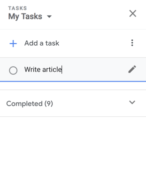
4. Now, type a task in the line beside the bubble and then click the “Enter” or “Return” key.

Screen Shot 2018-06-26 at 9.53.12 AM-1

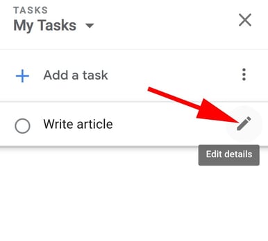
5. If you only need to add a basic task, you’re all set. However, the Tasks tool also allows you to edit your task -- to do this, click the pencil icon beside your task.

editdetailstask-1

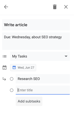
6. Here, you can add details including when your task is due (which will integrate into your Calendar), a paragraph box for your own notes, and the option to add subtasks if you feel the need to break up your task into parts.

Screen Shot 2018-06-24 at 5.39.40 PM

7. When you’ve completed a task, simply click the bubble beside the task. When you do, it will briefly show a check mark, cross itself off, and then disappear off your list.

8. You can also drag and drop your tasks to rearrange the order -- for instance, I dragged “Dinner reservation?” to the first item on my to-do list.

How to Add an Email to Your Google Tasks

If you receive an important email you’re too busy to answer immediately, you can add it to your Tasks list for later. Here are two different ways to do this:

1. Simply hold the email and drag it to your open Task list. You’ll see the email icon underneath the task, which, if you click, will take you to the email.

moveemailtasks

2. If you’re within the email when you decide you want to add it to Tasks, simply click the three-dot icon at the top of your email and select, “Add to Tasks”.

How to Use the Google Tasks App

If you’re often making to-do lists on the go, you might want to use the Google Tasks app supplementarily -- since it’s connected to your email, your tasks will sync up with your desktop Task list, and they’ll also integrate into your Calendar on both your phone and desktop.

After you download the app on your phone, here’s how to use it:

1. When you open the app for the first time, here’s what you’ll see (look familiar?). Click the blue “Get started” button.

2. Next, click the blue “Add a new task” button.

3. Using your phone’s keyboard, type your task and then click “Save” or “Done”.

4. If you click on your task within the app, you’ll have the option to “Add details”, “Add date”, or “Add subtasks”. For this instance, if I want to add my task to my calendar, I’ll click “Add date”.

4. A calendar will pop up within the app. Choose the date your task is due, and then click “Ok”.

5. When you add subtasks, you’ll see the bubble beside each task. When you complete a task, simply click the bubble.

6. To rearrange the order or change the dates of your tasks, click the three-dot icon in the bottom right corner.

7. Here, you can sort your full task list by customized order or date, rename the list, or delete all completed tasks.

Ultimately, Google Tasks is an effective organizational method, since it integrates seamlessly into other Google features including Gmail and Calendar. If you’re feeling overwhelmed filling up your calendar or sticky notes with to-do lists that range in level of importance, you might want to give Tasks a try.

Additionally, take a look at 12 Tools That'll Keep You Productive Morning, Noon & Night to further increase your efficiency levels.


from Marketing https://blog.hubspot.com/marketing/google-tasks