Friday, 30 November 2018

15 of the Best WordPress Newspaper Themes in 2019

Whether you’re a blogger, editorial writer, journalist, or any other type of writer, there are a number of different WordPress themes that allow you to share your content with your visitors on your website.

Newspaper WordPress themes — despite their name — work for all types of writing. No matter your content type, the layout you’re looking for, or the design you envision for your website, there are hundreds of newspaper themes to choose from. That’s why we’ve compiled this list of our 15 favorite newspaper themes for 2019 to help you find one that meets your needs.

15 of the Best WordPress Newspaper Themes for 2019

Each of the following themes contains a description and a few key takeaways to help you efficiently determine which option or options might work for your own website. If you don’t see a theme listed below of interest, you can always check out the WordPress theme library for more options.

1. News Pro Theme

News Pro is a great newspaper theme for content-heavy websites. This theme formats your articles, photos, audio, and videos in a way that works for the story you are telling and for your website visitors. The simple navigation options also keep your content organized to ensure a great user experience. Additionally, if you’re already a WP Engine hosting plan user, you get free access to all other StudioPress themes.

Key Takeaways:

  • Ideal for content-heavy websites
  • Simple navigation
  • WP Engine hosting plan users get access to all StudioPress themes

2. Newspaper 

newspaper-wordpress-theme

Source

Newspaper is a WordPress theme created for writing articles and blogs in a newspaper template. The theme has several different layout options in their gallery suited for a wide range of blog types. There are also over 50 unique demos you can install in one-click to help get you started designing your website and adding your written content.

Key Takeaways:

  • Created for articles and blogs
  • Variety of layout options featured in their gallery
  • 50 installable demos

3. Voice

voice-wordpress-theme

Source

Voice is a clean and simple theme ideal for news and magazines. The theme has formatting features created for both news articles and editorial content. Voice has a wide variety of layout, color, and font options to customize your site. There are options to set multiple authors on a single post as well as add a “related posts” sections at the bottom of specific articles or pieces for visitors to continue reading on your site.

Key Takeaways:

  • Ideal for news and magazines
  • Can add multiple authors per post
  • Related posts sections

4. Noozbeat

noozbeat-wordpress-theme

Source

Noozebeat is a fully responsive theme, meaning visitors can move seamlessly from desktop to mobile to tablet while on your site. It’s designed for magazines and news articles and gives you the option to add advertising space, pages for your featured posts, and custom widgets to enhance your site’s user experience.

Key Takeaways:

  • Fully responsive
  • Created for news articles and magazines
  • Custom widgets

5. Hive 

Hive is a WordPress theme built for bloggers. There are a number of customizable typography options to make your written content look unique and fit your style. Adaptive layouts make your website interactive and exciting to look at — with these you can mix and match your written content with different fonts, styles, images, and more.

Key Takeaways:

  • Built for bloggers
  • Custom typography options
  • Adaptive layouts 

6. Felt

felt-wordpress-theme

Source

Felt is a WordPress theme ideal for publishing magazine-style content. The theme allows you to implement slideshows and carousels that automatically move visitors through a number of different images on your site. The theme also has built-in SEO features that will help you organically rank and reach more people.

Key Takeaways:

  • Ideal for digital magazines
  • Option to implement slideshows and carousels
  • Automatic SEO features included

7. Wonderwall

wonderwall-wordpress-theme

Source

Wonderwall is a great theme option if you’re a writer for a lifestyle blog and or digital magazine. There are formatting options to display banner ads on your site and add a built-in newsletter subscription widget to quickly grow your number of readers and email list. There are also a total of nine different customizable homepage layouts to choose from for your digital publication.

Key Takeaways:

  • Created for lifestyle blogs and digital magazines
  • Banner ads display options
  • Nine customizable homepage layouts

8. SmartMag 

smartmag-wordpress-theme

Source

SmartMag is a multi-purpose WordPress writing theme suited for online magazines, newspapers, blogs, and review sites. The theme has a drag-and-drop page builder that allows you to easily test your content in different areas of your site, try different formats, and create your website without the need for any coding. There is also the option to add multi-content slideshows to enhance the visual elements of your website and even help you generate more ad views.

Key Takeaways:

  • Multi-purpose writing theme
  • Drag-and-drop page builder
  • Multi-content slideshows 

9. GoodLife

goodlife-wordpress-theme

Source

GoodLife is a newspaper and magazine theme with five different types of article and post layouts to choose from based on your content type. There are also gallery pages for those of you looking to display your photo and video content in a unique way. The theme is SEO-focused so your website will be more likely to organically rank for certain key phrases and terms.

Key Takeaways:

  • Created for newspapers and magazines
  • Five different article and post layouts
  • SEO-focused

10. ColorMag

ColorMag is a magazine and blogging Wordpress theme that comes with a layout for easily organizing and pairing your written content with your photos and videos. There are a number of ways to create specific pages and post types for featured and highlighted articles so they stand out to your readers and visitors. ColorMag also has a dedicated support team ready to help you if you stumble upon any issues while designing your site.

Key Takeaways:

  • Magazine and blogging theme
  • Featured and highlighted post types and pages
  • Dedicated support team 

11. The Voux

the-voux-wordpress-theme

Source

The Voux is ideal for digital magazines with layouts tailored to galleries, articles, and online shopping. You can set your images in a “lightbox” so they take up the entire width of your page and stand out with a black background for your website visitors. You can also set Image Hotspots and Shoppable Images so visitors and customers can click on certain items in your images to learn more about them, see their price, and purchase them.

Key Takeaways:

  • Built for magazines
  • Gallery image layout options with lightboxes
  • Image Hotspots and Shoppable Images

12. NewStar

newstar-wordpress-theme

Source

NewStar is a newspaper and magazine WordPress theme that features a one-click import tool so you can quickly select the features and layouts you want for your site and implement them immediately. The theme offers a customizable Article Teaser so you can get your readers excited about continuing to read your piece as well as neatly list multiple articles on one page. There is also plenty of ad space available in moveable banners throughout several different locations on your site.

Key Takeaways:

  • Ideal for newspapers and magazines
  • One-click feature import tool
  • Customizable article teaser 

13. MagPlus

magplus-wordpress-theme

Source

If you’re writing for a blog or magazine, MagPlus could be a great WordPress theme option for you. The theme has a Live Customizer so you can edit your website’s page designs, update their content and appearance, and see what your changes look like in real time. MagPlus is a lightweight theme so it’s speedy and efficient for your visitors. There are also 25 different layout options to help you customize the look of your site.

Key Takeaways:

  • Created for blogs and magazines
  • Live Customizer
  • 25 customizable page layout options 

14. Soledad 

soledad-wordpress-theme

Source

Soledad is a multi-purpose writing WordPress theme, meaning you can use it for your blog, newspaper, magazine, and other content. The theme has dozens of layouts that allow you to mix your magazine and blog content or completely separate your images, videos, and blogs. Soledad also has a White Label Tool that allows you to remove all of the Soledad logos throughout your site and replace them with your own so your theme is branded.

Key Takeaways:

  • Multi-purpose writing theme
  • Mix and match your written content with videos and images
  • White Label Tool

15. Gridlove

gridlove-wordpress-theme

Source

Gridlove is a WordPress theme tailored to newspapers and magazines. With no coding knowledge required, anyone can easily get started building their website with one of the hundreds of customizable, pre-made layouts and templates as well as their drag-and-drop page builder. The theme offers a flexible homepage in which you can feature any number of articles and other types of content.

Key Takeaways:

  • Tailored to newspapers and magazines
  • No coding knowledge required
  • Hundreds of customizable layouts and templates

Back To You

These 15 WordPress newspaper themes are built to help you share all types of written content with your website visitors and customers. Whether you’re writing for a blog, magazine, review site, or newspaper, there is a writing theme tailored towards your needs. Get started and pick a theme listed above based on the type of writing you do, install it to your WordPress website, and start adding and sharing your content.


from Marketing https://blog.hubspot.com/marketing/newspaper-theme-wordpress

Revenue Marketing Insights from 80 Marketing Leaders

What happens when 80 senior marketing leaders come together to talk about revenue marketing and ROI? Amazing insights, that’s what!

At our Marketing Nation Engage event in London, we hosted a series of roundtable sessions with marketers around the region to discuss hot topics of the day. And nothing was hotter than revenue marketing and ROI. Each of the three roundtable sessions was hugely oversubscribed, and we had standing room only for each!

Here’s what marketing leaders find most challenging about revenue marketing and tracking ROI:

Lead Quantity vs. Quality

Sales teams demand more leads but often complain they’re not the right ones. We know that not all leads are equal, and the challenge is measuring quality, as well as quantity. Expectation setting is also important—with increased lead quality often comes a decrease in quantity.

Measuring ROI Across Channels

Most participants used a mix of digital, events, offline, and sales related channels. But seeing performance across those channels is tough and some, like PR and branding, are particularly challenging to measure.

Sales Loves Events

Of course they do—most of the resource effort sits with the marketer! But many wonder if the resulting revenue impact is enough to warrant the effort, especially when events typically make up the majority of many marketing budgets.

What to Measure

So many things are measurable, but what’s the right thing to focus on? Marketing qualified leads (MQLs) were the most common metric and used by almost all participants, but with no direct link to revenue does this go far enough?

Attribution

Last touch is the most common attribution method used, followed by first touch and multi-touch. It’s acknowledged there are flaws with this approach, but no participants use anything more sophisticated at the moment.

Long Sales Cycles

B2B is tough with so many touches and sales cycles that can last years. Tracking and measuring engagement is seen as key to building a picture of the entire process.

Any of these challenges sound familiar? We found the majority of our B2B marketing leaders shared the same challenges and frustrations irrespective of company, industry, or location. What the group also had in common was a desire to move the marketing story forward in the area of ROI, attribution, and revenue marketing. Everyone knows it’s going to make a real difference not just with marketing efficiency and effectiveness. It will also improve sales and marketing alignment, as well as marketing’s perceived value with the rest of the C-suite and the board.

So, what can marketers do to take things to the next stage? Here are some tips from our experts:

Measure Through the Pipeline

Measure beyond leads. Marketing metrics need to focus on key stages across the combined sales and marketing pipeline, including marketing-sourced opportunities and revenue. Synchronizing between marketing automation and CRM will make sure the source data is the same, so there’s no ambiguity.

Engage the Rest of the C-Suite

Measuring marketing returns in terms of revenue helps you speak the same language as the CFO, CEO, and rest of the C-suite. It proves the value of marketing, and having a few revenue metrics can make all the difference.

Capture All Channels

Digital channels are often the easiest to capture but need to be brought into the same picture as email, offline, events, and sales channels for an all-important single customer view. This way you can really see how each part of your marketing mix is performing, as well as getting a view on the lifecycle of each prospect.

Lead Quality Measures

Introduce lead scoring as a measure of lead quality. Using data enrichment is also a good way to provide more information on a lead, as well as lead routing accuracy. Make sure any useful insights about what a prospect has done are shared with sales to help them refine their pitch. Being able to pass better leads to sales teams, at a warmer stage of the buying process, and including relevant insights, should increase conversion rate.

Link Activity Cost to Results

Include costs of activities in your program reporting so you can more easily analyze the cost per lead/cost per marketing-sourced revenue. This way you’ll be able to demonstrate the impact of each dollar of marketing spend. You can also create a measure of non-financial resource. While this is harder to measure empirically, it’s a great way to identify the activities that cost little but take a lot of effort for very little effect.

One Sales and Marketing Process

If you don’t have one already, it’s vital to get one single lead process across sales and marketing. This needs to be agreed by all parties. SLAs are often useful for keeping leads moving and giving full accountability. This leads to one set of metrics for all teams and can be aligned through synching across CRM and MA. Without this, assigning marketing sourced and influenced leads to the sales funnel often becomes a contentious issue.

Different Metrics for Different Audiences

Marketing can be guilty of measuring too much of the wrong thing. Clicks, likes, and downloads may be useful for measuring activity efficiency but revenue, opportunities and leads generally provide a better indicator of pipeline health and future revenue.

Expand Attribution Models

Some attribution is better than none, and we’d always advise marketers to just get started collecting some data. After that, it’s worth considering what the limitations are and how they could be overcome. Use a model that works for your sales cycle. For example, if it’s a long cycle that has a large number of touches, then a U or W shape attribution can make sure the right touches get the significance. And with the right tools set up, this can be easily tweaked and analyzed as required.

Explain it to Sales

Once they understand that marketing shares the same revenue goals and is focused on the same things, the process eases. It may take a while, but there are often benefits to making sales part of the campaign journey rather than just the recipient of leads.

Keep Measuring

Long sales cycles and multi-touch sales processes mean we need to keep measuring results beyond what many marketers actually do. Reports and dashboards can help, but don’t just measure once and stop, as we know the impact of activities often lives on in a longer sales cycle.

Measuring marketing ROI and taking a revenue marketing approach is not always easy. From convincing others to thinking in a different way, to getting the right metrics for the right audience, there’s a lot to think about. It won’t happen overnight, but measurement is something marketers should be improving all the time. In the end, this will increase the attribution of marketing activities, improve accountability, and make ourselves as relevant as possible to the overall business objectives.

The post Revenue Marketing Insights from 80 Marketing Leaders appeared first on Marketo Marketing Blog - Best Practices and Thought Leadership.


from Marketo Marketing Blog https://blog.marketo.com/2018/11/revenue-marketing-insights-from-80-marketing-leaders.html

The Definition of Human Resources in 300 Words or Less

It's likely you already have an understanding of what Human Resources does -- at the very least, you probably know they have tasks that include recruiting and hiring employees, and dealing with an organization's culture.

However, it's a tricky term to define, particularly since HR deals with so many different aspects of a company.

Click here to unlock a free guide and template designed to help you create a company culture code. 

Along with recruiting and hiring employees, Human Resources is responsible for compensation and benefits, on-boarding employees, training, organization development, and workplace culture -- this long list of tasks can make it difficult to cleanly define HR in the first place.

Here, we've defined HR in less than 300 words. Whether you're interested in pursuing a career in the Human Resources field, or simply need to know how your HR department can help your team, it's critical you understand the term. Fortunately, we've made it easy.

download free guide to company culture


from Marketing https://blog.hubspot.com/marketing/what-is-human-resources

How to Convert Images From PNG to JPG and JPG to PNG

When I first started my marketing career and needed to include an image in one of my articles or post a picture on social media, the image’s format didn’t matter to me. In my eyes, JPG and PNG were exactly the same.

Once I actually dug into the difference between the two, though, I realized they’re quite different. But one format isn’t necessarily better than the other -- JPG is optimal for some situations while PNG is optimal for others.

In a nutshell, JPG images are best suited for social media and blog posts because they’re optimized for photography and have a smaller file size than PNG images.

PNG images are best suited for web graphics and professional photography because they maintain their quality no matter how many times you open and save them, whereas JPG images decline in quality every time you open and save them.

Fortunately, JPG and PNG images aren’t permanently stuck in their respective file format. You can convert images from PNG to JPG and vice versa in less than one minute with the help of some free online tools.

How to Batch Convert Files from PNG to JPG

1. Visit one of the free online PNG to JPG converters listed in the section below.

2. Upload your PNG images.

3. Press “Convert” to convert your PNG images to JPG images.

4. Click “Download” to download your new JPG images.

Best PNG to JPG Converter Tools

1. iLoveImg

With iLoveImg, you can convert up to 15 PNG files at a time without signing up for a free account. If you register for a free account, you can convert up to 30 PNG files at a time.

2. png2jpg.com

Png2jpg.com lets you convert up to 20 PNG files at a time. The free tool doesn’t ask for your email address.

3. online-convert.com

Online-convert.com offers a free tool that lets you convert up to 20 PNG files at a time without giving them your email address. If you buy their premium version, you can convert up to 200 PNG files at a time.

How to Batch Convert Files from JPG to PNG

1. Visit one of the free online JPG to PNG converters listed in the section below.

2. Upload your JPG images.

3. Press “Convert” to convert your JPG images to PNG images.

4. Click “Download” to download your new PNG images.

Best JPG to PNG Converter Tools

1. ILoveImg

With iLoveImg, you can convert up to 15 JPG files at a time without signing up for a free account. If you register for a free account, you can convert up to 30 JPG files at a time.

2. jpg2png.com

Jpg2png.com lets you convert up to 20 JPG files at a time. The free tool doesn’t ask for your email address.

3. online-convert.com

Online-convert.com offers a free tool that lets you convert up to 20 JPG files at a time without giving them your email address. If you buy their premium version, you can convert up to 200 JPG files at a time.


from Marketing https://blog.hubspot.com/marketing/png-jpg

Thursday, 29 November 2018

14 PowerPoint Presentation Tips to Make More Creative Slideshows [+ Templates]

I like to think of Microsoft PowerPoint as a test of basic marketing skills. To create a passing presentation, I need to demonstrate design skills, technical literacy, and a sense of personal style.

If the presentation has a problem (like an unintended font, a broken link, or unreadable text), then I’ve probably failed the test. Even if my spoken presentation is well rehearsed, a bad visual experience can ruin it for the audience.

Expertise means nothing without a good presentation to back it up. For starters, grab your collection of free PowerPoint templates below, and use the tips that follow to perfect your next presentation.

Click here to download our free templates to create beautiful PowerPoint presentations.

No matter your topic, successful PowerPoints depend on three main factors: your command of PowerPoint's design tools, your attention to presentation processes, and your devotion to consistent style. Here are some simple tips to help you start mastering each of those factors, and don't forget to check out the additional resources at the bottom of this post.

Content Creation Templates

PowerPoint Style

1. Don’t let PowerPoint decide how you use PowerPoint.

Microsoft wanted to provide PowerPoint users with a lot of tools. But this does not mean you should use them all. Here are some key things to look out for:

  • Make sure that preset PPT themes complement your needs before you adopt them.
  • Try to get away from using Microsoft Office’s default fonts, Calibri and Cambria. Using these two typefaces can make the presentation seem underwhelming.
  • Professionals should never use PPT’s action sounds. (Please consider your audience above personal preference).
  • PowerPoint makes bulleting automatic, but ask yourself: Are bullets actually appropriate for what you need to do? Sometimes they are, but not always.
  • Recent PPT defaults include a small shadow on all shapes. Remove this shadow if it's not actually needed. Also, don’t leave shapes in their default blue.

2. Create custom slide sizes.

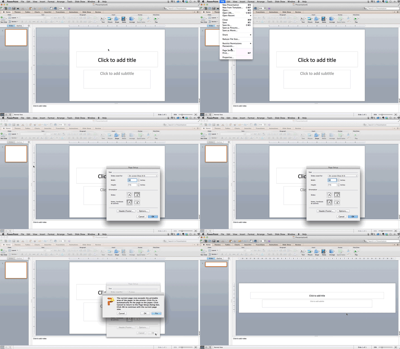
While you usually can get away with the default slide size for most presentations, you may need to adjust it for larger presentations on weirdly sized displays. If you need to do that, here's how.

  1. In the top-left corner, choose "File."
  2. Select "Page Setup."
  3. Type the height and width of the background you'd like, and click "OK."
  4. A dialogue box will appear. Click "OK" again.
  5. Your background is resized!

Tip: Resize your slides before you add any objects to them or the dimensions of your objects will become skewed.

Change-Size-of-Background-PPT-2

3. Edit your slide template design.

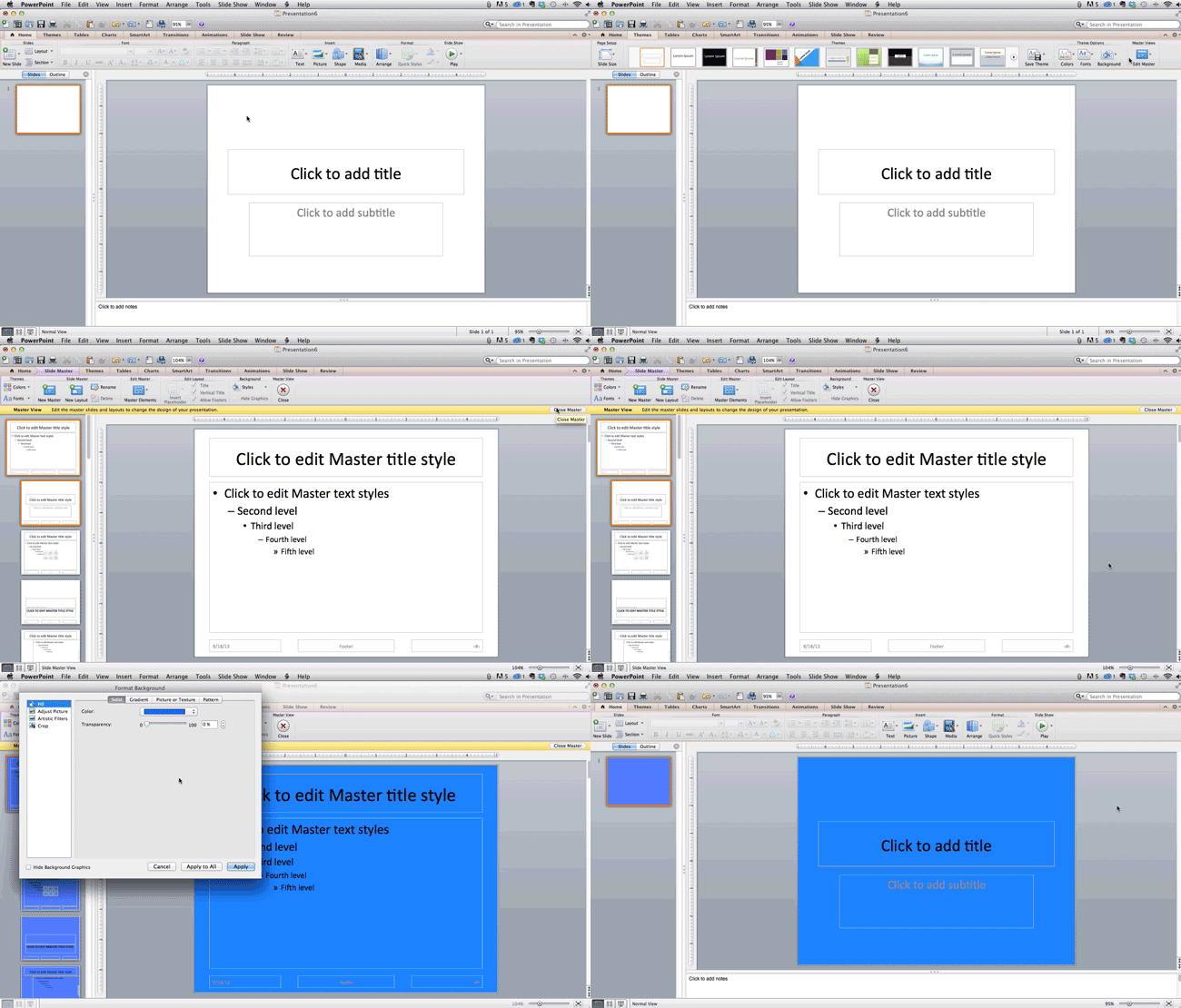
Often, it's much easier to edit your PowerPoint template before you start -- this way, you don't have design each slide by hand. Here's how you do that.

  1. Select "Themes" in the top navigation.
  2. In the far right, click "Edit Master," then "Slide Master."
  3. Make any changes you like, then click "Close Master." All current and future slides in that presentation will use that template.

Change-Slide-Master-1

4. Make sure all of your objects are properly aligned.

Having properly aligned objects on your slide is the key to making it look polished and professional. You can manually try to line up your images ... but we all know how that typically works out. You're trying to make sure all of your objects hang out in the middle of your slide, but when you drag them there, it still doesn't look quite right. Get rid of your guessing game and let PowerPoint work its magic with this trick.

How to align multiple objects:
  1. Select all objects by holding down "Shift" and clicking on all of them.
  2. Select "Arrange" in the top options bar, then choose "Align or Distribute."
  3. Choose the type of alignment you'd like.

Align-to-Object

How to align objects to the slide:
  1. Select all objects by holding down "Shift" and clicking on all of them.
  2. Select "Arrange" in the top options bar, then choose "Align or Distribute."
  3. Select "Align to Slide."
  4. Select "Arrange" in the top options bar again, then choose "Align or Distribute."
  5. Choose the type of alignment you'd like.

Align-to-Slide

PowerPoint Design

5. Use "Format Menus" to better control your objects' designs.

Format menus allow you to do fine adjustments that otherwise seem impossible. To do this, right click on an object and select the "Format" option. Here, you can fine-tune shadows, adjust shape measurements, create reflections, and much more. The menu that will pop up looks like this:

powerpoint_format_menus

Although the main options can be found on PowerPoint’s format toolbars, look for complete control in the format window menu. Other examples of options available include:

  • Adjusting text inside a shape.
  • Creating a natural perspective shadow behind an object.
  • Recoloring photos manually and with automatic options.

6. Take advantage of PowerPoint's shapes.

Many users don’t realize how flexible PowerPoint’s shape tools have become. In combination with the expanded format options released by Microsoft in 2010, the potential for good design with shapes is readily available. PowerPoint provides the user with a bunch of great shape options beyond the traditional rectangle, oval, and rounded rectangle patterns, unlike even professional design programs like Adobe Creative Suite or Quark.

Today’s shapes include a highly functional Smart Shapes function, which enables you to create diagrams and flow charts in no time. These tools are especially valuable when you consider that PowerPoint is a visual medium. Paragraphing and bullet lists are boring -- you can use shapes to help express your message more clearly.

7. Create custom shapes.

When you create a shape, right click and press "Edit Points." By editing points, you can create custom shapes that fit your specific need. For instance, you can reshape arrows to fit the dimensions you like.

edit_points

Another option is to combine two shapes together. When selecting two shapes, right-click and go to the "Grouping" sub-menu to see a variety of options.

  • Combine creates a custom shape that has overlapping portions of the two previous shapes cut out.
  • Union makes one completely merged shape.
  • Intersect builds a shape of only the overlapping sections of the two previous shapes.
  • Subtract cuts out the overlapping portion of one shape from the other.
By using these tools rather than trying to edit points precisely, you can create accurately measured custom shapes.

8. Crop images into custom shapes.

Besides creating custom shapes in your presentation, you can also use PowerPoint to crop existing images into new shapes. Here's how you do that:

  1. Click on the image and select "Format" in the options bar.
  2. Choose "Crop," then "Mask to Shape," and then choose your desired shape. Ta-da! Custom-shaped photos.

Crop-to-Shape

Learn more about creating images for your marketing channels in the video below.

9. Present websites within PowerPoint.

Tradition says that if you want to show a website in a PowerPoint, you should just create link to the page and prompt a browser to open. For PC users, there’s a better option.

Third party software that integrates fully into PowerPoint’s developer tab can be used to embed a website directly into your PowerPoint using a normal HTML iframe. One of the best tools is LiveWeb, a third-party software developed independently.

By using LiveWeb, you don’t have to interrupt your PowerPoint, and your presentation will remain fluid and natural. Whether you embed a whole webpage or just a YouTube video, this can be a high-quality third party improvement.

Unfortunately, Mac users don’t have a similar option. Agood second choice is to take screen shots of the website, link in through a browser, or embed media (such as a YouTube video) by downloading it directly to your computer.

PowerPoint Process

10. Embed your font files.

One constant problem presenters have with PowerPoint is that fonts seem to change when presenters move from one computer to another. In reality, the fonts are not changing -- the presentation computer just doesn’t have the same font files installed. If you’re using a PC and presenting on a PC, then there is a smooth work around for this issue. (When you involve Mac systems, the solution is a bit rougher. See Tip #11.)

Here’s the trick: When you save your PowerPoint file (only on a PC), you should click Save Options in the "Save As …" dialog window. Then, select the "Embed TrueType fonts" check box and press "OK." Now, your presentation will keep the font file and your fonts will not change when you move computers (unless you give your presentation on a Mac).

11. Save your slides as JPEGs.

In PowerPoint for Mac 2011, there is no option to embed fonts within the presentation. So unless you use ubiquitous typefaces like Arial or Tahoma, your PPT is likely going to encounter font changeson different computers.

The most certain way of avoiding this is by saving your final presentation as JPEGs, and then inserting these JPEGs onto your slides. On a Mac, users can easily drag and drop the JPEGs into PPT with fast load time. If you do not use actions in your presentation, then this option works especially well.

If you want your presentation to appear "animated," you'll need to do a little tinkering. All you need to do is save JPEGs of each "frame" of the animation. Then, in your final presentation, you'll just display those JPEGs in the order you'd like the animation to appear. While you'll technically have several new slides in place of one original one, your audience won't know the difference.

An important consideration: If your PPT includes a lot of JPEGs, then the file size will increase.

12. Embed multimedia.

PowerPoint allows you to either link to video/audio files externally or to embed the media directly in your presentation. You should embed these files if you can, but if you use a Mac, you cannot actually embed the video (see note below). For PCs, two great reasons for embedding are:

  1. Embedding allows you to play media directly in your presentation. It will look much more professional than switching between windows.
  2. Embedding also means that the file stays within the PowerPoint presentation, so it should play normally without extra work (except on a Mac).

Note: Mac OS users of PowerPoint should be extra careful about using multimedia files.

If you use PowerPoint for Mac, then you will always need to bring the video and/or audio file with you in the same folder as the PowerPoint presentation. It’s best to only insert video or audio files once the presentation and the containing folder have been saved on a portable drive in their permanent folder. Also, if the presentation will be played on a Windows computer, then Mac users need to make sure their multimedia files are in WMV format. This tip gets a bit complicated, so if you want to use PowerPoint effectively, consider using the same operating system for designing andpresenting, no matter what.

13. Bring your own hardware.

Between operating systems, PowerPoint is still a bit jumpy. Even between differing PPT versions, things can change. One way to fix these problems is to make sure that you have the right hardware -- so just bring along your own laptop when you're presenting.

14. Use "Presenter View."

In most presentation situations, there will be both a presenter’s screen and the main projected display for your presentation. PowerPoint has a great tool called Presenter View, which can be found in the "Slide Show" tab of PowerPoint 2010 (or 2011 for Mac). Included in the Presenter View is an area for notes, a timer/clock, and a presentation display.

Screen_Shot_2013-12-05_at_2.07.31_PM

For many presenters, this tool can help unify their spoken presentation and their visual aid. You never want to make the PowerPoint seem like a stack of notes that you use a crutch. Use the Presenter View option to help create a more natural presentation.

Pro Tip: At the start of the presentation, you should also hit CTRL + H to make the cursor disappear. Hitting the "A" key will bring it back if you need it!

With style, design, and presentation processes under your belt, you can do a lot more with PowerPoint than just presentations for your clients. PowerPoint and similar slide applications are flexible tools that should not be forgotten. 

Want more? Read 20 Great Examples of PowerPoint Presentation Design.

powerpoint presentation templates

download free powerpoint templates


from Marketing https://blog.hubspot.com/marketing/easy-powerpoint-design-tricks-ht

Looking Back on Facebook's Murky 2018: Here's Why Users Are Sticking Around [New Data]

It’s fair to say that Facebook has experienced some turbulence in 2018.

As the year draws to a close, looking back at the bumps in the road for Facebook over the past 11 months makes it difficult to believe that, well, it's only been 11 months -- to the point where It's difficult to encapsulate the 2018 ups and downs experienced by Facebook in a single paragraph.

But here goes.

The year kicked off with a major News Feed algorithm change in January to prioritize posts from users' friends and family over those from Business Pages. By August, engagement with these Pages had dropped by up to 50%. In the spring, details emerged on the improper harvesting of private user data by a voter profiling firm -- leading Facebook's CEO Mark Zuckerberg to appear before Congress in two high-profile hearings. In November, the New York Times published a report that the company's leadership had not only actively worked to hide these issues (instead of fixing them), but also hired a PR firm to portray Facebook's critics in a negative light.

And that's only a selection of some of the bigger stories about Facebook from 2018.

But with every new announcement and report, it seems that it isn't quite enough for people to part ways with the social network for good. After many of these events, we ran surveys to determine if it they were enough for users to delete or deactivate their accounts, and every time, there was a consensus: "No, I'll stay."

To find out why, we decided to go directly to users themselves and ask, "Look at the year this company has had. What's keeping you around?"

Here's what we found.

Friends and Family First

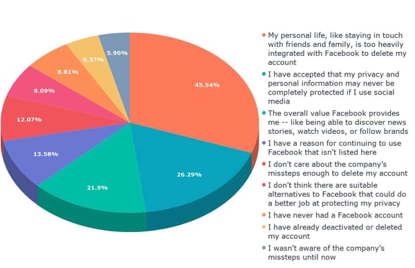
In our most recent survey to measure user sentiment toward Facebook, we provided a short summary of the company's alleged scandals over the past two years for 643 people across the U.S., UK, and Canada, followed by a key question. It read:

"Over the past two years, Facebook has been plagued by a number of scandals. These include foreign actors using the site to spread misinformation and influence major elections, voter profiling firms improperly obtaining private user data, and a major data breach. There have also been reports of company leaders actively trying to hide these issues instead of fixing them, as well as hiring a PR firm to help make critics of the company look bad. However, our research has shown that despite all these issues, very few people have deactivated or deleted their Facebook accounts. What are your reasons for continuing to use Facebook, despite these issues?"

What are your reasons for continuing to use Facebook, despite these issues_

Data collected with Lucid

In previous instances this year, we've speculated that, for most users, the cost of losing the connection to friends and family provided by Facebook is too high when compared to the cost of the company's issues.

That was confirmed by the responses we received to this survey.

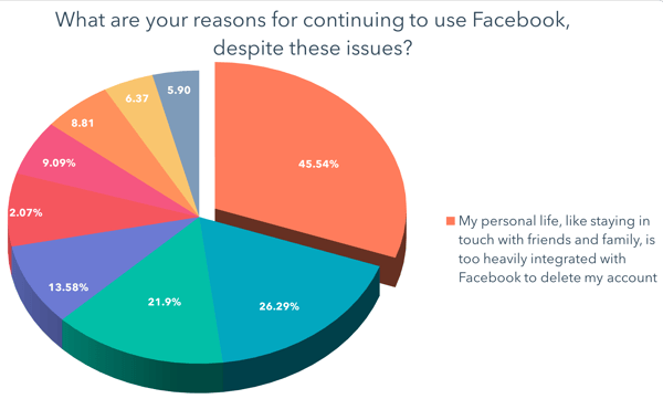
My personal life, like staying in touch with friends and family, is too heavily integrated with Facebook to delete my account-1

Data collected with Lucid

The highest number of users -- about 45% -- indicated that they haven't left Facebook due to their personal lives being too intertwined with it.

When we ran one of our earlier sentiment surveys in October, Likeable Media CEO Carrie Kerpen pointed to Facebook growing as a source of connections to relatives, for instance, who may not have previously considered using social media at all.

"Your Grandma is likely not on Twitter, but she's on Facebook now," Kerpen said at the time. "It's easy to use Facebook, every one is on it, and it's widely adopted."

Some People Have Given up on Privacy

At the same time, some users say they have simply accepted that using social media comes with the cost of their privacy being protected.

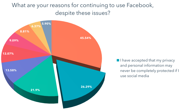
I have accepted that my privacy and personal information may never be completely protected if I use social media

Data collected with Lucid

That was the second-highest response we received, with over a quarter of participants selecting the answer: "I have accepted that my privacy and personal information may never be completely protected if I use social media."

This response could indicate that many users have simply come to terms with a potential lack of privacy as a result of having a presence on any social apps. That was one thought that HubSpot VP of Marketing, Jon Dick, had about the seemingly lack of shock among respondents earlier this year when we surveyed them about a Facebook data breach.

"People just assume that their data is constantly breached," Dick told me a few days after news of the breach first broke. That's why it's possible that "the Facebook news didn't even alarm people."

Benefits Beyond Friends and Family

If that's true -- that social media users simply assume and acquiesce that their personal data will always be compromised as a result of using it -- that impression could lend itself to other reasons respondents indicated for maintaining a presence on Facebook.

For example, the third-highest number of responses we received were from users who said that the other benefits provided by Facebook -- such as getting news or discovering other new content -- outweighed any problems the company might have.

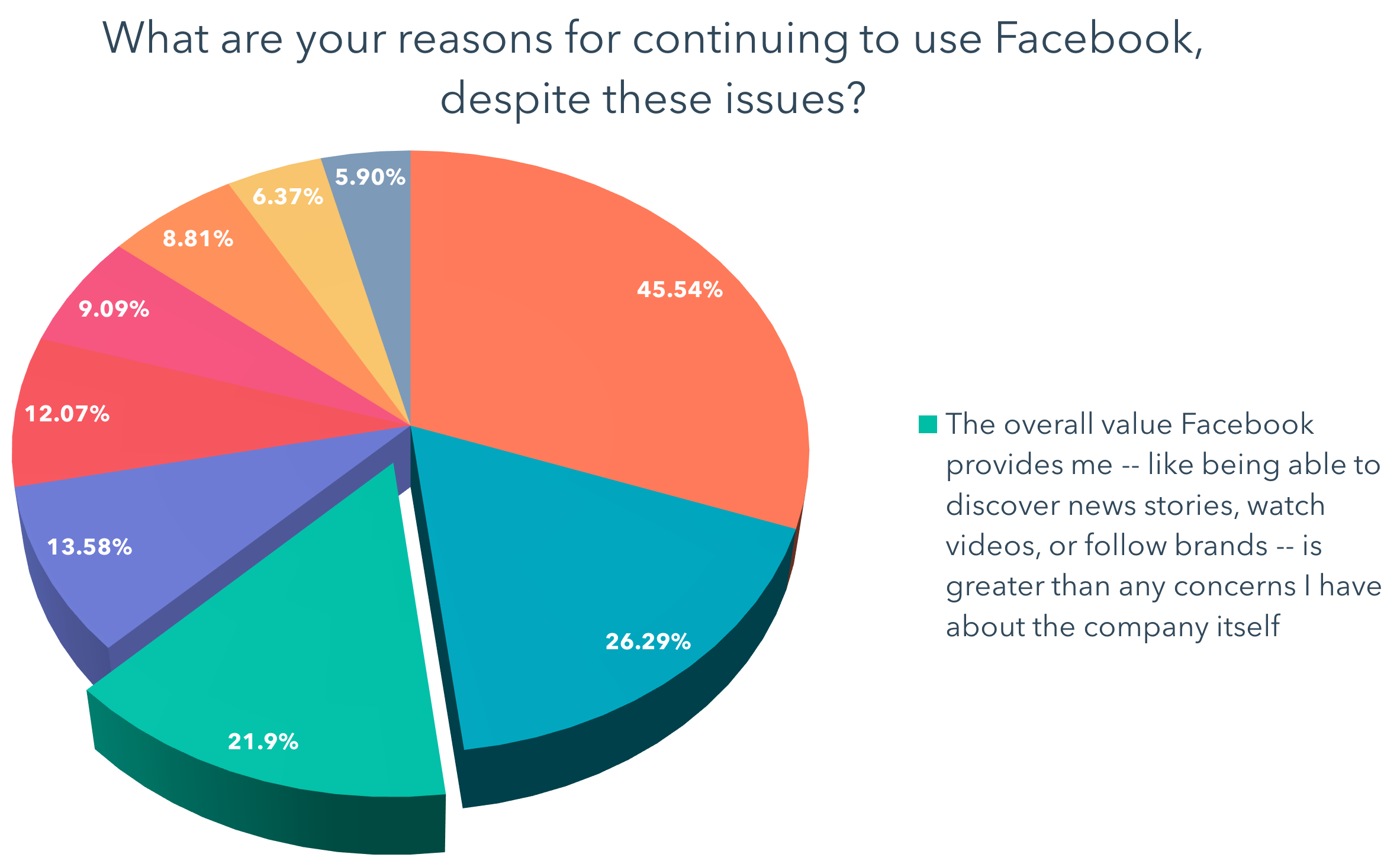
The overall value Facebook provides me -- like being able to discover news stories, watch videos, or follow brands -- is greater than any concerns I have about the company itself

Data collected with Lucid

Just over a fifth of respondents answered, "The overall value Facebook provides me -- like being able to discover news stories, watch videos, or follow brands -- is greater than any concerns I have about the company itself." 

That aligns with a point made by HubSpot VP of Marketing Meghan Keaney Anderson regarding user alliance to Facebook, when we discovered that many still didn't plan to delete their accounts upon learning of the aforementioned data breach. 

And as per Kerpen's point, Facebook in particular serves as "a primary connection point to family members, to news, to society at large," Keaney Anderson said at the time. "And for now, there is no viable replacement to that."

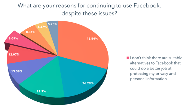
But Facebook's seemingly irreplaceable nature wasn't one of the more popular responses we received, with only 9% of people answering, "I don't think there are suitable alternatives to Facebook that could do a better job at protecting my privacy and personal information."

I don't think there are suitable alternatives to Facebook that could do a better job at protecting my privacy and personal information

Data collected with Lucid

Looking Ahead

As 2018 draws to a close and the roller-coaster it's provided for the tech industry at large (Facebook hasn't been isolated in its controversy), we find ourselves looking ahead at its potential ripple effect.

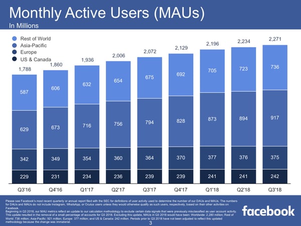
Although users mostly say they're not leaving Facebook, the company's growth has all but come to a screeching halt in some regions -- namely, in the U.S. and Canada, which are its largest markets for (advertising) revenue.

Q3-2018-Earnings-Presentation

Source: Facebook

With new users plateauing in its most lucrative markets, some speculate that Facebook is on something of a warpath to find new revenue streams, such as introducing ads to WhatsApp: the encrypted messaging app it acquired in 2014. Instagram, too -- which Facebook acquired in 2012 -- is viewed by many as a social plethora of ads, and has been identified by some as something the company will heavily rely on for revenue in the near future.

So, what does all of this mean for marketers and small-to-midsize businesses? 

While active user growth in certain regions may have slowed, the fact that most of Facebook's core users have yet to leave the network likely means that it's still one of the best places for marketers to reach audiences.

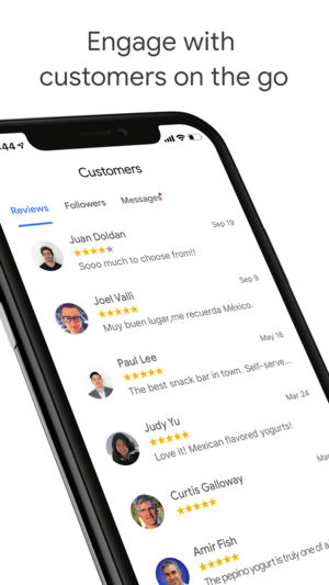
That hasn't stopped other companies from building out tools and resources for businesses that are similar to those provided by Facebook. For example, Google recently introduced new features to its Google My Business app that emulates some of those provided on Facebook Business Pages, such as the ability communicate with customers via in-app messaging.

300x0w

Image source: Apple

But when all is said and done, Kerpen says, it could be quite some time -- if ever -- that business tools provided by other platforms begin to rival Facebook's.

"Google My Business seems interesting, but even in a best-case scenario, it’s years away from even being a blip on Facebook’s radar," Kerpen explains. "If advertisers ever flee Facebook -- which won’t actually happen until results decline -- it’s going to be for ad platforms like Instagram [which is owned by Facebook], Twitter, Pinterest, and YouTube."

And as we look ahead to 2019, it seems that Facebook continues to serve as a resource valued by users and businesses alike -- one that, despite its issues, upholds a high barrier to being replicated or replaced. 


from Marketing https://blog.hubspot.com/marketing/facebook-2018-user-motivation

8 Journalism Concepts to Drive Better Engagement

More and more these days, I find myself searching for “The Magic X.” “The Magic X,” of course, is the fastest way for me to skip all of the useless & irritating things that pop up and get between me and the content I came here to consume. To an advertiser, this is obviously unwanted behavior. But to the content marketer, this could be exactly the behavior you should hope your reader is doing every time they come to your site. But how do you make content that the consumer actually wants to read? The answer is simple and may have been around for generations before “The Magic X” ever existed. That answer is to create the content that your reader is trying to find in the first place.

Nobody knows how to produce quality content that readers actually want to read more than journalists. For years, journalists have been crafting stories—in newspapers, magazines, television, and the internet—that readers actually want to see. So what can the successful content marketer learn from journalists? It’s easy: learn how to tell a good story.

As a former journalist, I’ve put together a list of eight journalism concepts that every content marketer can learn from the age-old craft of telling good stories.

1. Be Relevant and Useful to Your Audience

Business Week writes to business people. Sports Illustrated writes to sports fans. Vanity Fair writes to the vain (just kidding). Journalists write stories that are of public interest and public service. Likewise, your content should be of interest to your readers and provide them value. Serve readers first and yourself second. Readers and search engines can see right through content that is self-serving and not pertinent to your audience.

2. Simplify

Complicated words and complex phrases can confuse your reader. Keep it simple, easy-to-read, and avoid too much unnecessary jargon, without sacrificing your voice as an authority in your field. The greater the complexity, the higher you set the bar, and that means potentially alienating readers. Strike a balance between finding the lowest common denominator and dumbing down your article to the point it is no longer useful.

3. Stories Can Be Told Many Different Ways

Your readers are complex and unique individuals who consume information in different ways. Therefore the more ways you can meet those needs and preferences, the broader your audience base will be. Interesting copy, compelling photography, engaging videos, and informative podcasts are the types of content you can provide.

Keep in mind though that you must use different tools for different jobs. Understand each medium’s strengths and weaknesses and aim to provide the right content on the right platform. For example, dense, long-form copy might not hold a reader’s attention for long, but that same information could be much more easily and passively digested in the form of a more casual, one-hour podcast instead. The why informs the how.

4. Don’t Bury the Lead

While marketing strategy often tries to keep the reader on the site as long as possible, don’t forget to put the reader’s needs and desires first. Burying the lead can frustrate a reader looking for you to “get to the point” and in this age of short attention spans, that could quickly lead to lost readership.

Think of your story like a three-course meal. The appetizer should do just that: appetize. It shouldn’t leave them sated, nor deprive them of what they came for, but rather excite the reader and leave them wanting  more. We call this the inverted pyramid style. Start with the big picture (appetizer), fill out the details (main course), then provide background and context to understand why it’s relevant (dessert). Your job as a storyteller is to intrigue the reader. Open with an interesting premise and the important facts so that they will be compelled to read on. Your content is worthless if nobody is reading it.

5. Work Your Angles

Stories are rarely one-dimensional, and while it serves to be thorough, breaking down the many facets of your story works both to simplify, and give you more potential content without becoming repetitive. Learn to look at your story from different perspectives. Why does this matter, not only to your reader but your reader’s customers, managers, and subordinates? What will make this relevant and useful to them? Look at ways you can tell the story from an analytical angle, but ask yourself how you can flip that same story and address a more human interest angle. Your readers are humans with feelings and experiences, as well as being professionals in their respective fields. Give them something to relate to, someone to root for in one story, and data and numbers and concepts in another.

6. Seek the Truth and Report It

Accuracy is key. Be extremely careful not to misquote your sources to neatly fit words to a different context for the sake of convenience, but try and get your sources to speak directly to the topic you are addressing. Spell names correctly, give people their proper titles, and let no fact be called into doubt. You have a responsibility to represent your sources with the utmost respect and accuracy while still telling a good story. Statistics should be cited, and news stories should be linked to, leaving no room for a reader to question how you came to the conclusion that you assert.

7. Be Curious

Journalists are rarely subject matter experts in a vast majority of topics that they write about. Likewise, when you find that you lack the necessary credentials to speak about a topic, go find someone who does. Ask them all of the questions that your readers are likely to ask themselves. But get it in their own words. If there’s something you don’t know about a topic, chances are some of your readers will not know them either. This gives you an opportunity to seek out those answers and give your readers some new information, useful tips, and interesting facts. Doing this helps to expand the pool of content you can write about, without sacrificing your authority as a source of reliable information.

8. Be Timely

Journalists often report both on trends and unusual occurrences in a given subject, and both are uniquely tied to the times. An analysis of industry trends from 1998 when the internet had yet to reach ubiquity is not relevant to an industry insider of 2018. This is an increasingly important point, given the rapid turnover of popular applications and websites and the constantly changing climates and attitudes toward certain industries.

Be careful about falling for the trap of being the first at the expense of being right. Being first is great, but being accurate is still the number one concern of any good journalist. This requires being deeply attuned to a certain topic or industry, but also far enough back to observe (or at least be aware of) the big picture as it shifts and evolves. It also requires that you be diligent and obsessed with ensuring that what you’re reporting is the truth.

Brand Journalism Defined

The key to being a trusted source of information is to be as impartial as possible. Sometimes that idea seems to run counter to the goals of a marketer, but if you can establish yourself as a credible & realistic storyteller, you can ensure that your readers will continue to trust you as a source of reliable content, rather than someone simply trying to push an agenda or sell a product. Transparency and a commitment to avoiding the perception of bias help to establish you as both a thought leader and a source of trustworthy information.

This doesn’t mean you need to be crediting your competitors for whatever they’ve done right. It means avoiding leaving your readers with the impression that your brand is above reproach. Making light of one’s own mistakes is a great way to provide useful anecdotal information while still giving the impression that your company is, in fact, built upon people, and people are by nature fallible.

The post 8 Journalism Concepts to Drive Better Engagement appeared first on Marketo Marketing Blog - Best Practices and Thought Leadership.


from Marketo Marketing Blog https://blog.marketo.com/2018/11/8-journalism-concepts-to-drive-better-engagement.html

15 of the Best Simple WordPress Themes

When it comes to determining what you want your WordPress website to look like, you’ll first need to consider the theme that you plan on installing — that’s because WordPress themes are how you actually design and customize the look of your entire website.

No matter what industry you’re in or which style you’re envisioning for your website, a simple theme — meaning minimalist, clean, and well-organized — is often ideal for businesses, visitors, and customers.

However, with the hundreds of simple WordPress themes available, finding one that fits your needs may seem like a daunting task. That’s why we’ve done the work for you and compiled this list of our 15 favorite simple WordPress themes for you to explore.

Download our free guide here to uncover 10 SEO mistakes to avoid in your next redesign.

15 of the Best Simple WordPress Themes

We have categorized 15 of our favorite simple WordPress themes by need and industry to help you determine which option is best suited for your website. Whether you need a theme to display your photography, manage your online store, complete a variety of different tasks, showcase your writing, or share your creative work, there is a simple WordPress theme option that could work for you.

Simple Photography Themes

If you are a photographer or want to display your artwork, these simple photography themes will allow you to share your content in a way that looks nice, organized, and doesn’t detract from your work.
 

1. Fargo

fargo-wordpress-theme

Source

Fargo is a minimalist WordPress theme built for artists who want to share their photography. The theme offers unique transitions between photographs as well as Smart Galleries that seamlessly move visitors between types of content, such as text to photos to videos. If there are certain aspects of a photo that you want to make sure your viewers see, this theme offers zoom-in and zoom-out features that add a “cinematic experience” to your still photography.

Key Takeaways:
  • Unique transitions between photos
  • Smart Galleries
  • Zoom-in and out features

2. Luisa

luisa-wordpress-theme

Source

Luisa is a simple theme preferable for photographers, graphic designers, and artists who want to include written content or blog-type content with their photographs. Each photo is displayed as a portfolio post-type, meaning your projects are beautifully formatted in categories of your choosing with the option to include text if you’d like. The theme also supports videos. Lastly, Luisa is SEO-optimized to help you organically attract more traffic and visitors.

Key Takeaways:
  • Portfolio post-type
  • Option to include video
  • SEO-optimized

3. Shape

shape-wordpress-theme

Source

Shape is a simple WordPress theme ideal for artists who want to tell stories through photography. Shape is known for their Filterable Galleries feature which offers smooth transitions between pictures and videos as well as the ability to add written descriptions of your photographs, display your content in a way that is unique to your site, and add a comments section for your visitors. The theme even has social media support so you can post and link to your social accounts (like Google+, Twitter, and Facebook) straight from your website.

Key Takeaways:
  • Filterable Galleries
  • Ability to add comments section
  • Social media support

Simple Business and E-Commerce Themes

These simple business and e-commerce themes are ideal for a distraction-free and intuitive online shopping experience for your customers. 

4. Monochrome

monochrome-wordpress-theme

Source

Monochrome is a simple WordPress theme created by StudioPress that works well for businesses and online stores. The theme is pre-styled for WooCommerce, an e-commerce platform for WordPress websites, making it easy to integrate your online shopping experience. The typography options and multiple areas of white space allow for a simple, focused, and straightforward experience for your visitors.

Added bonus: WP Engine hosting plan users get free access to all StudioPress themes.

Key Takeaways:
  • Pre-styled for WooCommerce
  • Simple typography and plenty of white space
  • WP Engine plan users get free StudioPress theme access

5. Enterprise

enterprise-wordpress-theme

Source

Enterprise is a simple, multi-purpose WordPress theme meant for businesses and corporations. The minimalist and modern-looking theme offers a variety of pages you can customize for your customers, such as FAQ, forums, support, and a knowledge base. The theme has built-in shortcodes so users without coding knowledge can still easily build their website.

Key Takeaways:
  • Ideal for corporations
  • Customizable pages include FAQ, forums, knowledge base, and more
  • Built-in shortcodes 

6. Presence 

presence-wordpress-theme

Source

Presence is a business, e-commerce, and education-focused simple WordPress theme that provides you with pre-built layouts, blog pages, and different designs. These designs are created for different industries including corporations, online stores, hotels, and real estate companies. Presence also has a drag-and-drop page builder to make website creation even easier.

Key Takeaways:
  • Pre-built layouts
  • Different designs based on industry
  • Drag-and-drop page builder feature

Simple Multi-Purpose Themes

Whether you’re looking for a simple theme for your business, blog, photography, or creative website, these multi-purpose themes can be manipulated and designed to fit your exact needs. 

7. Salient

salient-wordpress-theme

Source

Salient is a simple, multi-purpose theme that offers over 250 different templates you can use to customize your website. There are also hundreds of ways to customize your color scheme and typography to keep your site on-brand and matching your company’s aesthetic. Salient is a lightweight theme which means it’s speedy, efficient, and takes up less space on your server.

Key Takeaways:
  • Over 250 different customizable templates
  • Hundreds of color and typography options
  • Lightweight theme

8. Infinite

infinite-wordpress-theme

Infinite is a simple WordPress theme with WooCommerce integration and a variety of installable demos suited for different industries such as creative, corporate, e-commerce, and other niche businesses. In addition to customizable demos, the theme also offers access to the Google Fonts library which includes over 770 different fonts. Infinite is automatically responsive on all devices, meaning you don’t need to worry about creating another version of your website for mobile and tablet usage.

Key Takeaways:
  • WooCommerce integration
  • Customizable, installable demos
  • Access to Google Fonts library 

9. Montblanc 

Montblanc is a simple, multi-purpose WordPress theme ideal for creative and e-commerce use. Whether you’re an author, photographer, videographer, blogger, or graphic designer, this theme has a wide range of features including five different shop and homepage layouts that allow you to display your work in a unique way. Montblanc is WooCommerce integrated so you can also sell your artistic work directly from your site.

Key Takeaways:
  • Creative, multi-purpose theme
  • Five shop and homepage layouts
  • WooCommerce integrated

Simple Writing Themes

No matter the type of writer you are, these simple themes are ideal for featuring your work — there are options for news writing, editorial writing, business writing, blogging, and more.
 

10. Newspaper

newspaper-wordpress-theme

Source

Newspaper is a simple WordPress theme ideal for writing and posting articles and blogs on your website. The theme offers a newspaper template so your pieces are formatted in a layout that’s easy to read for your visitors. Newspaper also has social media and YouTube integration so you can seamlessly share your content with your followers on all mediums.

Key Takeaways:
  • Ideal for news articles and blogs
  • Newspaper template
  • Social media and YouTube integration

11. Writee

writee-wordpress-theme

Source

If you’re a blogger of any kind, Writee is a great way to share and display all of your content. This simple WordPress theme can be translated into multiple different languages and has customizable features to fit your blog no matter what you write about — whether it’s food, lifestyle, fashion, or marketing. Writee also has a number of options to help you feature your photographs and other visual content in a way that complements your written work.

Key Takeaways:
  • Ideal for bloggers
  • Can be translated into other languages
  • Customizable options to pair written and visual content

12. The Breaking News

the-breaking-news-wordpress-theme

Source

The Breaking News is a simple, minimalist WordPress theme created for news sites and online magazines. The clean design includes distraction-free styling, whitespace that keeps visitors focused on your content, and simple typography. The theme also provides you with a number of ways to feature your most relevant, popular, and important articles.

Key Takeaways:
  • Ideal for news sites and magazines
  • Distraction-free styling and formatting
  • Options to feature your relevant and important articles

Simple Creative Themes

The following simple themes are ideal for any professional looking to share their creative works such as art, writing, photography, in a minimalist format. 

13. Kalium

Kalium is a simple theme ideal for any type of creative professional. The theme offers installable demos that include entire website concepts so you can simply customize the content within the theme to get your site up and running as quickly as possible. Kalium is already translated into over 16 languages and includes a wide range of portfolio layouts so you can display your work in a way that makes the most sense for your specific business and industry.

Key Takeaways:
  • Installable website demos
  • Translated into over 16 languages
  • Multiple portfolio layout options

14. Corner 

corner-wordpress-theme

Source

Corner is a simple, creative WordPress theme that includes over 16,000 color variations to customize your website’s look, WooCommerce integration to allow for a simple online shopping experience, and a clean layout for a great user experience. The theme also has several custom widget options so you can include buttons on your site that direct visitors to your social media profiles and other content.

Key Takeaways:
  • 16,000+ color variation options
  • WooCommerce integration
  • Custom widgets

15. Kleanity

kleanity-wordpress-theme

Source

Kleanity is a simple, creative theme for anyone looking to share their portfolio. The drag-and-drop page builders allow you to easily showcase your work. There is also a Live Customizer feature that allows you to edit your pages with your content on them and view your changes instantly. The theme also auto-updates so you’ll never have to worry about downloading any new software.

Key Takeaways:
  • Ideal for displaying portfolio work
  • Drag-and-drop page builder
  • Live Customizer feature

Back To You

Simple WordPress themes are a great way to build a minimalist, clean, and straightforward website that improves user experience while getting rid of unnecessary fluff and content. Simple themes allow you to create a focused online experience for your customers and visitors that is unique, on-brand, and appealing to the eye.

No matter your industry, there’s a simple WordPress theme option that works your website, buyer personas, and company. So, if a minimalist and clean design is what you envision for your site, try installing one of these 15 options and implementing your own content to see what a simple theme could do for your website.

website redesign seo mistakes


from Marketing https://blog.hubspot.com/marketing/simple-wordpress-themes