So, apparently, there’s a show on Disney Channel called Dog With a Blog.
Yes, you read right.
When I discovered this, two thoughts quickly entered my mind -- one, “what the heck ever happened to good old shows like The Mickey Mouse Club?,” and two, “literally everyone has a blog now, don’t they?”
With so many people (and apparently pets) blogging today, general consumers are far more familiar with most blog conversion practices and, unfortunately for marketers, how to avoid them.
Despite this newfound hurdle, there are still several simple, data-backed features and tactics to help you attract more leads with a high-converting blog design.
Think your blog is missing something? To paraphrase another Disney classic, just look for these blog necessities; these simple blog necessities.
1) A Dedicated Blog Subscription Page
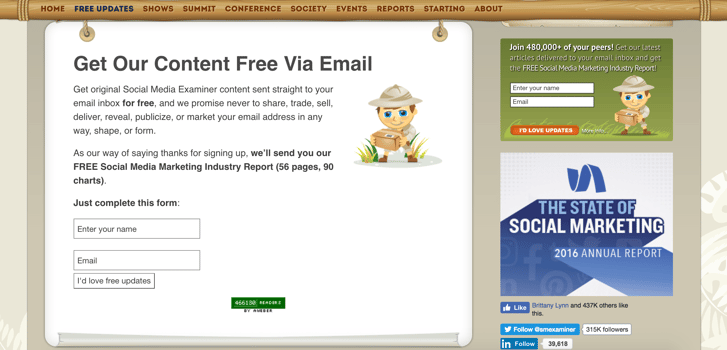
This is an old “hack” that many brands seem to forget these days -- having a landing page dedicated specifically to subscribing to your blog.
Part of the reason many subscriber lists don’t grow is because people don’t understand why they should be subscribed in the first place.
Why should they volunteer to hear from you? Why should they grant you access to their personal inbox? What value does your blog offer?
A dedicated blog subscription landing page allows you make your case in more detail than most pop-ups or sidebar forms allow.
On your dedicated landing page, you can incorporate social proof, share examples, and fully sell the value of your blog to your audience, in turn, making it more inclined to convert.
Doing this also creates a page that you can directly link to from your blog and one that can be optimized and indexed by search engines to get your brand found. After all, the more new people finding your blog, the more opportunities to gain new subscribers.
Below is a great example from Social Media Examiner. Notice how they incorporate a lead magnet; this is something we'll talk about in #7.

2) Crisp, Beautiful Visuals
If the rise of photo filters has taught me anything as a marketer, it’s that we live in a superficial world.
It’s not enough to tell people what they need to know anymore, you need to show them -- and the view better be good.
Studies show that on average, the #1 search result on Google has 9 images and if those images are high-quality, they are likely to get 121% more shares. Knowing this, make an effort enhance your written content with relevant graphics, photos, or charts.
A high-converting blog design is fully-optimized to showcase high-quality images like these and offer the best viewing experience possible.
Contently has done a commendable job with this; making striking, colorful imagery the focal point of its article right-off-the-bat.
3) A Fast Load Time
Now, where there are beautiful images, unfortunately, there are also often speed and loading issues.
According to a study by Akamai, about half of web users expect a site to load in two seconds or less. That means if your blog design is image-heavy or not optimized to handle high-resolution files, you may be losing a large number of potential leads while these visuals load.
To avoid this, compress image files and optimize your blog design to load quickly while you still have your audience’s attention.
Not sure how quick it needs to be? Use Google Analytics to find your average user’s on-screen time. If the time is low (and your bounce rate is high), you may be losing people to a slow site speed. Find your blog’s exact site speed here then talk to your developer about ways to improve this number if need be.
Even a few seconds too many could lead to an uptick in your bounce rate and a huge drop in your number of conversions.
4) Mobile Responsive Design
If your business is anything like ours, your blog is one of the most popular pages amongst mobile users. Make sure that its browsing and reading experiences are the best possible by optimizing the page through responsive design.
Responsive design is arguably the most efficient approach to mobile optimization, as it automatically adjusts fonts, images, and layouts to the specifications of the device at hand, without the need for a separate, dedicated design.
Offering a positive, consistent user experience both on desktop and mobile, makes it easier for people to convert on your blog when and where the mood strikes them.
5) Cross-Browser Optimization
Similar to mobile optimization, you want to make sure that your blog design is uniform and beautiful across different web browsers.
Cross-browser testing and optimization help ensure a consistent, high-quality experience to all of your users. The last thing you want is to lose a loyal reader because they’ve switched to a Mac and your blog design was only optimized for Android.
6) Prominent Social Share Links
Word-of-mouth is a powerful marketing tool and it’s only getting stronger with the aid of social media and inbound marketing. One of the easiest ways to harness it to increase your conversion rates is by including prominent share links in your blog design, like we do at IMPACT (both on the main page and within articles):
As sad as it may be, Upworthy found that readers who only consume about 25% of an article are, more likely to share than those who actually complete a piece, so use this to your advantage. Place easy-to-identify and click social share buttons on each of your articles and your blog homepage.
Making it as easy as possible for people to share your content with their audience makes it that much more likely they will do so; and again, the more new eyes on your blog, the more chances of gaining new leads.
7) A Subscription Lead Magnet
As great as your blog may be on its own, sometimes people need a little extra push to commit with an email subscription. That’s where your lead magnet comes into play.
A lead magnet is a premium offer of irresistible value. It’s a piece of content that visitors can’t help but want to exchange their email address for, and in this context, it is an incentive to subscribe to your blog.
Adding a high-quality piece of content that people can only get by subscribing (i.e. a video or guide like IMPACT does above) is like adding a free gift to an in-store purchase. It "sweetens the deal." It delivers a more immediate value (instant gratification, if you will) to the act of subscribing and creates a sense of exclusivity.
Highlighting this added value in your blog design can help entice new subscribers and boost conversions.
8) An Exit-Intent Popup
For those of you not familiar with them, exit-intent popups are framed messages that only display when you’re about to close the window or attempt to navigate away from the site.
As consumers, we all hate them, but as marketers, frankly, they work.
WP Beginner, for example, increased its subscriber numbers by about 600% by implementing an exit-intent popup on its blog and results like that are quite common.
Though a bit in-your-face (even Google is cracking down on them on mobile), exit-intent popups give users one last chance to convert before leaving your site.
Instead of simply bouncing away, these additions give you an opportunity to make your final case and possibly win back a lead that was ready to give up on you. So, test it out!
Consider integrating an exit-intent popup into your blog design that highlights its value or even promotes your subscription lead magnet.
Neil Patel took a bold approach with his here:
So, How Does Your Blog Stack Up?
Download our full 10-point blog design optimization checklist here to see what else your blog may be missing.
If you’d like some help implementing or even fine-tuning one or more of these tactics, talk to IMPACT. Our all-new blog optimization services will help you incorporate the 8 necessities mentioned above and many more, to start generating more leads from your business blog!

from HubSpot Marketing Blog http://blog.hubspot.com/marketing/8-necessities-of-high-converting-blog-design
No comments:
Post a Comment