Monday, 31 October 2016

Here’s 5 Smart Ways to Plan Your E-commerce Sales Promotion

Ready for your next sales promotion?

For some ecommerce teams, it’s a time-consuming task deciding which items to markdown and how to publicize a sales event. However, sales promotions play an integral role in attracting customers.

A survey found that up to 50% of consumers make a purchase only with a promotion. Shoppers desire a good deal before they invest in your products. Moreover, your business may want the additional revenue.

“Sales promotions can give you the edge you’re looking for when it comes to revenue. Successful companies know that sales promotions are among the most effective methods of increasing sales and building customer satisfaction,” writes Emily Weisberg, content marketing manager at ThriveHive.

Take a strategic approach when planning your sales promotions. Below are five smart ways to help your team.

1. Select Specific Incentives

Sales promotions take various shapes and forms. Cater your incentives to fit your consumers’ needs.

Start by using customer analytics. Historical purchasing habits can uncover what promotions performed well. Social media comments also provide first-hand details on whether customers possess interest.

Next, match your findings with a sales initiative. From mystery discounts to purchased-based donations to bundle sales, several options exist.

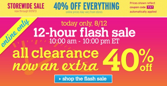
Monetate “found that 56% of businesses agree that flash-sale campaigns are better received than regular campaigns.” Limiting the timeframe creates urgency for the customer to act now.

12-hour-flash-sale-ad
(Image Source)

Thinking about free offers? PaySimple’s Vice President of Knowledge Lisa Hephner explains the power of free incentives:

“Everyone loves free. Whether it’s free gifts, free refills, or free service segments, free sells. One of the most powerful free offers is free shipping for online orders, as evidenced by multiple studies where respondents highlight it as the most important factor in making a purchase decision.”

Figure out the best promotions for your customers. Review your data before moving forward.

2. Cross-Sell With a Purpose

Every sales promotions doesn’t need to involve discounting your signature product. Instead, it can focus on secondary items.

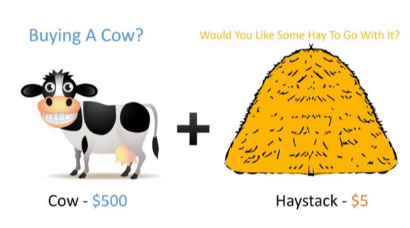
Cross-selling is another opportunity to provide value to your customers. Buyers love convenience, and they want to save time shopping at one place. And it eliminates the hassle of sifting through multiple ecommerce sites.

Align your promotions with products that complement one another. Give consumers the chance to buy everything they need from your store.

“Savvy marketers use this concept to increase sales by informing consumers how one product complements another. Cross selling can take several forms. Understanding your customers’ motivations helps you choose which approach to take,” says Sara Huter, a contributor at BusinessBee.

For example, if your company sells cell phones, your team can offer a promotion on the accessories, like bluetooth earbuds, phone cases, or charging cables.

buy-cow-buy-haystack
(Image Source)

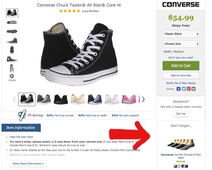
Research found that “cross-selling was shown to be much more effective when presented on the checkout pages versus the product pages.” So, add images of promotional products in the sidebar menu.

suggestive-selling-zappos

Plus, cross-selling aids with bringing in more cash flow for your business. Amazon credits up to 35% of its revenue to cross-selling.

Think differently about ecommerce sales promotions. Don’t remove cross-selling from your list of possibilities.

3. Microtarget Your Customers

Microtargeting isn’t a new technique to your team. Nevertheless, you may be failing to put it into practice.

Segmenting your audience lets your business offer the right promotions to the right individuals. Customization speaks directly to consumers—signaling that you know exactly what they need.

Melissa Jenkins of Mel Jens Designs believes “running a successful promotion is all about finding that delicate balance between audience segmentation, great timing and setting the perfect price or placing the perfect offer.”

Examine your data to segment properly. Try geographical locations, buying habits, income levels, or even past purchasing behavior.

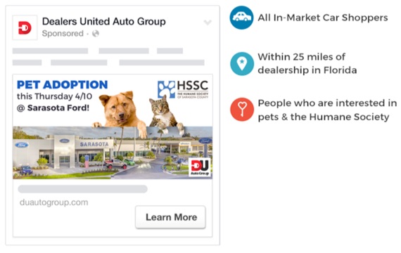
Dealers United Auto Group created mock ads targeted for car shoppers within 25 miles of the dealership that possess an interest in pets. Specificity is vital for effective micro targeting.

dealers-auto-group-micro-targeting
(Image Source)

A study reveals that 51% of marketers believe sharing data across their organizations is a major issue. Avoid data limitations that will hinder segmentation for your sales promotions.

Create an open dialogue across departments to gather all data about your customers. You’ll have more knowledge to build an accurate buyer persona.

Pinpoint who needs to know about your sales event. Microtargeting is a benefit to your company.

4. Hype Up Engagement

Draw attention to your sales promotions with social media and email campaigns. This extra engagement will get people interested in your sales incentives.

Facebook users spend an average of 50 minutes a day on its multiple platforms. Work with your team to promote sales on your social pages. Or even enlist the help of industry influencers to spread the word.

User-generated content (UGC) is also another way to lure shoppers toward your brand. Actual consumers enjoying your products authenticates your value to hesitate buyers.

“User-generated photos are a great way to generate social proof. Prospective customers see that your products are regularly being purchased people just like them, and feel more comfortable doing something that others are doing,” says Dan Wang, a content specialist at Shopify.

Big box retailer Target retweeted a post from loyal shoppers who made a funny video in one of its stores. Encourage customers to submit UGC of them unboxing your products.

Also, keep your email subscribers in the loop about promotions. Craft engaging emails that explain the benefits, provide social proof, and use a distinct call-to-action.

“When it comes to creating a high-converting marketing offer email, the final piece of the puzzle is using a prominent call to action button. This is important because buttons make it clear to the reader what the next step is and encourage them to click-through,” states Aaron Beashel, director of demand generation at Campaign Monitor.

Shout your sales promotions from the rooftop. Get shoppers excited to participate.

5. Move Toward Customer Loyalty

Returning customers spend on average 67% more than first-time customers. Consider promotions as a pathway to retaining customers.

Give your customers an opportunity to discover your brand’s values and culture. Sign up shoppers for your weekly newsletter, or enroll them in your rewards program.

Customer loyalty centers around building worthwhile relationships. However, buyers may only be interested in your promotions.

“The use of sales promotions can be positively utilised in order to encourage brand loyalty and brand switching by companies. However, academic research suggests that consumers can become loyal to sales promotions rather than a brand,” states Zhorna Ali, a sales and marketing assistant at M3.

To avoid consumers from brand switching, companies must thoroughly personalize their sales promotions strategy. Focus on specific product categories to remain competitive within the market.

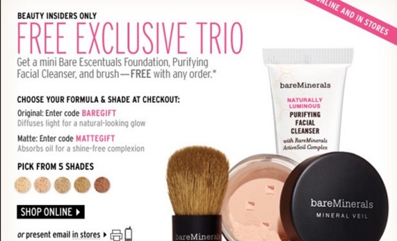
Rather than giving sales incentives to everyone, Bare Escentuals limits its promotions to its loyal fans called Beauty Insiders. In the example below, customers received three free items with any order.

trio-makeup-ad
(Image Source)

Create plans to engage customers beyond your sales promotions. Earn their loyalty.

Prep for Sales Promotions

Planning for your next sales event involves lots of time and decision-making. You want to boost your revenue and satisfy customers.

Choose buyer-specific incentives that will attract people. Cross-sell products that complement one another. And think beyond the promotion by focusing on customer loyalty initiatives.

Upgrade your sales promotion. Prepare for it today.

About the Author: Shayla Price lives at the intersection of digital marketing, technology and social responsibility. Connect with her on Twitter @shaylaprice.


from The Kissmetrics Marketing Blog https://blog.kissmetrics.com/plan-your-ecommerce-promotion/

A Tale of Marketing Halloween Horrors

A Tale of Marketing Halloween Horrors

Author: Patrick Groover

This spooky Halloween tale is not for the faint of heart (in terms of marketing disasters, that is). Legend has it that this is based on a true story…

One mid-October day as the wind-blown leaves of Autumn collected along the sidewalks of the metropolis, marketers from Amazing Brand were heading to work early to get ready to launch their annual Halloween-a-thon campaign. The team had made all of the usual preparations and just needed to finalize their orange and black content that had been carefully laid out in all of the usual rigor.

Igor, who was newly promoted to VP of Marketing, was excited to have his first chance to lead the team in executing the renowned Halloween-a-thon campaign. He sat at his desk carefully reviewing all of the creatives and campaign flows that would put the company in the black for the rest of the year. This year was particularly unique because the campaign had grown so large in recent year that the team was considering moving to a new marketing automation platform. Albeit they never quite made the move…

Igor planning

Everything was on track and running smoothly. It had been a busy year, with tons of planning sessions for this one campaign. Igor had gathered all of the right players and despite the decision to forego investing in a new platform, he had effectively prevented the last-minute rush that they had experienced in previous years. Igor had leveraged historical skills in campaign management through detailed spreadsheets, color-coded deliverables, and timelines for the marketing team.

Igor reflected, “Sure, it’s time for Amazing Brand to graduate to some of the newer techniques for automating our campaigns, but with a team like ours, we’ve got this thing on lockdown.” He smiled to himself as he thought about how his current practices were driving anticipated increases that would likely set him on a path to promotion sometime next year. Things were looking good!

At 3pm, Igor would stand in front of the entire team to rally everyone for the official launch that would go out at 10am the next morning. He smiled as he envisioned a room full of clapping and cheering. This would be the perfect Halloween.

Something’s Brewing in the Cauldron

Meanwhile, Fran Stein, Amazing Brand’s GVP of Marketing, was having a long morning in the executive boardroom. As they were discussing the projections for the final quarter of the year, the board had once again questioned the company’s dependence on the annual Halloween-a-thon campaign to put the company in the black. Last year had been full of last-minute changes and it sure seemed like a lot was riding on this one marketing push. They demanded more.

Fran knew that adding a second annual push would require more resources than she had available and the board was always reluctant to add marketing staff, questioning the returns of each program. Thumbing through Igor’s print-outs, Fran struggled to make sense of the team’s current workload. “There’s always more room in the schedule…where’s Igor?!?” she thought to herself. “We must pull out all stops this year! I have just the plan!!!”

The Perfect Halloween…Disaster

“Igor! Igor! We’ve got to talk!”

Fran came striding into Igor’s office…she was on a mission. He was just about to give her an update about his fully-loaded project status from the open spreadsheet on his screen when Fran cut him off.

“Igor…we’ve got too much riding on this year’s Halloween-a-thon” said Fran as Igor nodded in agreement. “We need to add a second major campaign push.”

Igor knew where she was going with this. They had been over it many times. To bring in more revenue, they would need to run more campaigns to generate demand from their potential and existing customers. And to prove the ROI of their efforts, they needed a way to track and measure their campaigns. This was simply impossible to accomplish on their current platform.

“Igor…” she continued “Do you remember our idea for targeting those extra audience groups this year? How long would it take to get them together?” Igor took a deep breath, walked Fran through the project spreadsheets for the hundredth time, and swallowed hard. They had talked about the two additional audience groups, which was really another 10 sub-groups in total. They had initially agreed that these were not likely to be needed since the schedule was already fully loaded—though Fran usually nodded in agreement like a deer-in-headlights since she struggled to follow all of his multi-threaded worksheets.

Ultimately, misinformed as it might have been, Igor had made the decision to put the precautionary preparations on the back burner to help his team focus their time on making the core campaign top-notch. After all, who could argue with his well-documented and over-communicated spreadsheets that showed the team being fully loaded? Didn’t they know they could always come by his desk to look at them? But Igor was beginning to regret his decision not to invest in the marketing automation platform he was evaluating, which had a top notch marketing calendar that could plan, organize, and communicate marketing plans in real-time across the organization in a single, unified view.

Igor responded methodically as Fran had the reputation of being a bit of a mad scientist when leading the Halloween-a-thon in previous years—some people nearly quit on the spot. “Yes, we discussed them. Given our resource constraints and previous discussions, I had placed them on the back burner with our initial decision to heighten the results from the core audiences with personalized content—and with our systems, that alone wasn’t easy.”

Fran responded rapidly as if she hadn’t even heard him. Igor could see the fire in her eyes. “How quickly can we get this second campaign out the door?” asked Fran, getting up to leave with the decision already made in her mind. Igor looked out the window to see that the weather, which had been gray all morning, had ushered in some darker and foreboding storm clouds. His previously pleasant fall day seemed to be taking a turn for worse.

Igor thinking

He began to outline the steps, “There are so many pieces we’d need to manually build out…the content, the audiences…and we need to personalize messaging for each of those…all within the next 16 hours if we’re going to make the deadline…and that really doesn’t include proofs and copyedits.” But Igor could see a distant and increasingly fiery look in Fran’s eyes, one he’d seen in previous years. A slight shiver ran through his spine as Fran declared her decision as if he wasn’t even in the room…“Bring me the pieces!!!”

A small bolt of lightning flashed in the distance at the announcement and Fran departed the room with crazed focus surrounding her every step.

Sticks and Stones May Break Their Bones, But More Campaigns Could Kill Them

Igor stood nervously in front of the room as his 30-person marketing team gathered in anticipation of a positive affirmation of a job well done for this year’s Halloween-a-thon. Some were even expecting a bonus for their hard work. Outside the conference room windows, Igor could see that the clouds were growing in darkness and every-so-often flashes of lightning would outline the increasing darkness.

The team had tirelessly worked to identify their target audiences to make sure that this year’s big offer delivered on expectations. Not to mention, they had worked seven long months to develop the creatives and ad placements that would make this year even bigger than the last.

He began, clearing his throat more often than usual with anticipation of how the group would react. “Team, I want to thank you for the tremendous efforts you have put into our most important campaign this year. As a result, we have been far ahead of the typical schedule.”

Members of the audiences smiled and patted each other on the back, excited for the chance at a break and even the potential announcement of certain rewards. A feeling of shared relief stirred, having made it to the finish line despite archaic methods and tools for delivering on their advanced marketing objectives.

Unexpectedly, Igor looked down, turned away from the spot he had been standing, and paced in front of the group. “As you know, this is the most important campaign of the year and a lot is riding on our results. I’ve been asked to expand our efforts a little farther…”

A low groan moved over the room…it was like a bad dream. From somewhere in the back of the crowd, someone shrieked in fear, “There’s just no way…we don’t have the time or tools for these kinds of last-minute changes…” It was clear by the looks on their faces that the collective thought was the same. Even Igor didn’t know how they were going to accomplish this, but he knew they had to try.

Later that day…

“She’s been pacing the floor, micro-managing us” said Beth, the Email Marketing Manager.

“The whole thing is going to fall apart,” said Al, Head of Web Development. “She keeps repeating “Bring it to life!! Bring it to life!!”

“I’m really concerned that we can’t build out our segments in time” stated Justine, the Manager of Segmentation. “My team is leveraging old-school SQL queries. While we can hit go on the queries in about an hour, we won’t know until 11pm whether or not the results line up and make sense.”

Igor nodded. “We must deliver this, no matter how much of a monster we think it might turn out to be.” He pivoted—his crew was top notch and they had done such a great job up to this point. Just a few more changes and they would be home free. “Ok team, we’ve got this…let’s go through the list one more time.”

Knowing the drill, they reviewed the executables. Each knew the other was nearing the breaking point. Through Igor’s office window, they could see Fran Stein pacing the floor, lightning from the storm flashing in the background and rain beginning to hit the roof.

Beth began, “Email sends require the audience segments to be prepped and ready by 11pm. My team is working on 10 different email layouts, since each one requires individual HTML coding to line up the proper segment to the right content.” Beth continued, “We’re also waiting on the creative team to finish up some of the graphics in order to finalize the email layouts.”

Al chimed in, “We’ll take the same creatives and upload them to individual landing pages that match each of the audiences. And we’re trying to modify the self-coded JavaScript to dynamically adjust our core website for the new audiences, but that just doesn’t seem doable in this timeline.”

Dejected, Justine gave the final update from the segmentation team, “As mentioned, we’ve got one shot at building these audiences through our current database querying process. If the queries or counts are off, the whole thing is shot. Only time will tell.”

Igor attempted to rally the team, though in the back of his mind he realized the full value of what it would have meant to have a sophisticated marketing automation platform that could scale all of their efforts. “Alright, we’re capable and if this is what Fran wants, then this is what Fran gets. For the love of marketing, we must bring this to life! Go get ‘em team!”

The team scurried off but looked back at Igor’s office as he delivered the message to Fran. It didn’t look like it was going well at all.

Justine spoke in a near whisper, “Geez! I mean we know that this was an impossible ask! We got the counts back from the audience queries at 10:45pm and they were all messed up, just not enough time to validate the data pull to support the campaign. My team is so very frustrated, everything was already setup as of this morning! If only we got approval to move forward with self-updating segmentation in the marketing automation platform we were evaluating.”

Beth agreed, “Yes, our email system is just not built for these last minute changes. Some of our folks are so new… who would have thought that Danny would unintentionally affect the code on the other messages that were already set to go out. Now we’re under the gun to get the core emails reconfigured and we’ll be lucky if this gets done! This would have been far easier with the dynamic content in some of the newer marketing automation platforms; right now it’s a completely manual process.”

Al shook his head. “Well, if it’s not bad enough that all of the emails probably won’t go out on time, we just couldn’t create that many landing pages for our website in time. This whole thing is a wash and my team is getting ready to walk out! A newer system would have allowed for automatic website personalization, which includes landing pages, without large amounts of coding.”

Moments later, the door to Igor’s office flew open, banging into the wall as Fran spoke loudly so that all could hear. “Heavy misfortunes have befallen us, but let us only cling closer to what remains!!! I expect the team to bring this monstrosity to life!!!” She stormed off down the hall towards her office.

Stepping out slowly, Igor noticed that the nameplate on his office had fallen to the floor. He bent over to pick it up and prepared to push the sticky-side back on top of the old nameplate that once belonged to Fran before his promotion. As he glanced at it, he experienced a strange feeling as it revealed Fran’s middle initial, Fran K. Stein.

Shaking off the feeling, Igor signaled for everyone on the floor to gather around. Worn out faces, frustration, and even anger poured out from each set of eyes. As the rain poured down and the storm caused the lights to flicker, some held laptops in hand, while others squeezed stress balls.

He began as steadily as possible. “Team, we must get this back on track. We must deliver on the Halloween-a-thon!”…he looked down…then up…“and we must get all of this out by tomorrow morning!”

Faces turned from downcast to distraught and angry. Someone from the marketing team cried out…“Where is this Fran Stein!!!…I’ll let her know it’s impossible!!!” The murmurs grew to a throng of voices with people rushing back to their desks to grab laptops, reports, examples, and more. It looked like someone even grabbed some duct tape. “We’ll seal her in her office!” someone cried. A few appeared to be heading to for the exits.

Just then, with a great rumble from the clouds and the rain pounding on the roof in great torrents, a great flash of lightning struck and the lights went out.

‘Til Next Spooky Season…

Did the team make the deadline? Did the creatives come together at the last minute? Did the revolt end in dramatic chaos for Dr. Fran K. Stein? On this Halloween, no one knows…

One thing’s for certain: it’s time for Amazing Brands to adopt a sophisticated marketing automation platform that can deliver on all of the requirements the team needed to improve scalability, increase consistency, reduce manual effort, and pull together the reporting that shows campaign ROI. Then again, this is Halloween and things don’t usually go according to plan.


A Tale of Marketing Halloween Horrors was posted at Marketo Marketing Blog - Best Practices and Thought Leadership. | http://blog.marketo.com

The post A Tale of Marketing Halloween Horrors appeared first on Marketo Marketing Blog - Best Practices and Thought Leadership.


from Marketo Marketing Blog http://blog.marketo.com/2016/10/a-tale-of-marketing-halloween-horrors.html

20 of the Best Free Stock Photo Sites

Stock Photo Websites.jpg

We've all heard the mantra, "Don't settle for anything less than you deserve."

Yet for some strange reason, many people continue to push out cheap (and usually cheesy) stock photography to serve as a representation of their brand.

But the truth is, high-quality stock photos don't have to come hand-in-hand with a hassle or high price tag. To prove it, we've compiled a list of 20 awesome resources for free, high-quality stock images. Download the free stock photos you've been searching for here, no attribution required.

From enviable office spaces to stunning scenery, we're certain you'll find exactly what you're looking for with the help of this roundup.

20 of the Best Websites to Download Royalty-Free Stock Images

1) Negative Space

Negative Space.jpg

Negative Space offers up new free stock photos every week. All of its photos are shared without copyright restrictions, meaning that you are free to use them however you please.

From architecture to technology, Negative Space's continuously growing collection of images is one you'll find yourself tapping into again and again. The best part? It's easy to filter through the gallery of photos, which are sortable by category, copy space position, and color.

Click here to view the full license details.

2) Death to the Stock Photo

Death_to_the_Stock_Photo

When founders and photographers, Allie and David, noticed how challenging it was for businesses, bloggers, and creatives to find free high-quality images that fit their "vibe and tribe," they stepped in.

As a result, Death to the Stock Photo was born. Simply submit your email and enjoy a new batch of photos delivered to your inbox every month.

If you do have some extra budget to spend, Death to Stock also offers a Premium membership for $15/month or $180/year. The cool part about the paid membership is that a percentage of the profit is used to fund photography trips and other creative projects to keep the resource moving forward.

Click here to view the full license details.

3) Picjumbo

Picjumbo-1.jpg

Need images for your next web design or blog post? Look no further than picjumbo.

With new photos added daily, there is a wide selection of high-quality images to fit a variety of different topics.

The photographer, Vicktor, also offers unique paid packages for bloggers, designers, and agencies (starting at $10/month), as well as a handy plugin for Photoshop and Sketch for just $7.99.

Click here to view the full license details.

4) Stokpic

Group of people chilling out reading magazines.jpg

Photographer Ed Gregory generously dishes up 10 new photos every two weeks that you can use on your website, as part of a template, in an ad, and ... well, pretty much anywhere.

You can check out his latest 100 pictures here, or browse through categories like landscapes, people, and technology until you find the perfect fit.

Click here to view the full license details.

5) Kaboompics

Kaboom pics.jpg

Karolina, a web designer from Poland, is the creative eye behind this awesome resource for high-quality photos. From fashion to food to landscapes, her images cover a variety of different scenarios. And users have the freedom to use them for anything they'd like -- commercial or not.

While there are no formal attribution requirements, Karolina does ask that you include photo credit with a link back to the site when possible. This request will help her grow the website, and in turn, provide even more awesome photos for everyone to use.

Click here to view the full license details.

6) Startup Stock Photos

Startup Stock.jpg

"Take 'em, these things are free. Go. Make something."

With a Twitter tagline like this, it's tough not to scoop up what Startup Stock Photos has to offer.

While the name is specific to startups, there are plenty of professional options to use no matter what industry you're operating within.

Click here to view the full license details.

7) Freerange

taking-notes-1.jpg

All of the photos on the Freerange website come from a pool of both in-house photographers, as well as a growing community of external contributors.

Not only is there a lot to choose from, but the photos are good quality, too: "Images provided directly (in-house) by Freerange Stock originate one of two ways. They are either digitally photographed on Canon DSLR cameras or they are a high resolution (4000 dpi) Nikon scan of an original 35mm slide," according to the site's 'About Us' section.

Click here to view the full license details.

8) LibreShot

LibreShot.jpg

Photographer and SEO Consultant Martin Vorel is the creative force behind the stunning photos available on this site.

From crisp architectural shots to vibrant florals, Vorel's collection of photos contains some of the most unique selections we've come across.

Click here to view the full license details.

9) Fancy Crave

Not only are the photos on Fancy Crave free of copyright restrictions, but they're also pretty remarkable. (Can't you practically taste those green grapes?)

All the photographer asks is that you never advertise the photographs as your own, and provide attribution when and if you can.

With two new photos uploaded daily to keep things feeling fresh, this is a bookmark-worthy resource for great photos if we've ever seen one.

Click here to view the full license details.

10) Unsplash

Unsplash-3.jpg

Unsplash serves up 10 new "do whatever you want" photos every 10 days.

What we love most about this resource is the uniqueness of the photos. With pages upon pages to choose from, you won't run into any cheesy, "Smiling Boss Shaking Hands With Male Employee" shots.

Not to mention, every photo published on Unsplash is licensed under Creative Commons Zero, which provides users with the freedom to copy, modify, distribute, and use all of the photos without permissions or attribution.

Click here to view the full license details.

11) StockSnap.io

StockSnap.jpg

StockSnap.io proudly claims that it's "not your typical crappy stock photo site." And we couldn't agree more.

In fact, its selection is so interesting and versatile that it's almost too easy to "fall down the rabbit hole" and come to fifty-something scrolls later.

Click here to view the full license details.

12) SplitShire

SplitShire offers a ton of awesome free photos for you to use without restrictions. Powered by Italian photographer Daniel Nanescu, all of the images available on the website are "made with love" -- and it shows.

From stunning portraits to sleek work stations, we've got a feeling you won't have any trouble finding the perfect photo for your next project or blog post.

Click here to view the full license details.

13) Life of Pix

Life of Pix.jpg

Brought to you by Leeroy Advertising Agency in Montreal (and its network of talented photographers), Life of Pix is home to some awesome high-resolution photos.

All of the images are donated to the public domain, and are available for personal and commercial use.

As if that wasn't enough, Life of Pix also has a counterpart, Life of Vids. According to its website, Life of Vids serves up free footage videos, clips, and loops, weekly. Like the images, the video content contains no copyright restrictions, and can be easily downloaded on its Vimeo account.

Click here to view the full license details.

14) Pexels

These photos are carefully handpicked from a variety of free image sources to ensure that you're getting only the best of the best.

All of the photos that make the cut are under the Creative Commons Zero license, meaning that they are free for personal and commercial use with no attribution required. And thanks to its search functionality, turning up the right photo for your next project is super easy.

Click here to view the full license details.

15) HubSpot

HubSpot stock photo collage.jpg

You didn't think we'd leave you hanging, did you?

When we noticed there was a shortage of high-quality free stock photos available to marketers and creatives, we decided to whip up some of our own.

Check out the following collections to get your fix:

16) Gratisography

Gratisography-1.jpg

With new photos added weekly, Gratisography is another awesome website serving up high-resolution photos covered under the Creative Commons Zero license.

All of the photos are taken by Ryan McGuire, a "whimsically creative visual artist, based in Ithaca, NY." And while these photos are a bit more quirky (we're talking everything from monster feet slippers to Vespas to bananas), they are entirely usable for the right project.

Click here to view the full license details.

17) Jay Mantri

Jay_Mantri

Designer Jay Mantri has built up an impressive gallery of professional, quality images just for you and me ... and everyone else.

If I had to describe Mantri's photos in one word, it'd be "scenic." But don't just take my word for it. Go see for yourself.

Click here to view the full license details.

18) ISO Republic

Jay Mantri.jpg

ISO's Republic's mission is to "provide high-quality images to be used by designers, developers, bloggers, marketers, and social media teams."

And all it takes is one quick scan of the website to know that it is succeeding in doing just that. (So much so that it's hard to believe the images are free)

For those looking for access to more exclusive free photos, ISO Republic invites you to sign up for its email list and receive photos right to your inbox.

Click here to view the full license details.

19) New Old Stock

Who can resist a good black and white photo?

This collection of vintage photos comes from the public archive via Flickr Commons. According to the website, the photos are free of any known copyright restrictions.

That said, while it's likely that they are safe to use for things like blog posts and hero images, you'll want to read up on the rights and usage below before you use them for any type of commercial project.

Click here to view the full license details.

20) Pixabay

Pixabay.jpg

Pixabay serves as a repository for a ton of quality photos that released under Creative Commons CC0 into the public domain. The site is clean and intuitive, making it easy to navigate your way through the 780K+ free photos, vectors, and illustrations.

The main search bar even allows you to filter your query down by factors like media type, orientation, color, and minimum dimensions.

Click here to view the full license details.

Did we miss any of your favorite resources? Let us know in the comments section below.

Editor's Note: This post was originally published in February 2015 and has been updated for freshness, accuracy, and comprehensiveness.

80 royalty-free stock photos

download 80 royalty-free stock photos


from HubSpot Marketing Blog http://blog.hubspot.com/marketing/free-stock-photos

How to Excel in Community Management: Advice from 12 Experts

Excel at Community Management.jpg

Community management has become an essential part of a successful long-term social media marketing strategy. In fact, it's turned into more than just a social media strategy: Community management leads to customer retention, and studies have shown that profits increase 95% when retention grows over 5%.

In order to get to the point where community management turns into business growth, you need to first put in the effort to develop deep personal relationships with customers and people in your community that may or may not be interested in buying your services. They're part of your community simply because their beliefs are similar to those of your brand and industry leadership. 

Vanilla Forums, along with 12 leading community management experts, has written about building a foundation for a great community, as well as the strategic steps along the way, to help grow that community and ultimately your business.

In this ebook, written by 12 leading community management experts, you'll learn:

  • The best tactics in community management to build up to your first 100 members.
  • The key metrics executive teams use to measure community success and how you can start incorporating those metrics from the start.
  • How to find a great moderator.
  • Much more about building and fostering a healthy community to fuel your business' growth.

Click here to check out How to Learn Community Management from the Experts.

free ebook: how to excel in community management

from HubSpot Marketing Blog http://blog.hubspot.com/marketing/community-management-expert-advice

The Ultimate Guide to Creating Shareable Infographics Using PowerPoint or Keynote

Infographic Design.jpg

Want to learn how to plan, publish, and promote viral infographics?

You’re in the right place. But let’s start by making something clear: If you’re thinking, “I’m not a natural designer" or “I’ve never made an infographic before,” you’re not alone.

However, instead of making excuses, answer this: Have you ever made a presentation in PowerPoint or Keynote?

Great. Believe it or not, you’ve got the skills to make an infographic. And now that I know you can do this, I'm here to walk you through the seven steps that I take when creating infographics. Save countless hours using these free, pre-made templates to design your infographics.

The plan is to cover each of those steps in detail so you know exactly how to create and launch infographics for your business as well. Let's dive in.

How to Create Shareable Infographics Using PowerPoint or Keynote

create-an-infographic-final.png

Step #1: Choose topic and collect content.

If you’ve already got a blog and some content under your belt, the best place to find a topic is to look at your most popular content from the past.

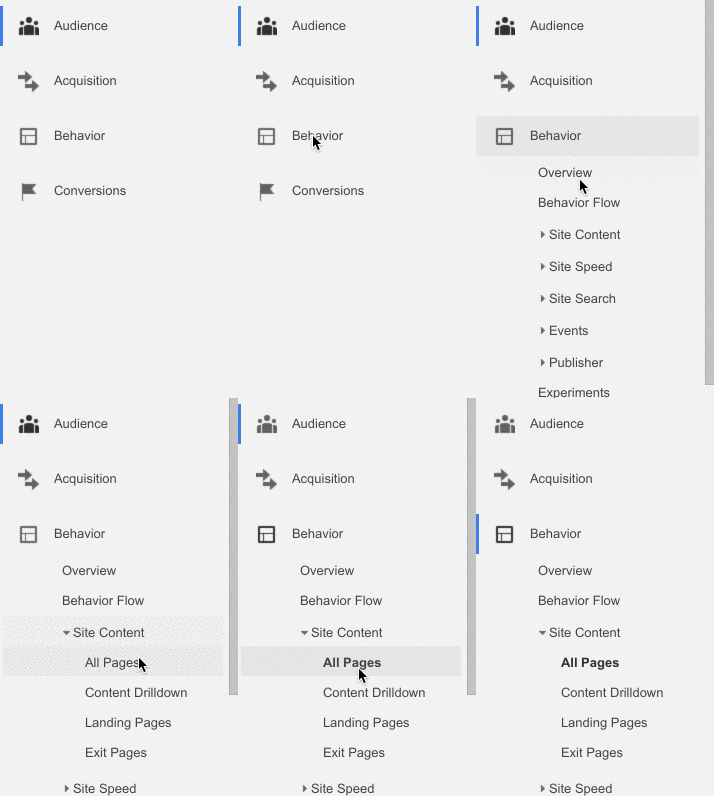
Just head over to Google Analytics (or dig into your HubSpot software) and pull up your most popular pages (from the last 6-12 months) by going to Behavior > Site Content > All Pages.
65V2Vb072E.gif

From there you’ll be able to see which topics your readers are already most interested in.

It’s a smart idea to match your infographics to the topic of your most popular blog posts because:

  • First, you’ll be able to content from those blog posts in your infographic to fast-track your project.
  • Second, you already know your audience is interested in those topics.

For example, one of the clients I work with owns an interior design firm and her blog has some great content on it. But the most popular blog post month after month was her article on “questions to ask when interviewing an interior designer.”
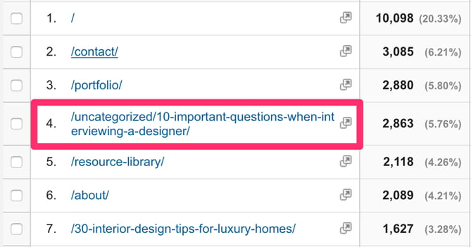
So we decided to use that content and create an infographic around that topic:

Because all of the content was already written, all we had to do was come up with the design.

Alright, so what if you don’t have a lot of content to work with?

I recommend that you head over to Google Trends, Google’s Keyword Planner, HubSpot's Keywords App, and/or BuzzSumo to research what’s being searched for and shared most often.

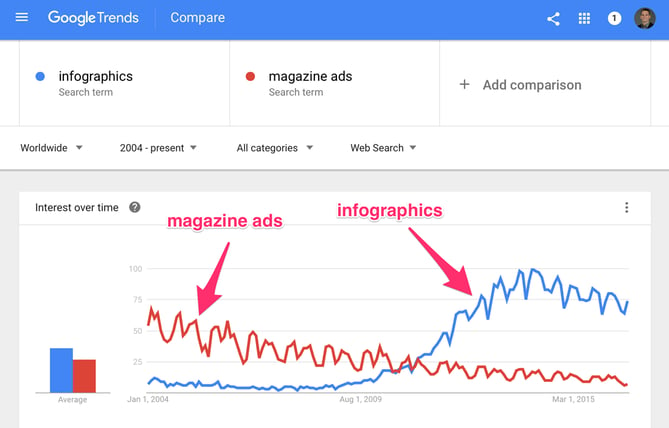
If you’ve never used Google Trends, then you’re in for a treat. You can use this tool to see what topics are trending and most popular in real time. Plus, you can see how popular a topic was in the past and then compare that to other topics.

Check out the popularity of “infographics” vs. “magazine ads” from 2004 - 2016:
So how do you guarantee your topic will be a home run?

Use Google’s Keyword Planner (HubSpot customers: Try HubSpot's Keyword App) to see the exact number of people who search for specific keywords and topics so you can instantly gauge the popularity of a topic. Since we’re talking about creating viral infographics in this post, don’t forget to also research your topic in BuzzSumo so you can find the most shared topics and content online to confirm people's interest. 

Once you’ve got a topic, it’s time to do some research. One of the best parts about infographics is that you don’t have to write much copy by yourself -- almost every single infographic online includes quotes, data, and resources from other people and brands.

To get started, you'll want to open up an app like Evernote and write down everything you personally know about the topic you’re covering, plus every sub-topic you want to research.

After you’ve got your own notes down, head over to Google Search and start the research process. For example, type in phrases like: “best (my topic) articles," “(my topic) statistics,” “(my topic) quotes,” “(my topic) blogs,” and “(my topic) infographics.”

This will give you dozens of great resources to pull ideas and data from that you can include in your infographic. Just don’t forget to save the website address (URL) for each resource you cite.

Lastly, it’s important that you remember this is an infographic -- not a blog post. That means you should only collect the most important, focused data and resources. Ignore all the gritty details and “fluff.”

Action items for Step #1:

  • Choose and validate a topic for your infographic
  • Collect and cite important resources you’ll quote

Step #2: Create and re-size a blank presentation.

This step is super easy. All you need to do here is create a blank presentation deck in either PowerPoint or Keynote and resize it to the shape/size of an infographic.

Personally, I prefer Keynote. But rest assured that every single tool you need to make infographics are available in both PowerPoint and Keynote.

Let’s start with PowerPoint: Click “Design” then “Slide Size” to resize your deck.
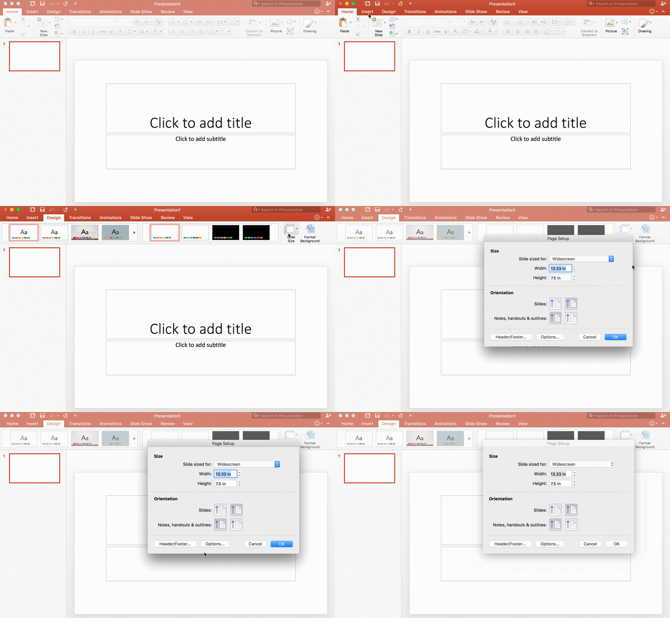
(Note: 6.5 x 50 inches in the maximum size in PowerPoint.)

For Keynote: Go to the “Document” options, click “Slide Size” to resize your deck.
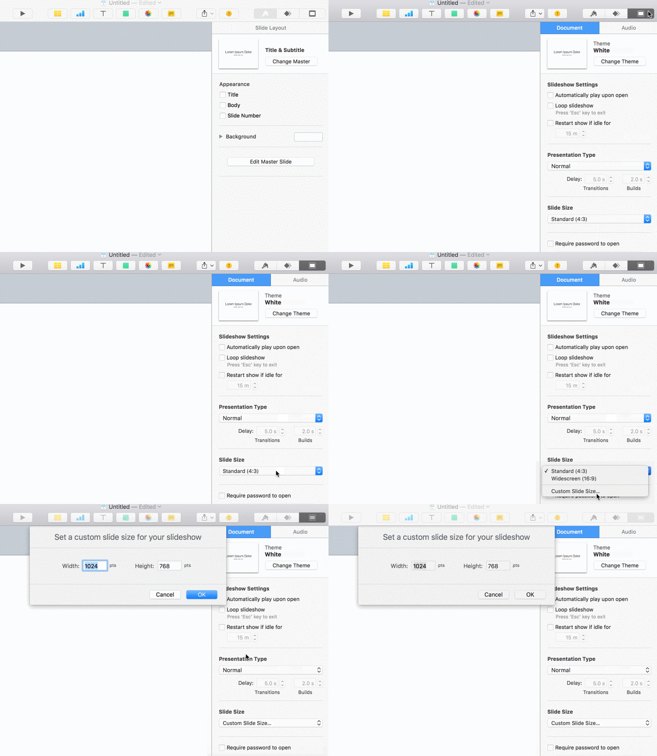
(Note: 900 x 6000 points in the maximum size in Keynote.)

Don’t agonize over getting the “perfect” height for your infographic, just give yourself enough space to work with. (You’ll learn how to crop and optimize your infographic in step #6.)

Action items for Step #2:

  • Create a blank presentation in PowerPoint or Keynote.
  • Resize the deck to an infographic-friendly size.

Step #3: Wireframe each section using shapes.

Both PowerPoint and Keynote have “Shape” tools which will allow you to create (you guessed it) shapes.

PowerPoint has more options for shapes than Keynote as you can see below:
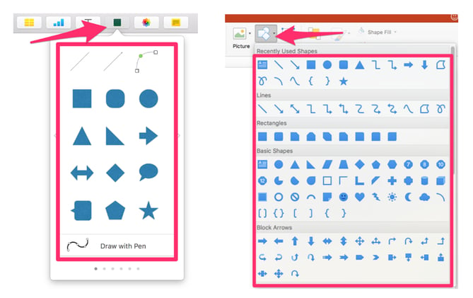
In this step, our goal will be to use those shapes to create a “wireframe” and layout each section you’ll need for your infographic.

Here are the basic areas / sections that you’ll need to create:

  • Header / Title Area
  • Introduction
  • Body / Main Argument
  • Conclusion
  • “Brought to you by…” Section
  • Cited Resources

In most cases, each of these sections on every infographic will remain relatively the same. The only exception is the “Body / Main Argument” section, which will vary depending on your goal for the infographic.

For example, a comparison infographic would need to have a different “wireframe” and layout than a timeline infographic to effectively illustrate your point:
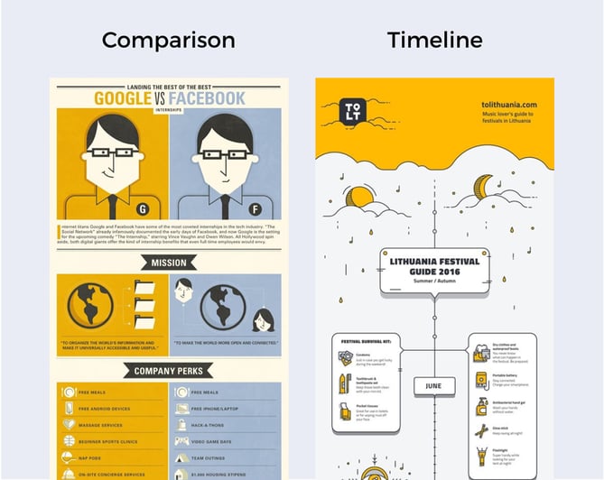
That’s why it’s smart (like with any creative project) to start with the end in mind. The creation process will be a lot easier if you can picture an outcome and work towards that. And I've seen too many infographics fail because they focus too much on fancy design instead of creating a solid wireframe and layout that compliments their topic.

Let’s be clear: The “design” is how your information looks, but the “layout” is how your information is organized and presented. The layout is far more important than any fancy design elements.

First, you’ll want to use rectangles and borders to define large areas of your infographic like in the example below:

Don’t worry about the colors just yet, we’ll get to those in the next step.

Next, using a combination of rectangles, squares, circles, triangles, and lines, create your subsections:

When creating your wireframe and layouts, there are two important design rules to consider:

  1. You need to make sure there is enough white space so your infographic is easy to read.
  2. You need to create hierarchy with your most important content and sections at the top.

If you’re still having an issue creating your layouts, add some wireframes to a blank presentation deck and use the “Shapes” tool to trace layouts until you get the hang of it. 

Last note: If you’re using Keynote, once you’re happy with your wireframe, I recommend that you “Lock” the shapes in place, that way when you’re adding in content later, you don’t accidentally screw up the layout. (You’ve been warned!)
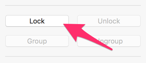
Action items for Step #3:

  • Find layout inspiration on Pinterest.
  • Use the “Shapes” tool to create your wireframe.
  • Create infographic sub-sections using shapes.

Step #4: Choose a color and typography palette.

Now with your snazzy new wireframe, you’re ready to choose colors and fonts.

Let’s talk colors first: A color palette is one of the most subtle, yet crucial aspects of any creative project. Your color palette will set the tone for your infographic and tie visual elements together.

When designing an infographic, I like to choose two different color sets. The first color set is the background(s), where I typically use soft, subtle colors so I can draw attention to important elements with brighter colors.

Here are a few examples:

Of course the flip side of that is to use bold background colors. But even with white text, it can make the graphic difficult to read. 

The second set of colors you choose will serve as your primary palette. These can be brighter and more eye-catching --“flat” colors are very popular for infographics.

Here are a few examples:

Keep in mind that it’s a smart idea to choose a palette that compliments your brand’s style. You can use a tool like Adobe Color to build a pallet around any color you’d like.

If you don’t want to build your own palette, I recommend that you check out Colour Lovers for endless inspiration created by other people:
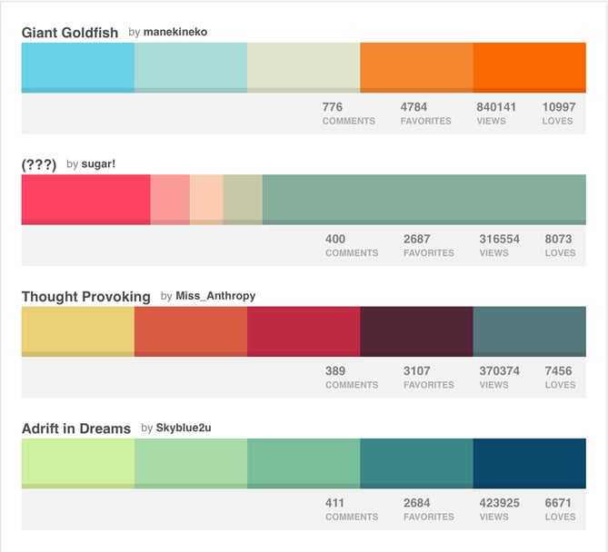
Make sure that you’re not choosing too many colors as that can create “disconnect” between important areas of your infographic and overwhelm readers. If all else fails, using different shades of same color is always a safe bet.

Once you’ve got a nice color palette, it’s time to choose a font combination. The first thing you should do is avoid fancy or intricate fonts. (Even if it compliments your brand.)

Why? After you resize the infographic to a “web-friendly” size, those types of text can be extremely difficult to read. Instead, stick with easy-to-read fonts like Arial, Open Sans, Courier and Verdana.
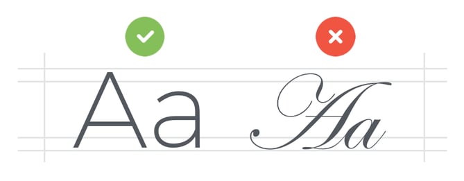
When choosing a typography combination, you can combine two fonts, or use variations of the same font.

Check out the two examples below:

Make sure that you’re not using any fonts below 16 pts as it becomes extremely difficult to read once you resize your infographic in step #6. There is one exception when it comes to the fonts however: You don’t have to match your header’s title with the rest of your typography -- you can take a bit more creative liberty with that area of the infographic.

For example, check out these great headers that grab your attention immediately with eye-catching typography:

Want some incredible fonts for your title, sub-headers, and body text that you can download and use for free? Check out this article.

Action items for Step #4:

  • Choose a background color scheme.
  • Choose a primary color scheme.
  • Select an easy-to-read typography combo.

Step #5: Add in your content, charts, and visuals.

Now it's time to take all the resources you collected in step #1 and extract the most focused, actionable content for your infographic.

Start by adding in your sub-headers and body text to the wireframe you created in step #3:
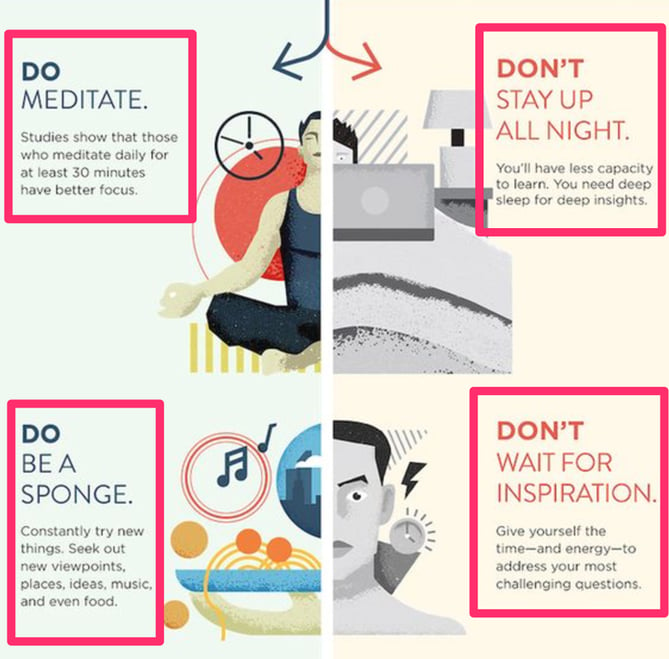
Make sure that your copy is short and to-the-point like the example above. You'll also need to include links to every resource you cited at the bottom of the infographic:
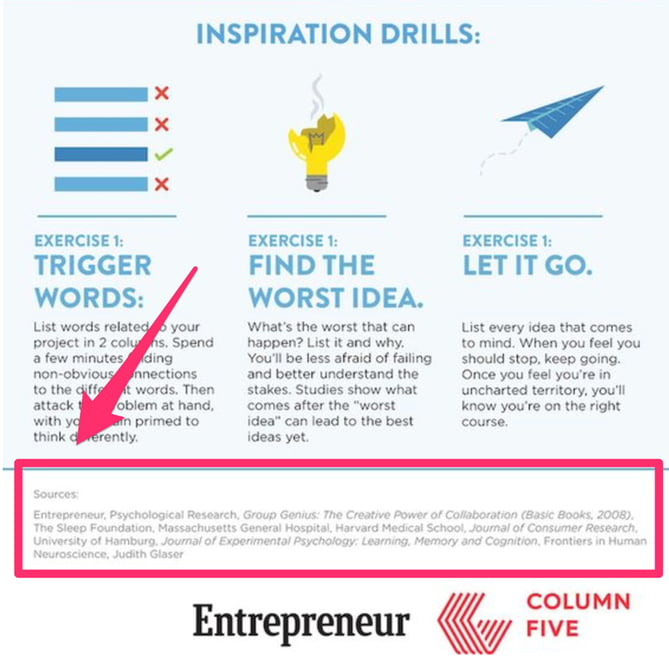
Now, it’s time to bring your words to life. To do this, use strong visual elements that instantly get your point across by “showing” not “telling” your readers:
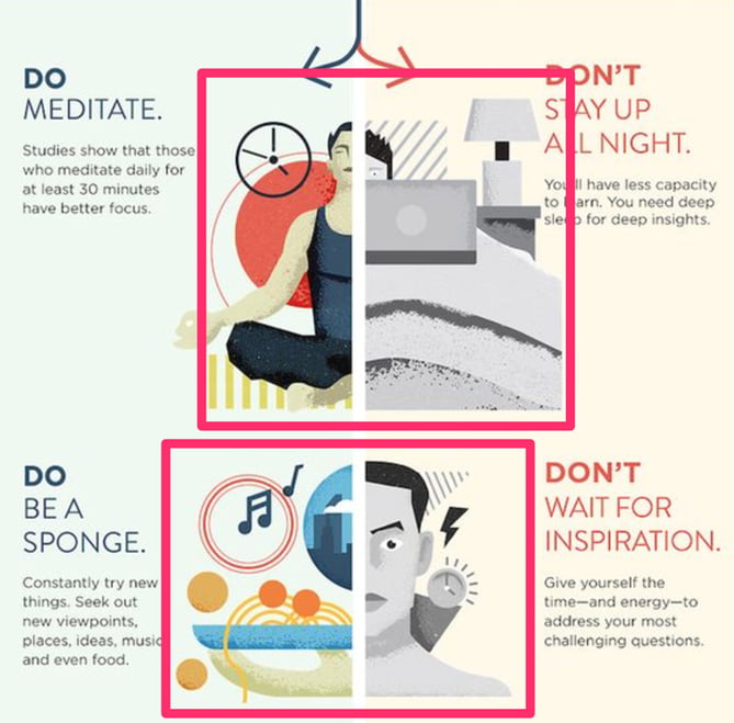
You could make every single visual by yourself, or you could use my best-kept infographic design hack: Purchase community-made visual assets from online marketplaces. Websites like Graphic River, Creative Market, and Flat Icon sell visual assets made by professional designers that you can purchase and use in your projects.

For example, check out this sleek icon set you could purchase and use on any of your infographics:
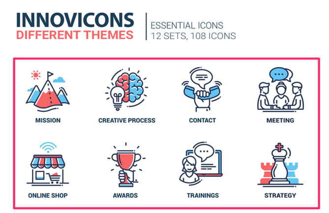
There are dozens of other icons sets, illustrations, header images, and more that you can use to give your infographic a more professional look and feel immediately.

However, if you’re like me, once in awhile you want to make your own visuals from scratch. For example, one day I couldn’t find a decent “flat style” image for a fire pit, so I decided to use the “Shapes” tool in Keynote to “build” my own firepit. Check out how I made it below:


Now I realize that I might upset some people when I say this, but too bad: Data is not a requirement of a viral infographic. Of course, data makes it incredibly easy to prove your point by using indisputable numbers -- but I’ve also seen dozens of infographics go viral that don’t include a single graph or piece of data.

That being said, when you choose to include data in your infographic, there are some important things to consider.

The traditional way would be to use charts and graphs:
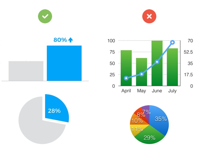
The second way to display your data is to use “data visualization":
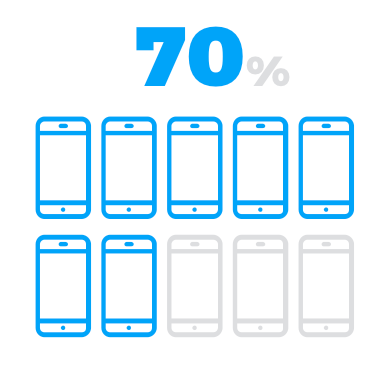
For example, you could use a set of 10 “smartphone” icons where seven are colored and three are greyed out to represent the fact that 70% of Americans own a smartphone.

Or you could use a unique illustration like a ship race to visualize your data.
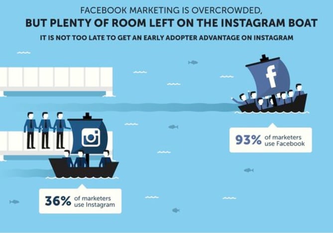
Just remember: Regardless of what type of infographic you’re creating, make sure that you’re using highly-engaging visuals and data visualizations to bring your content and data to life.

Action items for Step #5:

  • Summarize and add in your copy.
  • Add strong supporting visuals to “show” not “tell.”
  • Use charts and visualizations to bring data to life.

Step #6: Export, optimize, and upload.

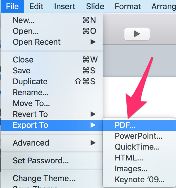
Once you’re happy with your infographic, it’s time to get it ready for the web. The first thing you need to do is export the “presentation deck” that you’re working on to a PDF.

In PowerPoint, just click on “File” then “Export” from your menu bar.
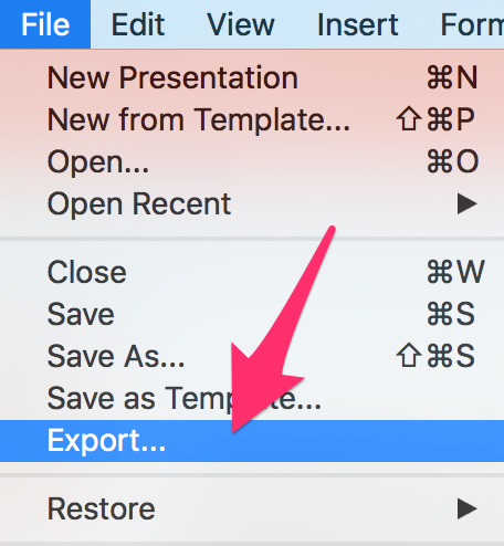
In Keynote, you do the same thing, except you choose “PDF…” from the menu bar.
Now that you have a PDF version of your infographic, you need to optimize the file size for fast loading online, without sacrificing quality or readability. Like I mentioned in step #2, there’s a good chance your infographic won’t fit perfectly into the resized PowerPoint or Keynote deck, so here’s a simple solution:

Open a photo editing tool (it doesn’t have to be PhotoShop) then crop and/or stitch together your PDF(s) to get the perfect height.
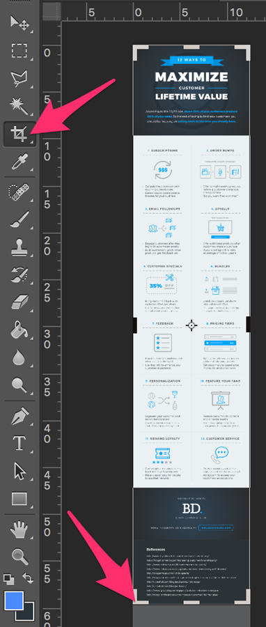
Next, resize your infographic to be between 700 and 900 pixels wide. Again, this will preserve the quality of the image while making the file’s size as small as possible.

Also, I recommend using a tool like Optimizilla to compress and optimize your infographic even further. Try to get the final file size to be less than 5 MB -- and be sure to save the photo file as a PNG or JPG.

The next thing you need to do is create a home for your infographic on your website. To do this, create a new page or blog post with a unique URL that you’ll upload and add the infographic image to.

This is important because when the infographic is shared around the internet, you want to make sure all the links point back to you so you get more traffic and shares.

Action items for Step #6:

  • Export infographic to a PDF.
  • Crop and/or “stitch” together your PDF(s).
  • Resize to 700-900 pixels wide.
  • Upload to a new website page or blog post.

Step #7: Go viral with strategic promotion.

Real talk: Infographics don't go viral by accident -- even if you’ve got the best infographic in the world.

Instead, strategically promoting your infographic by identifying the right people and the right websites can get your infographic in front of thousands of people fast.

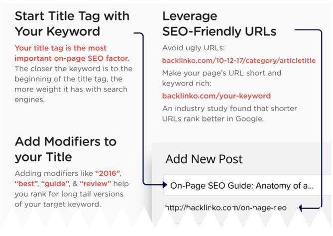
But before we do that, you’ll want to make sure to optimize your infographic for search engines. SEO won’t necessarily help your infographic go viral, but it’s extremely beneficial because it will help increase your search engine rankings (which means more free traffic to your website).

Check out this infographic by Backlinko to help guide you while you’re optimizing your infographic(s) for search engines:
After that’s done, here are the next three things you should do:

#1: Find websites and blogs that share similar infographics.

For example, if I had just published an infographic on email marketing, I would go to Google at type in: “Email marketing infographic.” What you’re looking for are websites and blogs that have published similar infographics made by other people.

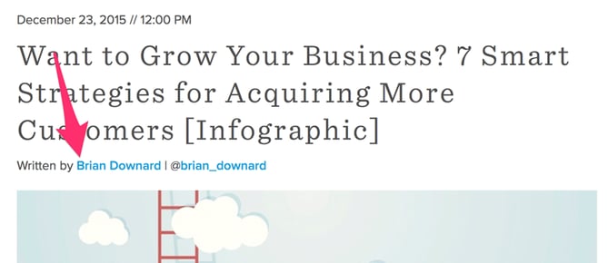
After you’ve got a decent list of websites who you think will be willing to share your infographic, it’s time for some email outreach. First, start by identifying the authors from each of the websites who published similar infographics. You can usually find the author’s name in the article’s byline:
Once you’ve got a list of authors, use a tool like Viola Norbert or ContentMarketer.io to find email addresses so you can start sending personal emails.

If you want to learn how the pros do email outreach, check out this article my friend Emil Shour did with Brian Dean at BacklinkoPart of that case study highlights the “Pre-Outreach” and “Content Roadshow” strategies he used to generate buzz for his content.

For example, check out Emil’s 2-step approach to email outreach. Instead of doing what most people do and asking for a backlink or share right away (1-step approach) here's what he did:
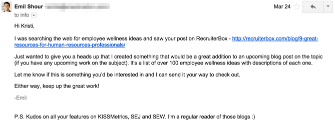
And because he wasn’t being pushy, he get’s responses like this from people asking to send his content over (2-step approach):

See the difference?

Now I’ll be the first to admit that email outreach is not the most exciting part about infographic marketing -- but it’s crucial if you want to get more eyeballs on your work.

Plus, the long-term benefits from the relationships you’ll build with influencers and bloggers will become invaluable down the road.

#2: Identify influencers who share similar infographics.

The best tool to find these influencers is BuzzSumo. Just type in a topic or copy/paste a specific link to pull up content that is sorted by number of social media shares.

For example, if I were doing an infographic on gardening, I’d type in “gardening infographic” into BuzzSumo. Next, I would go through the results one by one and click “View Sharers” on any infographics that are similar to mine:

This will give you a list of the people who have shared that infographic, which is helpful because you can sort by number of followers to identify influencers with a large number of followers who have shared infographics that are similar to yours.

Like in the last step, find their email address and start reaching out one-by-one. Aside from Viola Norbert and ContentMarketer.io, another clever way to find someone’s email address is to subscribe to their blog -- the welcome email and all future emails should come from an address that you can respond to.

As an alternative, if you can’t find someone’s email address, you can always use Twitter to reach out publically:
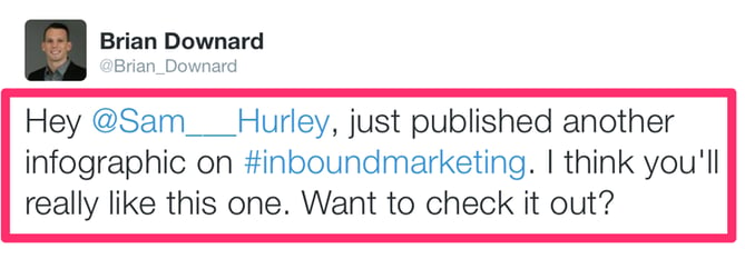
Sam Hurley has hundreds of thousands of followers but still responded and shared my content:
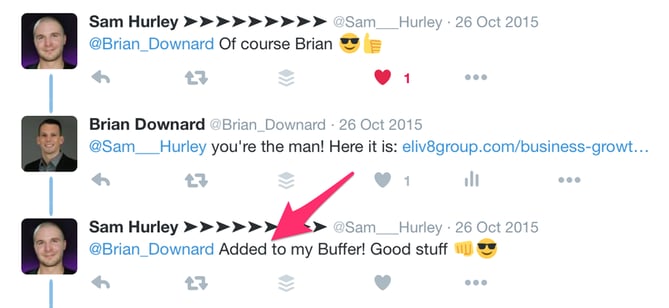
See how I used the same 2-step outreach approach like the email example from above?

  1. Ask if they want to see it.
  2. If they say yes, send the link.

Not being pushy is the key to getting responses and getting your content shared. You might also consider sending a friendly "thank you" note after an influencer shares your content to strengthen the relationship:
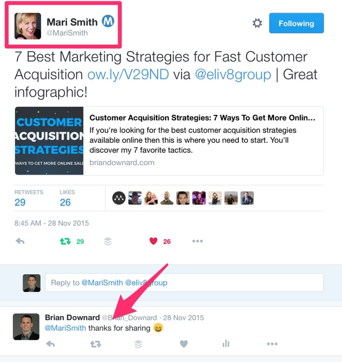
#3: Submit your infographic to infographic directories.

These directories are basically websites that curate infographics for other people to see. And they are the perfect place to get your infographic discovered by people who might want to share it on their website.

Trouble is, there are dozens of these directories out there, so instead of manually doing each one by yourself I recommend using Fivver to pay someone to do it for you. You don’t need to have someone submit your content to 50+ directories -- just stick with the people who only add it to the top 10-30 infographic directories.
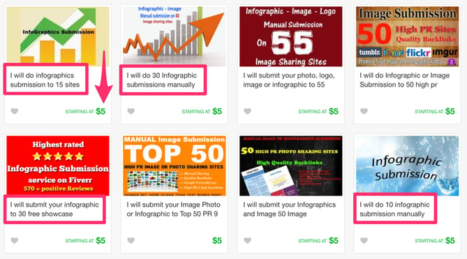
Once you've added you infographic to the right directories, share it through all of your marketing channels:

  • Share with your email lists
  • Schedule multiple social media posts
  • Paid ads / remarketing ads
  • Add links to infographic on relevant website pages
  • Share with industry partners
  • Send to influencers/bloggers who’ve shared your content in the past
  • Share with any brand or person you mentioned in your content

Action items for Step #7:

  • Optimize your infographic for search engines.
  • Share infographic with the right bloggers and influencers.
  • Promote through all your digital marketing channels.

Wrapping Up

Alright, so I know this was a long one ... but be sure to bookmark this article so you can come back and refer to it at any time during the infographic creation and promotion process.

Need more help? I've put together a few bonuses to guide you along -- including a 20-step infographic checklist (we only covered seven here), as well as a handy teardown video. Click here to grab those.

What other infographic creation questions do you have? Share them in the comments below.
15 free infographic templates in powerpoint


from HubSpot Marketing Blog http://blog.hubspot.com/marketing/create-infographic-powerpoint-keynote