Growth Hacking is a popular marketing buzzword, but does anyone really know what it means? Neil Patel does a pretty good job explaining the concept and talking about its origin, saying that a growth marketer is someone who uses “analytics, inexpensive, creative and innovative ways to exponentially grow their company’s customer base.” But how can one pull off that kind of growth -- especially with a limited budget and resources?
Growth hackers or marketers are inherently what we call “scrappy” -- fast-moving and super creative. They experiment and experiment until they find something that multiplies growth by 10, 20, or 40x, instead of doing large projects that increase conversions in small increments.
On the surface, it might look a little intimidating. But with a little bit of light shed on how growth hacking works -- and how marketers have successfully experimented with it before -- you'll be on your way to producing your own significant results.
A Bit About Growth Hacking
At its core, there are five major pillars to growth hacking:
- Evaluate current marketing initiatives. Do a full audit that determines your best sources of leads, traffic, and page views. Figure out which channels are working for you.
- Set achievable goals. Determine where you'd like to improve these numbers, and start to think about how you can do so.
- Plan experiments to test your hypotheses. Come up with two, three, four, or twelve ways of testing your theories, and how you can reach your goals.
- Let it run. Experiment until your results are statistically significant. You can also continue optimizing until you reach your goals.
- Document your winning results, and share them with your team. Growth hacking is all about improving what you already have. If you come up with a game-changing tactic, spread the word.
For traditional marketers, this level of experimentation can look overwhelming, or maybe even foreign. But if you’re already testing certain marketing variables and learning from the outcomes, you're executing "growth hacking" without the label.
Think about it -- have you ever A/B tested a subject line in an email? That’s an experiment. Have you ever noticed that a certain landing page converts much high than another? It's an opportunity to duplicate that page for other campaigns and optimize for conversion. That conversion rate optimization (CRO) is a major component of growth hacking. It takes your existing content and updates it to increase conversion rate, making things like your landing pages and blog posts perform better, without having to create new content.
To give you an idea of how to start growth hacking your marketing plan, we talked to four growth marketers from some of the top tech companies in Boston. We asked them to give an example of an experiment that they ran with significant results -- here’s what we found.
4 of the Best Growth Hacking Experiments From Real Growth Marketers
1) Andrew Capland, Growth Team Lead, Wistia
For video hosting platform Wistia, getting a video into a new user's account is the first important step in the onboarding flow. Once users upload a video, they can begin to explore all of the core Wistia features, like customizing player colors according to the brand, and adding lead generation tools or clickable links. After experimenting, Andrew's team was able to produce a 15% lift in onboarding metrics. Here, he explains how:
Objective/Hypothesis
Capland's team zoomed into the data and noticed that many users who borrowed a video from Wistia just to complete that onboarding step actually viewed it -- which presented an opportunity.
"We realized there could be an opportunity to use that video for additional product education," said Capland. "We believed that we could increase our active users by making our 'loaner' video more educational and product focused." Wistia decided to test this hypothesis by creating a new video that gave a tour of the media page and taught users how to use the Wistia tools.
Here's the old video:
Experiment Plan
Wistia created a new video -- which we've shared below -- for their users to borrow, and showed it to 50% of visitors.
Results
The new variation produced a 15% lift in one of Wistia's main onboarding metrics - and led to more account activations and sales.
2) Jessica Webb, Growth/Content Marketer, Trello
The team at Trello needed to find the best way to position the product on its homepage, to make the best impression on new site visitors. To test out different messaging options, the team ran an experiment that ultimately increased homepage conversions by 2%. Here's how:
Objective/Hypothesis
The homepage serves as Trello's most important real estate for new users to learn about the product and sign up. The team was looking to determine the best messaging to accomplish that, and came up with the idea that experimenting with different themes would be a good way to see what resonated most with visitors.
"We didn't know if productivity, collaborating, project management, or something else would be the best way to position our product," Webb reported, "so we decided to let the data speak for itself."
Experiment Plan
Webb's team tested 11 different messaging headlines on the Trello homepage -- English-speaking only, on both web and mobile. The experiment ran until a statistical significance was determined, which, in the end, only took about two weeks,
To give you an idea of what that might look like, the test variants were labeled with internal language and included the following:
- default
- collabToolPerspective
- projectPerspective
- platformPerspective
- visualTool
- organizedTool
- collabTool
- teamPerspective
- youPerspective
- sharedPerspective
- platformSharedPerspective
Results
The experiment resulted in a 2% increase in sign-ups with the "collabtool" variant. That makes sense, since Trello is a collaborative project tracking tool.
And it didn't end there. "We also used the winning messaging to inform other pages," Webb said, "and make them more collaboration-focused as well."
3) Lindsy Lettre, Marketing Operations, InsightSquared
InsightSquared is a company all about data. So when Lettre's team began to evaluate how to increase conversion across its website, they realized that their long forms might be stopping people from completing them. After an experiment that removed an optional field, the team was able to create a new form that converted 112% better than the old form.
Objective/Hypothesis
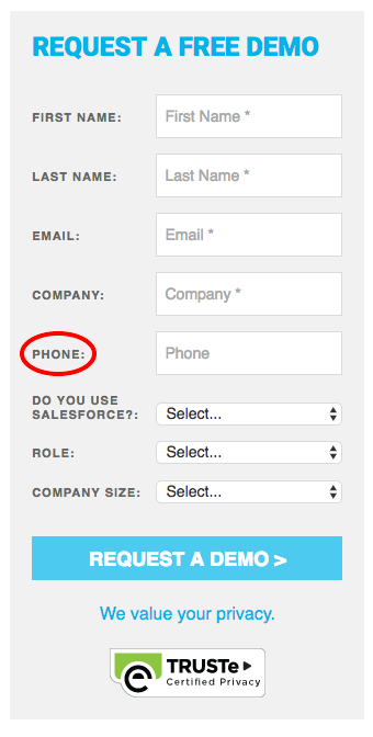
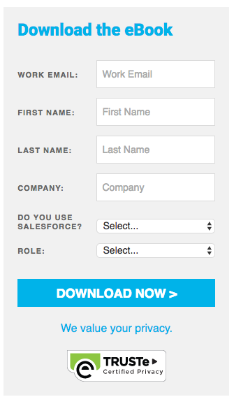
Historically, the previously long form -- which had to be required in order for visitors to download any piece of content -- had some required fields, and others that were optional, like "Phone Number."
"We had a hypothesis that if we presented a short form to our audience, we would see increased conversions," Lettre said, "as the form would look less daunting."
Experiment Plan
First, the team looked into what percentage of people provided a phone number when they filled out a form, which was only 15%. The next step was to run an A/B test on an eBook landing page for 30 days, to see if the field removal made any difference.

Results
Once the experiment was under way, Lettre's team saw that the form without the optional field converted 112% better than the old form. That was a statistically significant result -- and all other content forms were subsequently updated in the same way.

4) Eric Peters, Growth Marketer, HubSpot Academy
Throughout 2016, Peters' team released five new HubSpot Academy certification courses. It became necessary to find a simple way to introduce those courses to existing students, without knowing which skills that section of the audience was interested in developing. But the team had an idea -- add a status bar to emails that indicated how far along the student was on various certifications. That increased the number of certifications per user by 18%.
Objective/Hypothesis
The purpose of this experiment was to increase the number of HubSpot Academy certifications held by each student. "Our goal was to reach 1.5 certifications per user by the end of 2016," Peters said. He hypothesized that by showing users the status of their certifications, it would provide functional value that also introduced them to other courses.
Experiment Plan
Peters and his team began by implementing a module that displayed all of the certification badges one could acquire, in grayscale, within Academy emails. If the user had achieved that certification, it was orange, but once it expired, it would revert to grayscale. The badges were hyperlinked to a central page listing all courses.
"We built this module directly into one of our main email nurturing templates, so it immediately went live in dozens of nurture tracks and hundreds of emails," Peters explains, "depending on which stage a user is in for each of our 12 certification courses."
Results
Initially, there were a few bugs that made some student statuses reflect incorrectly -- for example, certifications that they held weren't orange, or they didn't realize that the certification expired. As it turns out, the experiment proved to be a great way to remind the community that certifications do expire.
After a few days, these little status icons were receiving a remarkably high number of clicks -- specifically, the orange ones that showed a user held an active certification. After speaking to some users, Peters and his team learned that they were proud of their orange badges, and wanted to get more of them.
"We are still not at 1.5 certifications per user, so we did not reach that overall goal," Peters said. "But we have increased the number of certifications per user from 1.1 to 1.3 -- up 18% -- thanks in part to this experiment."
Time to Put on Your Lab Coat
Experimentation doesn't have to be a massive project that requires developers, expensive software, or complicated charts. It just needs to be a way for you and your team to test out hypotheses, and learn from the data rather than by guessing. From these four examples alone, we learned that the results can improve other areas of your business, that sometimes "less is more," that teaching opportunities might already exist where you least expect them, and that data you already have can inspire your users to do more.
Growth hacking is as simple as improving and optimizing your existing marketing efforts through experimentation. Get out there, and get experimenting. And to help you get started, check out HubSpot's Marketing Experiments Calendar to get some new ideas on the board -- your team/boss/department will thank you.
Have you conducted any growth hacking experiments? Let us know in the comments.
from HubSpot Marketing Blog https://blog.hubspot.com/marketing/best-growth-hacking-experiments

No comments:
Post a Comment