You’ve seen the stats before.
1-2% conversion rates for websites. Which means 98-99% ain’t buying. For one reason or another.
A bigger chunk of that is bouncing; leaving your site almost immediately after getting there.
You work so hard (and spend so much) on getting them there in the first place, and then they just… leave. It’s disheartening. Depressing.
The worst part is that you have no reason why. No specific clue or indication for what caused them to leave so abruptly.
It’s like someone walks into your retail store, takes one look at your goofy haircut today, and bolts for the door. You take it personal. The question eats away at you hours later.
WHAT is driving people away? Here’s how to find out.
The Problem with Surveys (Or, Why No One Answers Your Stupid ‘Likert’ Questions)
You could ask them, right? Hey, you could ask them!
Throw up a pop-up overlay, screen takeover, or slide something up in the bottom right-hand corner of the screen. Whatever it takes to grab their attention.
‘Cept for one problem: math.
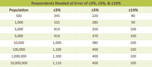
You want a “statistically accurate” result, so you need a large enough sample size. For starters, let’s say you’re gonna shoot for around 100 respondents. (That’s on the low size, but it makes for simple math in a second. And I ain’t that smart, so gotta KISS.)
Great. How many people do we have to ask in order to get those 100?
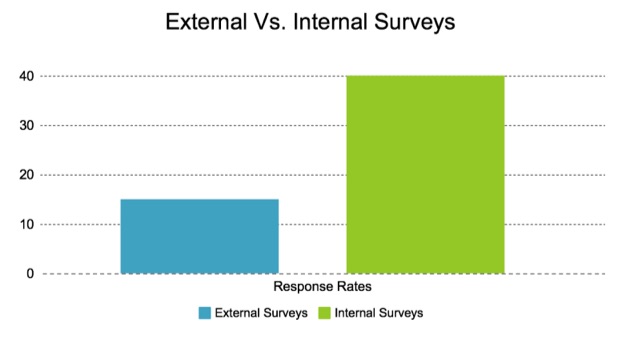
SurveyGizmo, whose advice seems decent given “survey” is in the name, says you can expect to see an average 10-15% response rate for ‘external’ surveys.
But…
That number can fall as low as 2% if your population is “less-targeted, when contact information is unreliable, or where there is less incentive or little motivation to respond.” In other words, exactly who we’re trying to reach with those flashy little tactics for untargeted website visitors.
So. IF we’re being incredibly optimistic, you need a population of 1,000 (at 10% response rates). But in reality, because it’s hard to incentivize and segment random site visitors, that number might be as high as 5,000. That number could go up still further, depending on how many terrible ‘likert’ and other terrible question formats are used.
Now. How many visits does your boring Services page get? How many for that new product?
It’s an uphill battle. Of Mt. Everest proportions. Just to get someone to give you any indication of what is preventing them from opting in or buying on this page.
Not to mention, the reliability of any information you do receive might be flawed based on lack of context and other common errors in surveys. We haven’t even touched on inherent survey bias. Which, there always is. (And which freaking Deming wrote about in ‘44!)
So. We can sit here and dream up ways to maybe, possibly, hopefully, get someone to answer a few basic questions and give you the ‘magic bullet’ for why they’re not convertin’.
Or. We can roll up our sleeves and find out for ourselves.
‘Specially, as it turns out, we ain’t got many other options. Here goes nothin’.
Three Easy Ways to Spy on Website Visitors
BounceX calls it “conversion friction”.
Which applies to all the things on your site that are preventing people from taking this microsteps, from looking at a particular page to adding a product to their cart or filling out a form.
The trick to spotting these friction points are to look for the clues left behind.
Some stats say 93% of our communication is nonverbal. Which means our behavior, or expressions, gestures, etc., give off more than we think.
Online, customer behavior can tell us what’s working or not working. Their actions give it away. If we only know how to listen.
Here’s three questions to ask in order to find out.
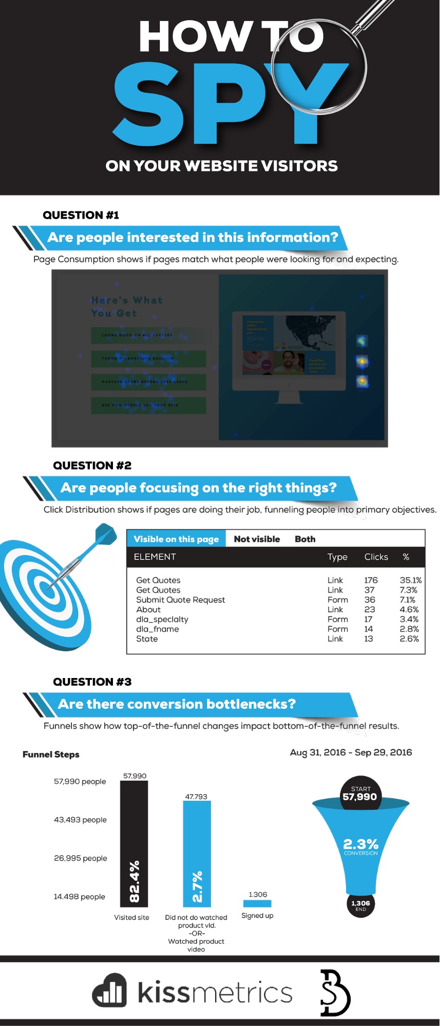
Question #1. Are people interested in this information?
Way before a purchase happens. Prior to a quote form getting filled out.
People land on a page and decide what to do next. To click, or not. The red pill, or the blue.
Design is the first thing they notice, 94% of the time, which helps them for a first impression with a few fractions of a second.
Much of that, is colored by their expectations. Their thoughts and motivations before ever arriving here. And the match (or lackthereof) of your page to those expectations can dictate whether they stick around (or not).
A person’s “state of awareness” can be deciphered based on how they got to your site. Namely, which channel or avenue they used.
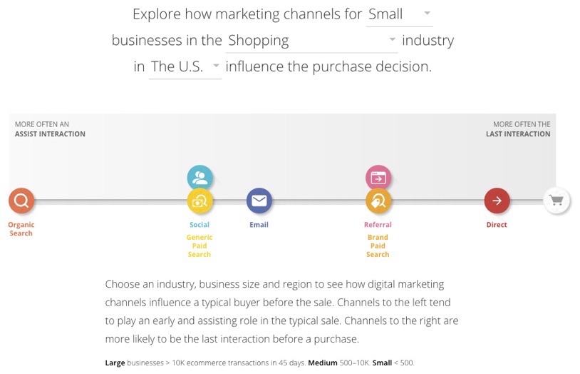
For example, Google’s Customer Journey to Online Purchase tool will tell you how people use different channels, differently, along their own ‘customer journey’.
And this can help you answer age-old questions, like “long copy vs short”?
If it’s cold traffic from Generic Paid Search, long. If it’s warm traffic from a Brand Paid Search, short.
The thing to watch for, is page consumption.
Are people consuming the information on this page, or not? Are people reading and interacting with it, or not? Are they learning and discovering and finding what they need in order to make the next decision (that gets you closer to the money)? Or not?
Good old-fashioned heatmaps and scrollmaps can help you here, visually showing you whether you got it right (or not).
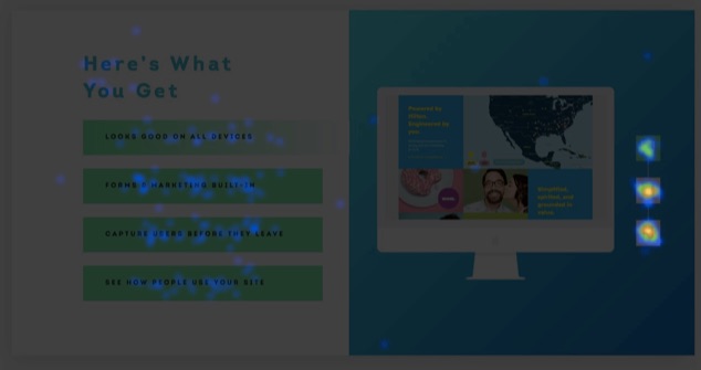
For example, feast your eyes on this:

This, is a long page. That rainbow-like color palette tells us it’s working though. People are actively reading and engaging along the way. Which ain’t too shabby, considering this is largely cold traffic from ads.
Case in point: let’s zoom into the ‘What You Get’ section two-thirds of the way down. Here, we’re trying to show, not explain, responsive design (without using complex, industry-jargon). So you want people clicking on the different options on the left, and then flipping between the corresponding device options on the right.
To summarize:
- People had their own expectations before coming to this page. (In this example, based on the ad they clicked on prior to coming here.)
- They’re expecting to see those expectations laid out properly.
- You design a page and present information to hopefully align those first two things.
- Heatmaps and scrollmaps can help you quickly, visually see if you got it right, or wrong.
- Page consumption is a good indication that people are going to click the next link, button, or CTA that gets them one step closer to conversion.
Question #2. Where are people focused?
Trick question: What’s the primary action you want visitors to take on a Get Quotes page?
To Get Quotes!
Which means filling out a short form, and hitting a button or link of some sort that will send you their information, so that you’re able to, you know, send them quotes.
That’s it. That’s the whole goal of that page. Click distribution on a particular page can tell you if that’s happening.
So sticking with the same example, you should see the majority of page clicks on a ‘Get Quotes’ CTA for a Get Quotes page. Simple, right?
Let’s back up a second though.
What page, or CTAs across your site, are sending people to this Get Quotes page in the first place? Many times your final destination or purchase page is working fine. It just doesn’t have enough eyeballs or visitors on it yet. The ‘paths’ or funnels throughout your site aren’t clear.
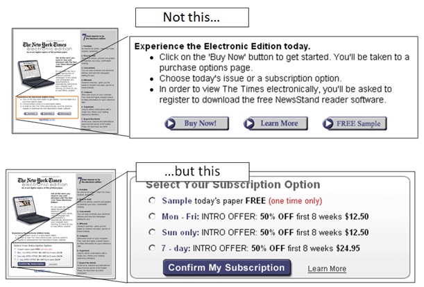
For example, which of these two CTAs are you supposed to click first?

There’s no way to tell. They aren’t doing their job. Because they look and sound exactly the same.
You know what happens when a visitor isn’t led or directed properly?
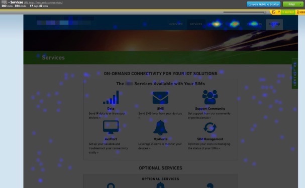
This:
Chaos. Click distribution is all over the map. With the majority unfortunately congregating in the upper right-hand corner of the page on the primary menu, which is like the virtual equivalent to hitting your browser’s Back button ‘cause you didn’t find what you wanted.
Conversion-focused design centers everything around those one or two actions people need to take on a page. And in this example, just by simply changing a CTA’s shape or color, you could see a 64% conversion increase according to one MarketingExperiments study.
To summarize:
- Click distribution, or the percentage of people clicking different variables on your site, can help you quickly spot problems.
- The elements with the highest clicks should be your primary page objectives.
- Look at the page(s) that precede your ‘converting’-one to make sure they’re doing their job; priming people properly and sending a majority of its traffic.
- Change that page’s CTA’s to increase the number of people interacting with them.
Question #3. Are there conversion bottlenecks?
Every website contains a funnel. A path people progress through, exactly like a checkout process, to get from A -> B.
No matter if it’s B2C or B2B, people will go through various pages and steps to eventually transform from Stranger -> Lead -> Marketing Qualified Lead -> Sales Qualified Lead -> Customer or Client.
Often, the easiest way to increase conversions is to streamline or remove steps from this process. That way, you can get people to what they’re looking for faster, and easier.
We’ve already looked at a few ways to do that. You can spot which pages are ‘bottlenecks’ to the conversion process, by spotting that huge drop off of people from one step to the next and then cross-referencing what that page’s activity looks like to see what’s going on.
Keep thinking of it like one giant eCommerce Checkout process (even when it isn’t), where you’re sleuthing for clues behind the theoretical cart abandonment.
There’s only one problem to watch out for, however.
Up-and-to-the-right graphs aren’t always what they appear to be. GrowthHackers-newsfeed-busting-case studies featuring button A/B tests that delivered 10X traffic can turn out to be a red herring when little-to-no sales come in the door.
(Read our new A/B testing guide to discover the step-by-step process for getting results from your A/B tests.)
You don’t see everything you should be. Or you’re seeing bumps in one area, but not where it counts.
Skyrocketing free trials, when 70% of them turn out useless, are a pretty useless metric too.
The trick is to optimize the entire ‘user flow’ so that you’re optimizing revenue and not just conversion rates. That involves identifying and eliminating bottlenecks, or introducing new features at each step of the way to increase revenue gained.
Videos are one of my favorite examples because they’re one of the few things that almost always increases results.
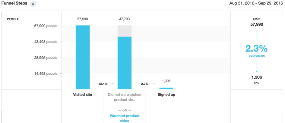
You can see this in action by creating a Funnel Report. For example, you can see how those middle-of-the-funnel steps eventually influence the right conversions you’re after all along.
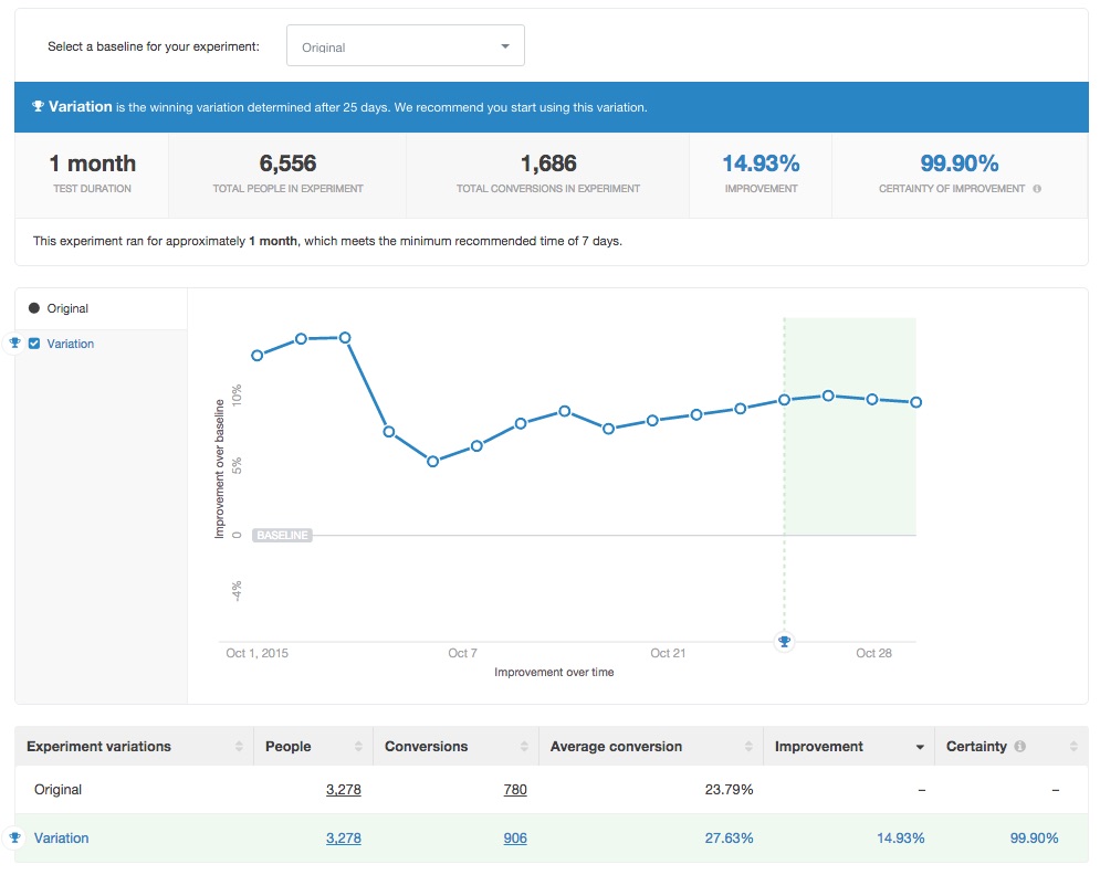
Now, when you decide to run A/B tests, you can look at how those leading indicator changes not only affect initial signups, but more importantly the number of actual paying customers too.
To Summarize:
- Think of your website like an eCommerce Checkout funnel.
- Look for clues along each transition from one step to another to spot bottlenecks that are strangling your conversions.
- Remove or streamline the process from one step to the next to increase total conversions.
- Just be careful of ‘lying’ stats, that tell you one change is working to drive more sign ups (even though total conversions hasn’t changed).
- Look at how changes in the top or middle of your funnel affect the entire thing, including your ‘macro’-revenue generating objective at the very bottom.
Conclusion
Getting quality, qualitative feedback from website visitors is tough.
The numbers behind successful response rates are dim. Not to mention, all of the problems and errors and bias that most surveys contain.
Instead, let customer actions and behavior be your guide, showing you the spots on your website that are working and the ones that are strangling conversions.
Simple heat and scroll mapping tools will tell you if people are consuming the information on a page. Looking at total click distribution gives you an idea of if people are focusing on what they’re supposed to on each page. And full-funnel A/B tests will help you see how changes on inputs at one end affect results on the other.
Clues are left behind. You just need to know where to look.
About the Author: Brad Smith is a marketing writer, agency partner, and creator of Copy Weekly, a free weekly copywriting newsletter for marketers & founders.
from The Kissmetrics Marketing Blog https://blog.kissmetrics.com/covert-conversion-hacking/


No comments:
Post a Comment