Companies are understandably excited to tell the world when they push new features. New developments can take months and they are the hope for more users, greater engagement, and achieving milestones towards success.
So how do teams communicate these big announcements to their users? A blog post, an unread notification, an email, and… that’s it. They sit back and wait for impact, but are disappointed if the anticipated uptick in usage doesn’t arrive.
Here we’ll explain why standard feature announcements are missing the mark, and how to drive new feature adoption amongst your users.
The Standard Feature Announcement
The BJ Fogg behavior model is a big component of our thinking on user experience. It explains that new behaviors form when three elements align:
- Motivation—the user wants to perform the action.
- Ability—the user has the capacity to perform the action.
- Triggers—the user is nudged to perform the action.
You can see how these three elements intersect in this graph:
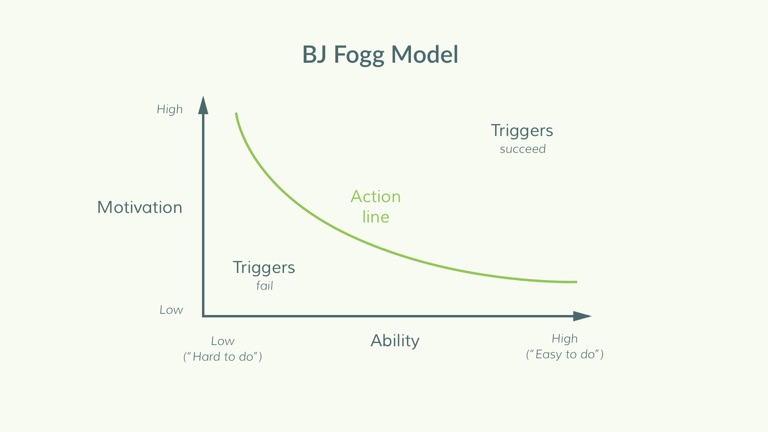
When people have high motivation, they are more able to do hard things. When people have low motivation, they will only take action for easy to do behaviors. Triggers will push people into performing the actions, as long as there is sufficient motivation AND ability (above the action line curve).
When trying to change user behavior to adopt a new feature, an announcement serves as the trigger.
However there are three problems with conventional feature announcements:
- Users miss them or forget about them because those channels are noisy and are out-of-context.
- Announcements focus on HOW to use the feature and emails are a terrible way for this: we learn by doing, but emails are not interactive. We explain more here.
- Announcements don’t actually help a user adopt the new behavior, because they don’t improve a user’s ability (they don’t make the new feature “easy to do”).
In these cases, the feature announcement email or notification or blog post is a trigger below the action line, and so it doesn’t cause users to act and adopt the new feature or workflow.
Blog & Email Announcements
Blog and email messaging can help motivate users, but they don’t help them adopt any new behavior. What’s more, when a user is going through their inbox or reading a blog, they are away from the context of the app. Even if they see information about a new feature, it is difficult for them to internalize the new actions just through reading.
Automation tool Zapier has a whole section of their blog devoted to product updates:

They post once a month about new updates to their product. This is great information for new and current customers alike, but it isn’t actionable. They are in the wrong place and the wrong frame of mind, so don’t have the ability to make any behavioral changes. They are just reading a blog, not thinking about using the product.
Following this up with an email highlighting the feature is also common. This is an email from email marketing tool MailChimp announcing improvements to their A/B testing tool:
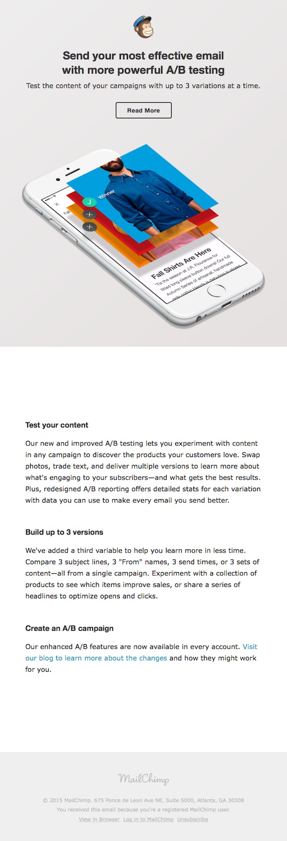
This email does tell you all you need to know about the new features. These type of update emails are great for maximum reach as you can send the update to the thousands of users on your email list. If any currently aren’t finding good use for your product, this might be enough to bring them back.
But this doesn’t help the user actually use the product. The call-to-action at the end of the email is to read more, even though they have just read a very long email about the product. Reading doesn’t help the customer internalize the idea of the new feature. Though they might be giving use cases for the new features, the only way people can really learn is by using the product. MailChimp missed the opportunity here to direct the user into the product and to a tour of the new features.
In-app notifications
Ability is slightly higher with in-app announcements. In this case, the user is in the product and they are familiar with how it works.
But they are still way below the threshold needed to get the new user invested in the product. They are often delivered at the wrong time to the wrong user. Also, they just give the user more to read, instead of guiding the user through actions they need to take to get value from the new feature.
Most in-app notifications have this fatal flaw. For instance, if you’ve ever used project management tool Trello, then you will be familiar with Taco the Husky and his announcements:

If you were to click on that link though you would be taken away from the product and to their blog:
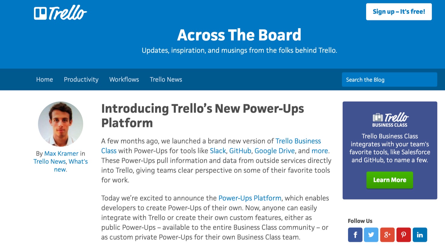
This is the opposite of what you want. Users have been moved to a detailed description of your product, possibly raising their motivation, but lowering their ability. Plus, there’s no guarantee users will come back once you send them away from your app. How many times have you clicked through a link thinking you’d just read one blog post or article and get back to what you were doing, only to disappear into a hours-long timesink? This is the fate Trello is tempting with this kind of feature announcement.
Instead showing them what to do in bitesized chunks through tooltips and product tours is much more effective. Users can internalize each new concept and start to use that feature, without being overwhelmed.
Increase Adoption with Targeted Product Tours
In each of the feature announcements we’ve looked at, users are simply told about the new feature and then left to find it themselves. They have low motivation and low ability. You need to get to your users when they have high motivation and high ability. This means teaching users with a product tour within the product.
Some products do this. For instance, Instagram’s new Stories feature comes with a quick in-app tour that is easy to find, and pushes you towards using the feature:
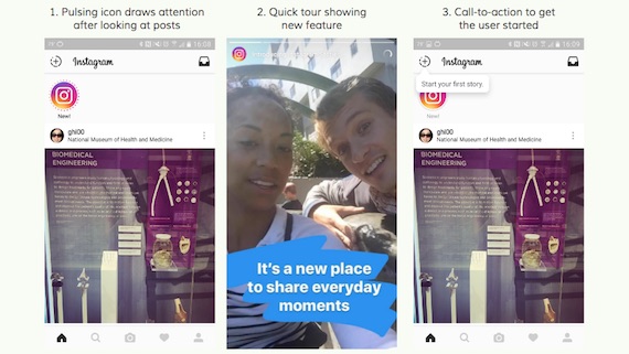
These tours work best when they are in-context of what the user is doing at that very moment. For that, you need to segment users by both time and behavior.
Targeting the Right User
Sharing a new feature with all your users may seem the best way to increase engagement. But the truth is that each of your customer personas will have different use cases for your product. They will favor some features over others. Therefore, they will want to hear updates about some new features more than others.
Using behavioral data you can look at how different subsets of users have used a certain feature before, how engaged they currently are with the feature, or if they have used adjacent features recently.
You are looking for a behavior they have exhibited that demonstrates they are ready to learn about your new update. For instance, you could use Kissmetrics Analyze to identify specific customer journey’s through your app and target different features to these different journeys.
Another example is the MailChimp feature above. If MailChimp want to increase the use of their improved A/B testing they could target a tour towards users who exhibit the following behaviors:
- Have previously created five regular campaigns — this shows they have the motivation to continually create campaigns, but perhaps not the knowledge of A/B campaigns.
- Have two or more saved templates — they have the ability to start testing each of these templates immediately with A/B testing.
- Have 1000+ contacts in their list — they have enough users to make a test statistically useful.
- Are currently creating their next campaign — they are in the position to start their next campaign.
These are the users that will be ready to use A/B testing in their email campaigns. Users who are just starting out with a single campaign, don’t have templates ready, or only a small readership will not find value in this new feature.
Targeting at the Right Time
Targeting at the right time is as critical as targeting the right person. In the MailChimp example above, pinging that ideal customer just as they start generating their new campaign with “Hey, there’s a better way!” can be just the trigger to move them to the new feature.
This isn’t as simple as targeting someone the moment they sign in or start using a feature. It depends on what the new feature is and how it corresponds to the current feature they are using. Look at this example from survey platform Typeform. They show the announcement at the start of building a new survey:
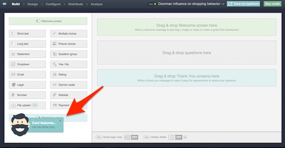
This is a lost opportunity. At this point I have a form to build. That is my main motivation. I am going to immediately dismiss this tour and continue with my main task. By the time I’m finished, I’ll have forgotten about these “cool features.”
If instead this was targeted after I had finished my main task then my motivation could be to check the new features out. Once I had successfully completed one task, I would then be ready to learn more.
Conclusion
Emails, blogs, and in-app notifications all have their place when it comes to feature announcements. Each messaging channel can be used at a different point to inform, teach, and highlight features to users.
But the in-app tour is the most powerful tool at your disposal for engaging users with new features:
- You can target the right people: New features will appeal to a certain segment of your users most. Using behavioral data, you can find out who uses the features you’re upgrading or aligned features and target a brief tour of the release only to them.
- You can target those people at the right time: in-app tours let you get your new features in front of users at the exact moment when they would find them most useful. This might be just as they finish a task, or just as they start another. But timing an in-app tour allows users to have the context needed for them to find value in the feature, as well as the ability and motivation to learn more.
When you target a tour to the right people at the right time you will have them when both motivation and ability are high. Then it only requires a small trigger to push them into action.
If you get this targeting right, then you have introduced the best customers to the most valuable features to them, meaning you are building success for them and your product.
About the Author: Pulkit Agrawal is cofounder & CEO of Chameleon, a platform for better user onboarding. He believes that first-user experience is a hidden treasure to drive improved user activation and retention. He writes on the Chameleon blog, which contains great resources on the psychology of effective user engagement. You can converse with him on Twitter.
from The Kissmetrics Marketing Blog https://blog.kissmetrics.com/release-notes-to-drive-feature-adoption/
No comments:
Post a Comment