A few months ago, I took the stage at Digital Summit Dallas to talk about blog conversion rate optimization (CRO). The session right before mine was led by Unbounce Co-Founder Oli Gardner -- a household name for those of us in the CRO industry. Needless to say, it was a tough act to follow.
In his session, "Frankenpage: Using A Million Little Pieces of Data to Reverse Engineer the Perfect Landing Page," Oli shared lots of great data-backed tips for landing page optimization. In discussing best practices for conversion forms, he talked about how two-column forms weren't ideal.
What's the Beef With Two-Column Forms?
Oli isn't the only one to frown upon the use of two-column forms. Baymard Institute, a usability research company, published this a few years back, and ConversionXL Founder Peep Laja has also asserted that one-column forms perform better.
Peep's colleague Ben Labay even published a study about the superiority of the one-column form over multi-column forms. The study showed that users complete the linear, single-column form an average of 15.4 seconds faster than the multi-column form. While speed is not directly tied to form completion, the data suggests that if the single-column form is faster to complete, fewer people will abandon it, garnering more conversions. It all boils down to user experience.
But Oli's advice to avoid multi-column forms originally caught my attention because we had just redesigned HubSpot's demo landing page, one of the most important landing pages on our website, and switched from a one-column to a two-column form in the process.
The thing that stuck out to me was that in switching to two columns, we had actually improved the conversion rate of our page by 57%. Now to be fair, the form wasn't the only variable we manipulated in the redesign (we refreshed the design and made some copy tweaks as well), but it still made me wonder whether two-column forms were really all that bad.
So I put it to the test.
The One- vs. Two-Column Form Test
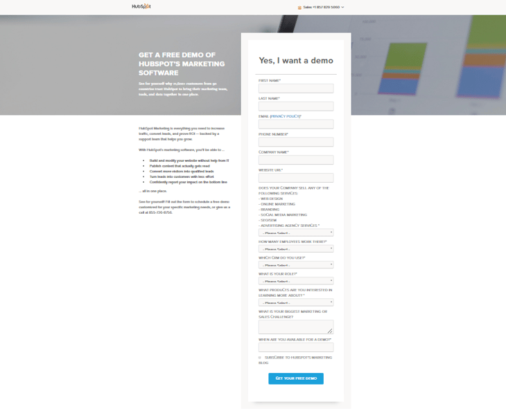
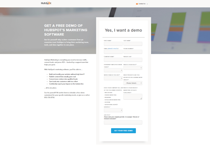
Using HubSpot's landing page A/B testing tools, I pitted the two-column form (the control) against the one-column form (the variant). Here's how they looked ...
Control (Two-Column Form)
Variant (One-Column Form)

So "best practices" aside, which do you think performed better?
And the Winner Is ...
... not the one-column form. In fact, the two-column form converted 22% better than the one-column form, statistically significant with a 99% confidence level.
Surprised? I wasn't. Just look at the length of that one-column form! Yes, HubSpot's lead-capture forms are long (13 fields to be exact), but they're long by design. Through our experience, we've learned that having more fields helps us better qualify our leads, and weed out unqualified ones.
But a 13-field form doesn't exactly lend itself to a one-column design, which is why I think for us, the two-column form works better. The theory is that the one-column form, despite having the same number of fields, looks longer, so visitors are much more likely to get scared off before completing it.
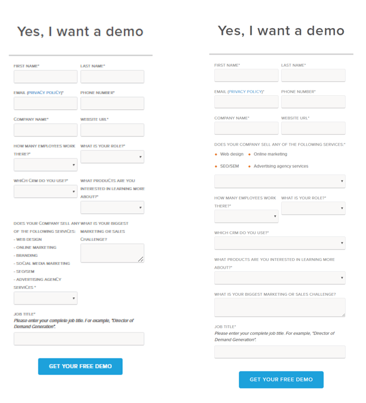
Since we ran the test, we've actually switched to a kind of hybrid form, with elements of both a one- and two-column form, to make our two-column form a bit more user friendly. Our old two-column form is on the left, and our new hybrid form is on the right.

Questioning "Best Practices"
Any CRO worth their salt knows there's really no such thing as best practices, and that everything should be tested yourself (which, coincidentally enough, was a major theme in the talk I delivered after Oli's).
In fact, Oli and Peep will be the first ones to tell you that while they may share certain CRO findings and trends from their experience, there are no sure things. That's why testing things for yourself is so important. What might work better for one site, might not necessarily work better for yours -- that's fundamental to CRO.
And in my opinion, running those tests to figure out what works for you is what makes conversion rate optimization so much fun. Especially when the results challenge what the experts say ;-)
from HubSpot Marketing Blog https://blog.hubspot.com/marketing/one-vs-two-column-form-conversion-test


No comments:
Post a Comment