Friday, 30 June 2017

Marketing: 4 Things You Should Do for Sales Development that Aren’t MQLs

I’m lucky. Here at Marketo, I’ve had the pleasure of working with not one, but two (!) of the best sales development leaders out there. What makes them so great? Both are beloved captains who are awesome at finding talented people and developing them into great sellers. And, they’re just as skilled at cross-functional collaboration.

Bottom line: my sales development leaders totally get that somewhere between MQL and SQL, their teams become the face of the brand in a major way.

That means coaching and learning are a big part of their teams’ day-to-day so they can assume that role with confidence and agility. Because let’s be honest—every sales call is a different beast. I share this because leaders who care deeply about learning are the prerequisite to everything else I’m about to say. They WANT marketing involved as a partner to ensure the experience from nurture to hot lead to first sales call is a consistent, personalized experience.

So with a lot of guidance from strong sales leaders along the way, here are 4 specific things I’ve learned marketing can do to contribute to a learning culture in your SDR/BDR organization.

Flip the Script

Think contextually, not linear (script) when you create live conversation materials for inside sales teams. After all, that’s how conversations work. I’ve learned from the leadership here to deploy “open-ended questions” that get a thoughtful conversation flowing. Our battlecards are context on one side (topical details, when to use the battlecard, etc.) and on-call content on the other (those open-ended questions, with some proof points and talking points for smart responses.) This approach can work whether you’re making materials for competitors, industries, personas, or important industry topics.

Enable Enthusiastically and Often

We have a cadence—every time we release a new battlecard, we do a ‘lunch and learn’ that includes deeper enablement for the team. Why did we make this card? Who should you use it with? How will it help? What is the purpose of each open-ended question? Why do we recommend certain proof points? These answers should help the team look for cues so they can tailor and add value in conversation with a prospect.

Play the Part

If you have a pent-up theater kid inside of you, you’ll love what I’m about to say: roleplay is an incredible tool for honing the above (tailored, value-adding conversations) without risking anyone’s experience with your brand. And I take this seriously (ask Stacey Thornberry or Mike Madden.) Make a few fictional personas that correspond to your battlecards. Enlist SDR leadership, sales enablement, or other marketers to play the parts with you. And don’t forget to throw some curveballs. That’s real life, right?

Be a Partner

Don’t be hands off with your SDR/BDR team. Sit with them and listen. Invite their feedback and their questions. Take a closer look at the performance of the email cadences they use—just like you would any other campaign. Help with the content, to be sure the connection between their messages and yours are tight. Sales development teams can be great partners for testing new messaging and providing feedback on what works, especially when they’re outbounding. Don’t let that opportunity pass you!

So, marketers: it’s time to share the brand spotlight and ensure continuity with the stories we tell our prospects and customers. Our campaigns don’t just stop at MQL. If we do our job right, they get better at that point, because there’s a real, intelligent person ready to make a human connection. I’m excited to help them do that, aren’t you? (Ok, fine, if that’s a little lofty to you, how about this? You’ll also get more SQLs and the pipeline to go with them.)

The post Marketing: 4 Things You Should Do for Sales Development that Aren’t MQLs appeared first on Marketo Marketing Blog - Best Practices and Thought Leadership.


from Marketo Marketing Blog http://blog.marketo.com/2017/06/marketing-4-things-sales-development-arent-mqls.html

7 New Twitter Features (and 4 Others You May Have Missed)

new-twitter-features-update-compressed.jpg

In an industry fixated on rapid growth, any slowdown in user acquisition or monetization sounds alarms. And Twitter, whether it likes it or not, has been sounding a lot of them lately.

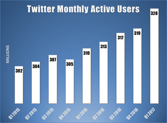
After a few years of stagnant monthly active user growth and disappointing the market, Twitter has been on an upswing thus far in 2017 -- beating investor projections by generating more money and adding more new users than initially anticipated.

In the face of a negative narrative, the company has been quick to take action and focused predominantly on changes geared toward the user -- and it seems to be working. New Call-to-action

Over the last year, Twitter has made a number of changes, small and big, to drive user engagement and improve the overall onboarding and experience of the platform. But we know how tough it can be to keep up with these types of updates, which is why we put together a list of the more notable features and changes below. Marketers, take note.

7 New Twitter Features

1) The End of Vine ... and the End of Periscope?

When technology companies are struggling to grow, as was Twitter for much of 2016, they will usually do one of two things -- cut staff to make financial ends meet, or develop new innovations to attract and engage users.

In Twitter's case, it did both -- Twitter sunsetted Vine and launched an in-app live video streaming feature -- thereby eliminating the need to stream from Periscope for many users.

Vine paved the way for the popular short-form and infinitely-looping videos we see on Snapchat and Instagram today (like this one), and in the fall of 2016, it was ultimately shuttered as Twitter shifted its focus to live video content.

Vines are still available to share and watch (and rewatch), but now, six-second looping videos must be recorded and shared directly to Twitter or saved to the creator's camera roll.

Then, in December 2016, Twitter launched its own in-app live video streaming and recording function -- effectively eliminating the need to live-stream from within the Periscope app.

Twitter hasn't discontinued Periscope the way it did so with Vine, so users can still download the app and live-stream videos to their audience there. But these changes in such rapid succession disappointed a lot of avid fans and users -- and reflected Twitter's growing need to keep users within its app.

It's no secret that video is no longer just popular -- it's also a requisite element of any successful social media platform. Twitter is trying to innovate its video creation, broadcasting, and sharing tools to give users the types of content they want -- short-form, looping, and live broadcasts -- to compete with other platforms, attract new users, and keep existing users engaged.

We haven't seen Twitter jump on the bandwagon of creating an ephemeral video stories feature like most of the major social media platforms -- yet. But we should expect more features and announcements -- like Twitter's deals to live-stream professional sports and breaking news -- that signal its continued emphasis on video content in the future.

2) A New Layout

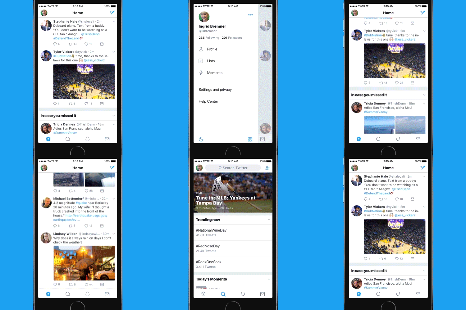
In June 2017, Twitter completely redesigned its desktop site and mobile app to make Twitter feel "lighter, faster, and easier to use" in response to user feedback:

Twitter's user base has been slowly growing -- and sometimes dipping -- over the past few years, and these UI and UX innovations could help attract people to Twitter, while also preventing users from leaving it.

how-many-users-does-twitter-have_large.pngSource: The Motley Fool

Here's a rundown of the changes:

  • Decluttered UI: Twitter now offers a sidebar menu where users can more easily navigate to their profiles, lists, and personal settings -- instead of having to tap through the app more than once.
  • Real-time reply, retweet, and like counts: Users can now watch the engagement numbers with tweets increase in realtime within the app, instead of refreshing and reloading tweets.
  • Clearer typography and iconography: Twitter changed the in-app font, made some headlines bolder to attract attention in the busy feed, and changed the "Reply" button to a conversation bubble (so it didn't look like a back arrow anymore).
  • Round avatars: Profile images are now round instead of square.

And here's what these changes look like in action:

Check-new-look-iOS Refresh Full Walkthrough.gif Source: Twitter

Most of the changes were widely panned by users, but this is the internet, after all -- and Twitter will never make everyone happy. Some users pointed out that cosmetic UI changes are not nearly as important as improving users' abilities to report and challenge abusive language on the platform -- and that's next on our list.

3) More Comprehensive Anti-Harassment and Cyberbullying Features

One of the biggest complaints against Twitter is how easily harassment can spread and exacerbate on the network -- and there was no better test of this hypothesis than political rhetoric surrounding recent global elections. Historically, tweets aimed at threatening or scaring individuals on Twitter have gone unfettered and caused a number of users to delete their accounts or even fear for their safety -- as blogger Ariel Waldman has chronicled.

Twitter Rules prohibit the kind of abuse we mean here -- threats, hate speech, bullying, and harassment on the basis of users’ race, ethnicity, gender, religion, sexual orientation, age, ability, disease, or nationality. However, until as recently as March 1, 2017, there haven’t been a lot of options for users report and stop abuse they were experiencing in real-time. Twitter has begun to respond to harassment and threats on the network with a series of features and services aimed a keeping people safe. These additions include:

  • Notification filtering: Users can specify which accounts they don't want to receive notifications from. For example, you can filter out notifications from accounts without profile photos and with unverified email addresses.
  • Mute option: Users can mute specific keywords and phrases, and they can choose how long they don't want to see that type of content.
  • Reporting transparency: Users now receive notifications when -- and if -- Twitter intervenes on an abuse report the user files.
  • Time-out: Users who are reported are sometimes temporarily put in "time-out" while Twitter investigates the report to prevent the further dissemination of abusive content.
  • Safe search: Machine-learning technology will prevent users from being served potentially abusive content when they search for tweets on the platform.
  • Hiding abusive tweets: Twitter has started identifying low-quality tweets from potentially abusive accounts so users see high-quality content first. The tweets will still be on Twitter -- they'll just be harder to find.
  • Preventing new abuse: Twitter has started preventing reported and flagged users from creating new accounts with the same contact information in an effort to prevent repeat offenders on the platform.

These updates are critical to ensuring Twitter stays a welcoming place for all users. In a leaked memo last year, former Twitter CEO Dick Costello underscored the importance of this move, saying:

I'm frankly ashamed of how poorly we've dealt with this issue during my tenure as CEO. It's absurd. There's no excuse for it. I take full responsibility for not being more aggressive on this front. It's nobody else's fault but mine, and it's embarrassing.

We're going to start kicking these people off right and left and making sure that when they issue their ridiculous attacks, nobody hears them. Everybody on the leadership team knows this is vital."

4) Moments for Everyone

Twitter introduced Moments -- curated tweets about a single topic or story, all in one place -- back in 2015. Moments allowed publishers and brands to pull together their tweets and tweets from other users about a topic to tell a story in one story collage -- and in August 2016, Twitter opened up Moments to any user who wanted to create them. Here's what they look like:

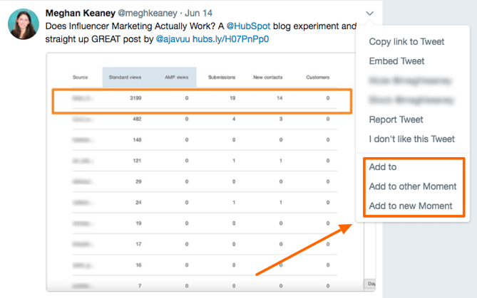
Now, whether you want to feature your own tweetstorm, content from other people on the platform, or both, anyone can easily make a shareable Moment to tell a story. You can go into the Explore tab (or the Moments tab on Twitter's desktop site), and create a new Moment there. Or, you can find a tweet you want to feature and create a Moment while you're scrolling or on your own profile:

twitter_moment_add.png

Moments present another opportunity for users to get discovered and shared on Twitter, so opening this publishing capability up to everyone was a smart move.

5) Explore Twitter

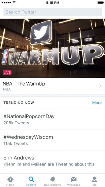
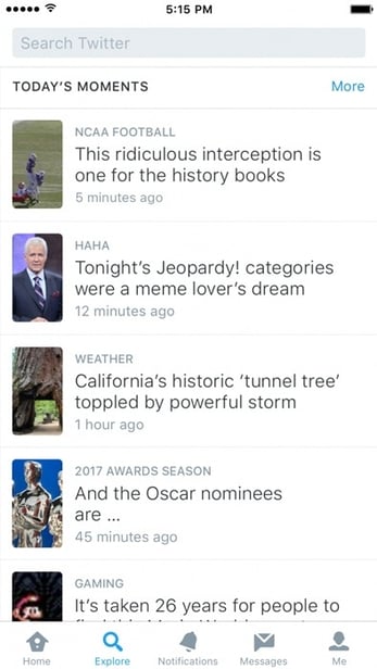
In January 2017, Twitter axed the Moments tab and created the Explore tab on the mobile app, which combined Twitter trends, Moments, and search -- all in one place.

It was a simple new feature that combined features already in existence, but by putting these all in one tab, Twitter made it easier for users to find and engage with new content on the platform -- and hopefully, stay in the app longer.

Here's what it looks like (if you haven't already noticed it):

Explore-Screenshot1.jpg.img.fullhd.medium.jpg Explore-Screenshot2.jpg.img.fullhd.medium.jpg Source: Twitter

6) More Characters to Reply

Twitter made a big change to the way users can directly reply to one another. Whereas before, users had to @mention the account they wanted to reply to, the mention is now built directly into the reply button. This gives users more characters with which to reply, because they don't have to type in the username and cut into their precious 140 characters. Check it out:

new-reply-button-twitter.png

This change has been met with some criticism, though -- because users can't specifically one-off reply to particular people. So if you're included in a tweet with multiple other users, everyone will get a reply notification -- even if the reply isn't specified for them.

But while Twitter is giving users more room to express themselves, it might also give them the ability to communicate with too many other users -- especially if bullies and abusers are replying-all to tweets.

7) Safer DMs

If you receive private Direct Messages from users you don't follow, users now have the option to approve or deny the request to connect -- and report the message if it's inappropriate.

This feature is a win on a couple of levels. It helps users better screen for and identify abusive content -- and choose if or when they want to engage. It also prevents the need for a tweet back-and-forth of asking someone to follow you before you reach out to them via DM. Instead, you can simply shoot them a message -- and they'll approve it if they wish.

4 More Twitter Features You May Have Missed

I wrote the original version of this blog post back in 2016 with a different set of new features, and wanted to make sure you still knew about those neat new(-ish) capabilities, too.

1) The 140-Character Count Loophole

As far as debates go, Twitter's 140-character limit is about as contentious as the Oxford comma. Some say the character limit on tweets is essential to Twitter's identity. It secures Twitter in place as one of the fastest available ways for ideas to spread. Others are ready to see it lifted, arguing that removing the 140-character cap would open Twitter up to a new and engaging range of content and possibly new users. One area where the pain of the character cap is particularly sharp is in adding media to your tweets.

By default, media links used to take up 23 characters in a tweet, which is about 16% of your allotted characters -- no small portion. That said, images are a boon for interactivity on your tweets: HubSpot conducted a study and found that tweets with images resulted in 18% more clickthroughs and 150% more retweets.

Tweets_With_Images_Stats.png

Last year, Twitter announced that media (e.g., images, polls, videos) attached to tweets would soon no longer count against your 140-character count. The same rule would apply to the @handle when replying to someone else's tweet.

This update makes a couple of changes to the way replies and retweets are handled. Users will no longer have to add a character prior to a reply -- for example, ".@meghkeaney" -- to ensure their reply is seen by all followers. Not to mention, users will be able to retweet their own content if they want to add a thought to a previous post.

2) Accessible Images

Back in October of 2015, Twitter CEO Jack Dorsey made a public appeal to developers to submit ideas for product enhancements:

One of the ideas generated out of that invitation focused on making Twitter more accessible to users who are visually impaired. In other words, people using Twitter's iOS and Android apps can now add alt text descriptions to images within tweets. Websites have long used alt text to help visually impaired visitors understand the messages conveyed by images, using assistive technology like a screen reader or Braille display.

The accessible images feature has to be set up at the user level, a drawback for it gaining mass adoption, but it's easy enough to set up. In an Android or iOS device, go to your Twitter settings (the gear icon) and follow these steps:

  1. Tap Accessibility.
  2. Next to Compose image descriptions, turn that feature on.
  3. From there, when you add an image to your tweet just tap Add description to insert descriptive text.

Adding accessibility may seem like a smaller win, but it's a best practice across the board for businesses and organizations looking to grow their audiences and do the right thing.

3) Native GIF Search

Even though this list isn't weighted for significance, it took real willpower not to place this at number one. As someone whose reliance on GIFs is beyond description, this feature release was a big one for me. In 2015, people shared more than 100 million GIFs on Twitter. When you think about the steps it previously took to share an animated image on Twitter, that number is even more impressive.

Previously, you had to leave Twitter, search for the appropriate GIF on any number of GIF search engines, save that image, go back to Twitter, recompose your tweet, and finally, upload the image. Today, with Twitter's new GIF feature, you just click a button and conduct the search there -- no saving or uploading needed.

Gif Search on Twitter Source: Twitter

(By the way, if you like GIFs, I highly recommend this post by my colleague. It's a fascinating history and analysis on why exactly GIFs became so popular.)

4) The Switch to Uncropped Photos

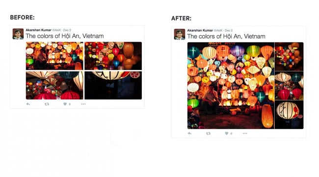
Twitter may have started as a text-based platform, but images are a source of some of its top engagement. That's why the news that Twitter had adjusted its image size requirements to not force-crop most images came with such praise. The resulting experience means that Twitter is more visual and engaging right off the bat. See the before and after shots provided by Twitter below:

Source:  Twitter

Along with the uncropped photo update, Twitter also introduced a new view for multi-photo displays. This update allows users to see even more of the individual photos included in a collage.

new_look_for_twitter.com_photos_2.jpg Source: Twitter

In all the punditry on the current and future state of Twitter, most of the narrative to this point has focused on the competition. Twitter's response, however, has been largely focused on its users. While some of these updates may seem small, in aggregate, they signal a move to a much more intuitive user experience fed largely by user feedback. Time will tell if this focus on fan-favorite features amounts to a measurable increase in usage and revenue.

What do you think about Twitter's latest features? What else would you like to see? Share your thoughts in the comments.

Editor's Note: This post was originally published in May 2016 and has been updated and for freshness, accuracy, and comprehensiveness.

free kit for growing followers on Twitter


from HubSpot Marketing Blog https://blog.hubspot.com/marketing/new-twitter-features

17 Examples of Fabulous Explainer Videos

ai_hero.jpg

Feel intimidated by the notion of creating an explainer video? There’s no need to be -- they just represent another excellent way to get your content out to your target audience.

Besides the really big brands that we are all familiar with, a lot of lesser-known companies and even small startups are using them.

Even if you believe your product isn’t "cool" enough to become a fancy, interesting explainer video, there's probably someone out there with a problem that can be solved by what you have to offer.

Sometimes a quick, easy, explanation is just what someone needs to help clearly understand how your product solves a problem.

Download this free ebook for more examples of effective product videos.

Think you need a professional production team to create a worthwhile explainer video? Think again. Compiling an explainer video doesn't have to be more complicated than putting together a slide deck in a Powerpoint presentation. You decide what to say, find some relevant graphics to jazz things up, and record a voiceover. 

Explainer videos should generally be 30-90 seconds in length, which translates into a written script of around 200 words or less in most cases. To get a good feel for crafting your own video, start by gathering some inspiration from brands doing it right. You’re bound to find something that resonates with you as a good example for brainstorming your own.

Here are 17 fabulous explainer videos across a wide variety of industries, media outlets, and publications to jumpstart your own project. You should have no trouble getting inspired to make an explainer video part of your marketing strategy.

17 Examples of Fabulous Explainer Videos

1) Unroll.Me


2) What is AI? (HubSpot)


3) PandaDoc


4) Yum Yum Videos


5) Dollar Shave Club


6) What is an API? (MuleSoft)


7) Mint.com


8) Spotify


9) How Deep is the Ocean? (Tech Insider)


10) SafeDrive


11) Final


12) Ethical Coffee Chain


13) Pinterest


14) BriefMe


15) Munzit


16) Stitch Fix


17) Water Mark


Seen any great explainer videos lately? Let us know in the comments.

HubSpot Marketing Free


from HubSpot Marketing Blog https://blog.hubspot.com/marketing/explainer-videos

Thursday, 29 June 2017

Persuasive SaaS Onboarding Emails: 10 Conversion Lessons Stolen From Attorneys

A successful attorney’s entire job rests on one question: can he persuade the jury to view the case as he does?

If he can, he wins.

Steal these 10 conversion lessons from attorneys to make your SaaS onboarding emails more persuasive and, in the process, increase your conversions.

1. Know Your Goals

How do you know when you’re successful if you don’t have a goal? You can’t. Not having a goal makes successful use of analytics impossible.

A successful attorney — let’s call him John — has two goals in his case. First goal: prove his case, whether his client is innocent or the defendant is guilty. Second goal: a granular goal for each witness and piece of evidence that contributes to the success of his first goal.

To illustrate, imagine John is prosecuting a man for killing his wife. He calls the boat dock attendant as a witness. His goal for this witness? Getting her to admit that she saw the defendant carrying his wife’s limp body onto his boat. This goal contributes towards John’s first goal of proving the defendant is guilty.

So how does this talk of limp bodies and goals work for your SaaS onboarding emails?

You need to show your new user the value of your app. This is your first second goal. You also need to persuade them to pay for your app. This is your second goal.

Assign one goal for each onboarding email in your campaign. Make sure each email’s goal works towards your campaign’s first goal: showing the value of your app. Think of your emails like stepping stones across a lake, guiding your new user towards your first and second goals.

2. Each Question Builds on The One Before

Attorney John builds his case question by question to prove his client is innocent. His questions lead the witness down a path that John wants him to take, so he makes his point to the jury.

John can’t ask a question without laying the foundation for the logic of his next question.

For example, if someone is suing because he fell off a ladder, John might ask: “On January 5th, you walked by the barn and did you see a ladder?”

The witness says, “Yes.”

Now John can ask his next question because the witness confirmed he saw the ladder in question: “That day, when you had this incident, you thought it was a good idea to climb this ladder?”

Notice how John’s first question sets up his second question for the “yes” that he wants.

This strategy is what you want to do with your onboarding emails. Each email lays the groundwork for the emails coming next by explaining one action step that your new user must accomplish to reach your end goal.

Think of building a house. You need to build the foundation before the walls, or you’ll end up with a pile of timber, loose wires, and wet cement.

This where your first and second goals come into play. Each of your onboarding emails’ goals works towards your first, big goal of successful onboarding, like Attorney John’s witnesses contribute towards proving Mr. Defendant is guilty. Figure out your onboarding goal, then use each email to lead your user along the path to complete that goal. If you do that well, your user will also want to convert from a trial to paid user, accomplishing your second goal.

Here’s how: break down your onboarding process into specific steps. Make each step into one email.

Then assemble those emails, so each email logically builds on the one coming before.

For example, if you signed up for Zola Suite, you need to activate your account to start using the software. You can’t import or organize data without taking this step. So the activation email triggers you to take that step.
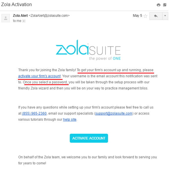
zola onboarding email

I underlined your next step: activate your firm’s account by setting a password.

Here’s another example from MeetEdgar. This short and sweet email points you in the direction you need to go.
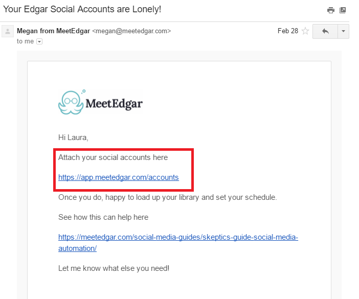
meetedgar accounts are lonely email

The red box is your next step: sync your social media accounts.

3. Relevance Is Powerful

“You know, if you don’t want to testify on Tuesday,” I said, “We can always subpoena you and you’ll have to show up whenever is most convenient for us.”

As a litigation paralegal, I was on the phone with a reluctant witness. The attorney I worked for had asked me to get this witness to testify in court in two weeks. The witness didn’t want to.

“But if you work with me a little bit,” I said. “I can work with you. We can schedule this for a day that is better for you.”

Suddenly his demeanor changed. Minutes later, I hung up with the witness’ testimony scheduled for Wednesday at 2 p.m.

Like this witness, your SaaS user only cares about one thing: how will this app improve their life?

Relevance to your user’s life and situation are powerful. Don’t make your user do the heavy lifting on understanding on how your app improves their life. When you show your user how your app benefits their life, your likelihood of getting a conversion skyrockets.

This is your responsibility in your persuasive onboarding emails.

Focus on getting your new user that first success. Here’s how:

  1. Use more “you” in your emails than “I” or “we” to show relevance to your user’s life. ​​​​​​
    Help your user understand and use your software. What foundation do you need to build, so they’re successful in using your app? How can you set them up for success?
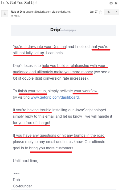
    drip lets get you set up email

    I underlined all the spots where Drip says “you.” Focus is squarely on the new user and their success.

    Relevance extends to customer success stories. Customers only care about what your software did for other businesses in the context of what your software could do for their business.

    Use customer success stories that are relevant to your customer’s business and situation. A solopreneur isn’t going to relate to a case study about Home Depot using your app.

  2. Build the first ten days of your onboarding campaign, so your user achieves the aha moment.
    Intercom discovered that the first ten days after your new user signs up for your software are critical. In this period, your new user is pumped to take action and use your app.

    Capitalize on their excitement by helping them achieve the aha moment. Your onboarding emails need to direct that action, so the aha moment is triggered.

    How to figure out your app’s aha moment?

    Lincoln Murphy of Sixteen Ventures recommends:

    The easiest way to figure out what success looks like for your customer – before you can break that down into milestones – is to ask them. What is their desired outcome? How do they measure success themselves? How are they measured by their boss? What are they trying to achieve with your product?

    I’d ask them what ‘success’ means to them first. Do that with several [users] from a similar cohort (if you have multiple types of customers across various use cases – as you often find in very horizontal products – you may want to pick an ideal customer to focus on initially). Analyze that for similarities and patterns. Reduce it down to a handful of absolute required outcomes, and then turn it back to them for approval/buy-in.

4. Break Down Resistance With Humor

If I asked you to come up with five attorney jokes in under five minutes, I bet you could.

Attorneys are universally hated. Even in the courtroom, attorneys are disliked by the judge, jury, and even their own kind: opposing counsel.

Attorney John knows this and uses humor to melt that resistance to win his case.

Pamela Hobbs researched how attorneys effectively used humor as a persuasion tool.

Laughter produces, simultaneously, a strong fellow feeling among participants and joint aggressiveness against outsiders. Heartily laughing together at the same thing forms an immediate bond, much as enthusiasm for the same ideal does. Finding the same thing funny is not only a prerequisite to a real friendship, but very often the first step to its formation.

In short, we like people who make us laugh.

Like the jury eyeing Attorney John with a cocked eyebrow, your new SaaS user is skeptical. They’re wondering: will this app really improve my life?

Talk about resistance. The customer wants to believe your app will help them, but they have been let down many times by empty promises made by crappy software.

Inject some humor into your onboarding emails to break down resistance.

I know what you’re thinking: writing humor is hard. So, instead of forcing the humor — because then it’s not funny — think of your reader as a friend. If it makes sense for your brand, use sarcasm, funny analogies, dry wit, or an unexpected observation to tap into that humor.

For example, here’s an email I recently got from AppSumo that made me laugh:
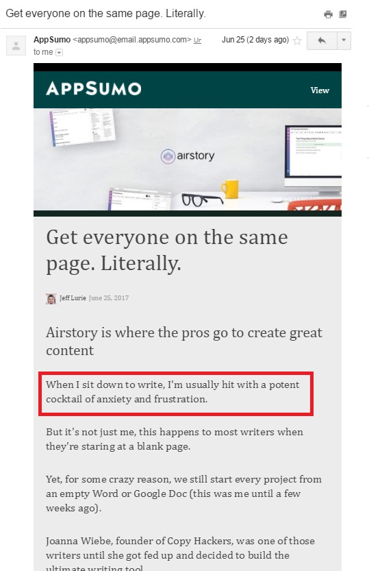
appsumo email

The funny part is in the red box. It’s funny because it’s a relatable, unexpected observation.

5. Research is Vital

What the movies don’t show are the long months of research an attorney does before a trial starts.

This research is the longest part of every case. Attorney John researches each part of his case, investigates all evidence, and interviews the witnesses. The reason for this intense research is simple.

How can he persuade the jury of any fact when he has no context (aka research) for his hypothesis (aka argument) about the case’s events so that he can prove his case?

Research is vital to a case’s success. The same research phase exists for persuasive onboarding emails. For an onboarding series to be successful, you must know vital information about your user:

  • Why they signed up for your software
  • What success for them looks like
  • The specifics of that success
  • What the first step is towards success (the aha moment)
  • What steps are needed to achieve that aha moment

Back to Lincoln Murphy of Sixteen Ventures. He says, “When I talk to someone about optimizing their SaaS free trial for more conversions, as an example, I ask them what a successful free trial looks like for their prospect. And no… it’s not ‘they convert to a paying customer.’ That’s YOUR definition of success; don’t confuse that with THEIR definition of success.”

To create persuasive onboarding emails that convert, you should do research as your first step. Yes, even before you start writing or planning your series.

Here are some questions to start your research:

  • Is your target audience different from your actual users?
  • How your customer uses your software: for its intended use? Or something else?
  • What do you need to know about your user to provide them with a great experience?
  • What does the user need to do to get value from your application?
  • What are the costs and benefits of adding friction to your onboarding process?
  • What is the point when your user sees success in your app?
  • What are each steps needed to achieve that success?
  • At what point in your user’s lifecycle does onboarding need to be completed?
  • What actions must your user regularly take to drive growth and revenue?

6. Create a Consistency Loop

A consistency loop is: “you did this before, so you’ll do it again.”

The first yes is the hardest yes to get. But once you get that first yes, the other ones are easier.

For Attorney John, getting the witness to keep talking to him on the phone instead of hanging up is that first yes.

For your onboarding emails, the first small commitment or first yes is your all-important welcome email. If your customer opens your welcome email, they’ll want to open the rest of your emails. Those subsequent requests are consistent with their view of themselves.

So, make that welcome email darn good.

Here’s how: Set your user up for success. Going back to your research, figure out the first step your user needs to take to get success from your app. Make that first step super easy to take.

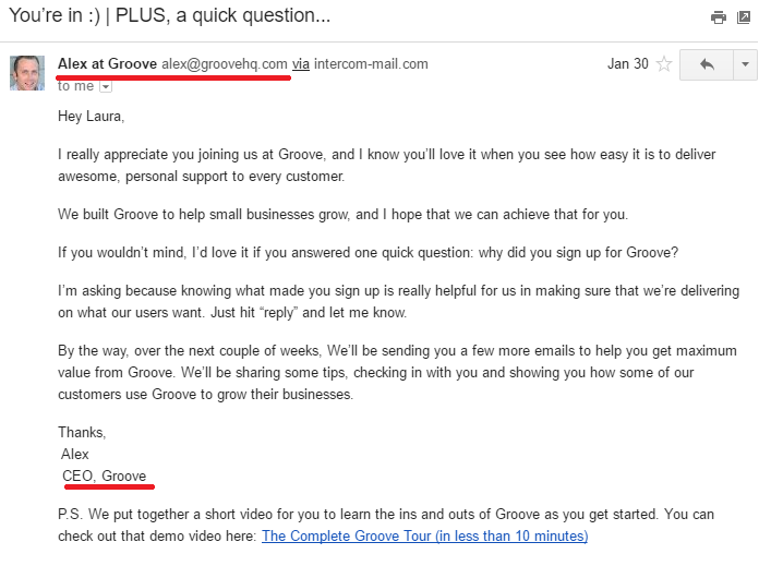
Second, give your welcome email some personality. People want to connect with other people. Give a glimpse of the human personalities behind your software. Some SaaS companies, like Groove, have the welcome email come from the CEO.
groove ceo email

Look, there is a person behind this software. And he’s friendly and nice. You feel welcomed, don’t you?

7. Invoke Emotions

Research has found that the effect of emotions on decisions of any kind is not random or a sweet side bonus. Emotions are powerful and predictable drivers of decision making.

Attorney John knows this, so he uses emotion in his opening statement to set up the case and tap into those emotions.

Maybe he taps into the most powerful emotion: anger. He slants his case in an “us versus them” mentality, or a call to “fight our quick-fix litigious society,” or a warcry of “don’t let evil triumph in the world.”

Steal his secret and trigger an emotion in your new user, like excitement or hopefulness.

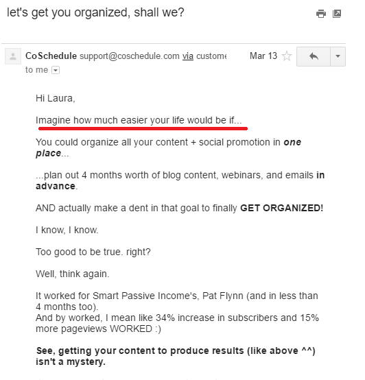
Stirring your new user’s imagination with story-based email copy is how you tap into that emotion. Paint a picture by telling a story and getting your user to imagine the pain-free life after being onboarded.
emotion in email

This email starts right off with telling you a story and getting you to imagine your life pain-free.

8. Put Your Message Into Context

“As you were getting your beer, the lights went down in the auditorium,” the defense attorney asks the plaintiff. “And you heard the guitar start playing and you panicked. So you started to run. Wouldn’t you say that’s why you didn’t see the water on the floor and you fell because you were missing the start of this show that you’d driven 500 miles to see?”

Plaintiff’s counsel asks the same question, but in a different way: “You came around the corner and didn’t see the puddle of water right next to the auditorium’s curtain, because the hallway was dark and the curtain was closed, correct?”

The difference between the two questions is in the framing.

“Framing means packaging information,” says Stuart Diamond, author of Getting More: How to Negotiate to Achieve Your Goals in the Real World. “Or presenting it using specific words and phrases that will be persuasive to the other party. The idea is to give people a vision of what the key issues are. If a restaurant is late with your reservation, ask, ‘Does this restaurant stand by its word?’ Or, to any service provider, ‘Is it your goal to make customers happy?’ Figuring out how to frame things comes from asking yourself the question, ‘What is really going on here?’”

For your onboarding emails, you should frame your message to let your new user see all the benefits of your software.

Here are three ways to use framing in your emails:

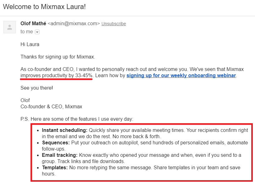
  1. Provide a quick recap of why your user signed up. Your welcome email is a great spot to include this information as Mixmax did.
    mixmax welcome email

    I marked all the benefits you get from using Mixmax. Makes you want to use it, right?
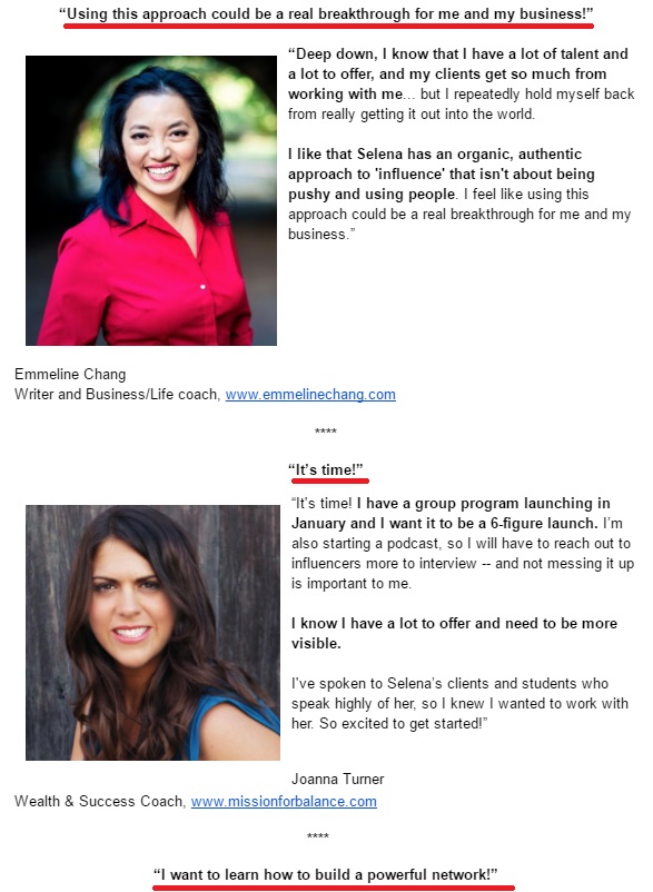
  2. Add a little line or headline above your testimonials to give a snapshot of the testimonial. Connect the dots for your user between your email copy and the testimonial like Selena Soo did in this email.
    testimonial email

    I underlined where the framing happens. She puts the testimonial into context, making it more powerful.
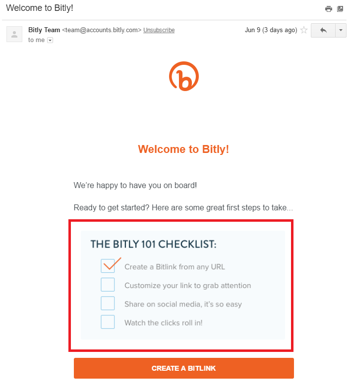
  3. Give an update on your user’s progress in onboarding and tell them what that means. Check out how Bitly did that in this email.
    bitly onboarding email

    Bonus points to Bitly for already checking off one to-do on this list. It gives you a sense of accomplishment.

9. Show and Tell a Story

Attorney John knows he’s just an actor putting on a story for the jury. He brings in supporting actors in the form of witnesses to play out the story and support his case. In the process, he gives nonverbal commentary to help the jury understand the plot with an eyebrow cocked in skepticism or the way he phrases his questions.

Then he layers on another persuasion technique: storytelling. His entire case is a story about the events that lead up to this trial.

For your onboarding emails to convert, steal Attorney John’s persuasion tactic: show and tell a story.

Joanna Wiebe, founder of Copy Hackers and co-founder of Airstory, explains:

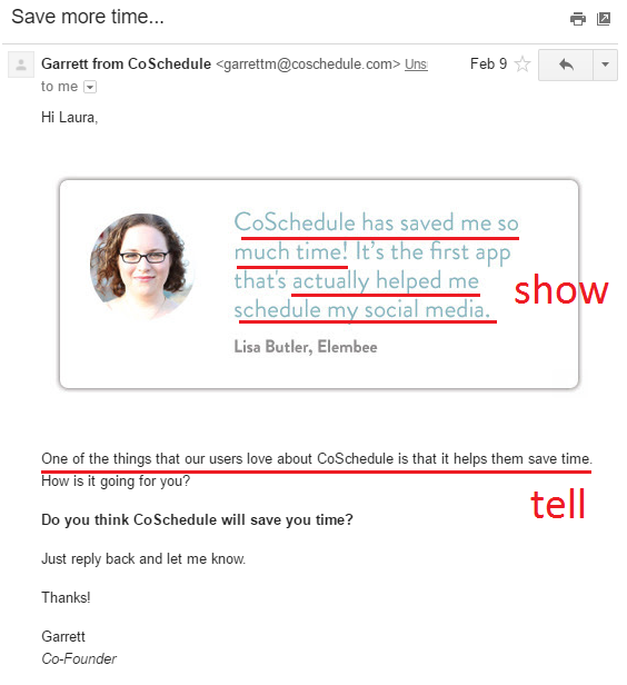
If you don’t tell, you risk leaving the best messages implied. Implying is BAD in conversion copywriting. Because there is too much room for error/interpretation when you imply. The idea is to SHOW then TELL. First, show them what’s different or awesome about you. Follow that up by explaining – in clear, meaningful words – what you’ve shown them, what you’ve implied.

To do this in your onboarding emails, show in your screenshots and testimonials, and tell in the copy you write. Tell your new user explicitly what your app does and how it will benefit their life. Then, show them a story to cement that idea.
coschedule testimonial sales email

Top half of email: shows what’s different about CoSchedule. Bottom half: tells what’s different.

10. Don’t Be Afraid to Sell

Attorney John’s job is to advocate for his client. At the end of his case, he must ask the jury to do something. Usually, that ask ties directly to his end goal. For his case to be successful, his ask must be clear.

If he didn’t ask, he would fail at his job.

If you don’t ask, your emails will never convert.

Your onboarding emails have an end goal: to properly onboard your new user and show them the value of your app. For your onboarding to be successful, your new user will want to pay, so the app is permanently in their life. In other words, a paid conversion.

I see too many onboarding emails skimp on that ask. Don’t be timid or shy about it.

Ask for the action you want your user to take and make it obvious how it benefits your user’s life.

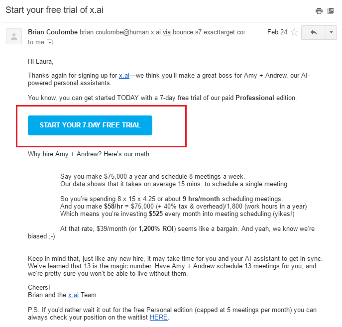
Ask clearly and remove any barriers about confusion like multiple CTAs in one email, hesitancy in asking, or not showing her the positive impact your app will have on their life.
x.ai onboarding email trial offer

x.ai’s ask is underlined in red. Notice there is only one CTA and you know exactly what you get by clicking that button.

Second, make it an easy action that your user must do to complete your ask. For example, when you ask them to pay for a year subscription, lead them directly to a checkout page with as much information pre-filled in as possible. Don’t litter the path with hidden work in your onboarding emails.

Last, like a good attorney who explains to the jury how to fill out the verdict form so he wins and they can all go home, take your user through each step of your ask. Explain how they’ll capture her brilliant ideas immediately using your app like Evernote, and they’ll never again scramble for a pen and paper while their genius idea floats away, lost forever.

Bottom Line

Instead of reading about these persuasion tactics that attorneys use, you might find it helpful to see and hear them in person. If so, head to your local courthouse to catch a trial and see persuasion in action.

My recommendation is to see a civil trial. In these cases, parties are fighting over money, so fewer emotions clutter the courtroom than in a criminal or family law case where jail time, divorce, or child custody are determined. That makes it easier to see the persuasion tactics at play.

Persuasion is a subtle art and one that some attorneys wield better than others. If you see a trial in person, stick around long enough to see at least two attorneys question a witness.

But even if you don’t see a trial, channel Matthew McConaughey’s attitude from The Lincoln Lawyer and steal these 10 persuasion tactics for your onboarding emails and a taste of attorneys’ conversion power.

About the Author: Laura Lopuch is an email conversion engineer for SaaS and e-commerce companies. Her specialty is crafting persuasive onboarding email sequences. Want a welcome email that creates a consistency loop, so your users say “gimme more”? Get my essential checklist and revolutionize your welcome email against boring nothingness.


from The Kissmetrics Marketing Blog https://blog.kissmetrics.com/persuasive-saas-onboarding-emails/

How to Growth-Hack Your Way to Revenue Gains—Even if You’re Not A Startup

Have your marketing efforts hit a plateau? Are you looking for an innovative way to reach new markets and solve new problems?

If so, you may have considered growth hacking but run into snags if your company is beyond startup mode.

As may already know, Sean Ellis, an experienced marketing leader, entrepreneur and angel investor, coined the term “growth hacker” to describe “a person whose true north is growth.” The initial concept was that budget-strapped startups needed to use unconventional tactics to achieve an ideal product/market fit and progress to driving mass user adoption.

Since then, several upstart companies, including Instagram, Airbnb, and Slack, have ridden the growth-hacking wave to stardom—attracting interest from established companies.

However, a cultural conflict has stopped many SMBs and enterprises from realizing the promise of growth hacking. Why? Inherent risk aversion and a focus on process are in opposition to the concept behind growth hacking—that failure is OK, as long as you can rapidly execute agile, measurable, out-of-the-box tactics.

This is unfortunate—and remediable. Growth hacking has an important place in larger, more evolved companies, too. If you’re willing to step out of your comfort zone, growth-hacking success stories can inspire new ideas that elevate your marketing and bolster ROI.

In this blog I’ll share three growth-hacking lessons and use cases that you can use to help generate ideas on how to use growth hacking for your organization and improve your results:

1. Use Your Best Customers as Your Research Lab

To achieve product/market fit, revamp your approach to innovation by using your best customers as your research laboratory.

Use case:

Instagram: In 2009, location-based mobile applications were skyrocketing. Mirroring the buzzworthy app at the time, Foursquare, Instagram co-founder Kevin Systrom developed a similar app, named Burbn. The app allowed users check in to locations, post planned activities, and post pictures using filters.

Systrom secured a $500,000 round of funding and hired his first employee, Mike Krieger. Together, they examined how Burbn’s user base behaved within the app. It became abundantly clear that the photo-sharing capability was by far the most popular feature. The two studied the cluttered yet embryonic photo-sharing app marketplace and realized there was an opportunity to develop a filter-based app that also boasted a social network.

Based on this learning, they pivoted away from the original premise of Burbn, instead developing an easy-to-use app that eventually became Instagram.

Instagram grew by leaps and bounds—to 100,000 users in a week, 1 million in 2½ months, and 30 million just 30 months after its launch. Facebook eventually purchased Instagram for $1 billion.

The Instagram approach also can work if your company has been around for years. Deeply evaluating user behavior, may lead you to decide to focus solely on a particular product feature, or to enhance and emphasize it to improve your company’s competitive edge.

2. Use “What If” Analysis to Create New Opportunities

To expand market share, use “what if” analysis to create new opportunities.

Use case:

Airbnb: If your company already has a viable product or service, growth hacking can help you drive awareness. Take a cue from Airbnb penetrating Craigslist’s marketplace.

Airbnb, which enables almost anyone to convert a spare bedroom into a hotel room available for rent, wanted to increase its market penetration. To do so, it reverse-engineered an application program interface (API), allowing its users to post listings on Craigslist.

Although Craigslist’s model prevented the hack and there were no guarantees that the API would work, Airbnb’s team went for it based on the potential payoff. The plan succeeded, and because Airbnb’s listings generally were better than traditional Craigslist ads, Airbnb drove more traffic to its application—at virtually no advertising cost.

You could accomplish a similar breakthrough to expand the market for an existing product.

3. Address Problems That Prospects Don’t Know They Have

To define a new market, strategically address problems that prospects don’t know they have.

Use case:

Slack: Two weeks before launch, Slack co-founder Stewart Butterfield sent a memo to his development team. Titled “We don’t sell saddles here,” the memo conveyed Slack’s mission, stating: “Despite the fact that there are a handful of direct competitors and a muddled history of superficially similar tools, we are setting out to define a new market. And that means we can’t limit ourselves to tweaking the product; we need to tweak the market too.”

Butterfield further explained that Slack was more than a chat system; it was the key to “organizational transformation.”

“We’re selling a reduction in information overload, relief from stress, and a new ability to extract the enormous value of hitherto useless corporate archives,” Butterfield wrote. “We’re selling better organizations, better teams. That’s a good thing for people to buy and it is a much better thing for us to sell in the long run.”

And the market proved him right. By articulating a value proposition to serve a broader, previously unknown need, Slack became a $1 billion company in a mere two years.

While there’s no right or wrong way to growth-hack, these three lessons offer a foundation for finding new pathways to accelerated revenue gains and higher ROI—whether your company is on the launch pad or well-established.

Do you have a great example of growth hacking—either in your organization or outside of it? I’d love to hear about it in the comments below.

The post How to Growth-Hack Your Way to Revenue Gains—Even if You’re Not A Startup appeared first on Marketo Marketing Blog - Best Practices and Thought Leadership.


from Marketo Marketing Blog http://blog.marketo.com/2017/06/growth-hack-way-revenue-gains-even-youre-not-startup.html

20 of the Worst Typos, Grammatical Errors & Spelling Mistakes We've Ever Seen

worst-typos.jpeg

“How long did you take to revise this?” “A couple of sec, I mean minutes … ”

“Did you use any editing tools?” “Yes ... the red and green squiggly lines in Word.”

“Please tell me spell check is somehow broken. ” “ … I haven’t used that since 2008 … ”

Whenever the internet devours brands for making typos more cringeworthy than my parents’ joint Facebook account, I picture these conversations ensuing between writers and supervisors.

Because even though they have access to a stockpile of grammar and spelling tools, they still let typos or poor grammar creep into their copy.

Download our free writing style guide here to eliminate typos and grammatical errors from your own writing.

I empathize with these unlucky writers, though. Typos are inevitable. Sometimes, they tiptoe into my blog posts, and there’s nothing I can do about the embarrassment except lock myself in the nap room and wail into a pillow.

But the 20 pen slips below were so hilarious and shocking that my laughter pierced through all my colleagues' noise-canceling headphones. I couldn't stop chuckling at these editing blunders.

So, although our hearts sting for these writers, we decided to share their hysterical typos and grammatical errors. Hopefully, they'll forget the pain and laugh with us too.

20 Funny Typos, Grammatical Errors & Spelling Mistakes

1) We're having a little trouble imagining this.

imagine.jpg

Image Credit: 11 Points

2) Just found out The Purge actually happened.

hunters.png

Image credit: ViralNova

3) "When I grow up, I want to be a technincian!"

cincinnati_state

Image Credit: WCPO

4) If you think about, it is original.

Orignal.jpg

Image Credit: Slice

5) Best headline since "Headless Body in Topless Bar".

asdf.jpg

Image credit: The Guardian

6) Ironic Twitter shaming: a dish best served cold.

7) The few and the proud.

daysinn.png

Image credit: ViralNova

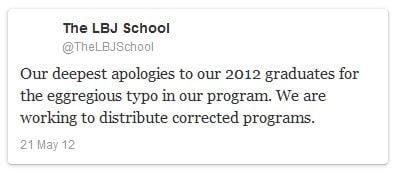
8) The one-two typo punch ...

First, the poster:

lbj_poster

Image credit: JimRomensko.com

Then, the apology tweet:

lbj_tweet

Image credit: The Chronicle of Higher Education

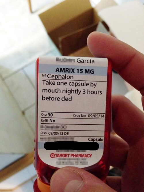
9) We wouldn't take one.

ded.jpeg

Image credit: Cheezburger

10) Did someone actually name their kid Sport?

Screen Shot 2017-06-20 at 4.14.04 PM.png

Image credit: Flickr

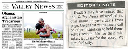
11) Well, at least they admit to their mistakes.

SpelMistk14

Image credit: Jazarah!

12) Did they edit this ad in a New York minute?

reebok_typo

Image credit: Engrish and Funny Typos

13) The ultimate silver lining.

find.png

Image credit: ViralNova

14) Apparently, floor cloth won him seven Tour de Frances.

Rugs.jpg

Image Credit: Slice

15) Is it proper grammar?

stella-artois-typo.jpg

Image Credit: The Huffington Post

16) We'd buy it.

brid.jpg

Image Credit: Pleated Jeans

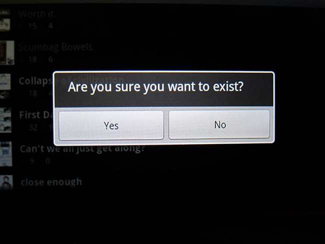
17) What would happen if you pressed no?

Exist.jpg

Image Credit: Pleated Jeans

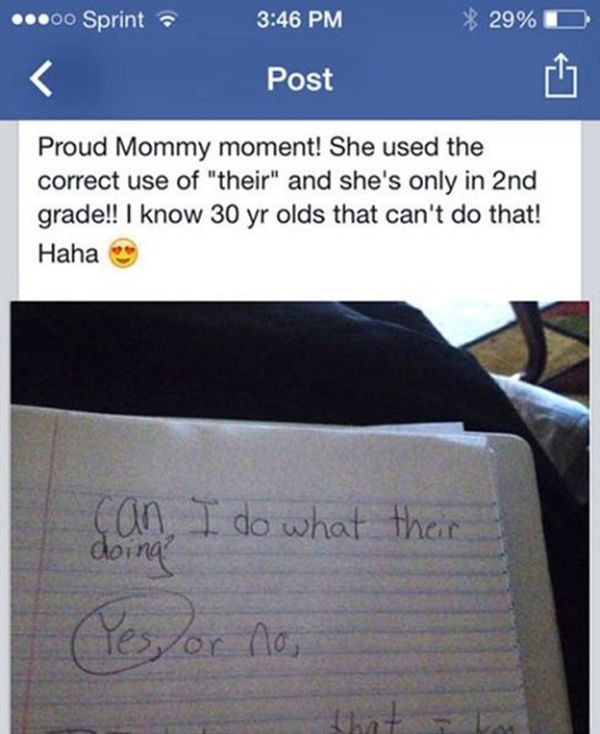
18) She doesn't know it yet, but she's talking about herself.

their.png

Image Credit: ViralNova

19) We hear he's a little dramatic under water.

scubadiva.jpg

Image Credit: Pleated Jeans

20) Throwback to Googing things.

Screen Shot 2017-06-20 at 4.11.37 PM.png

Image Credit: Flickr

What's the worst typo or grammtical error you've ever seen? Share your stories in the comments below!

Editor's Note: This post was originally published in June 2013 and has been updated for freshness, accuracy, and comprehensiveness.

master blogging - free hubspot academy class


free writing style guide


from HubSpot Marketing Blog https://blog.hubspot.com/marketing/14-worst-typos-ever