The success of your company depends on the performance of your sales funnel. No matter what product or service you offer, it can significantly contribute to getting qualified leads and driving more sales.
Fortunately, when it comes to optimization of your sales funnel, you don’t have to make drastic changes to see desired results. A few simple (yet smart and powerful) techniques that require minimal changes on your website can help you achieve conversion boosts.
Over the past few years, we have been successful in utilizing the proven SaaS funnel tweaks and have witnessed a notable increase in conversions.
In this article, we want to share those eight SaaS sales funnel tweaks that will optimize every part of your funnel. And as a reminder, it’s always important to test these changes for yourself. They helped our company, but it may not stretch across niches.
Top of the Funnel Tweaks
1. Use a Pre-Signup Form
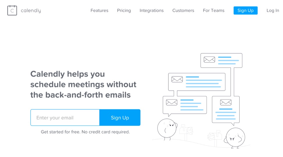
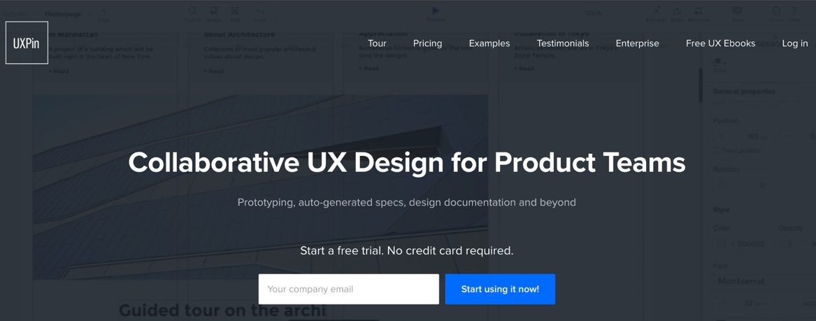
Are you using conventional signup buttons to get users to the registration form? If so, then it’s high time you consider a quick and easy option — a pre-signup form where a visitor just has to enter their email address and nothing else.
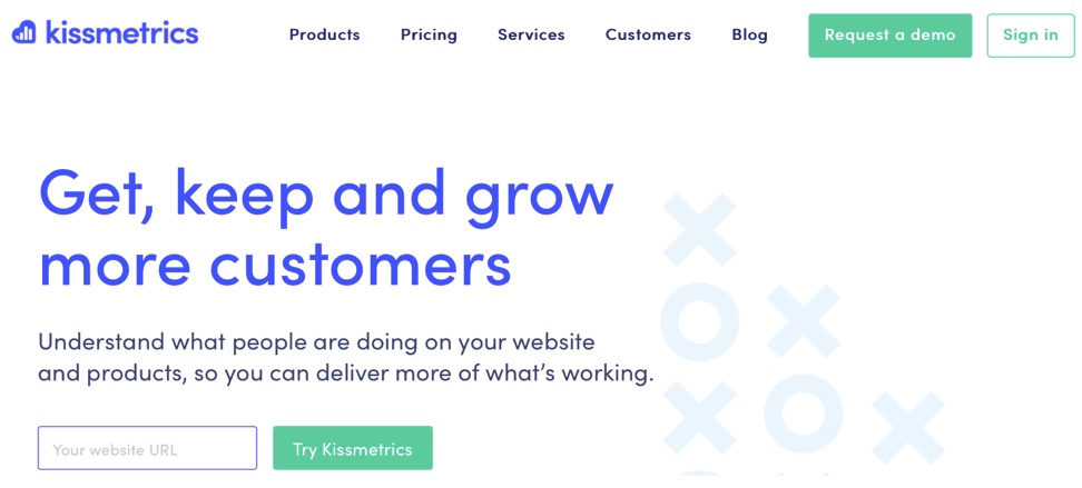
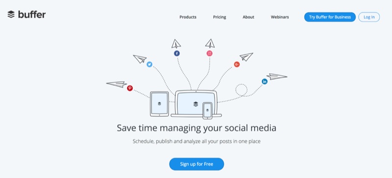
Here are some examples of companies using this strategy:
In some cases, you may want to ask for the most important information you need from users (which could also be their website URL) to get them interested. The idea is to get visitors’ contact information without making them go through a tedious registration process.
Once they have shared their information, you can direct them to a real registration page where their email address is pre-filled. If you need to qualify the leads, this is where you would do it.
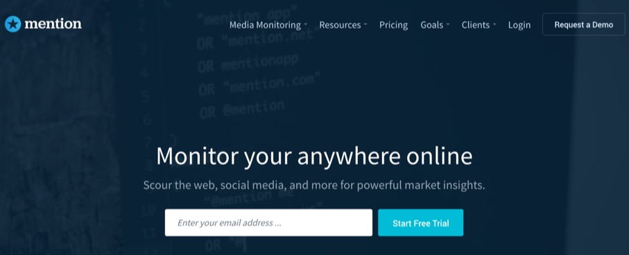
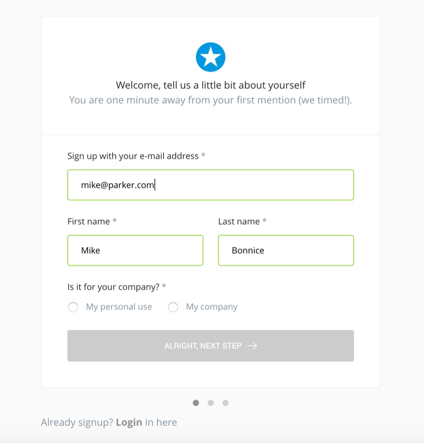
Here is the example from mention.com:
After you enter an email on the landing page and click the signup button, you get redirected to a registration page where your email is automatically prefilled. They take one more step and try to pull your real name (first and last name) from profiles on websites such as Google+, Linkedin and Gravatar.
Simplifying the registration process with a pre-signup form like this may improve conversions because users aren’t overwhelmed with a long registration form. Test out a shorter pre-signup form for yourself to see if it drives more leads.
2. A/B Test Content Hierarchies
We are already familiar with the importance of a/b testing headlines and other substantial elements, particularly those above the fold.
Here, we’d like to present you with a strategy we are using to effectively approach and get more familiar with users’ demands.
For example: if you are unsure whether your product is too expensive, or if you want to have a better grasp of how your potential users perceive the cost, you can avoid showing the price of your product/service on the homepage. We would recommend this for two reasons:
- It’s a common urge for users to gain a quick glimpse of the pricing even before exploring your service/product. So if you don’t offer freemium or if people have to pay a premium for your product, it’s best to create a separate pricing page and not put it on the homepage.
- If users navigate to the pricing page after gaining a better insight into your business value, they are more likely to convert. This is why it’s important to educate users about your product before they know your cost. In some cases, it’s better to make sure they learn about the product before they can even signup. These are known as conversion barriers, and while they may reduce conversions in the short term, over the long haul you’ll end up with better leads and possibly even better retention.
More importantly, this strategy will let you track the visitors who browse your pricing page. By looking at the heat maps and scroll and bounce rates, you’ll be able to run A/B tests that can improve conversions.
3. Use Remarketing Alongside Your Content Marketing
The heartbeat of any successful online business nowadays is content marketing, and SaaS companies are no exception. That’s why having a respected blog is incredibly useful when it comes to establishing your authority in your niche.
When starting out, it’s best to produce valuable content for readers that doesn’t promote your product. Once you have a few hundred posts under your belt, an audience, and some traffic, then you can write blog posts promoting your product. These can be new feature announcements, use cases, etc. As a general rule of thumb, you should write no more than one product-focused blog post for every five “regular” posts.
You’ll want to create content that tailors to your target audience. For example, if you have an SEO tool, you’ll want to have a blog that focuses heavily on SEO topics. You know that people coming to these posts are interested in SEO, and some of them may be interested in your product. This is where retargeting comes in. If someone views one or two of your blog posts, you can retarget them with ads for your product. You can even segment it by what your post is about and create ads relevant to those topics.
For example, if you had people visit a blog post about Penguin, you could retarget them with ads related to Penguin and your product. Perhaps something like “Make sure the next Penguin update doesn’t hurt your rankings.” You can then link to a landing page or your homepage. The key is to create product offerings relevant to the content you create.
4. Use Behavioral and Exit-Intent Popups
Try installing exit-intent popups based on visitors’ behavior. This way, you’ll be able to detect the visitors who are about to leave your website and possibly get them to stay.
For example, if users visit the pricing page, it means they at least have some interest in your tool. But if they decide to abandon the site at this point, it might also mean the product is too expensive or they are not yet fully convinced that your tool is right for them.
Using the right hook at the right page will ensure you capture the visitor’s email address. Later, you can follow up with drip campaigns based on their behavior as we discuss in the 5th funnel tweak.
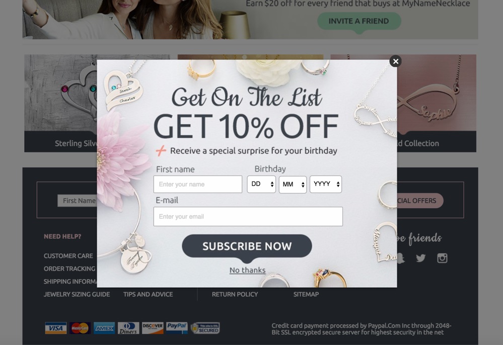
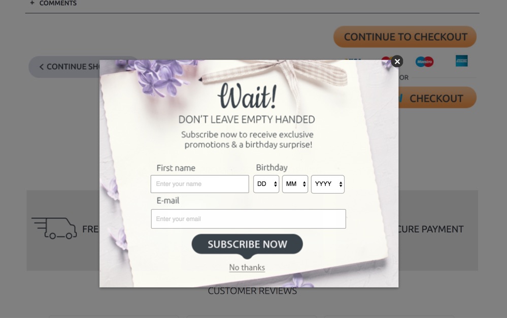
Here is an example from a website that sells personalized jewelry.
When you are about to abandon their website while browsing the products, they will offer you a birthday surprise:
If you try to leave during the checkout process, they will adapt the exit-intent popup:
They could improve this further and offer other options, such as free shipping.
Since you have a lead who has shown some interest in your tool, now it is in your best interest to persuade and make sure they are going to take the next step.
Middle of the Funnel
5. Create Separate Auto-Responder Campaigns Based on User Stage
Before implementing an email campaign, you should first decide the critical stages your users will be moving through before they are ready to use your SaaS app. What kind of product education do they need? What qualifications should they have? How will they know if they’re a good fit for your product? Your drip campaign can help them answer some of these questions.
Secondly, you should segment your users depending on the last stage they completed in your funnel — this could be leaving a lead, completing the registration page, configuring the app, opening an email, subscribing to a service, etc.
Usually, we can split those stages into the following sections:
- Lead sign up – Users enter their email on the landing page
- Registration – Users complete the basic registration (password and other mandatory fields)
- Basic configuration – Users complete a basic service configuration (for example, integration with major services like Google or Facebook to get the most essential data so that the service can start working)
Then, depending on their completion stage, you can target them with appropriate marketing messages through email or remarketing.
For instance, a user might get to the registration page, but might not be prepared to complete it. That’s where you can use a separate autoresponder campaign to convince them to take the next step and complete the registration. You could show them a real-life case of problem-solution or present them with an appealing reward if they complete the registration process. Maybe something like, “signup now and get 10 more free trial days”.
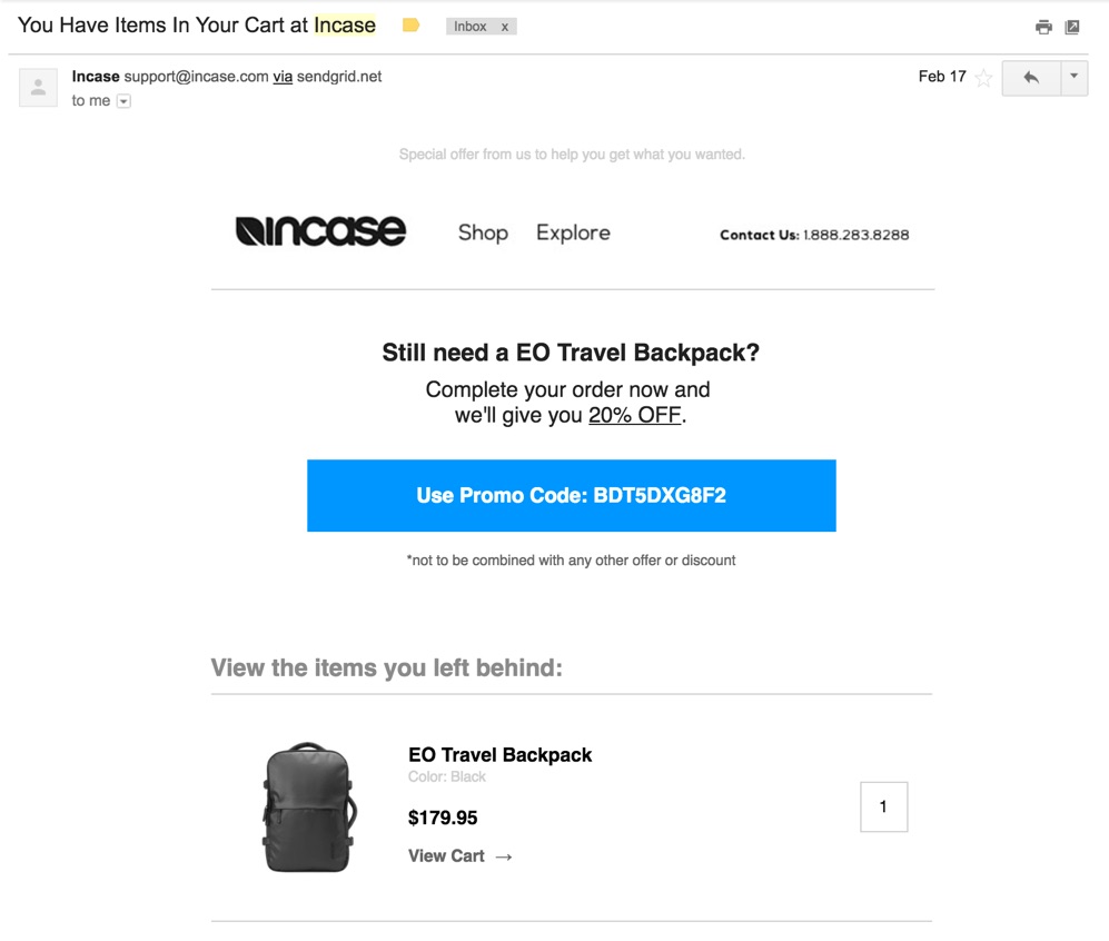
A good example here could also be a cart abandonment email from Incase. I wanted to buy a backpack, but I haven’t completed the checkout, so after a few days they sent me a special offer with a 20% discount:
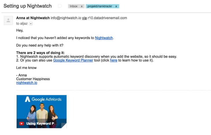
An example for SaaS businesses could be this follow-up email that comes after a user creates an account and doesn’t complete the onboarding process:
Try to focus on moving the user one step forward with your drip campaigns. Also, don’t expect your visitors to complete the onboarding process at one go. Depending on the product, it can take some time to get completely set up. Analytics tools, for example, often need the help of a developer and require more extensive setup. In those cases, it can take weeks to months to be fully set up. A more personal tool like Dropbox, on the other hand, has a shorter onboarding time and doesn’t require much work.
Expecting too much effort and time when your user is not yet fully convinced can damage your long-term retention by turning them off. As a result, you risk losing users even before they understand your product’s value.
6. Offer a Free Trial Only If a Visitor Doesn’t Subscribe to Your Service
Many SaaS services offer free trials. The idea here is to attract users to try your tool or service without requiring a credit card, which is great and works to a large extent.
However, sometimes free trials might backfire too.
How?
Since you are not asking users to make a commitment for testing the service, they might take advantage of your offer without a real need. However, if you ask for their payment info before a free trial, only seriously interested visitors will come forward to try them. It’s important to note (and tell users) that you aren’t charging their card, but it will be all set and ready to go if they choose to upgrade to a paying plan. This reduces a hurdle when their trial is over.
Now you might ask: what if we lose a genuinely interested visitor who likes to check out the tool before sharing the payment details?
A valid question. Here’s how we tackled it.
When a user doesn’t enter the payment info and thus doesn’t start the trial to our service, we send him/her a follow-up email two or three days later, stating that the free trial was activated without the payment info.
Basically, you are just allowing the user to wait for a couple of days and then use a free trial.
In the subscription activation email, you can say something like, “We require payment details because we only want users who are interested in trying our product. But sometimes we make exceptions. If you would still like to test our tool click here to activate your free trial.”
This way, you allow the user to try the tool without going through the whole setup again. And it’s a pleasant surprise for users.
However, this solution largely depends on the context and the problem that your SaaS is tackling. So it is best to test it yourself.
7. Send Summary Reports
Especially during the trial period, it can be beneficial to send summary reports to users. This report should showcase the results and findings of your tool.
For example, the summary report of an SEO tool can include keywords for which your website is ranked, which competitors rank for those keywords, and so on.
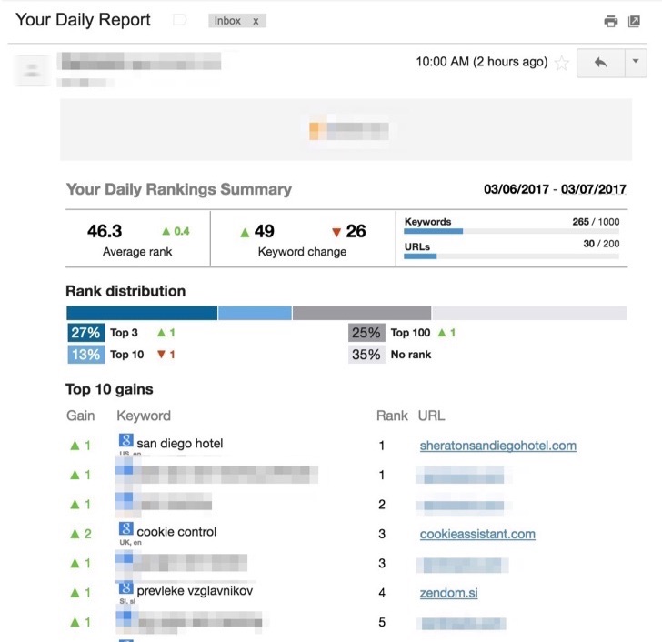
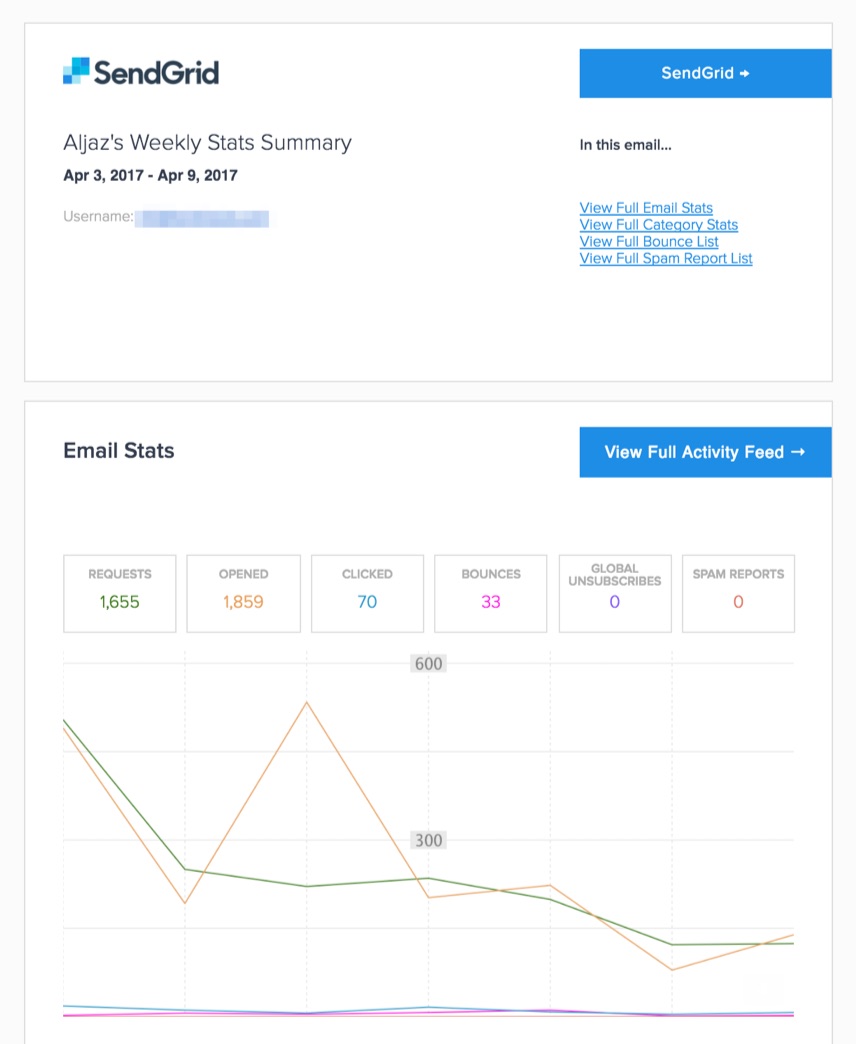
Here is a summary email of a transactional email service, which shows the most relevant statistics for user interactions with the email we’ve sent in the previous week:
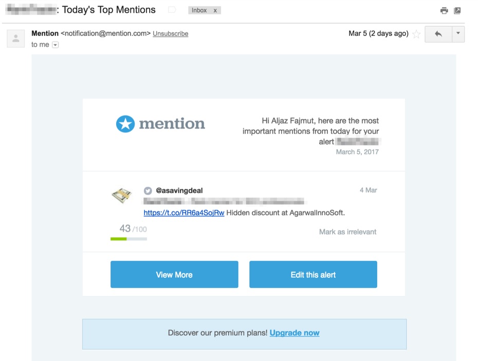
This report email informs us of daily mentions of our brand on social media websites:
Kissmetrics sends an email updating the user on the five metrics most important to them:
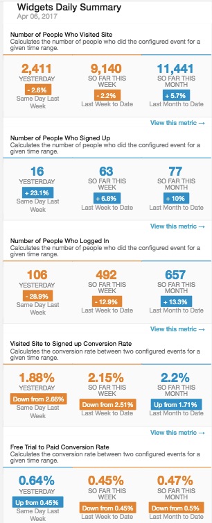
Show them the exact figures and statistics so users understand the real value of your tool and get reminded that the service is doing beneficial work for them.
Your summary reports will prove the perceived value of your tool to the users and help establish a better relationship with them.
Just remember to send them out wisely. You should set the timeframe after understanding your audience and their background motivations. Don’t send them too often. Shoot them the right information at the right time and frequency. Daily is probably too often — most companies stick to a weekly report. If you can let users choose how often they’d like to receive your reports, that may be an even better option.
Bottom of the Funnel
8. Consider Support Chat Widgets
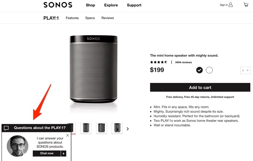
Lately, many sites have been employing “chat support” services. They pop up as soon as the visitor enters the website. Here’s an example from Sonos, which appears on product pages and pops up after about five seconds of inactivity:
This interaction seems to be great, but do not trick yourself into believing that they are always going to help you.
In some cases, they can be beneficial, especially for companies that are in early stages and are still exploring the right way to present their product to the users.
In those cases, chat widgets can be tremendously beneficial to discover the most efficient ways to present your product to your target audience. You can connect with your users directly and ask them about their motivation for using your service and concerns and problems they might be facing. Later, you can use this information for marketing purposes.
But in others, they might be a burden for your support team because of a lack of proper documentation and tutorials about your service, or sometimes even because of lazy users who might end up wasting your team’s precious time.
Alternatively, we recommend using the ‘Chat Support’ within the tool itself so that only committed users will benefit.
That said, this is a call you should take entirely based on your business model.
You spend time with only serious and qualified leads. You can also hear the good and bad of your product/service directly from the user. It gives you the chance to improvise your offerings on a regular basis.
Final Thoughts
Remember, a happy user won’t hesitate to pay for your tool/service if it simplifies their business process, saves time, and contributes to their ROI. Moreover, rest assured a great user experience and word of mouth also attracts more leads, which boosts conversion rates of your funnel in a significant way.
Try implementing these tweaks and let us know the results and your insights on this journey.
We would love to hear from you. Share the article and tell us what you think in comments below!
About the Author: Aljaz Fajmut is a web analytics and growth enthusiast, serial entrepreneur, and the founder of Nightwatch, a search visibility tracker of the next generation. Follow him on Twitter @aljazfajmut.
from The Kissmetrics Marketing Blog https://blog.kissmetrics.com/8-saas-funnel-tweaks/

No comments:
Post a Comment