When it comes to creating behaviorally-targeted marketing emails, we could all use a little inspiration.
After all, there are so many potential actions a customer can take that would trigger an email – how do you decide which ones are worth investing the time to create? Below are some of our favorite examples from brands across a wide range of industries. In addition to the examples, you’ll also get invaluable tips on what makes them so appealing to the customer. Read on for all the details.
Onboarding Email Examples
Airbnb
Runkeeper
Kissmetrics
Asana
Cart Abandonment Email Examples
Pinterest
Chewy
Adidas
Upsell Email Examples
Men’s Health
Women’s Health
Dropbox
Spotify
Harry’s
Follow-up Email Examples
MeetEdgar
Airbnb
OptinMonster
Kickstarter
Pinterest
Codecademy
Bodybuilding.com
Upwork
Notification Email Examples
Slack
Redfin
Spotify
Netflix
Quora
Facebook
Trial Ended Email Examples
Avocode
Kissmetrics
Shopify
Onboarding Email Example
Onboarding is the process of getting a user or customer acclimated to your brand and product. Although it’s most often used in human resources departments to get an employee up to speed on company culture and processes, it can also be used in email marketing to help prospects become more comfortable with your product or service and more receptive to an offer.
Airbnb
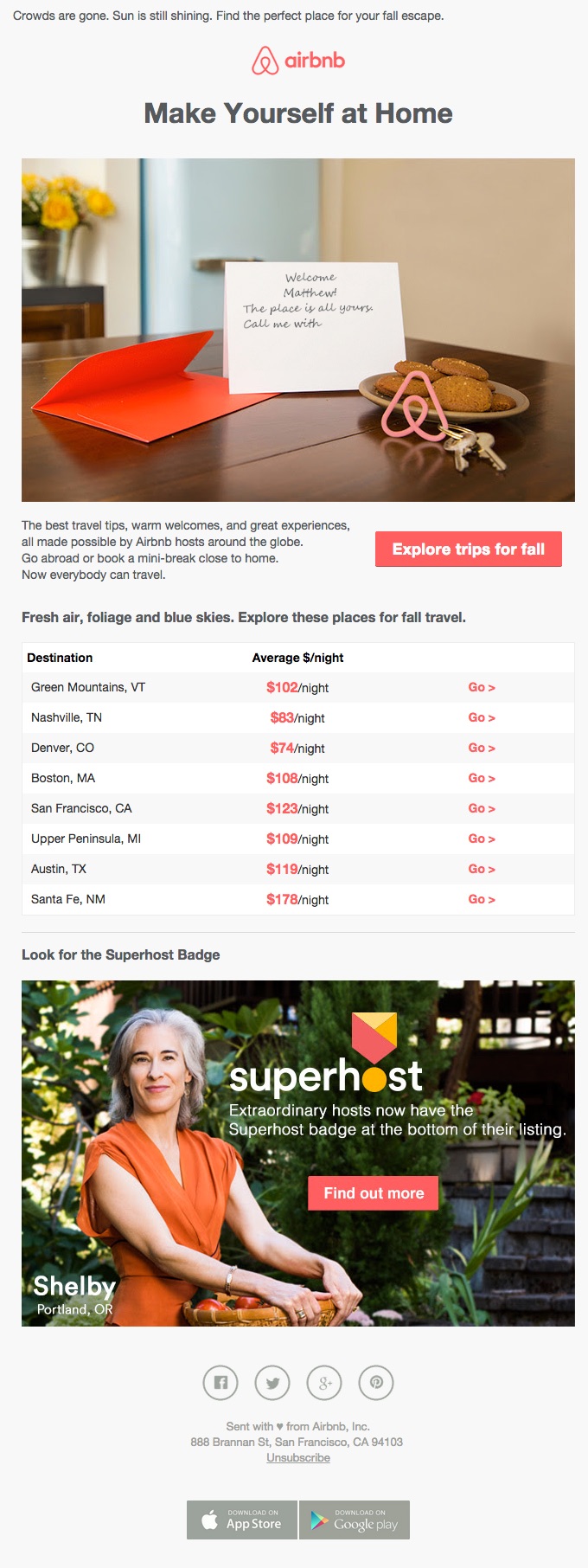
Airbnb immediately tickles your travel fancy by showing you the average rate of places in a variety of cities that are perfect to visit in the fall. Whether you love the foliage of Vermont or the azure skies of New Mexico, you’ll be tempted to start clicking right away.
This is a great way for Airbnb and its hosts to make extra money during typical travel downtime. Since the summer rush is over, homeowners in popular areas may be looking for ways to keep up their earnings in the off-season. This onboarding email welcomes clicks with open arms while appealing to customers who want to avoid the summer crowds. The SuperHost mention also helps newcomers know what to look for when choosing a place, so they feel safer and more secure in their decision.
Runkeeper
Runkeeper is an app that helps you track and save your runs and other physical activity. But if you haven’t used the app or a fitness tracking device before, where do you start? Many people never take the time to start an activity even if they have the tools because getting started can be confusing and challenging.
RunKeeper’s onboarding email helps take all of the mystery out of logging fitness activities with this step-by-step example. Whether you decide to track and save your runs through the website or through the app, these simple instructions and the large call to action button will help make the process much simpler and easier to understand.
Kissmetrics
As an analytics and engagement platform, Kissmetrics requires a pretty extensive setup process – which makes onboarding crucial. There are a number of steps a user has to go through before they can really start using Kissmetrics and getting the full value out of it. The first step is installing the JavaScript. After a user does that, they receive this email:
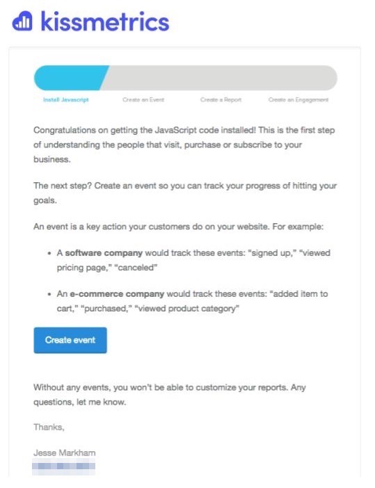
They also include the progress bar, to see how far along they are in completing onboarding as well as the next steps they need to take.
Asana
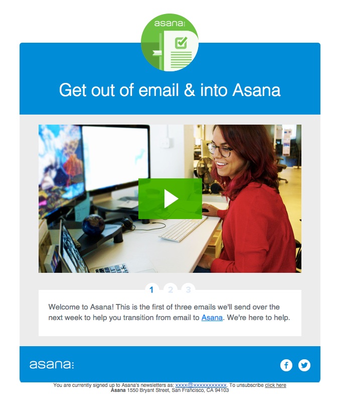
Asana makes it clear how many emails the new will receive, and the CTA is unmissable – just click the Play button to get started.
Cart Abandonment Email Examples
Cart abandonment reminders are one of the most common types of behaviorally targeted emails. But that doesn’t mean they have to be bland or canned-sounding responses. Check out what these companies have done to make their cart abandonment emails more enticing to the recipients:
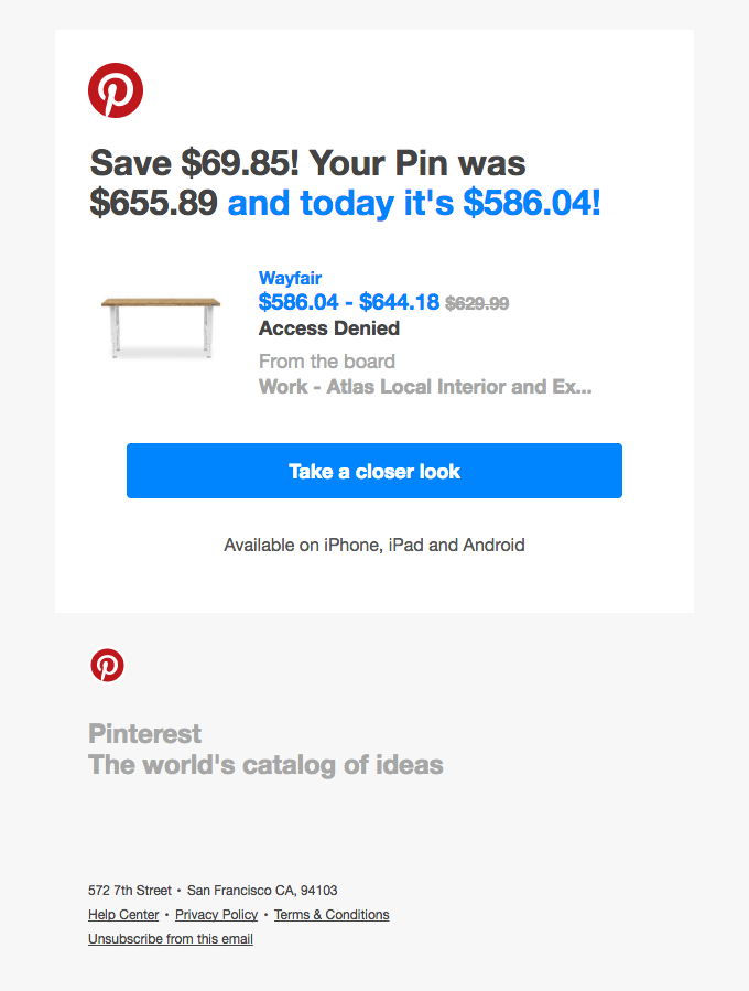
Pinterest always does a good job with their emails and this one is no exception. If you’ve pinned an item that’s for sale, but you ultimately don’t purchase it, Pinterest will notify you not only to remind you of the item, but when the price is lowered on it as well. So not only does the user get a reminder that one of their for-sale pinned items is still available, but that they can also get it at a discount — a win-win in the customer’s eyes!
Chewy
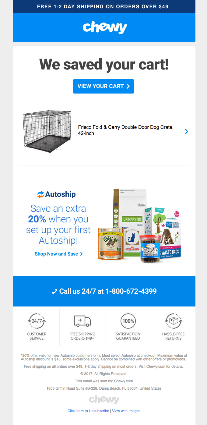
Sometimes the simplest, most direct emails are the best — and Chewy.com demonstrates this perfectly with their saved cart emails. Not only do they give you one-click access to view your cart, but also let you know how you can save by enabling autoship.
They further help seal the deal with mentions of free shipping when you spend a certain amount, 24/7 customer service, easy returns and a satisfaction guarantee. And should the user have any questions, there’s a fully staffed customer service toll free number ready to lend a paw.
Adidas
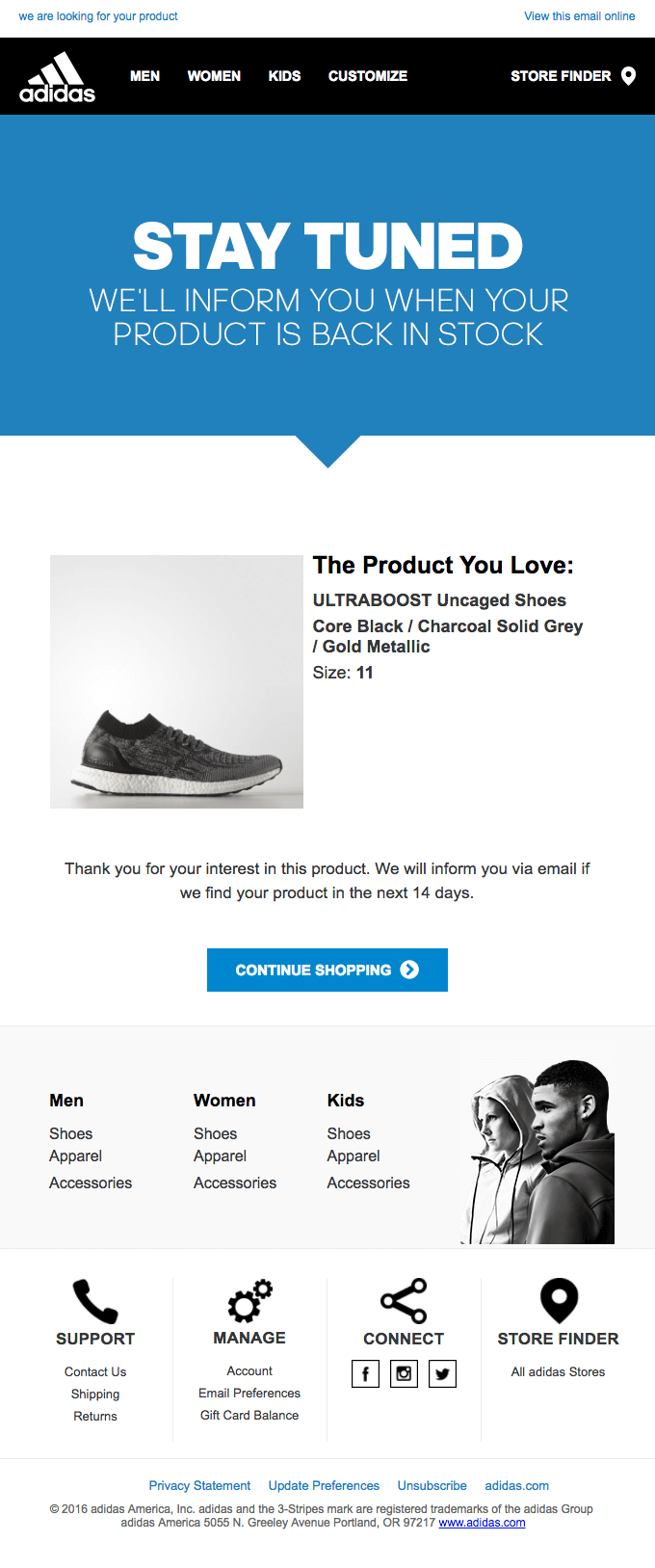
Adidas has a unique spin on how they handle their shopping cart. Rather than leaving you empty handed when the item you’re looking at is out of stock or otherwise unavailable, they’ll send you an order update when the item is back in stock. You can then choose to continue shopping or browsing. But rather than keep you waiting forever, this email notification only updates you if the item is found within two weeks.
Upsell Email Examples
But wait, there’s more! Upsell emails are designed to make you an irresistible offer. These brands have learned that the more enticing the upsell, the more likely you’ll want to take advantage of it. Each one of these brands has approached it in their own unique way, however, that fits in perfectly with their end conversion goals.
Men’s Health
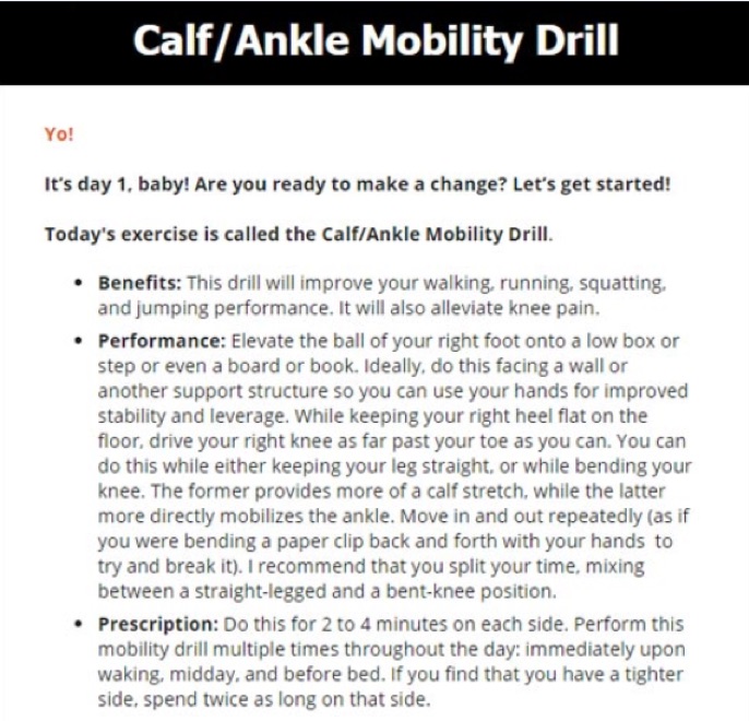
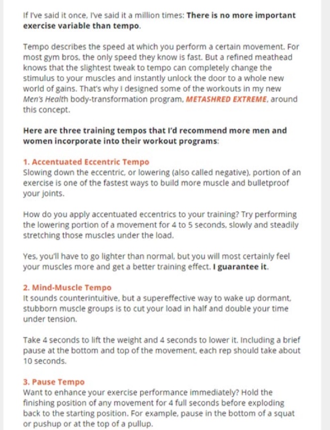
This email comes from a Men’s Health online program called MetaShred. It’s a free day-by-day workout plan delivered by email. This email, sent on day 1, showcases not just the steps to take, but why you should do them. Each day a new muscle group exercise is sent via email, so the user is never left feeling bored or uninspired.
On the last day of the free workout plan, an upsell to MetaShred Extreme is provided. But rather than the focus being all about the paid program, the author of the course still focuses on providing value through tips and suggestions:
The free offer is essentially designed to give readers a taste of what the Extreme version is like — without the hard sell on the paid version. Every email is all about delivering value, which in turn makes users more comfortable with taking them up on the offer to the more extreme version after they’ve seen results from a week of following the free plan. In the reader’s mind, if this is what the free version is like, the paid one must be even better!
Women’s Health
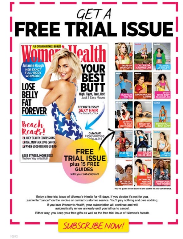
Women’s Health magazine follows a more visually oriented approach – tempting users with a free issue first and foremost, along with a whopping 15 different guides on everything from eating better to better sex. When you load the free offer with other items of similar value, and no obligation to continue, people will often take the initiative to try things out — if only just to get the freebies.
However, what often happens is that the advice is helpful to the point where they’d like to continue receiving the magazine and learning even more tips — which in turn opens up the opportunity for even more upsells in the future.
Dropbox
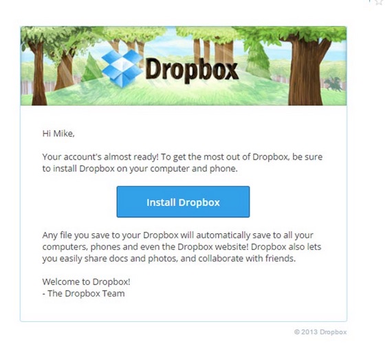
This list would be remissed if it didn’t include a collection of emails from everyone’s favorite online storage service. And Dropbox doesn’t disappoint. When you first sign up, you’re encouraged to download the Dropbox app on your phone and computer:
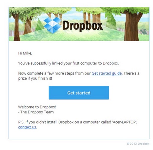
But that’s only the beginning. Once you install Dropbox, you’re given the next step:
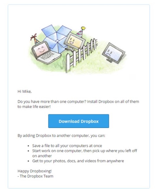
The user can continue following the guided tour online, but even after finishing the setup process, Dropbox still nudges the user to install it on multiple computers – without being intrusive:
As the user continues to work with the program, Dropbox will periodically send emails offering more space — either by referring friends, upgrading to the Business suite and so on. It only does this if the user’s existing Dropbox space is getting a little cramped, so these perfectly timed emails represent the perfect opportunity to gently guide the user from free to paid status.
Spotify
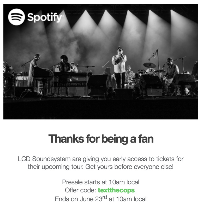
While Spotify receives the majority of their revenue from user subscriptions, they have another revenue channel – merchandise and concert sales. If you listen to any specific artist enough, you’ll receive offers when the artist goes on tour.
These emails are behaviorally triggered because the user listens to a particular artist and receives an email based on their listening history. This makes them very targeted as well.
Harry’s
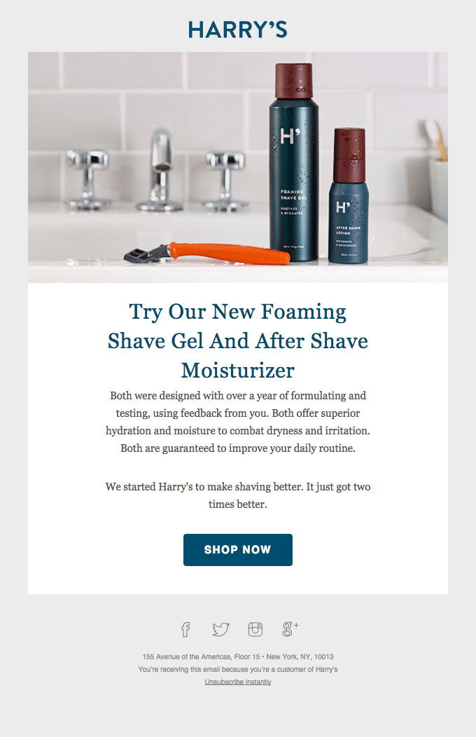
Harry’s, the shaving company competing with Dollar Shave Club, sends this upsell email to customers.
Since Harry’s sells shaving products, this foaming gel is relevant to 100% of their customer base. So when they release a new shaving product, they can email their entire customer base and know there will be interest. Or, to behaviorally target them, they can be sent to customers who recently purchased, or may have purchased a shaver without a shave gel.
Follow-up Email Examples
Not quite a cart abandonment email, but not quite an onboarding email, follow-ups fall somewhere in between — often teaching the user a new tip or trick to getting the most out of their favorite services. These can be sent to users who have signed up but not completed the process, requested an invitation but not followed through, or who simply haven’t logged in for awhile.
MeetEdgar
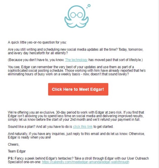
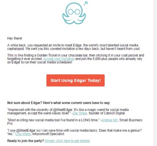
MeetEdgar is a social media management and integration suite, and they start off their onboarding process after you sign up by asking you a simple yes or no question about how you currently manage your social media updates. They follow up by letting you know how much Edgar will simplify your social media management, and the large call to action button makes it plain to see precisely which action they want you to take.
If you don’t respond, however, they follow up with another email – encouraging you to accept the invitation to “MeetEdgar” and then sprinkling in a few testimonials sharing how Edgar has helped others:
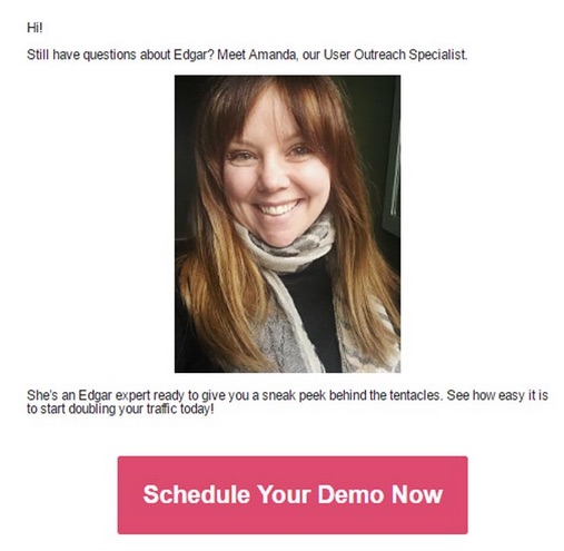
If that still doesn’t encourage you, they decide to switch tactics a bit, and focus less on you meeting a digital cephalopod and more of you meeting and working with a human being:
With your Outreach Specialist, you can then schedule a demo to see how the platform works. Further follow-up emails invite you to participate in a Getting Started webinar, and so on — demonstrating that Edgar has his tentacles in a wide variety of channels to make users feel more comfortable and empowered in how they manage social media.
Airbnb
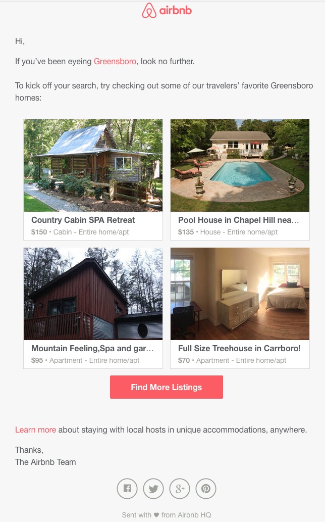
Been looking at a specific location on Airbnb? Expect to receive an email with top destinations at that location:
These types of retargeting emails will only work if you’re an Airbnb user and logged in while browsing those locations. Amazon sends similar emails when they email you about items that are similar to the ones you’ve been shopping for.
OptinMonster
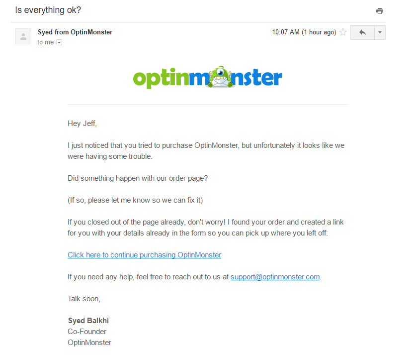
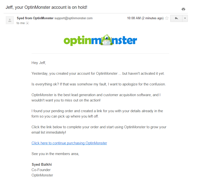
This optin plugin has a very clever set of follow-up emails that bank on urgency to encourage the user to take action. The first is a simple check-in with the subject line – “is everything ok?”
This follow-up email is a hybrid — it looks like an order fulfillment “oops!” at first glance, but mingles in elements of a typical abandoned cart message as well. If you don’t follow through with your purchase, however, things turn a bit more concerning:
This type of “one on one approach” — that “I found your order” and that “your account is on hold” may be enough to spur action, but unlike other emails in the onboarding collection you’ll find here, there’s no compelling reason to want to continue with the order process. Where are the user testimonials? The demo or getting started video?
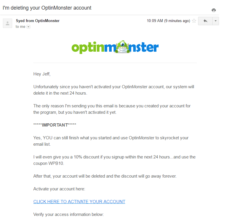
This should serve as a reminder that urgency alone isn’t often enough to seal the deal – even if it’s targeted by a customer’s behavior. OptinMonster makes another last ditch attempt with another compelling subject line:
“I’m deleting your account” sounds pretty harsh.The open rates on this email might be decent, but one has to wonder if this sense of “your account will be gone forever…but it can still be saved!” is a bit too dramatic. Remember, you catch more flies with honey than vinegar.
This set of follow-up emails was included in this list as it may be the right angle for some services. However, I’d suggest that if you are creating a follow-up sequence, to try out the Edgar approach over the OptinMonster one, as I personally wouldn’t be inclined to take any action if there was a risk of my account being deleted – even if it is a bluff.
Kickstarter
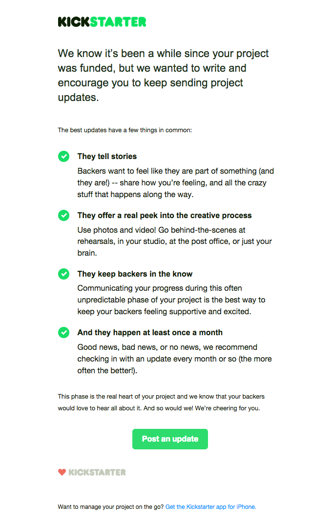
Kickstarter is great for getting funding for projects and ideas – but what happens after your idea is funded? To avoid people using the system once and leaving, Kickstarter sends this follow-up email when a user’s project is successfully funded. It not only provides tips and insights into what makes a successfully-funded project really shine, but also how to keep project backers in-the-loop.
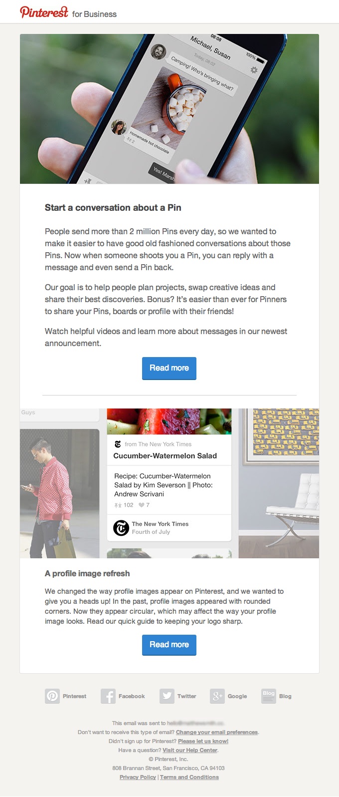
Pinterest’s emails are always a treat for the eyes, and the marketing brain. Here, they encourage users to follow up by starting a conversation around a pin (or sending one back). Many people who use Pinterest for the first time primarily use it to save pins to their pinboard for future inspiration. But there are many more uses for Pinterest, and this follow-up email encourages users to get back into the action and start conversations around their favorite pins.
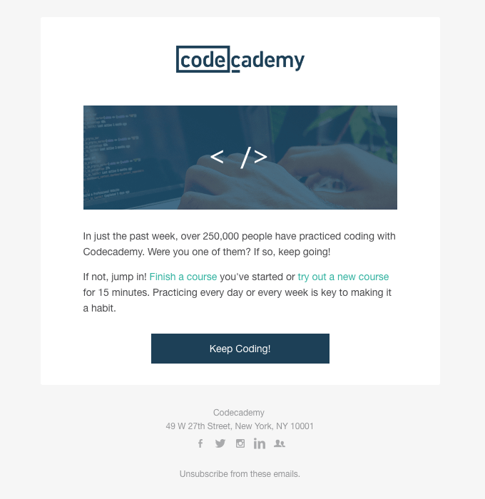
Codecademy
SaaS companies need their users to login and use the product. If they aren’t logging in, they aren’t using the product. And if they aren’t using the product, they aren’t getting value out of it, which means churn is inevitable.
Here’s the email Codecademy sends when a user stops logging in and taking a course:
This email encourages the user to “join the crowd” and keep coding.
Bodybuilding.com
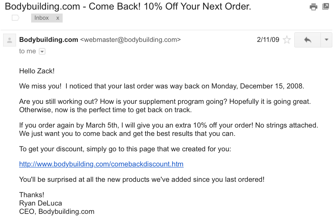
As an e-commerce company, bodybuilding.com sends their customers emails if they haven’t ordered in a couple months:
While this email seems like it’s coming from the CEO, it’s actually triggered after their system sees that the customer hasn’t re-ordered.
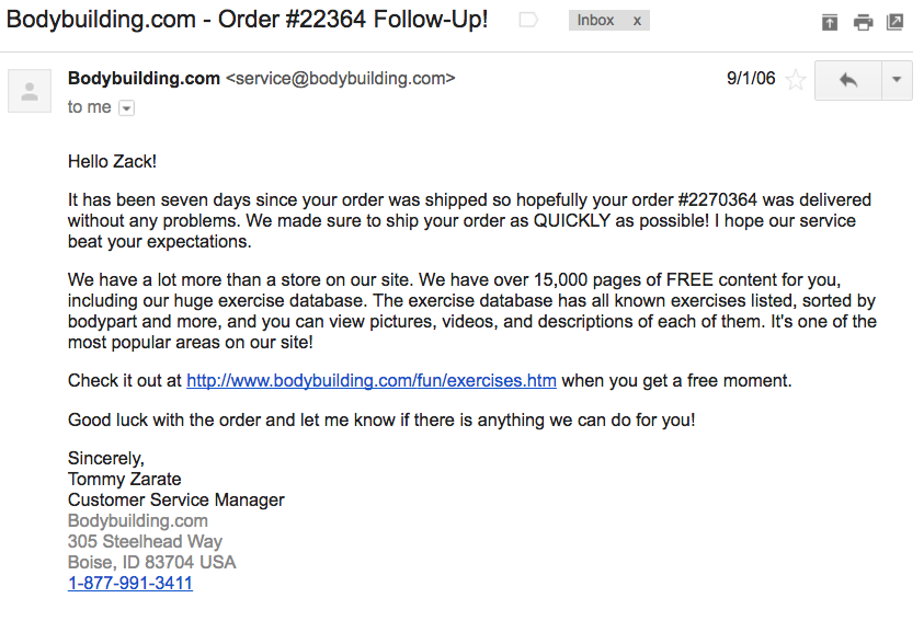
Before that email is sent, they send a follow-up email to get the customer re-engaged with the content area of their site:
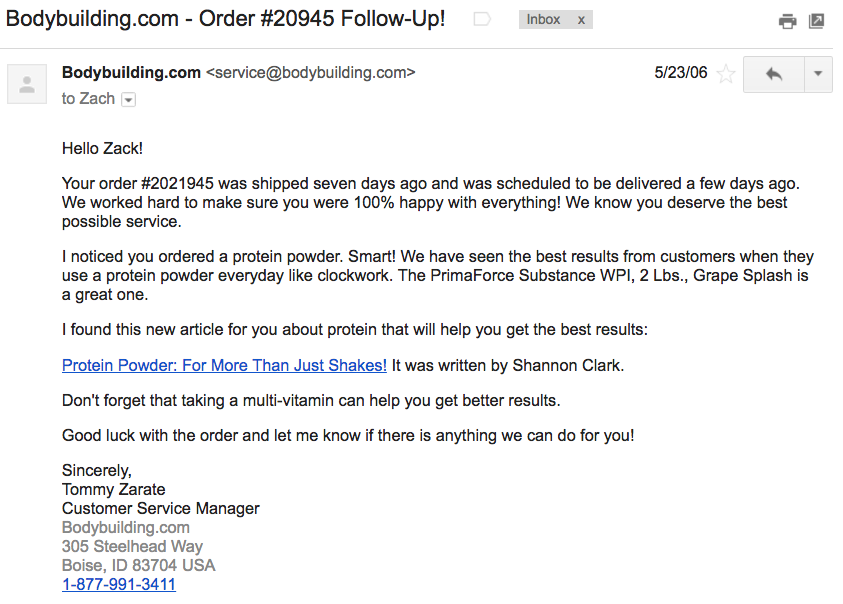
In some cases, they’ll point people a specific article that is related to their purchase:
These customer service emails are great because they let the customer know that they care about their order, makes it easy to email them, and keeps them engaged with the company.
Upwork
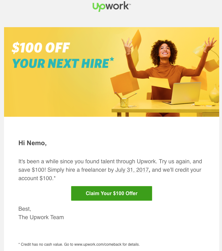
Freelance marketplace Upwork (formerly known as oDesk) sends an email to users after they stop using the services for a few months.
The subject line for this email was, “Save $100 when you come back to Upwork”. $100 in free work may seem like a lot, but it can be enough to entice an abandoned user to come back and try the service, and they may end up spending more that it makes up for the cost that Upwork has to expend up front.
Notification Email Examples
These emails are sent as a result of inactivity or simply when new things happen and the user hasn’t been seen it yet. These emails serve to alert your users of important activities going on in your app or store.
Slack
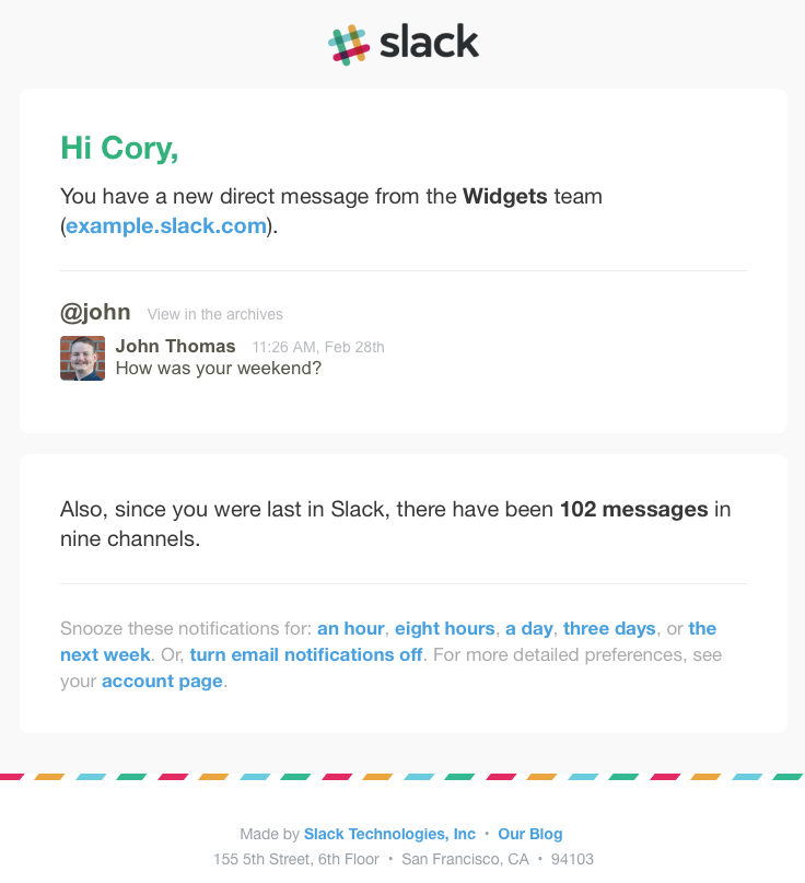
If you’re a Slack user, you’ve undoubtedly received the email notification when someone sends you a message that you haven’t read.
These sort of “inactivity” emails are a very common triggered email. They’re similar to an e-commerce sending emails to customers who haven’t ordered in a while, or have abandoned their cart.
Redfin
Looking to buy a home? If you use Redfin and are looking in a specific area, Redfin will send you a monthly “market report” that contains all the market details for the area that you’re looking at.
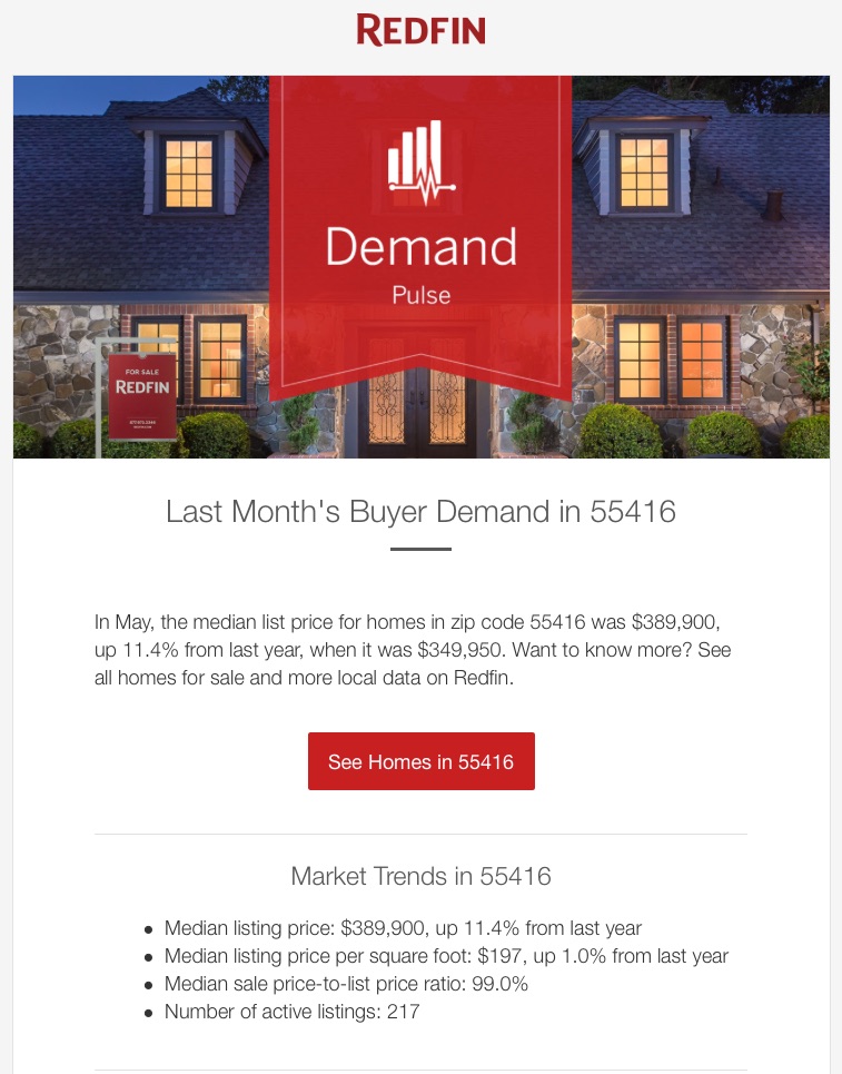
They’ll also send you emails when new homes are available in the area you’ve been searching.
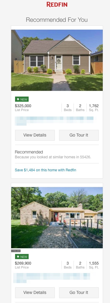
What’s great about this email is the format and CTAs. You have two options – view more details or go straight to scheduling a tour.
Spotify
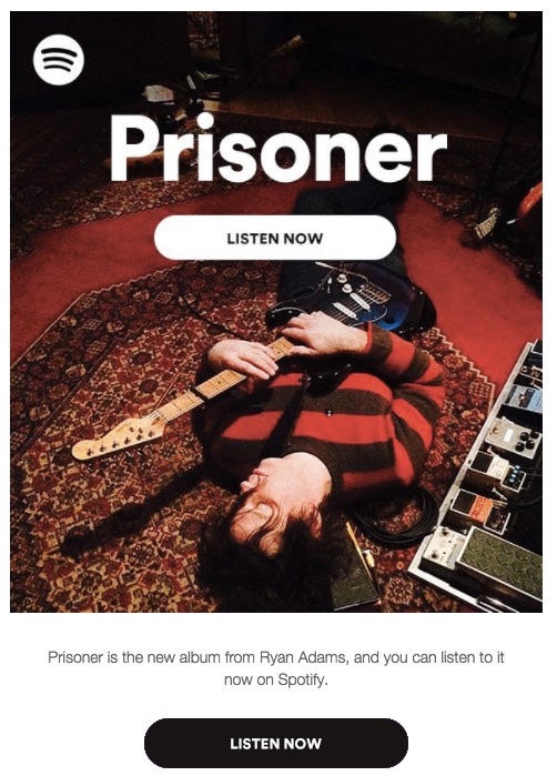
For Spotify, a listening user is an engaged user. If they’re listening, they’re engaged and getting value out of the product. And part of staying engaged is listening to new music from their favorite artists. So when Spotify knows your most-listened to artists, they’ll send you an email when they release new music.
The CTA “Listen Now” takes you straight to listening to the new album.
Netflix
Much like Spotify, Netflix will send you an email when a show you’ve been watching releases a new season.

They’ll also send a “suggested” show based on your viewing history and rating.
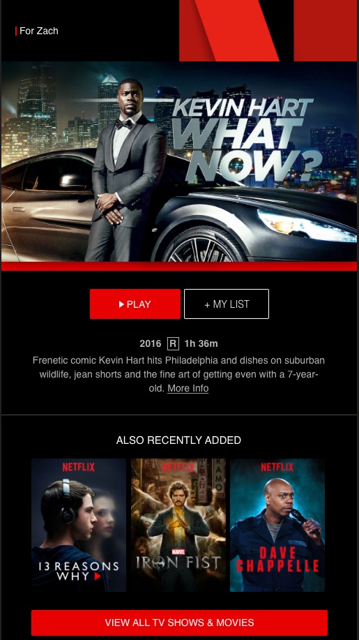
And if you’re not interested in the new suggested show, they have popular options that just dropped.
Quora
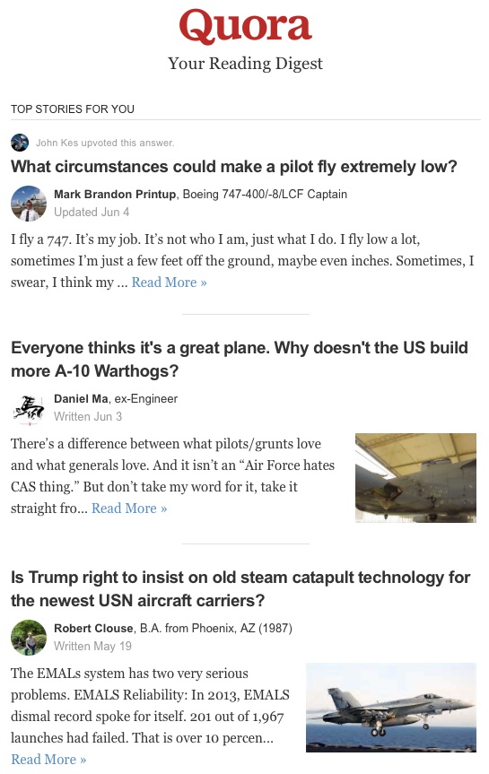
Quora wants most or all of their users to be registered. And there’s a reason for this – they want to know who you are, what you’re reading, so they can send you emails with new threads that are relevant to your interests. If you’ve been reading about airplanes or have it as a topic of interest, they’ll send you emails to new threads, threads with new answers, or threads you haven’t read yet.
And this goes for all topics – it isn’t just airplanes. They may also send you more popular threads that may not be a topic of interest to you, but nevertheless get you to open the email and click through to the app or website.
Been out of Facebook for a while? Prepare for a barrage of notifications and emails telling you what you’ve been missing. Facebook will do everything short of sending Mark Zuckerberg to knock on your door and ask you to log back in.
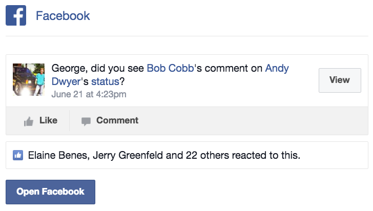
These notifications, while annoying, often work for a company like Facebook. They exploit the fear of missing out in people, which causes them to log back and start using Facebook and being a part of the community once again.
Trial Ended Email Examples
Goodbye doesn’t have to mean forever – and these example behaviorally-targeted emails perfectly demonstrate that although the free trial is over, the really good stuff is just getting started.
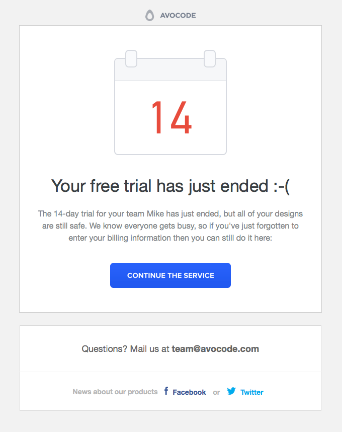
Avocode
If you design layouts regularly in Adobe Photoshop and want to convert them to an app format, Avocode is an intuitive way to do just that. But if your trial ends, does that mean all your designs are gone too? Fortunately, that isn’t the case. After your trial ends at Avocode, you’re encouraged to continue the service and reinstate access to your designs by simply entering your billing information.
Kissmetrics
Kissmetrics’ email focuses on what the user will get if they don’t upgrade the plan.
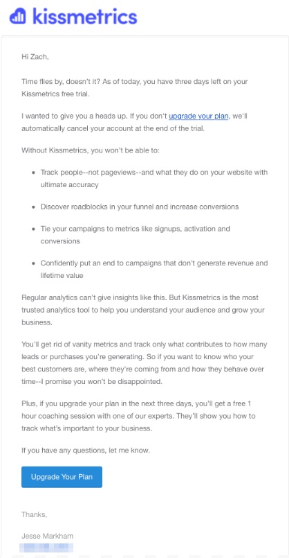
The two CTAs make it clear what the next step is – upgrading the plan so they can keep using the analytics & engagement platform.
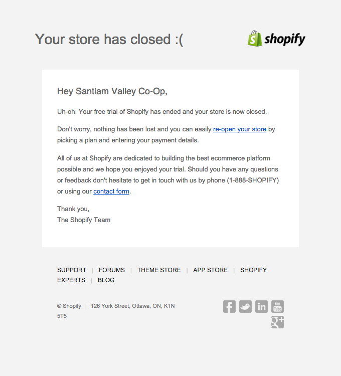
Shopify
Much like Avocode, online store platform Shopify follows a similar tactic in letting users know that their free trial store is closed, but that it’s easy to reopen and get back to selling as long as you enter your billing details and pick your plan. Should the user have any questions, a toll free number or online contact form are available within a single click to help.
With both of these trial ended options, the user’s data is kept intact at all times, and they only need to enter billing details to get back up and running. This is an excellent strategy not only for helping build customer goodwill and retention, but also one that demonstrates the company’s service in a way helps build trust and credibility.
Getting Started with Behaviorally Targeted Emails
By now you should be bursting at the seams with new ideas for your behaviorally targeted emails. But how do you get started?
Kissmetrics Campaigns is a great way to start creating behavior-based emails and improving customer engagement while increasing retention rates and lessening churn. Learn more about Kissmetrics Campaigns by watching the video below:
And if you’re already using behaviorally targeted emails in your campaigns, tell us about it! Have you used any of the methods or strategies shown here in your own campaigns? How did they work out for you? We’d love to hear about your triumphs and success stories, so be sure to share them in the comments below!
About the Authors:
Sherice Jacob helps business owners improve website design and increase conversion rates through compelling copywriting, user-friendly design and smart analytics analysis. Learn more at iElectrify.com and download your free web copy tune-up and conversion checklist today!
Zach Bulygo (Twitter) is the Blog Manager for Kissmetrics.
from The Kissmetrics Marketing Blog https://blog.kissmetrics.com/behaviorally-targeted-emails-examples/

No comments:
Post a Comment