When potential customers are researching you online, they're getting to know you by way of the content of your website. Understandably, many of them might be skeptical or hesitant to trust you right away.
To prove the value of what you have to offer, why not let your happy customers do the talking?
Your testimonial page serves as a platform to show off how others have benefited from your product or service, making it a powerful tool for establishing trust and encouraging potential buyers to take action. Plus, having a testimonial page serves as yet another indexed page on your website containing content covering product features, pain points, and keywords you're trying to rank for.
Read on for a closer look at what makes a great testimonial.
What Is a Testimonial?
First, let's have a little vocabulary lesson. Google's dictionary definition of testimonial is "a formal statement testifying to someone's character and qualifications." In the realm of marketing, that usually comes from clients, colleagues, or peers who have benefitted from or experienced success as a result of the work you did for them.
But effective testimonials go beyond a simple quote that proclaims your greatness. They need to resonate with your targeted audience, and the people who could also potentially benefit from the work you do in the future. That's why great testimonials also tell a story -- one that inspires and motivates the people reading it.
What does that look like in practice? Check out the examples below to find your own inspiration, to help you start building a great testimonial page today.
9 Examples of Awesome Testimonial Pages
1) Codecademy
Codecademy has nailed down the testimonials section of their website, which they call "Codecademy Stories." They've even included a few customer quotes (along with pictures, names, and locations) right on their homepage above a link to the testimonial page.
We love the approachable format and the fact that they chose to feature customers that users can really relate to. When you click into any story, you can read the whole case study in a Q&A format.
2) BlueBeam
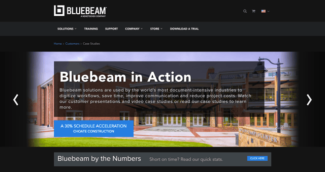
Many companies struggle to grab people's attention using their testimonial pages, but BlueBeam does a great job of catching your eye as soon as you arrive on the page. While it's technically called a Case Studies page, the first thing you see is a set of project examples in the form of large, bold images that rotate on a carousel. Scroll down and you can also click on video case studies, as well as view customer panels.
3) ChowNow
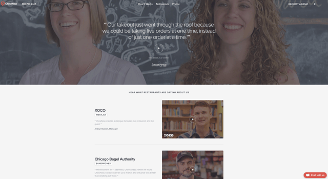
ChowNow does a lot right on its testimonial page, but the bread and butter is its collection of production-quality "client stories" videos. There's a handful of these awesome, 2–3-minute videos that cover everything from the clients' life before and after ChowNow, to how easy the platform is to use. The videos feature some great footage of the clients, their offices, and their food.
4) Decadent Cakes
There are times when you're leaving an online review and, for whatever reason, just don't want to include photos with it -- like when it's for something kind of personal, like your son's birthday party.
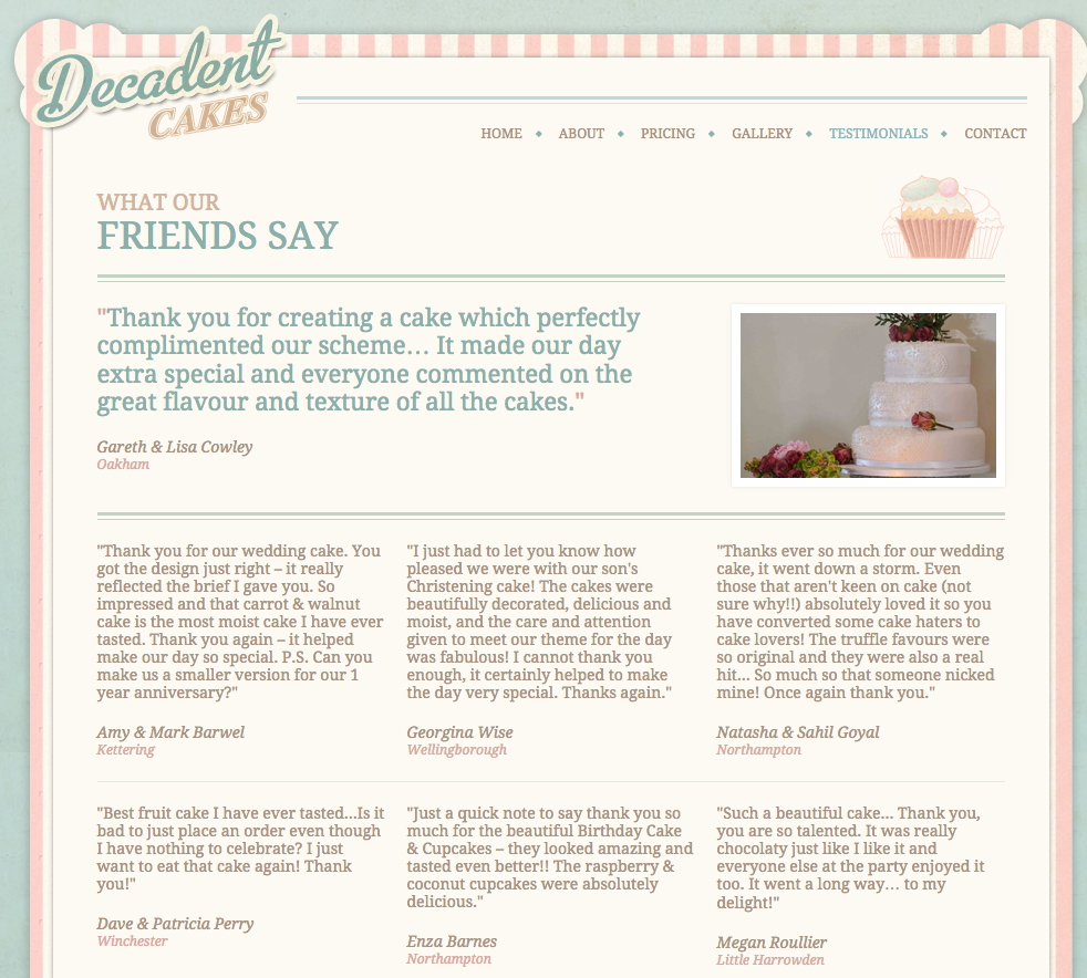
Decadent Cakes knew that and wanted to respect its customers' privacy, while also highlighting their positive feedback. To solve for that, the bakery showcases its customer testimonials on a whimsically designed webpage along with names, locations, and sometimes pictures of the cakes made for those people. We love that that customers are referred to as "friends," too.
5) mHelpDesk
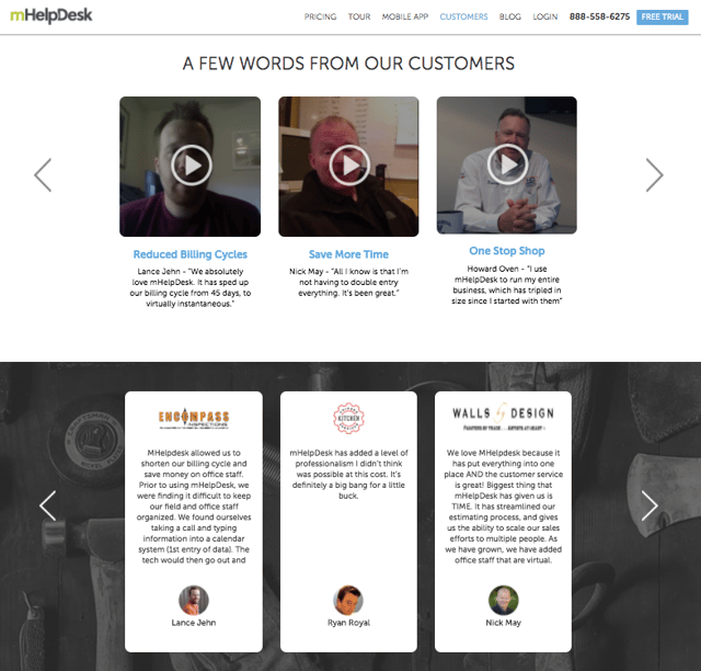
Visit mHelpDesk's testimonial page, and the first thing you'll see is powerful header text set over a large, faded graphic showing where in the world its customers are located -- a great way to show it's a global brand. Below the header text and call-to-action for a trial, they offer videos and text testimonials equipped with pictures.
The testimonial videos aren't production quality, but they get the message across and cover useful and relevant information -- which goes to show you don't need to invest thousands in production to get some testimonial videos up. Finally, in the theme of earning trust, we love that mHelpDesk closes out its testimonial page with awards and badges of recognition.
6) Clear Slide
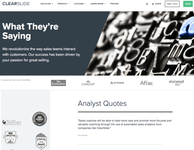
One of the first things we noticed about Clear Slide's testimonial page is how creatively it's named -- "What They're Saying." It includes a smattering of quotes from customers, topped with client logos from big names like The Economist and Starwood. If you have users that are celebrities or influencers within their community, be sure to include and even highlight their testimonials on your page.
7) FreeAgent
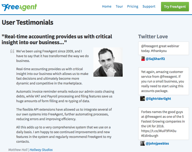
The folks at FreeAgent did a great job formatting its testimonial page with emphasized text quotations along with pictures, names, and companies to add credibility. But what we really love about it is the "Twitter love" banner on the right-hand side of the page.
Social media is a great source of real-time proof of customer satisfaction -- after all, that's why it's called "social proof" -- and many customers turn to places like Twitter and Facebook to informally review businesses they buy from. Be sure to monitor your social media presence regularly to find tweets, Facebook posts, Instagram posts, and so on that positively reflect your brand, and see where you can embed them on your website.
8) Focus Lab
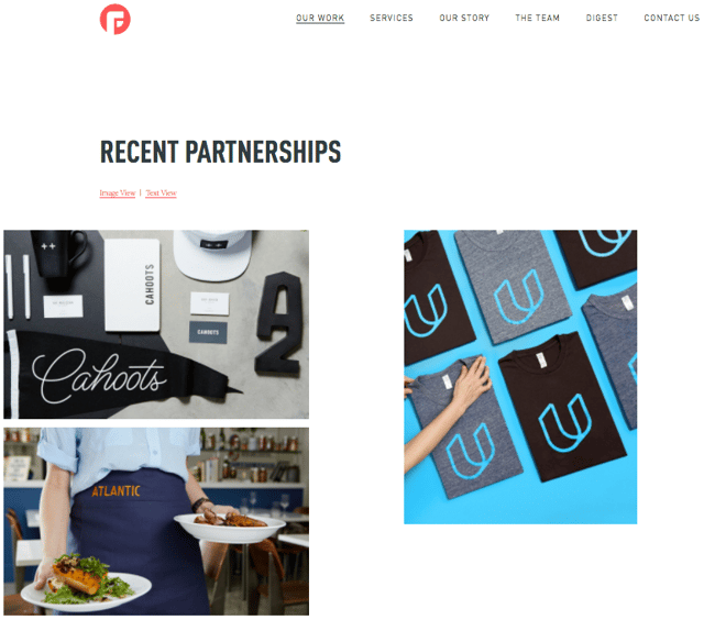
Focus Lab took a unique and very cool-looking design approach to its testimonial page -- which is fitting, seeing as its trade is in creating visual branding systems. Again, it's technically a visual catalog of both previous projects and works-in-progress, but instead of just listing out client quotes, the page opts for a card-like design with interactive, rectangular elements you can click on to see the full case study -- with quotes occasionally appearing in-between.
What's even cooler is what's included in each individual case study. Not only does FocusLab cover the challenges faced by clients and how FocusLab helped solve them, but the case studies also include some of the steps in the design process between conception and final product. In some instances, they included the evolution of the logo during the design process.
Finally, we love the aforementioned view of works in progress section below the case studies. These cards aren't clickable, but they give viewers a glimpse into the firm's current projects.
9) 99designs
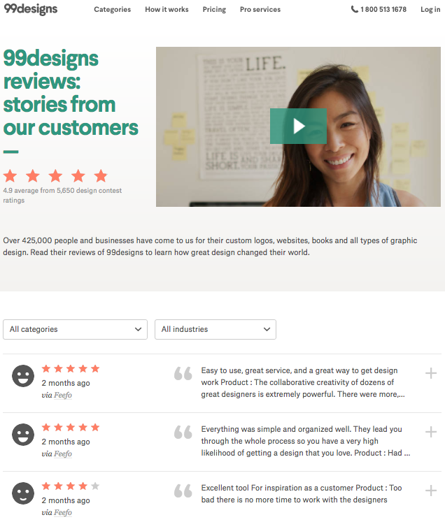
99designs takes a bit of an unconventional approach to its testimonial page. Using a star-rating system not usually seen in the B2B sector (read: Yelp and TripAdvisor), the page is headlined with an eye-catching video, with customer reviews below it. Plus, it gives users the ability to sort through customer reviews by category so they can read the ones most relevant to them.
Spread the Love
Once you've created a testimonial page, don't forget to promote it. Send it to the customer(s) you featured, your sales staff, and even to your other customers if you think they'd be interested. And don't forget to add a link to your testimonial page on your homepage, in your "About Us" page, or as part of your overall navigation.
from Marketing https://blog.hubspot.com/marketing/testimonial-page-examples
No comments:
Post a Comment