I have a long, interesting relationship with the HubSpot Marketing Blog.
Before I became editor, I was a full-time writer for this blog. And before I was a writer for this blog, I was a guest contributor to this blog. And before I was a guest contributor to this blog, I was a fan of this blog -- I learned from this blog.
So when it came time to kick off the blog redesign I'm about to walk you through, I had a lot of strong opinions (and arguably too many ideas). You see, our last redesign launched in December 2014. To give you some context, since December 2014:
- Blog.hubspot.com has more than doubled its monthly traffic, growing from under 2 million monthly views in December 2014 to over 4.5 million.
- There have been over 20 updates made to the Google algorithm.
- Snapchat has more than doubled its monthly active users, scaling from 71M at the end of Q4 2014 to 166M at the end of Q1 2017.
- Facebook Live has been invented, released to influencers, and launched to the general public.
It's safe to say, even though it's only been a few years, we're living in an entirely different time than we were back then. Our team is fresh-faced. Our editorial strategy is new and improved. And our audience is continuing to grow and demand new things.
We've been overdue for a change for a while now, so a change is what we brought. Now let's talk about what's new -- and why.
Why We Redesigned the Blog (And What's New)
Reason #1: To set the stage for new mediums.
During the back half of last year, we started to incorporate more video and audio content into our editorial strategy.
We've experimented with "posts as podcasts":
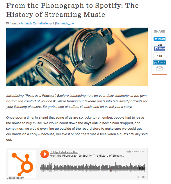
And short video recaps of popular articles:
This shift in strategy came at a time where you couldn't visit a marketing or tech blog without bumping into a headline like, "Why 2017 Is the Year of Video." But that wasn't the only driving force.
Around this same time, we'd just started to think about overhauling our email subscription, too. In doing so, we collected a lot of feedback from our subscribers that suggested they'd been craving different content formats -- such as audio and video -- for a while now.
It quickly became obvious to us that this was long overdue. We needed to refresh the blog in a way that lent it to more than just written content. We needed brand new post-level designs that were specific to the medium we were using to tell a story, teach a lesson, share a finding, etc.
How the redesign solves for this:
To create some contrast around all of the different types of content we were creating, we decided that the redesign would offers three distinct post formats: written, video, and audio.
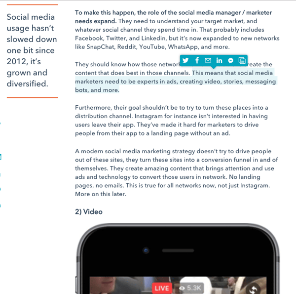
Written
Prior to the redesign, this was the only post type we had -- though it lacked pizzazz. The new written post design incorporates large block quotes for highlighting key quotes and stats, easily shareable text, and a whole lot of white space to make for a clean, inviting experience.
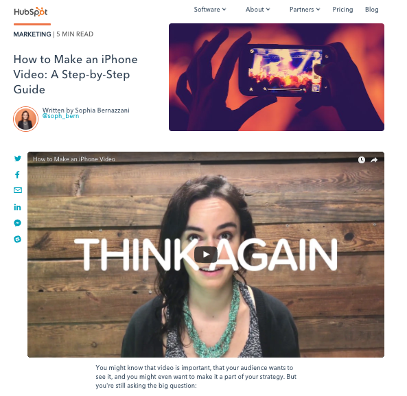
Video
This new post format allows our video content to take center stage, so it feels less like a secondary element. The best part? When you start to scroll, the video shrinks and hops to the side of the screen so you can keep working through the content while staying tuned in.
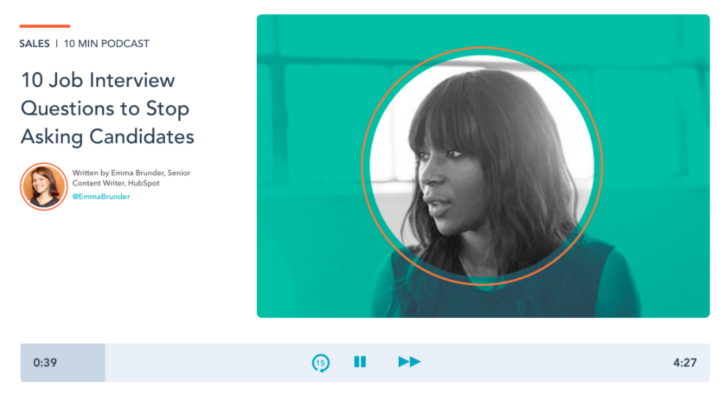
Audio
Between our own audio experiments on the blog and the steady stream of amazing audio content coming from our podcast team, we needed a place to show it off. Our new audio-centric post type includes a sleek audio player that puts the focus on the medium.
Reason #2: To solve for content discoverability.
After recognizing both a shift in the way search engines deliver results and the way searchers input queries, our in-house SEO experts introduced the team to a new way of looking at content mapping and search engine optimization.
The topic cluster model puts topics before keywords, allowing a single "pillar" page to serve as a hub of content for an overarching topic. From there, "cluster content" covering related long-tail keywords then links back to the main pillar to boost its authority. This approach aims to create a more intentional link structure across the blog properties, making it easier for Google to crawl and rank our content.
Needless to say, this new approach changed the way we organize content on the blog -- and ultimately helped to make related content more discoverable. With nearly 13,000 posts in just the HubSpot Marketing Blog archive alone, we've incorporated new functionality that helps us ensure you're not missing out on any old hidden gems, while also helping you easily surface content you care about.
How the redesign solves for this:
Our blog posts are now systematically tagged based on their associated topic cluster. For example, all of the posts within the "Social Media Trends" cluster receive a "Social Media Trends" tag which links back to the cluster's pillar page. This link helps to push the authority towards the pillar page, allowing it take more easily rank for the term we're going after.
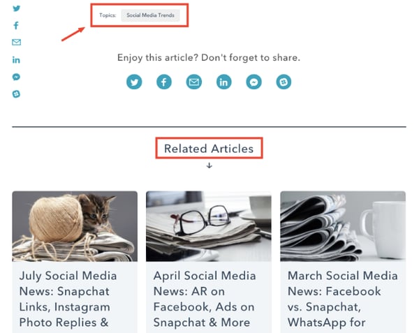
We also added a related articles section at the bottom of each post. This section pulls in articles from the cluster, allowing for more intentional link distribution.
Reason #3: To introduce new ways of sharing content.
At the time of our last redesign, Slack -- a real-time messaging app for teams -- had just celebrated its first birthday. Since then, the platform has gained some serious momentum -- so much so that it's referred to as the fastest-growing business app of all time. Here's proof:
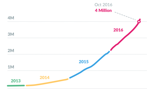
As of October 2016, the platform boasts over 4 million daily active users -- including us here at HubSpot. Internally, we use Slack to communicate across our global offices, spark discussions, host meetings, make announcements, and perhaps most often, to share and discover interesting content.
That's why, when it came time to plan this redesign, we knew that we had to find a way to incorporate Slack into the blog's functionality.
And then there's Facebook Messenger. With 1.2 billion monthly active users, this was another channel we'd had our eye on in terms of content distribution -- especially after seeing the results from a few Messenger experiments some of my colleague ran.

After testing Facebook Messenger against email as a content delivery system, they saw an open rate of 80% and an average CTR of 13% -- this was 242% and 609% better than the email controls.
How the redesign solved for this:
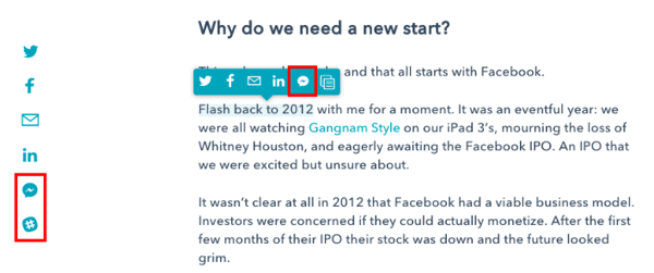
The redesign introduces both Slack and Facebook Messenger as two new channels for sharing content. These additions can be found in the sticky sharing options to the left of the content. As an added bonus, Facebook Messenger has also been added to the hovering share menu that appears when you highlight any string of text.
Reason #4: To refresh our branding.
A former boss once said to me, "We really need someone to come in here and call our baby ugly."
Of course, he wasn't referring to an actual baby. He meant our content. In a sense, it was our baby -- and we'd grown so close to it that it was hard to pull out the flaws, missed opportunities, and so on.
That was sort of the case here ... except we were pretty well aware that our baby was, in fact, a little ugly.
The old blog felt dated and sort of stale. It wasn't set up in a way that let our content shine (at least not anymore) and it didn't mesh with some of the newer, more polished pages across the website. But perhaps most importantly, it didn't reflect our current brand -- let alone the direction our brand was going in.
How the redesign solved for this:
If you've been following HubSpot for a while, you may have noticed that our branding underwent a bit of a makeover in the process of this redesign. For example, we've implemented new photo filters that reflect an updated color palette:

These filters, and several other changes, serve as the first step in rolling out a larger visual brand refresh over the coming months -- one that is true to our brand and values. Stay tuned.
Feeling Inspired?
If you're starting to think that it might be time for your own redesign, we've got just the thing. Check out this redesign planning guide for a behind-the-scenes look at how we tackled this project -- from start to finish. We've peppered it with free resources -- like editorial calendar templates and CRO advice -- to help you kick off a redesign on the right foot.
Shoutout to the redesign dream team: Matt Eonta, Amelia Towle, Taylor Swyter, Brittany Chin, and Liz Shaw..png?t=1501570203221&width=600&height=200&name=Untitled%20design%20(25).png)
from Marketing https://blog.hubspot.com/marketing/hubspot-blog-redesign


No comments:
Post a Comment