I was ready to buy. My finger hovered over the “Add to Cart” button. But I still wasn’t sure.
While all the images on the site were professional and inspiring, not one of them was user-generated or showed an outfit on an average-sized human being. If I’m spending a couple hundred dollars on a dress, I want to know it will be flattering on my body (and I’m not a size zero -- who is?). That conversion didn’t happen. I’m shopping elsewhere.
The wrong visual content can kill conversions as quickly as the right visual content can increase them.
In fact, conversion rates for brands that use custom visual content are seven times higher than those that don’t. And there are so many ways visual content can increase conversion rates. Since they’re so sharable, you can use them as social proof, and you can use them to quickly explain your product’s benefits and features. Essentially, all the functions you’d like your content to offer can be done -- often better -- with images. 
It’s no wonder that the right visual content increases conversions, but only when used the right way. We compiled five of our favorite methods of doing just that.
5 Ways You Can Use Visual Content to Increase Conversion Rates
1) Experiment with video.
Videos & Product Pages
Product videos have been shown to improve conversion rates -- 73% of U.S. adults, for example, are more likely to purchase a product or service after watching a video that explains it. That’s way up from the 20% conversion increase reported on Unbounce in 2012, and there’s a reason for that -- the internet has gotten faster. Loading these videos used to be a pain in the router, if you will, but with faster speeds, it’s quickly becoming the favorite way to get information. After all, Google didn’t acquire YouTube for fun.
But it’s not as simple as “Video = Conversions.” Videos only work this well when placed in the hottest areas of your product page, like next to product images or “Buy” buttons. When you give your videos prominent positions -- above the fold, top and center -- visitors stay longer, engage more, and buy more.
But what should these videos be about? Consider what your customers (don’t) want. They probably don’t want to read a lengthy product description -- most web visitors only read 25% of text. Instead, show how the product works and how real people are using it. And remember, features are nice, but what they really need to know is how your product will improve their lives.
Make sure these videos are accurate and will lead to more realistic expectations. That way, it can help reduce product returns, since a video shows how products are used day-to-day. It’s worked for Zappos -- and other brands, like ASOS, have estimated that a 1% fall in returns would add $16 million in profit.
Videos & Landing Pages
When Dropbox first put a video on their homepage six years ago, conversions went up by 33%. That impact has only increased over time, especially since there have been a few improvements and innovations in video marketing that can improve those digits.
Now, we have access to user data, which marketers can use to personalize experiences at scale. Below, Lowe’s leverages user data to customize its video based on:
- Whether the viewer had purchased from Lowe’s in the past.
- Location of the nearest Lowe’s store to viewer.
- On-sale items that were most relevant to the viewer based on their location and past purchases.
- Weather conditions, and weekday vs. weekend timing.
Lowe's ultimately had more than 180,000 variations on the video, each of which was personalized to the individual viewer.
On the lower-tech end of the spectrum, you can improve conversion rates by simply placing the video you use front and center, above the fold. We also recommend using a text call-to-action, like “click to play.”
2) Show people how to use your product or service.
Pre-Purchase Product Tours
There are a number of ways to show how a product works -- even without video. Virtual product tours can serve the same function, but if done incorrectly, they can be clunky, boring, and overwhelming.
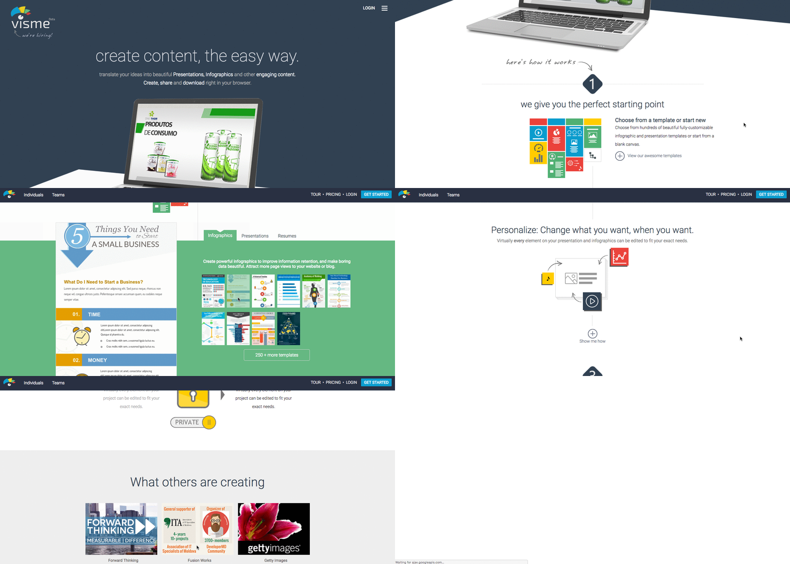
Most product tours become available after a product has been purchased, as part of the onboarding process. But pre-purchase product tours can act as powerful conversion enhancers, too. Take Visme’s product tour, for example. It’s cleverly designed for the early stages of the buyer’s journey, the visuals are large and simple, and the copy is concise. Not to mention, benefits are stated front and center, with “here’s how it works” displayed with an arrow below the top image, acting as a CTA to scroll down.

From there, you can see templates for infographics, presentations, and other visual content. With a couple of clicks, you can also see how to use Visme for social and web graphics. But what really makes it work is the “What others are creating” section, which shows the product in action.
3) Use Pinterest to your advantage.
It might not work for everybody, but if your target client is female, listen up -- Pinterest is where they are.
SmartMarketer Founder Ezra Firestone knew that, which might be how he managed to generate over $40,000 in ecommerce sales from a $775 Pinterest ad spend.
“At that point, I’d already had my eye on [Pinterest] for quite some time,” he explained. “With warp-speed growth, a user base of 70% women, and an average user household income of over $100,000, Pinterest was shaping up to be an ecommerce marketer’s dream.”
But here’s the thing -- you don’t need a visually appealing product to get attention on Pinterest. You just need visually appealing, genuinely useful marketing. Depending on your product and audience, Pinterest could be a game changer for your conversion -- about 19% of active users say they make a Pinterest-inspired purchase monthly (or more). But that doesn’t mean that you have to restrict your pins to visuals of products only.
Have a strategic look at the most popular category -- in the U.S. and Canada, for example, that’s Food & Drink. So, if your product is, say, a grocery store list app, you have an amazing opportunity here to post something like a link to a recipe on your site. If the recipe has a call-to-action to download your app and add the ingredients to your grocery list -- see how that works? -- you have your conversion.
Yes, you have to think a little outside of the box with Pinterest, but you will be rewarded.
4) Integrate your social content with the rest of it.
Curate Social Proof with Twitter & Instagram
Few marketing tools are as persuasive as social proof – other consumers talking about your product or service. It’s why almost 40% of Twitter users say they’ve made a purchase because of a tweet from an influencer.
The trick is to curate the tweets about your brand. Save the good ones, and make sure to include the entire body of it -- otherwise, it won’t seem authentic. That can be done by clicking on the three dots below a tweet, clicking “copy link to tweet,” and bookmarking that URL. You can retweet them, or if they’re product-specific, embed them on your site next to product photos of the “buy” button.
Why does social proof work? Consumers are more likely to believe the reports of other consumers, like themselves, rather than marketers -- hence that fancy statistic above about influencers. Seeing other people report favorably on a product removes fears and doubts, leading to more conversions.
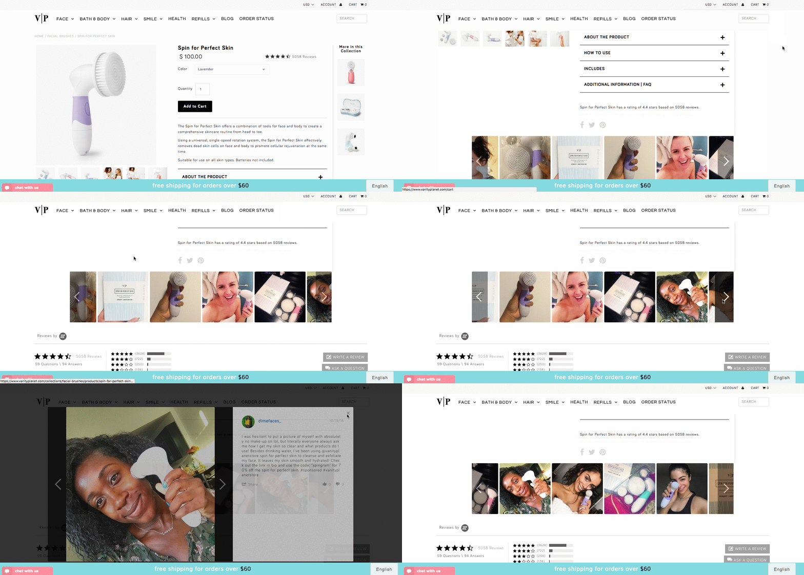
Similarly, adding user-generated Instagram photos to product pages can increase conversions thanks to social proof. Vanity Planet increased conversions by 24% by adding customers’ Instagram pictures to popular product pages, just above the reviews:

Still not sure you should hop on the Instagram bandwagon? Here’s a fun Instagram fact for you: Engagement rates for brands on Instagram are more than 10X higher than those on Facebook. (Want more Instagram inspiration? Check out these accounts.)
5) Not Selling Sweaters or Makeup? This Still Applies to SaaS.
Your product may or may not live in the Cloud, but these rules still apply:
- Prominently-placed videos sell products. Make them fun and benefits-driven. Show people how your product works with a pre-purchase product tour early in the sales funnel -- don’t wait for the demo.
- Use social media – but do it cleverly. (Check out how some unconventional brands use Twitter here.)
- Remember: Pinterest leads to your site pages, which can lead to conversions, as per the app download example above.
- Twitter and Instagram give you social proof, which reduces fears and -- you guessed it -- can also lead to conversions.
- Instagram produces much higher user engagement than Facebook, so make sure you’re investing the right amount of resources in each social network. Pew Research Center’s Demographics of Social Media Users might help, and once you know which networks to leverage, you can plan your social media posts with a calendar.
- All visual content should deliver real value for the user.
Picture This
Fundamentally, people want information, and they want it as fast and fun as possible. One of the most effective ways to give them what they want is through visual marketing. And when you give the people what they want, they’re more likely to give it right back to you, with increased conversions and positive feedback.
How has visual content benefitted your conversion rates? Let us know in the comments.

from HubSpot Marketing Blog http://blog.hubspot.com/marketing/visual-content-for-conversion-rates
No comments:
Post a Comment