If you’ve been reading our blog for awhile, you likely already know that a good product description can help sell a customer on your product or service. But too often, we put too much emphasis on the description itself while blissfully ignoring the other aspects of a product’s presentation.
According to a recent study from SurveyMonkey available through Salsify, fully 94% of customers will abandon a site if they can’t find the information they need to make an informed purchase. And 88% of shoppers said that product content plays an extremely or very important role in their purchase.
So what kind of content makes the biggest difference in sales? You may be surprised.
Price Isn’t Everything When it Comes to Motivating the Customer to Buy

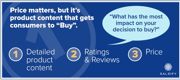
Price is understandably a big factor in making shopping decisions. But it is not the biggest or most pivotal reason in the customer’s mind. Customers who were surveyed for the study indicated that product features – particularly bullets, images, videos and reviews were much more likely to convince them than price alone.
When asked about the underlying reasoning behind their decision, the customers explained that these points were the only way they could know exactly what they were getting. The closer the item comes to fulfilling their needs, the better their overall experience.
Oftentimes, e-commerce sites have so many products or so many variations that they simply put up whatever the manufacturer has written about the item and hope that it’s enough to seal the deal. But manufacturers aren’t in the business of selling to end users, therefore their product details are usually bland, boring and highly technical.
If this is the case for items in your e-commerce catalog, it’s worth doing a content audit to determine which of the most in-demand items aren’t getting the conversions you’d hoped for, and then taking a closer look at what’s actually being presented to the customer.
Customers Want to See Things in “3’s”

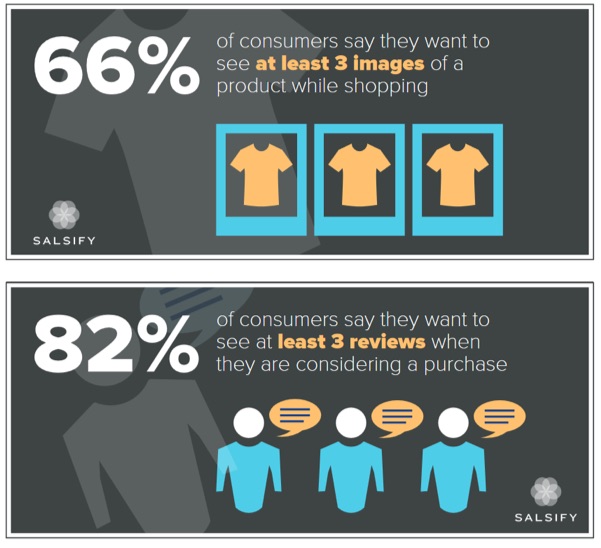
According to the study, the vast majority of customers wanted to see at last three images of the item, and read at least three reviews about it. What may surprise you here, however, is that around 75% of them said that they would rather see the image itself against a plain background or being used, rather than photos from users that bought the item.
What’s wrong with user-submitted photos? While “user generated content” is often promoted as another branch to your existing content marketing efforts, in this case it can backfire. Oftentimes they may include accessories or add-ons that don’t come with the original standalone item, or they may already have used the item, so it’s not an accurate representation of what’s in the box.
Here, it’s the responsibility of the brand to make sure the images they submit of the product are crisp, clear and show precisely what the customer is getting.
Even after you have crisp, clear images of the product, solid reviews and a competitive price, there’s still the question of catering to mobile shoppers. Do mobile shoppers carry the same priorities in mind as their more traditional desktop-shopping counterparts?
Mobile Shopping Still Has Some Growing Up to Do
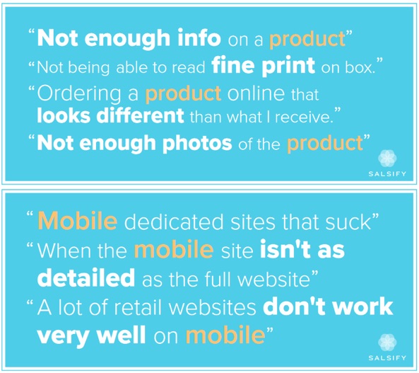
Consumers shopping on mobile devices have their own issues to contend with, and scant product descriptions don’t help here either. Oftentimes, in a rush to make sure they can attract mobile-browsing consumers, companies make the mobile version as bare bones as possible. But, as you might imagine, there’s a major trade-off between fast-loading sites on a phone or tablet, and getting all of the information you need.
Here were some of the complaints, according to the study:

And if you thought not having enough images, a lack of reviews, or boring technical data about a product were conversion rate crushers, just look at what mobile users have to contend with! Things like not being able to read the fine print (what are they hiding in there, anyway?), buggy websites, and even product fulfillment issues all considerably dampen the customer experience.
Fortunately, these are all things that can be remedied with a more thorough look inside the mobile shopping process. Don’t look at your mobile e-commerce as a branch off from your desktop-friendly version, but rather treat them as one and the same. Is it just as easy for a mobile user to find information on a product as it is browsing from a tablet or laptop?
If not, take steps to remedy that, as Google and other search engines are a prime spot for mobile users to begin their research – and the better prepared you are to accommodate mobile users, the more you could earn in revenues.
Targeting Moms or Millennials? Then Pay Close Attention…
As we gear up for the holiday shopping season, there’s no better time to carefully analyze your product descriptions. But there are two groups in particular that advertisers are keenly looking to attract: moms and millennials. Although product content is just as important to these two groups as all of the other demographics, there are specific approaches that need to be kept in mind if you’re targeting them.
First, millennials were 40% more likely to report that product content influenced their decisions to buy. They were also 50% more likely to rank ratings and reviews as having the biggest impact on deciding which site to buy from. Social and user-generated content are important to them as well, and unlike most shoppers, they are 72% more likely to buy an item based on photos from other users.
Moms, on the other hand (to the surprise of absolutely no one) don’t have a lot of time. They were nearly a third more likely to shop on their phones than others, and tend to only visit one or two sites before making a decision. That’s why it pays to invest in making sure your site’s mobile shopping experience is just as easy and thorough as regular desktop-based online shopping.
Making Your Product Content Shine
So what insights can you take away from these findings? First, if you’re focusing too much on your product description to the exclusion of everything else (reviews, images and even social content), you’re doing a major disservice to your users. Every aspect of your product detail page should be looked at – from bullet points to image selection to even unboxing videos and so forth.
Look for ways to integrate social and user content in ways that lend to – but not overshadow – brand-powered content. And above all, take the time to ensure that mobile shoppers can access the same kinds of details, swatches, photos and other information as regular online shoppers. Too often we pour our attention into making a site’s product and checkout flow as seamless as possible – leaving mobile as more of an afterthought hastily tacked on to the process than the integral part it should be.
What are your thoughts on getting the most out of product descriptions? Have you ever read a product detail page so irresistible you couldn’t help but buy? For many of us, the description is the make or break point of a conversion – so take the time to make sure yours is the best it can be, starting right now.
About the Author: Sherice Jacob helps business owners improve website design and increase conversion rates through compelling copywriting, user-friendly design and smart analytics analysis. Learn more at iElectrify.com and download your free web copy tune-up and conversion checklist today!
from The Kissmetrics Marketing Blog https://blog.kissmetrics.com/better-product-content/
No comments:
Post a Comment