Landing pages exist to serve one purpose: getting website visitors to convert to the next stage in the buying journey. Although their purpose is simple enough in theory, actually designing a successful landing page requires some detailed planning and creative testing.
Regardless of what your business is selling or the conversion action you hope to instigate, it's helpful to get inspired by seeing what other great landing pages look like. And because there's no one "right" way of doing a landing page, you'll want to check out examples from lots of different industries for different stages of the buying process.
Want to get inspired? Check out the great landing page examples below. 
Disclaimer: I don't have access to the analytics for each of these landing pages, so I can't tell you specifically how well they convert visitors, contacts, leads, and customers. But many of them do follow best practices while also implementing a few new experiments that could give you ideas for your own landing pages.
12 Great Examples of Landing Page Design
1) Lyft
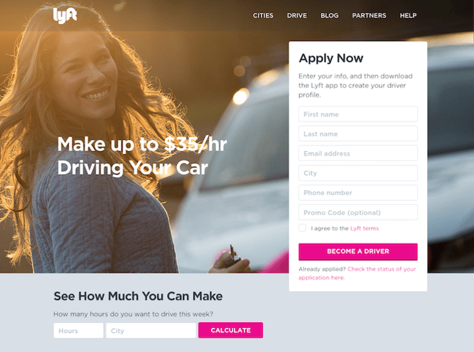
We love that on Lyft's landing page, they zero in on their drivers' main motivation: earning money easily.
We also love that, in addition to the "Apply Now" form, drivers can type their city and the number of hours they might drive for Lyft in a week to calculate how much they'd make. When visitors fill out that information and press "Calculate," they aren't taken to a new page. Instead, they see a dollar amount followed by a new call-to-action button to "Apply Now" (which, once clicked, takes drivers up to the form).
By offering these two conversion paths, they're able to address two different types of people in the conversion path: those who are ready to make the decision now and those who need a little more information before they convert.

2) The Professional Wingman
Okay, so the whole idea of having a professional wingman to help you find dates and a meaningful relationship is already pretty cool. But when you're faced with the prospect of hiring one, it also raises questions. How does it work? How much does it cost? Is this really going to help me?
That's why we love this landing page for Thomas Edwards, the original Professional Wingman himself, which outlines exactly what a complimentary coaching session is going to achieve. Plus, it's clear that it's complimentary, thanks to the boldly-colored call-to-action button above the fold.
Once you click that button, you aren't taken to a new page. Instead, an interstitial form appears right there. And while it does request a lot of information -- some of it a bit personal -- it also sends the message that The Professional Wingman is going to take this seriously, but only if you do, too.
3) Muck Rack
This landing page design has it all. It's visually appealing and interactive, offers scannable yet descriptive headers about Muck Rack's services, and uses quotes from industry professionals as social proof. Plus, the page is intuitive and easy to navigate.
The cool part about this landing page is that it can appeal to both of Muck Rack's audiences. The top of the page is split into two, featuring their two different services side by side. Once a visitor moves his or her mouse over either of the "find journalists" or the "build free portfolio" CTAs, a very simple form appears -- and that's important, so as not to distract the user from the task at hand.
4) Cigital
There are a few things that make this Cigital landing page work. It has simple and relevant imagery. The headline is straightforward and the description of the ebook informs viewers of the specific value they will get by downloading it. There is only one call-to-action -- "READ THE EBOOK" -- that stands out on the page thanks to a bright yellow CTA button.
The only thing we'd change about this landing page is that we'd remove the navigation bar at the top. They tend to distract visitors and lead them away from the intended action. Not only is this a landing page design best practice, but we've also conducted A/B tests that've shown removing navigation links from landing pages increases conversion rates.
5) Khan Academy
The hard part about using your homepage as a landing page is that you have to cater to several different types of audiences. But Khan Academy's homepage does that very well. This page is clearly designed for three different types of visitors: those who want to learn something, those who want to teach, and parents who are interested in using Khan Academy for their kids. Plus, how motivational is the emblazoned "You can learn anything" text at the top?
The remainder of the page is designed for viewers who are not completely familiar with Khan Academy. It colorfully and largely spells out the key benefits of using the learning platform -- all of which are easy to scan and understand. There's also a recurring CTA: "Start learning now." As soon as viewers feel they have enough information, they can click the CTA to get taken back up to the form at the top of the page without having to scroll.
6) Club W
A little bit of delightful copy can go a long way on your landing page. We love the playful little aside -- "(Hint: It's Wine)" -- that Club W included below the header of their corporate gifting landing page. It humanizes the brand and makes them likable, which could have a positive impact on their conversion rate.
The images below that header make a nice use of negative space, showing the user exactly what his or her gift recipient might actually receive, should they choose to gift with Club W. And, of course, there's that bold call to action -- "Email Us".
The one thing we'd change? The CTA prompts the users email software to open, which drives traffic away from the site and the browser entirely. A form might be more effective here -- not only would Club W be able to dictate what information it wants to capture, but also, it would keep the user on-site.
7) Codecademy
I like this page because it's simple in both copy and design. The image above the fold is a computer screen displaying an HTML bracket with a blinking cursor -- a whimsical, clear visual to accompany the form on the right.
The form itself is simple and only requires an email address, username, password, and a validation that you're not a robot to create an account. Or, you can just use your Facebook or Google Plus login, shortening the conversion path even further.
For visitors who need more information before creating an account, the landing page also offers a video below the fold that explains their concept and value by way of a real-life success story. Again, this helps make the potentially intimidating world of coding more approachable for beginners.
Those who need even more convincing can continue scrolling for additional testimonials and other forms of social proof.
8) Poached
I don't think we've ever lived in a time when, culturally, we've been so food-obsessed. Poached has turned that into a B2B model with a platform to connect proprietors and culinary talent.
When you visit the homepage, there's no mystery about what you're there to do -- the giant "Post a job" and "Choose a city" calls to action help with that. And once you click on one of them, you're taken to a no-frills form to become a member or log in, or a list of jobs in each city. It's colorful and comprehensive -- and, it makes us hungry.
9) Breather
Here's another example of clever, delightful design on a landing page. As soon as you visit Breather.com, there's an instant call to action: indicate where you want to find a space. Plus, it uses location services to figure out where you are, providing instant options nearby.
We love how Breather used simple, to-the-point copy to let the visitor know what the company does, followed immediately by the CTA to select a city. And if you need to scroll down for more information, you can see that Breather played with the microcopy with personality ("no commitment, ever"), reminding us there are real humans behind the design. That brings us a little closer to the brand. The negative space and soothing color scheme are also aligned with the product -- essentially, room to breathe.
10) Startup Institute
Visitors to your website won't hand over their personal information without knowing what they're going to get in return. On its landing page, Startup Institute makes abundantly clear what will happen after you apply by listing a Q&A right beside the form. It might prompt some people to say, "They read my mind!"
To avoid hesitancy to fill out a form, use your landing page to set expectations upfront. That clears the air, and can also weed out the people who don't take your content, product or service seriously.
11) Edupath
Who is your landing page's target audience? While most of Edupath's website content is directed toward students, there are sections dedicated to advising parents on helping their teenagers through college applications and SAT preparation. The landing page below is in one of these sections.
When parents fill out their teenager's name, email address, and mobile number, a link to download the Edupath app is sent directly to them. The folks at Edupath know students are likely to do something if their parents ask them to -- especially if it means they don't have to surrender their phones.
Plus, it's an easy, one-click process. This whole conversion path is a clever and helpful way to get the apps on more students' phones by way of their parents.
12) Taster's Club
If there's anything we enjoy more than a fine whiskey, it's a whiskey club homepage that makes it easy to either join or learn more about membership. Case in point: Taster's Club, which immediately serves up those very two CTAs on its landing page -- which also happens to be its homepage.
For those to wish to learn more, clicking that CTA will immediately scroll the user down to colorful, image-rich details on what a Taster's Club membership includes. Keep scrolling, and you get user testimonials.
But clicking the "Join Now" button is where the real fun begins. After doing that, you get to pick your poison -- that is, the type of whiskey you like the most -- and view the membership or gifting options available for it. Once you make your selections, you're taken to an easy-to-navigate checkout page to enter your payment information. Good design and ease of use? We'll drink to that.
Want more landing page design inspiration? Check out some of our favorite HubSpot landing page examples .
Editor's Note: This post was originally published in July 2014 and has been updated for freshness, accuracy, and comprehensiveness.
from HubSpot Marketing Blog http://blog.hubspot.com/marketing/fantastic-landing-page-examples


No comments:
Post a Comment