Talk to almost any online marketer and you’d think that they held a PhD in psychology. At the drop of a hat, they can tell you all about what button colors, typeface, contrast, spacing, line of sight, hero shots, etc you should use to subconsciously drive a website visitor to convert.
But do marketers really have these incredible mind powers? Do they wield the awesome power of psychology to control the rest of the world?
Testing the Testers
Recently, Chris Dayley, my head of CRO, ran a little experiment at the SearchLove conference in Chicago. Chris wanted to see how well marketers could use their understanding of psychology, marketing best practice or even gut instinct to predict which landing page design would produce the best conversion rates.
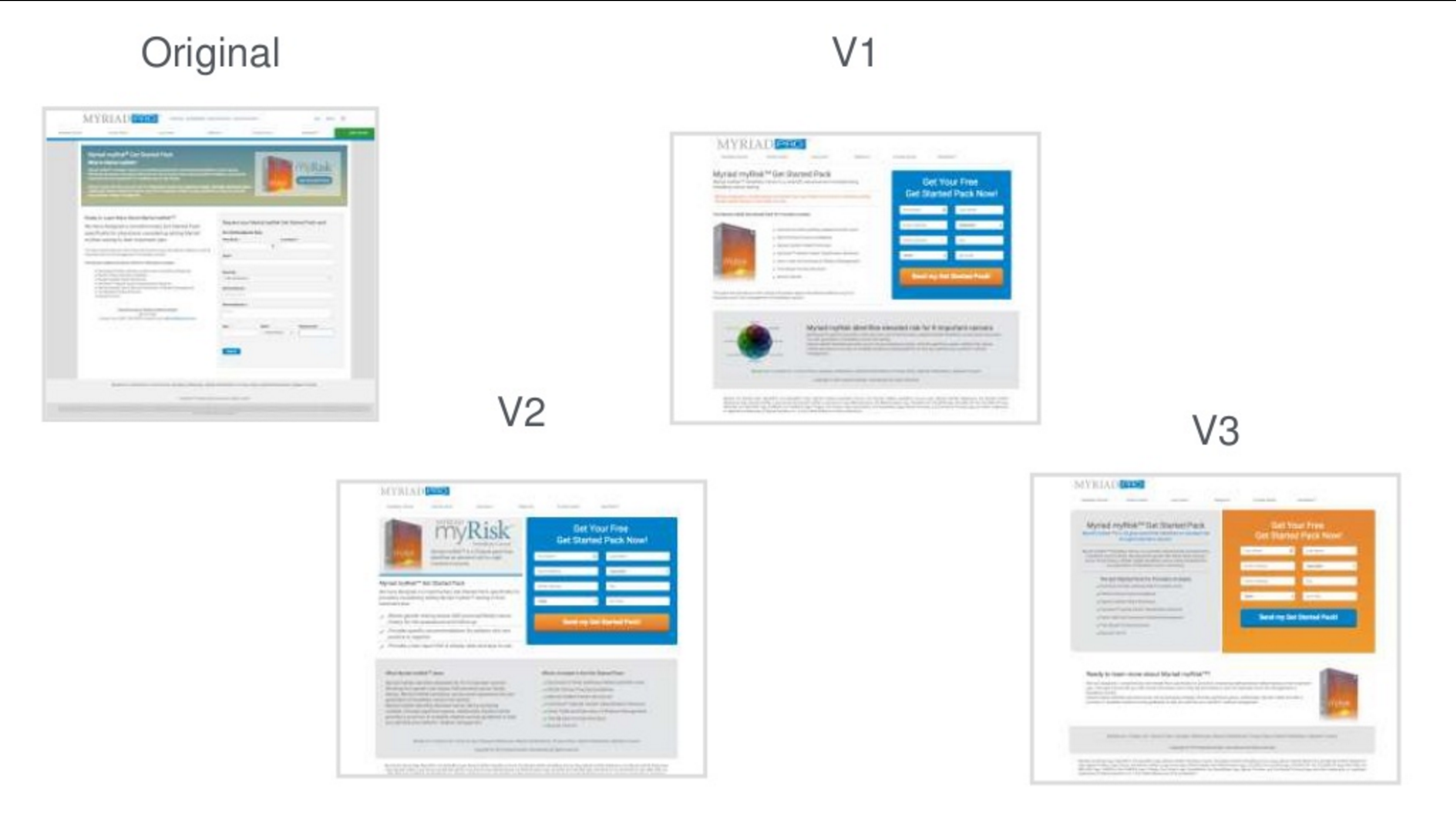
So, he presented an example A/B test from a real client of ours. There were four page variants and one of them had generated a 146% increase in leads. The room of marketers was given a link to a survey where they could examine each variant and submit their guesses as to which page had been the winner.
Take a look for yourself. Which one would you have picked as the winner?

Here’s how the marketers voted:
- Original: 0%
- V1:32%
- V2: 42%
- V3: 26%
Now, only one of the variants actually produced 146% more conversions, so—if we assume that V2 actually was the winning variant—at least 58% of these marketers were wrong.
But that wasn’t the real trick of the survey.
While the marketers were guessing which page had won in Chris’s A/B test, he was actually running an A/B test on them!
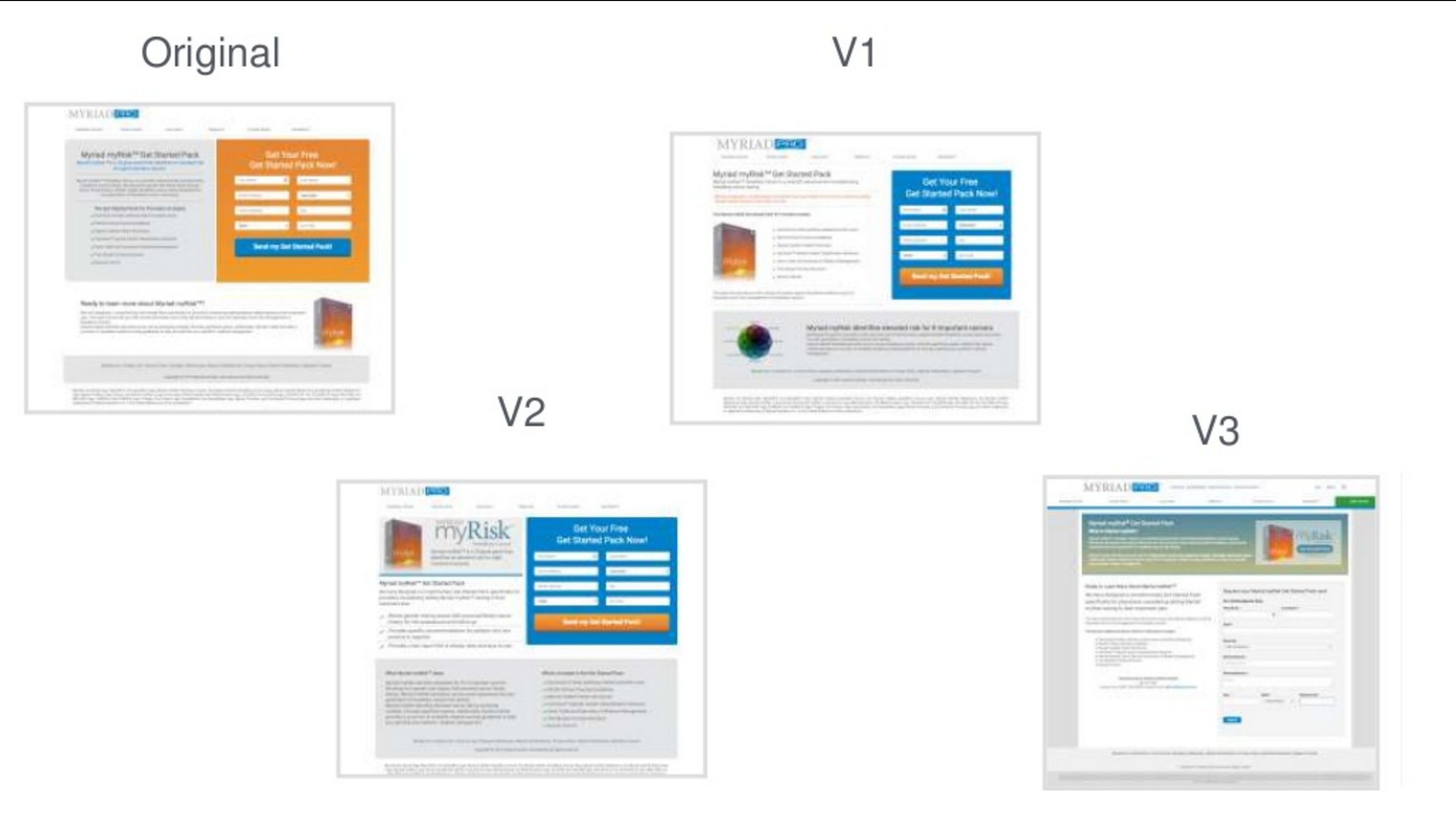
Only half of the surveys showed the page variants in the order seen above. The other half saw a scrambled version with the original and V3 switched like this:

Here’s where things got a little crazy. In the second group of marketers, no one voted for the “original” page—even though that page received 26% of the votes in the first group!
Even more intriguingly, V2 received the most votes in both groups:

But here’s the thing, V2 wasn’t actually the top-performing page—V3 (the “Control” in group 2) was. That meant the actual champion only got 13% of the popular vote!
The question is, why? How did the vaunted best practices and gut instincts of so many marketers fail them? To answer that, let’s take a step back from marketing psychology and take a look at the psychology of marketers:
Newer is Better
The most obvious thing highlighted by Chris’s experiment was that all the marketers assumed that the highest performing page variant couldn’t be the original. In both groups, the variant labeled “original” didn’t receive a single vote…even when it was the actual winner.
Now, there’s a dangerous assumption at play here. Everyone who puts an A/B test together would like to believe that he or she is going to shake things up and make them better. But can you assume that newer is better?
Null Hypotheses
In scientific testing, there’s a concept called the “null hypothesis.” The null hypothesis states that whatever you change in an experiment won’t affect the results. So, if you change the button color from blue to red, your null hypothesis is that conversions won’t change at all (the effect will be “null”).
In a good study, you’re supposed to act as though the null hypothesis is true until the evidence proves this can’t be the case (kind of an “innocent until proven guilty” sort of thinking). Unfortunately, this doesn’t happen very often.
Selective Perception
Instead of assuming that a change won’t affect conversion rates, most marketers tend to focus on other hypotheses like, “if I change the button color, the conversion rate will go up.”
As a result, many marketers fall into the selective perception (only acknowledging one possibility) trap and assume that new and different will always be better. Clearly, that was the case with this group of marketers.
This is part of the reason why testing is so important. If you just assume that your new idea will perform better and make changes without testing, you could end up hurting your site performance without realizing it!
I Already Know What Works!
So in Chris’s experiment, maybe people didn’t choose the right variant because it was the “original” in one of the groups and they were biased against the null hypothesis.
But why did so many vote for V2?
It’s hard to be sure without tracking them all down and asking them, but chances are that V2 was just the closest representation of their mental image of what a successful page should look like.
Now, having a sense for what a successful page looks like isn’t a bad thing, but if it keeps you from testing, that’s when your marketing skills can get you into trouble.
Appeal to Authority
There are plenty of sources out there that will tell you how a high converting site “ought to look”, but just because something’s “best practice” doesn’t guarantee that it will work on your customers.
A blog post (even this one) or a study by an authority figure should not be the end-all-be-all for your marketing decisions. As helpful and well informed as an expert’s advice might be, it’s still no substitute for doing your own testing.
For example, the most famous example of misplaced trust in authority occurred in 1923, when world-famous zoologist Theophilus Painter incorrectly stated that the human genome had 24 pairs of chromosomes.
Now, future studies quickly revealed that humans have 23 pairs of, but Theophilus was so famous that these scientists threw out their results, assuming they must have been wrong. Textbooks were even printed with pictures of 23 chromosomes, captioned with the number 24!
This went on for over two decades before somebody finally decided that “Theophilus said so” was not a good enough reason to ignore cold hard facts.
Now, I’m not trying to rag on authority figures or studies. They can be extremely valuable sources of information and a great way to come up with testing ideas. However, if you are so focused on marketing “best practice” that you aren’t testing to see how those ideas play out on your own pages, you’re headed for trouble.
In the case of the marketers at Chris’s presentation, many of them may have voted for V2 because they felt like it met the criteria of a “best practice” page. However, “best practice” doesn’t always mean “best results.”
False Consensus Effect
Of course, just because you can’t rely on best practice doesn’t mean that you should just rely on your own know-how instead. In fact, the most dangerous authority figure that you can rely on is yourself.
The problem is, it can be easy to assume that “if the site looks good to me then it must look good to my customers,” when—in reality—customers and marketers are typically more different than alike.
After all, most of your customers have no idea what a landing page is, much less what makes a good one. A marketer might say that his or her site design caused a conversion, but I’ve never had a customer tell me “I converted because of your excellent hero shot.”
Psychologists call the tendency to assume that others think the same as we do the “false consensus effect.” The word “false” in the name ought to give you an idea of how accurate this assumption is.
For example, to many of the marketers at Chris’s speech, V2 may have seemed like the page that would get them to convert. That’s great, but our client wasn’t targeting SearchLove attendees. Their target audience was different and, as a result, converted better on a different page.
Again, this is why testing is so important. Without testing, it’s easy to assume that a page that fits best practice or your own personal preferences will be a slam-dunk with your audience. Sure, that could turn out to be the case, but it’s much more likely that your ideal page design will be just as unique and unpredictable as your audience.
I’ve Got a Feeling…
So, if we don’t know how other people think and we can’t necessarily trust what other people tell us will work best, why do so many marketers think they “know” what’s going to work?
Believe it or not, this is actually a very normal part of being a human. It is surprisingly easy to believe that you have cracked the code on how life works and that you have evidence to prove it.
For example, let’s say you have a theory—“Redheaded people have bad tempers”—originally taught to you in the second grade by a competent authority (Billy on the playground). For the rest of your life, every time you see a redhead lose it, you remember this theory and think, See? That proves it! Billy was right!
But Billy never told you the null hypothesis: “Redheaded people behave the same as everyone else.” So, when you see a levelheaded ginger you think nothing of it and soon forget about it all together. Over the years, you amass a lot of memories of angry carrot-tops, but can’t think of any calm ones, so you decide that your theory must indeed be true.
Psychologists call this behavior “confirmation bias”—the tendency to only pay attention to information that confirms our preexisting opinions.
Unfortunately, confirmation bias is probably where most “marketer’s intuition” comes from.
If you only pay attention to the data that backs up your “gut instinct,” you’ll wind up feeling right all the time. This might be great for self-esteem, but it’s not a real great approach to site design or marketing in general.
You might think you have a great “sense” for what your audience responds to, but if you haven’t tested those instincts, odds are that you’re subject to at least a little confirmation bias.
Conclusion: Stick to the Data
Can you just shortcut the whole testing process and “go with your gut?” Not really…at least, not if you want real results from your online marketing.
On the other hand, if you’re willing to put aside your biases and take a data–driven approach to site optimization, you’ll be in a good position to make a real impact for your business.
So, before you gather your marketing team in a dark room, hold hands, burn incense, and try to “channel” the customer, try putting your hands on some real data and give yourself a reality check.
Did you guess the winning page variant? How good are your marketing instincts? Do you have any examples of when biases held back the potential of a website?
About the Author: Jacob Baadsgaard is the CEO and fearless leader of Disruptive Advertising, an online marketing agency dedicated to using PPC advertising and website optimization to drive sales. His face is as big as his heart and he loves to help businesses achieve their online potential. Connect with him on LinkedIn or Twitter.
from The Kissmetrics Marketing Blog https://blog.kissmetrics.com/test-your-site/
No comments:
Post a Comment