
Most conversion rate optimization experts you'll meet would agree: Copywriting first. Design second.
The idea is that copy (and the message you're trying to convey through that copy) should dictate design – not the other way around. Now, this is in no way meant to underestimate the importance of design. Design can breathe life into the story the copy is telling, and done properly, great copy plus great design will always outperform great copy alone.
The point is, it's not hard to find examples of "ugly" pages outperforming beautifully designed pages – and in those cases, it usually boils down to the copy.
Copy first. Design second.
We've been chatting about this a lot lately on HubSpot's marketing optimization team. In the past, our marketing team has typically followed a design first, copy second order of operations when designing web pages. And it's hard to blame us. We try to move fast and ship projects quickly, and the design before copy approach is definitely the quicker of the two, since copy can be written in tandem with the development of the design.
But when copywriting comes first, design can't even begin until copy is complete. And because development can't happen until design is done, this definitely extends the timeline of project execution. The problem is, this means you're crafting copy under the limitations of a fully baked design, handicapping your ability to tell the story in the best way possible.
Now I'll admit: All this "copy before design" business always sounded great to me in theory, but conversion rate optimization experts also warn against the dangers of "best practices," so it was really enlightening to find an example of this theory proven out on one of our very own web pages.
The Experiment
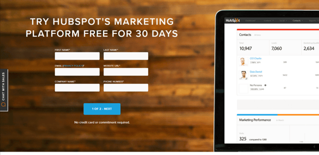
In addition to our main free trial landing page, we also have a bunch of targeted, tool-specific free trial landing pages that the marketing team uses for more segmented campaigns. Below you'll find an example of one (image B), which is targeted to specifically promote HubSpot's Blogging tool. And here are the two compared to each other ...
A. Main Free Trial Landing Page (Above the Fold)
B. Tool-Specific Free Trial Landing Page (Above the Fold)
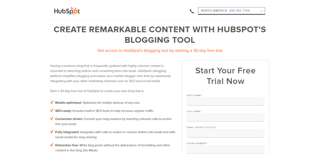
As you can see, these tool-specific landing pages were built using an older template, and when we redesigned our main free trial landing page to look the way it currently does, its tool-specific counterparts remained in the former design. Seeing this as low-hanging fruit from a conversion perspective, I converted three of our most trafficked tool-specific free trial landing pages into the newer template. To be sure the newer design was still in fact the better converting design, I A/B tested each page against its pre-existing design.
The Initial Results
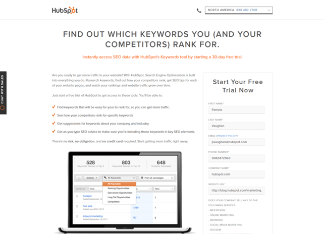
When I first analyzed the results of these three tests, the variation (i.e., the design using the newer template) only won for two of the three pages. Naturally, I tried to understand why. When I took a closer look at the third one (the free trial landing page for our Keywords tool), I noticed a difference. Can you spot it?
Older Template (Control)
Newer Template (Variant)
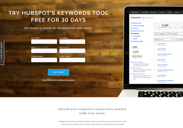
Okay ... obviously there are a few differences here, considering the design is completely different. But the one that stuck out to me immediately was that the positioning of the header/subheader copy in the control was very different than that of the variant.
Control Header + Subheader Copy:
Find Out Which Keywords You (And Your Competitors) Rank For
Instantly access SEO data with HubSpot's Keywords tool by starting a 30-day free trial.
Variant Header + Subheader Copy:
Try HubSpot's Keywords Tool Free for 30 Days
Get found in search for the keywords that matter.
The positioning in the control was primarily focused on the value of the Keywords tool, specifically emphasizing the competitive intelligence the tool provides, whereas the positioning in the variant was focused on clarifying what the offer was itself (i.e., a free, 30-day trial). And while I had made sure the variant still mentioned the competitive intelligence value of the Keywords tool, I had buried it lower down on the page ... below the fold.
Isolating Variables
The problem with this test was that I wasn't isolating the variable I was trying to prove. In this case, I wanted to prove that the new design for the page performed better than the existing design, yet I was manipulating more than one variable: design and copy. So after I had my "duh" moment, I decided to tweak the positioning in the header copy of the variant to match the control, and let the test run for a few more weeks. This way I'd be doing a better job of isolating design as the variable I was testing.
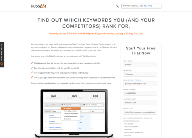
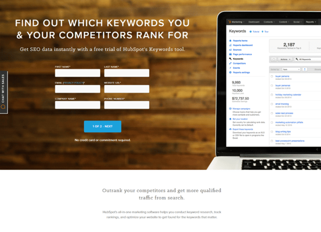
Here's what the header and subheader copy in the control and variant looked like after I tweaked the variant. Note that I made no changes to the copy in the control ...
Control Header + Subheader Copy:
Find Out Which Keywords You (And Your Competitors) Rank For
Instantly access SEO data with HubSpot's Keywords tool by starting a 30-day free trial.
Variant Header + Subheader Copy:
Find Out Which Keywords You & Your Competitors Rank For
Get SEO data instantly with a free trial of HubSpot's Keywords tool.
And here's how it looked in each template variation ...
Older Template
Newer Template
Final Results
A few weeks after making those tweaks, I re-evaluated my test. Bingo!
The variant was the new winner with 99.07% confidence and a 20% increase in conversion over the control.
Aside from the fact that this was (ultimately) a successful test, what I love is that it proves how influential copy can be. The only reason the control originally outperformed the variation was because people preferred the copy in the control -- even though the design of the variant ultimately performed better.
So there you have it: Don't underestimate copywriting in favor of design. In fact, copywriting can be even more influential than design when it comes to conversion rate optimization.
from HubSpot Marketing Blog https://blog.hubspot.com/marketing/copy-design-data-lesson
No comments:
Post a Comment