
If you’ve logged into LinkedIn over the past few weeks, you may have noticed something different. Actually, everything is different, because LinkedIn completely overhauled its desktop site.
After Microsoft acquired the job search and networking website in 2016, LinkedIn announced it would redesign its desktop website to more closely mirror its mobile apps.
LinkedIn is the world’s largest professional networking platform, with more than 467 million members worldwide. However, LinkedIn members aren’t actually spending much time on the site. In fact, only 23% of LinkedIn users visited the site every month at the end of 2016. That’s not a great monthly active user number, and the website redesign was meant to “create more value” for LinkedIn members -- and, hopefully, make them want to spend more time on the site.
For example, the LinkedIn desktop homepage used to look something like this:
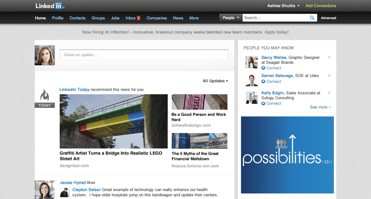 Source: LinkedIn
And this is what my LinkedIn homepage looked like when I wrote this article:
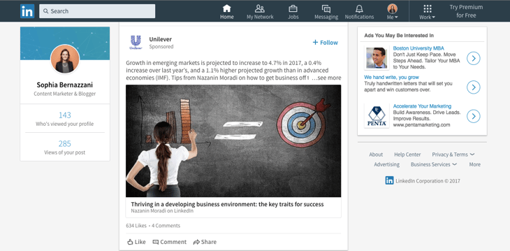
There’s a lot behind this slick interface. Let’s dive into some of the biggest changes to the site since the redesign and how marketers and users might take advantage of them going forward.
6 Changes to LinkedIn You May Have Missed
1) A new homepage feed
Using a combination of human editors and new algorithms, LinkedIn will start surfacing more content and fewer status updates. The homepage feed will start suggesting organic, sponsored, and native advertising content users might be interested in reading. The feed will also help users follow trending stories … sound familiar? If LinkedIn is trying to make its user base engage more on the platform, modeling a feed in the style of Facebook is a safe bet.
2) More analytics
LinkedIn now provides more analytics about how other users interact with the content you share -- not just who views your profile or who likes one of your posts. Now, users can see not only who likes their content, but which companies they come from and what roles they’re in.
Here are analytics from an article I posted recently on LinkedIn:
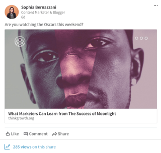
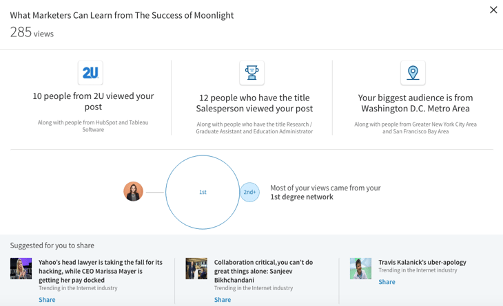
The platform also suggests other articles I might share with my network for even more engagement.
3) New (and missing) search features
LinkedIn refined its search capabilities so users can search all of LinkedIn with a single, unified search experience based on certain keywords. Now, users can easily toggle between different categories related to search terms without having to move between different categories of the site.
Check out what the results look like when I search for “content marketing:”
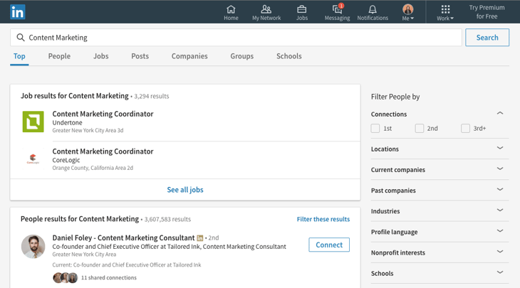
Whereas previously, LinkedIn users had to go into each of these sections (“People,” “Jobs,” “Companies”) in order to conduct searches, now users can search from one place to get all of the results they’re looking for.
Notably, LinkedIn removed some of the Advanced Search filters that were previously available on LinkedIn Premium and are now only available for the more expensive Sales Navigator tier of LinkedIn Premium. These filters include “years of experience,” “function,” and “seniority level.”
4) Chat-like messaging
Soon, LinkedIn will roll out messaging that allows users to send InMail like a chat instead of an email. Users won’t have to navigate to another pane to send a private message -- instead, they’ll be able to send a direct chat without leaving the LinkedIn homepage feed, as shown in the image below:
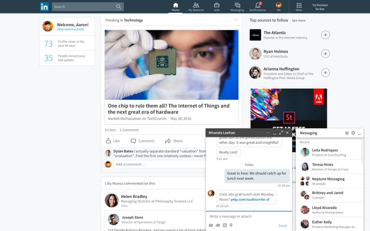 Source: TechCrunch
In another nod to Facebook’s Messenger layout, this change helps users easily spend more time clicking around the site. Plus, users might be less likely to send the dreaded default InMail message if they know it will appear like a chat instead of an email.
5) Calendar chatbot
Next, LinkedIn is introducing a chatbot. It will look at two connections’ calendars and find and set times for them to meet directly within LinkedIn’s messenger platform. It hasn’t been rolled out as of the time of this posting, but in another nod to Facebook Messenger and other bots, this is an addition designed to keep users spending time on the site. Stay tuned for more news when the bot launches fully.
6) New blogging interface
LinkedIn also now features a slick new publishing platform. Before, publishers had to navigate to LinkedIn Pulse to write an original blog post. Now, users are one click away from a slick, easy-to-use blog publishing platform.
Check it out:
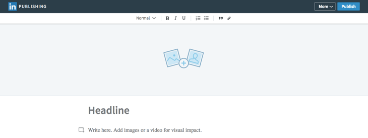
Blogging on LinkedIn could garner more attention to your brand’s site if LinkedIn grows in popularity. In fact, content consumption on LinkedIn has increased over the last few years, so marketers should consider LinkedIn as a platform for reproducing or creating original content.
What's Next For LinkedIn?
Amidst these changes, marketers should keep an eye on where their audience is spending time. If LinkedIn’s number of monthly active users increases in its next quarterly report, it might be worthwhile to invest more resources in running campaigns and creating content for the site.
We’ll keep you posted on more changes to the platform and its usage as that news unfolds. In the meantime, click around the new website and experiment with the new analytics capabilities to see if your audience wants to spend time on LinkedIn with you. And if you need guidance for running a strong LinkedIn ad campaign, download our guide here.
Do you publish original content on LinkedIn? Share with us in the comments below.
from HubSpot Marketing Blog https://blog.hubspot.com/marketing/new-linkedin-features

No comments:
Post a Comment