David Ogilvy, the modern Father of Advertising, once shared this great quote: "A good advertisement is one which sells the product without drawing attention to itself."
Advertising is supposed to be impactful and clever, but not overpowering. There are plenty of examples you've likely seen many times without realizing it at the time, but still managed to change your perception of the brand. Why? They reached you on a subliminal level.
Subliminal Messages in Advertising
Subliminal messages in advertising are designed to engage people subconsciously. These ads use various colors, shapes, and words that enable customers to make small but powerful associations between a brand and an intended meaning.
In short, be subtle.
And advertisements have a long history of being subtle. Whether they're hiding a double-meaning in a logo or working some Photoshop magic, subliminal ads definitely meet the criteria of clever. And the more clever the ad, the better we feel about "getting" it -- and the better we feel about the product.
Here's our list of eight ads and logos with subliminal messages you've probably missed.
9 Subliminal Advertising Examples That Deliver a Subtle Message
1. Pepsi vs. Coca-Cola Halloween Ad
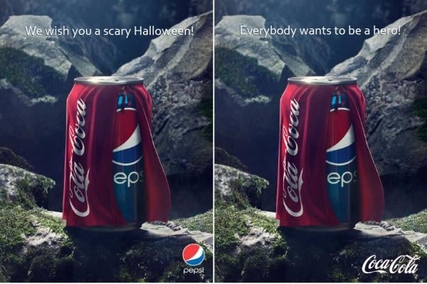
This is subliminal messaging at it's core -- subtle, but still clever. Pepsi released the image on the left and Coca-Cola responded with the image on the right. Pepsi's original ad is subliminal in that it makes the viewer think and chuckle a bit: it's funny to suggest that getting a Coke when you wanted a Pepsi is scary. Coca-Cola's response is perfect, as well, and becomes a great learning tool: sometimes, the tagline really does make the image.
2. Milwaukee Brewers
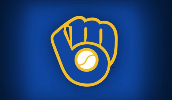
The MIlwaukee Brewers logo from 1978 to 1993 is an iconic example of a subliminal logo. Composed of an M and B to make a catcher's mitt, this logo was designed by University of Wisconsin art education student, Tom Meindel.
3. Pirates of the Caribbean
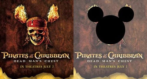
Disney's Pirates of the Caribbean bridges the gap between family-friendly and adult action movie, and did it well -- the franchise has earned over $3.7 billion in box office sales alone. While I can't say subliminal messaging -- and the visual overlap between the skull-and-crossbones and Mickey Mouse's ears -- are the reason why, I still love finding this secret.
4. Baskin-Robbins
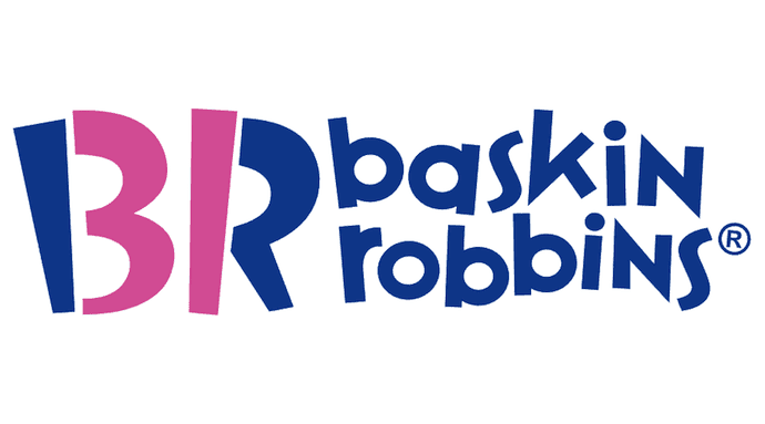
Baskin-Robbins isn't just famous for its ice cream -- it's famous for having 31 flavors of it. See how the end of the "B" and the beginning of the "R" in the logo above form the number "31"? The color contrast, and positioning the brand's initials just right, expose this subliminal message just the right amount to help you remember what makes Baskin-Robbins different from other ice cream parlors.
5. Amazon

An oldie, but a goodie, many don't see the subliminal message in Amazon's logo -- the current logo has been in use since around 2000 and it doesn't seem to be going anywhere. Why should it? The cute arrow connecting A to Z, while forming a grinning face, works so well to make you feel happy and see Amazon as an all-inclusive resource.
6. SFX Magazine
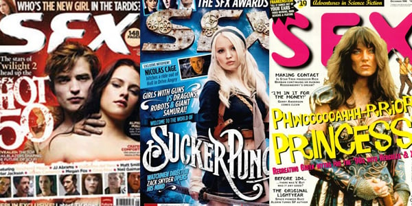
SFX is a sci-fi magazine that began in 1995. The mag focuses on sci-fi and fantasy news -- and some subliminal messaging to attract readers. Many sites have reported that the SFX logo often appears different when women are on the cover, making the reader view the title as "SEX." How much does sex sell? SFX has a circulation of about 26,000.
7. Tostitos
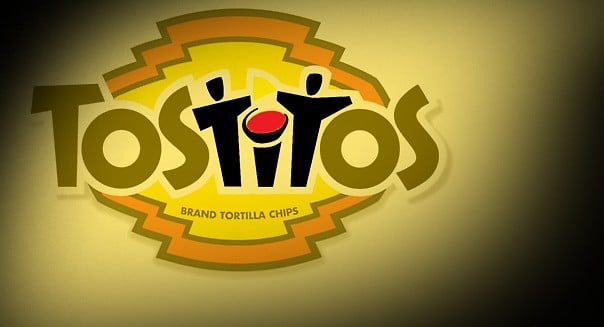
The Tostitos logo is fairly well-known, but you may have missed the subliminal message in it (and in every Tostitos ad that shows the logo). Notice how the fourth, fifth, and sixth letters in the brand name also make two friends sharing chips and salsa? I did, too -- and I wondered why it took me this long to find them.
8. Spartan Golf Club

While an advertising campaign might last for a quarter, a logo can last for years -- which gives a long shelf life to a well-designed logo. This Spartan Golf Club logo is, in my opinion, one of the best.
The design is just the right amount of subtle: The black silhouette of a golfer's backswing also looks like the face of a Spartan warrior, while the trail pattern of his swing also makes the shape of the classic trojan helmet.
9. FedEx
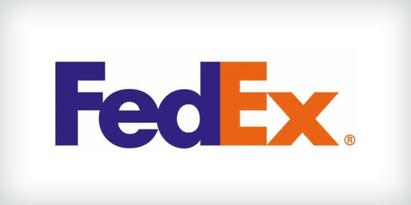
Another oldie-but-goodie subliminal message can be found in the FedEx logo. Whitespace in the logo clearly shows an arrow -- an indication of the company's speed and ability to get your delivery from Point A to Point B.
Subliminal messages can do a lot of legwork for you well after the campaign is done. Great ads will be shared, and reach a near-viral status, if the message is clever and subtle.
But of course, even the best ad will eventually fall out of style. If you're looking to make a lasting impression on your prospects and customers (and make the most of your marketing spend), be subtle and clever with all your content.
Learn more about context marketing in this free ebook from inbound marketing agency Cleriti.
from Marketing https://blog.hubspot.com/marketing/ads-with-subliminal-messages


No comments:
Post a Comment