Nothing summons the old imposter syndrome monster quite like the moments before a big project launch. All at once, you begin to question every decision you’ve made along the way — from the name of the project down to the comma placements.
For me, these nervous feelings are still fresh. Back in August, my team and I released a totally revamped version of our buyer persona tool, Make My Persona.
We’d been hard at work on the project for months and were all in agreement that it’d shaped up to be something uniquely valuable — something different than we’d worked on before. Nonetheless, I proceeded with caution as I began green lighting the promotion plans we’d put together.
Email? Check. Social media? Check. Blog post? Check.
The feedback started to roll in almost instantly … and it was positive.
Users loved the tool. And that’s when I knew it was time to spread the word a little further. So I pulled up Product Hunt, spun up the tool details, and set it free for the community to have at it. I gave the listing a courtesy upvote from myself and closed my laptop. It has been a long few months — and even a longer few days.
What happened next? Something special.
Make My Persona: The #1 Product of the Day
The great thing about having team members in Dublin is that they are up and at it hours before we’ve had our coffee here at HubSpot headquarters in Cambridge, MA. This means I often wake up to surprises from the designers and developers I work with — from updated wireframes to development progress to reimagined solutions for project blockers.
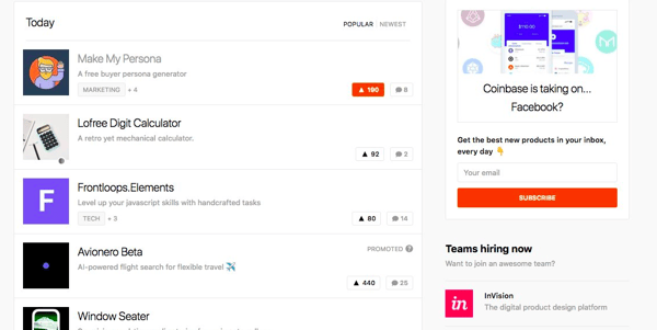
Though, I can confidently say that the Friday morning after our launch brought about my favorite surprise yet: A Slack message from my colleague claiming that Make My Persona had been featured as the #1 "Product of the Day" on Product Hunt.
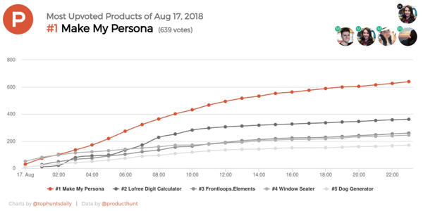
I rushed to the site to confirm and was delighted to see that my single upvote had grown into nearly 200 upvotes overnight. We were topping the charts and new upvotes were being tacked on by the minute.
In an attempt to understand exactly how we landed ourselves in this situation, I started reading articles from other teams that had seen success on Product Hunt. From what I could gather, this wasn’t something that was supposed to happen by accident. People had calculated plans. They’d researched the best time and date for launching. They’d done their homework.
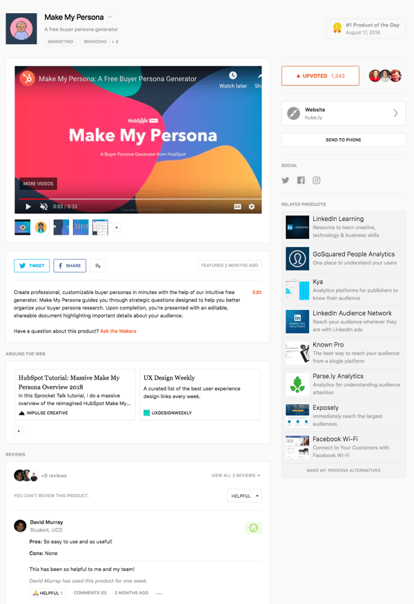
I’ll be the first to admit that I wasn't as strategic about the launch as I could have been. I’d launched a couple of lead generation tools on Product Hunt in the past, but our strategy still needed refining. I was learning. Though, the listing did check a lot of the launch “best practices” suggested by Product Hunt:
- We had a great explainer video heading up the gallery
- An animated thumbnail
- Quality screenshots of the tool’s experience
- A clear and concise description
- Links from features around the web
But I also missed a lot of opportunities:
- I hunted the tool myself
- I didn’t have all of our Makers in order before launching
- I failed to have one of the Makers post a comment to invite feedback
- I didn’t arrange any reviews
- I asked no one to upvote it — in fact, I didn’t even tell anyone I’d posted it yet
Suddenly, I could feel the imposter syndrome monster bubbling up again. Did we deserve this recognition? Was this a mistake?
I silenced that internal dialogue quickly. Of course we deserved this. This tool was unique, helpful, and visually stunning. I was proud of it for a lot of different reasons, so I decided to focus on that instead. And after tracing back the steps we’d taken to get here, it became clear why we’d been so successful. Allow me to explain ...
The Hidden Success Ingredient: Over-Investing in the User Experience
We had a kickoff for the project back in May where we drew up this list of improvements we wanted to make to the existing tool:
- Offer a solution for everyone
- Reduce friction in the conversion process
- Make the experience more engaging
- Encourage collaboration and customization
- Make the avatars more diverse to better represent all people
We referred to this bulleted list as our “rebuild objectives” and they all had one thing in common: they solved for the user. That was the hidden success ingredient. It suddenly felt so obvious. People were upvoting this tool because it was simple and engaging and entirely free. We over-invested in making it the best it could be for the end user and it was starting to show.
Here’s how each of those rebuild objectives shook out within the tool itself:
Offering a solution for everyone.
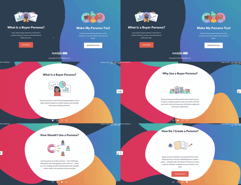
Make My Persona was a tool that we launched several years ago and made the decision to update this year. When we took a look at the tool's organic performance, we found it was ranking for a variety of buyer persona-related terms -- from "what is a persona" to "buyer persona templates." To ensure we met the needs of everyone that discovered the tool, regardless of their intent, we split the tool into two parts:
- Path #1: This conversion path was designed to help those who were just getting started with personas. Here we provided a brief intro to what a persona is, followed by a beginner's guide to walk them through how to conduct persona research.
- Path #2: This was the main conversion path that walked visitors through the creation of an actual persona. Visitors that chose this path would have already completed their persona research and be ready to document it.
Reducing friction in the conversion process.
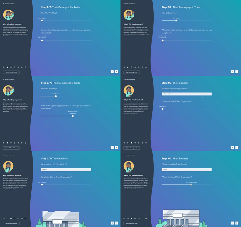
Persona creation requires a lot of information. And in most cases, the more detail you can provide – the better. With that in mind, we set out to balance the need for context with the even greater need for a simplified user flow.
To do that, we combined similar questions to form seven steps. In each step, we incorporated sliders and dropdown menus to help users input information faster, with less typing.
We also introduced a CTA that allows a user to skip the step-by-step process entirely and head straight to the editable template for an all-in-one view.
As a result, the new version of the gives users the freedom and flexibility to input information and work through the creation process on their terms, without restrictions or roadblocks.
Making the experience more engaging.
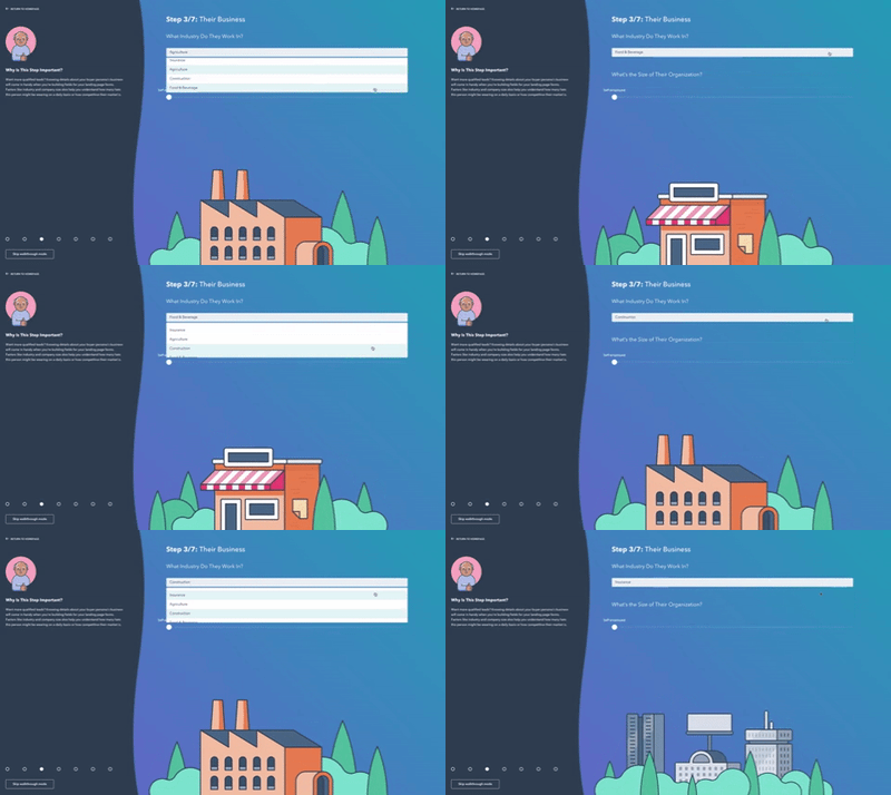
There are a ton of lovable "micro-moments" throughout the tool that are intended to make the experience more engaging – and more human.
For example, your avatar reacts to your inputs in the walkthrough mode (giving a thumbs up, winking, etc.) and confetti falls from the screen to help you celebrate when you complete your persona.
All of these gamified elements create an experience that is fun for the user, encouraging them to continue through to the next step.
Encouraging collaboration and customization.
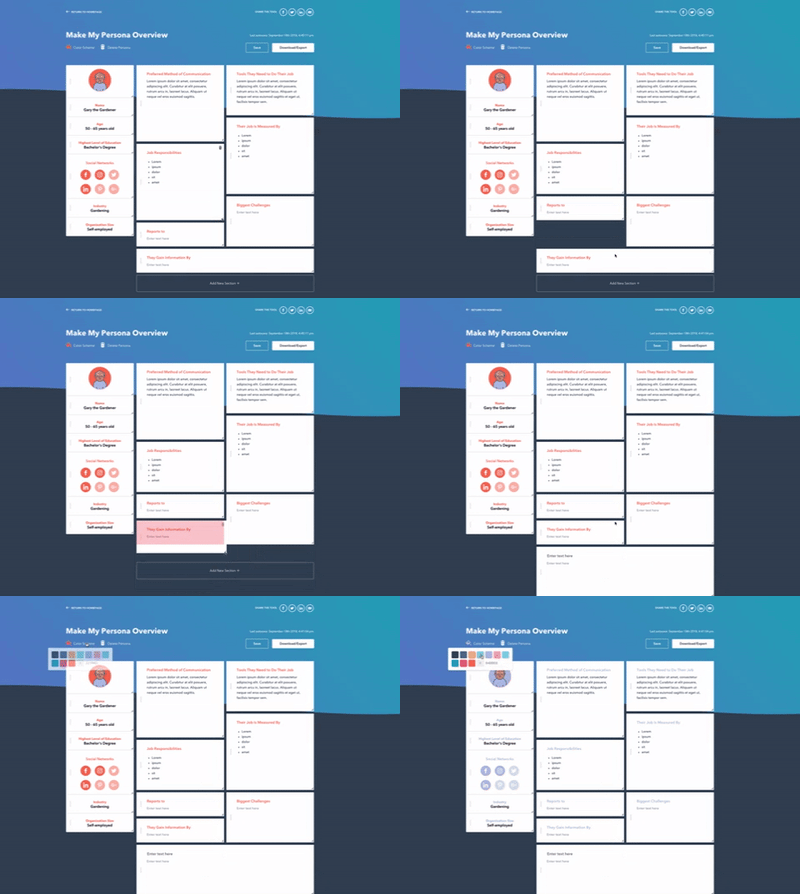
Buyer persona creation isn't always a one person job. And persona documents are not one size fits all. With these two things in mind, we introduced shareable links that users can send along to their colleagues to make edits to the persona and collaborate on the positioning.
This shareable link creates a copy of the master persona to ensure nothing gets deleted, while still providing the flexibility for others to rework the persona data.
To provide greater control over the actual look and feel of the document, we made the persona editor full customizable: users can drag, drop, resize, and reorder the modules to ensure the information that's most important to them is front and center. They can also adjust the color scheme to align with their branding.
Making the avatars more diverse to better represent all people.
![]()
The stock photo selection within the old tool was not a good look. There was only one-person of color represented – and an uneven amount of men and women.
In the 2018 version, we made the conscious decision to remove gender from the equation by introducing avatars that represent people – plain and simple. We also aimed to include a variety of skin tones, hair types, and age identifiers. While these were small acts of inclusion, they went a long way in terms of ensuring that everyone felt represented.
The Results: What Happens When You Top Product Hunt
At this point, you’re probably ready for me to skip ahead to the numbers. What impact does getting featured in the #1 slot have on the performance of your project?
Well, the Product Hunt win helped to shape our numbers in a few different ways:
Our upvotes skyrocketed. Being featured on the Product Hunt homepage = visibility. As a result, we ended the day we got featured with 600+ upvotes, though that number continued to grow over the next few days as we remained on the homepage. We also saw a second wave of upvotes from an inclusion in the daily digest email that followed. As it stands, the tool has 1.3K+ upvotes, making it the most successful HubSpot Product Hunt launch in history.
We saw a big increase in traffic. All said and done, we generated roughly 10K views from Product Hunt. Again, these numbers climbed steadily days after being featured thanks to continued homepage visibility and subsequent emails. We also saw an uptick in traffic from social media, as the listing spawned a lot of love on Twitter, LinkedIn, and Facebook.
We generated some leads. While the conversion rate from the traffic was nothing to write home about, we did pull in some leads from Product Hunt. Note: Because these people likely stumbled upon the tool on the homepage without searching for any terms, there’s no guarantee they actually have a need for it. We're keeping this in mind as we evaluate the quality of those leads and expect that those who find us through a deliberate search in the future will have more intent.
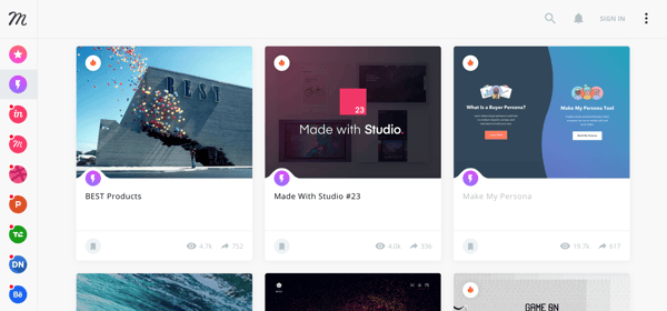
We got a lot of shout outs. As I mentioned before, the uptick in traffic from the feature earned us recognition via the Product Hunt email and on social media. But there were a few other unexpected surprises. For example, the tool was also picked up by InVision’s design inspiration extension, Muz.li. This extension curates content from hundreds of sources, including Product Hunt, which is where I suspect we got on its radar. This brought in another 7K+ views.
Setting the Flywheel in Motion
If you think about these wins in relation to the flywheel, it all adds up.
By investing in the delight stage — the overall user experience of the tool — we were able to build enough momentum to set the rest of the flywheel in motion.
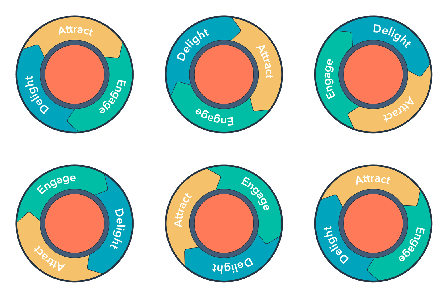
Delighted users shared and upvoted the tool
↓
Those shares and upvotes helped us attract a larger audience
↓
Drawing in a larger audience gave us more people to engage and convert
So while we enjoyed basking in the our fifteen minutes of Product Hunt fame, we're excited to watch this tool continue to build momentum. If you haven't already checked out it out, you can give it a spin here.
from Marketing https://blog.hubspot.com/marketing/how-we-topped-product-hunt-overnight

No comments:
Post a Comment