You’ve rolled out a lot of marketing tactics to boost traffic for your website. After copious amounts of content production, sharing, social engagement, and even paid ads, you feel like you can finally celebrate because your site is now pulling in tens of thousands of unique visits every month with a ton of page views.
However, if your conversions are bottoming out and growth is sluggish, then don’t celebrate just yet.
I hear about this problem on a regular basis. Unfortunately, pageviews don’t pay the bills. Purchases do.
If you’re struggling and want to improve your conversion rates, you should look beyond the traditional CRO recommendations and A/B testing recommendations for bottlenecks.
Here are some reasons why your visitors might be bailing on you:
Your Design is Turning Them Away
According to data from SmartInsights, more than 80% of people use smartphones as their primary method for accessing the web. You’ll see similar rates of mobile usage if you review visitor device information on your analytics platform.
It’s important to be aware of this trend, since 30% of mobile users admit to abandoning a transaction if the website isn’t fully optimized for mobile browsing.
Personally, I find it incredibly frustrating to visit a site on my phone, only to be greeted by a site that requires me to zoom in and scroll horizontally. It goes from bad to worse when a pop-up designed for desktop users suddenly fills my mobile screen and I’m unable to close it. That site is basically dead to me on mobile and I’ll never try to go back after that bad experience.
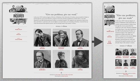
Google understands that frustration, and they have updated their algorithm to make mobile compatibility a ranking factor. If your site isn’t currently using a responsive, mobile-compatible design then it’s time to fix it. Otherwise you’ll miss out on conversions and risk a significant drop in organic search rank (and subsequent organic traffic).
Mobile usability aside, there are other on-page elements that can repel your visitors like:
- Multiple calls to action that prevent them from taking action (analysis paralysis)
- Poor navigation
- Sliders and rotators
- Too many steps in navigation to reach content/products
- Confusing or cluttered content
Rather than guess at what makes a good user experience, you can quickly identify and work to eliminate a lot of usability issues by working with UserTesting.com. You can submit your site to be reviewed by real people and watch videos of how the interact with and react to your site.
Autoplay Videos Hijack the User Experience
Don’t you just love the autoplay feature on ESPN and CNN.com? You land on a page to read an article, a video loads (with an ad) and you scramble to hit the pause or mute button so you can read the article.
With that being said..
Implementing video on your website could work wonders for conversions. According to a Liveclicker survey among major retail brands, the more videos a visitor watches, the more likely they are to spend within your funnel.
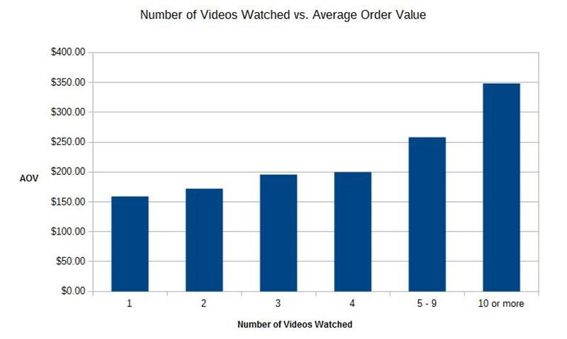
According to a survey of major online retailers, the use of video on product pages lifted conversions an average of 9%.
But setting videos to autoplay could potentially harm your conversions. It’s potentially a major disruption. According to W3C (the group responsible for setting standards for web design best practices), autoplaying audio can interrupt the navigation process as a user has to search for the source of the audio to shut it down.
Certain groups of people, especially those with attention disorders, can be easily distracted by motion which can disrupt the user experience and make it difficult for them to focus.
Worst case scenario, the visitor has a negative reaction to the disruption and closes the page.
Instead of autoplaying the video, create a call-to-action that draws visitors’ attention to it and persuades them to click the play button on their own. Another option is to run the video on silent in the same way Facebook autoplays video in a user’s feed.
Your Value Proposition is Unclear
If you’re not clearly communicating the value and benefits of your offer, then your visitors won’t feel compelled to click or make a purchase.
Why should they, if they have no idea what they’ll get out of the exchange?
Here’s a great example from Help Scout where they reference the launch of the Apple’s early iPod product. Not every member of their audience is tech-savvy, so trying to leverage storage capacity (a feature) would be meaningless to many people.
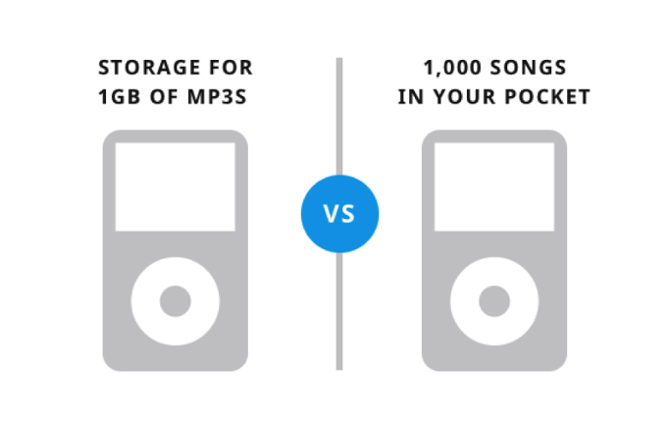
Instead, they communicated the real value and benefit of the product: 1,000 songs in your pocket.
Make sure your value proposition is crystal clear on your landing pages. Test different variations to see which phrasing gives you the best conversion lift.
Content Doesn’t Match Audience Intent
The first conversion opportunity isn’t on your website, it’s wherever your visitor came from. In most cases, this will be organic search or an ad elsewhere on the web. The headline and description make a specific promise to the reader and set their expectations.
If they arrive on your website and find something completely different, such as copy or offers that don’t match their intent, they’re more likely to click the back button.
For example, if you’re targeting enterprise businesses and your audience is mostly CMOs and upper-level marketers, they’re not likely to opt-in if you’re only offering a free e-book on local marketing strategies.
Make sure the copy, design elements, offers, and calls-to-action all line up with user intent to lift conversions on your landing pages. This is where audience research pays off.
Understanding the specific needs and pain points of audience segments will help you create more targeted offers to keep your visitors engaged.
Site Load Time is Terrible
Kissmetrics produced an infographic that shows us just how load time can impact your bottom line. Not only is load time a ranking factor for organic search, but it can also have a pretty significant impact on conversions.
As many as 47% of consumers expect a page to load in 2 seconds or less. If they’re met with prolonged loading graphics or a hanging white page then you risk losing them – and their patience can be short.
In fact, a delay of just 1 second in load time can result in a 7% reduction in conversions.
Do everything you can to reduce page load time on your website in order to avoid negatively impacting your conversion rates. I recommend:
- Optimizing/compressing image files to reduce size by using a tool like ImageOptim or TinyPNG. Lossless compression ensures quality isn’t compromised
- Enabling browser caching
- Combining multiple style sheets
- Reducing the plugin load on your website
- Loading your scripts from the footer, below the fold, so they don’t all try to load first
Opt-Ins Aren’t Optimized
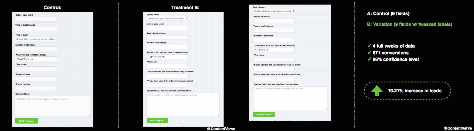
The old trick for improving conversions with opt-in messages was to reduce the number of form fields. This advice was based on a study from 2008 so by now, it’s obsolete. In fact, ConversionXL examined another study by Unbounce that compared shortened forms to optimized forms.
The result?
The forms with fewer fields performed worse. Meanwhile, the forms with improved label copy instead of reduced field counts saw a 19.21% lift in conversions.
So which method is the best approach?
The answer is “it depends.” There’s no concrete answer here. If you’re experiencing friction with opt-ins, then your ideal approach is to test variations and see what works best for your audience. Optimize the labels, try different field counts, adjust the call-to-action, and continue testing until you’re satisfied with the conversions.
Trouble with the Calls-to-Action
You would think that crafting an amazing offer, telling a great story with visuals, and writing dynamite copy would send your conversions through the roof. It’s actually quite the opposite.
Even if your audience is in tune with your offer, your conversions are going to suffer if you don’t have a strong, compelling call-to-action. In many cases, customers just won’t engage unless you specifically tell them what you want them to do.

If you’re missing a call-to-action altogether, then you’re definitely going to suffer from low conversions. One study from Small Business Trends found that 70% of B2B businesses lack a call-to-action on their homepage.
Such a simple thing can have a major impact and at least it’s an easy fix:
- Create a call-to-action that is prominent and stands out from other page elements
- Make it compelling and focus on the value; what do visitors get by clicking?
- Make your call-to-action relevant to match the audience’s intent
- Use verbs and actionable language
- Leverage urgency with words like “Now” and “Today”
Be sure test different versions of your call-to-action to determine which designs and copy offer the greatest lift in conversions.
There’s No Secret Formula
There’s no one specific thing you can do to suddenly make your conversions soar. While these individual items could hurt your conversions, making a single adjustment isn’t guaranteed to change or improve anything.
Rather than taking a tactical approach to improving conversions, identify the elements that could be creating problems and start testing. A/B testing small changes is more likely to help improve conversions over time and eliminate trouble areas like these.
What have you done to increase conversions on your website? Share your approach and results with me in the comments below.
About the Author: Andrew Raso is the co-founder and director of Online Marketing Gurus, a fast-growing, award-winning search company working with brands including HelloMolly, Baku Swimwear, and Forcast. Follow him on Twitter at @andrewraso1 or on LinkedIn.
from The Kissmetrics Marketing Blog https://blog.kissmetrics.com/why-people-leave-without-converting/
No comments:
Post a Comment