Building a website is, in many ways, an exercise of willpower. It’s tempting to get distracted by the bells and whistles of the design process, and forget all about creating compelling content. But it's that last part that's crucial to making inbound marketing work for your business.
So how do you balance your remarkable content creation with your web design needs? It all starts with the "About Us" page.
For a remarkable about page, all you need to do is figure out your company's unique identity, and then share it with the world. Easy, right? Of course it's not easy. That said, the "About Us" page is one of the most important pages on your website, and it can't go neglected. It also happens to be one of the most commonly overlooked pages, which is why you should make it stand out. 
But it can be accomplished. In fact, there are some companies out there with remarkable "About Us" pages, and there are elements of them that you can emulate on your own website. By the end of this post, showing off how your company's greatness won't seem like such a challenging feat.
10 of the Best About Us Page Examples
1) Yellow Leaf Hammocks
Why the "About Us" Page Rocks: It tells us a story.
When you have a great story about how your product or service was built to change lives, share it. The "About Us" page is a great place for it to live, too. Good stories humanize your brand, providing context and meaning for your product. What’s more, good stories are sticky -- which means people are more likely to connect with them and pass them on.
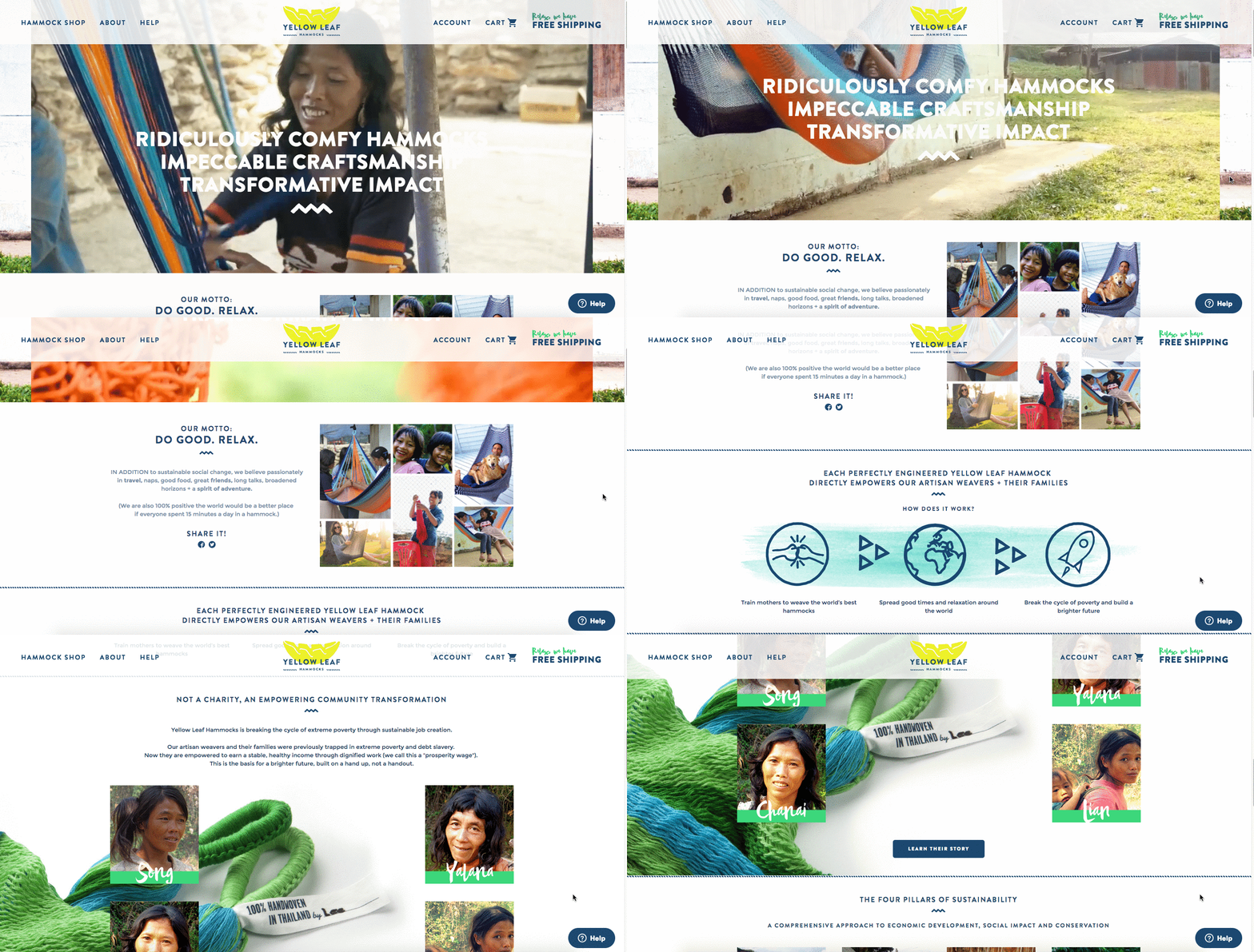
Yellow Leaf Hammocks tells users about its product by describing how the hammocks empower artisan weavers and their families. The company breaks down different pieces of the story into sections that combine words and easily digestible graphics, painting a picture instead of big chunks of text. They're clear about why they're different: "Not a Charity," the page reads. And then: "This is the basis for a brighter future, built on a hand up, not a handout."
Every company has a story to tell, so break out your storytelling skills from that random English class you took years ago and put them to work on your "About Us" page. Using descriptive and emotive copy and gorgeous graphics, an "About Us" page with a story works harder for your business than a generic one.
2) Eight Hour Day
Why the "About Us" Page Rocks: It's human.
People tend to think that "About Us" pages have to sound formal to gain credibility and trust. But most people find it easier to trust real human beings, rather than a description that sounds like it came from an automaton. Trying to sound too professional on your "About Us" page results in stiff, “safe” copy and design -- the perfect way to make sure your company blends in with the masses.
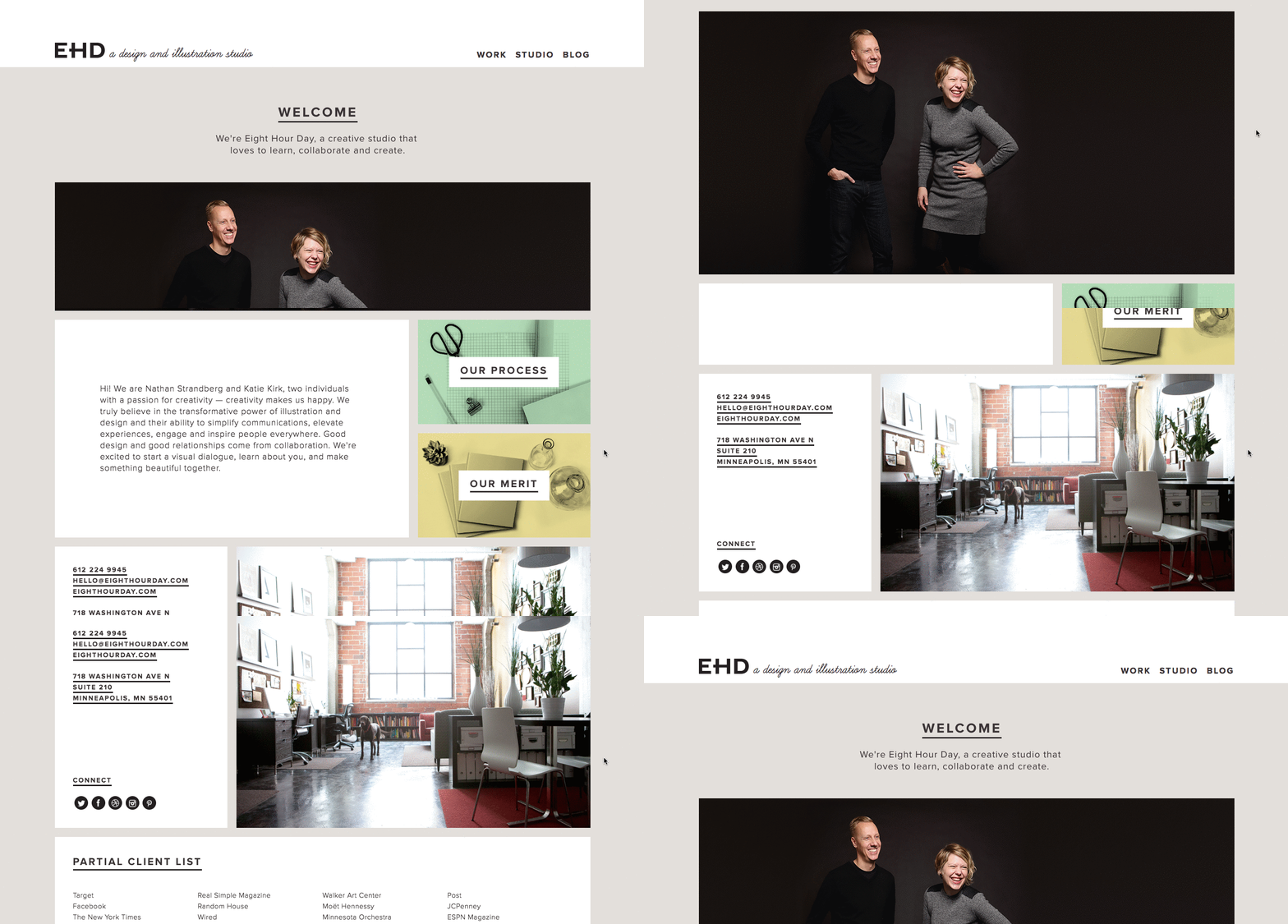
Instead, Eight Hour Day showcases the people behind the company and humanizes its brand. Introducing the founders by name and featuring the photos of them on the "About Us" page drives home the point that Nathan and Katie are -- as they so astutely put it -- "two individuals with a passion for creativity -- creativity makes us happy."
When you’re designing your "About Us" page, avoid industry jargon and replace it with an authentic voice -- yours -- to describe your product or service. Sure, it needs to be polished and free of errors, but it should always sound friendly and real.
3) Apptopia
Why the "About Us" Page Rocks: It skips the business babble.
We know -- no industry jargon. If you think it makes you sound super smart on your "About Us" page, think again. People want and appreciate straight talk about what your business does. After all, if people can't figure out what you do, how will they know they need your product or service?
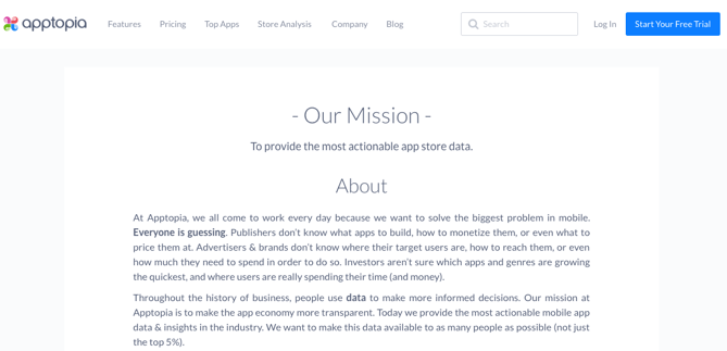
So, skip the industry lingo -- that's what Apptopia does on its "About Us" page. The startup's simple but polished language effectively communicates the company's offering while still allowing the Average Joe to understand it.
The moral of the story -- again: Try to get rid of jargon on your "About Us" page whenever possible. Use short and punchy sentences to explain complex products and ideas in a way that isn't patronizing, but rather, is empathetic.
4) Moz
Why the "About Us" Page Rocks: It's unique and visually interesting.
Instead of following the classic "About Us" script and writing a few paragraphs about the company's mission and origins, try something different -- there are plenty of ways to make it more visually compelling.
Take Moz, for example. A lot has happened since it was founded in 2004 -- the company chose to share those milestones using a timeline, using a fun and clean design that incorporates clear headers, concise blurbs, and little graphics to break up the text. We love how humbly they preface the timeline, too, with a thank you to their community: "We owe a huge thanks to our community for joining us on this awesome journey, and we hope that you’ll continue to be a part of our story."
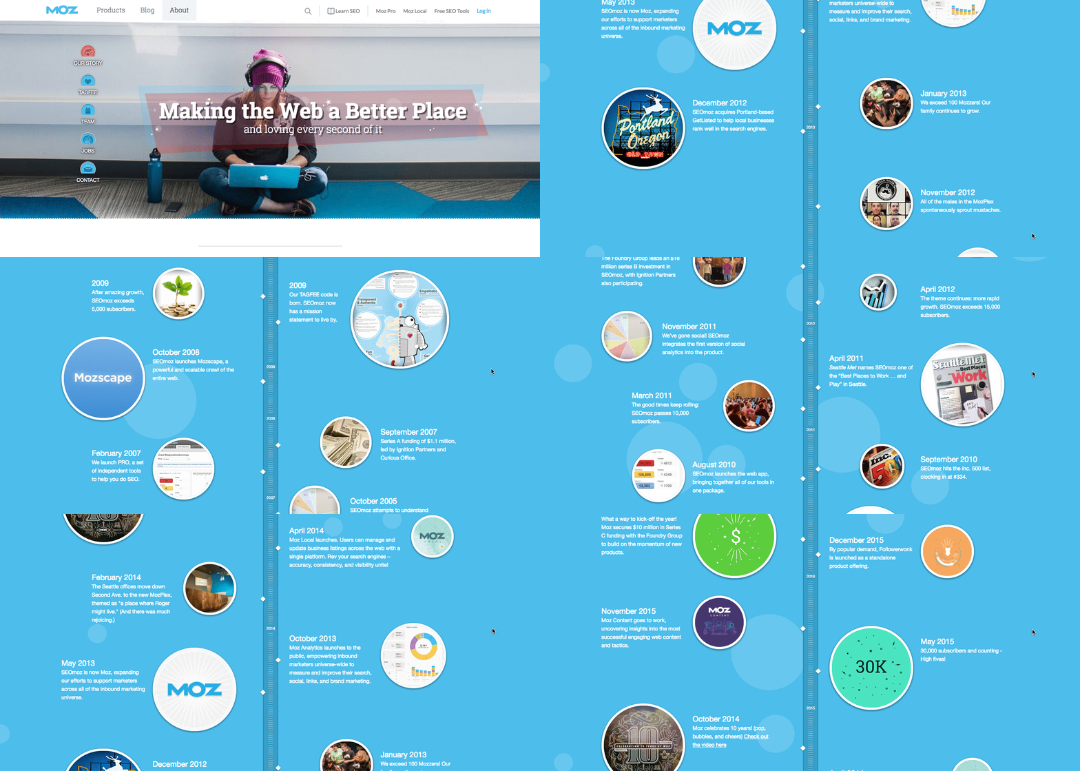
Visual content continues to be on the rise -- people like it for a number of reasons, including its ease to skim and absorb. Think about the ways you can use more visual formats to stand out from the typical "About Us" page style of paragraph text.
5) Cultivated Wit
Why the "About Us" Page Rocks: It breaks the mold.
Yes, this post is about, well, "About Us" pages. But sometimes, you don't always need to wait for users to get there in order to make a statement. That's part of breaking the mold to showcase your company's personality.
That's exactly what Cultivated Wit -- a creative agency and media company -- does, with both an edgy name and an incredibly fun story told through video and parallax scrolling ... right on its homepage.

Below is the actual "About Us" page, which is a gem once you get there. But it's great to see a company embrace its own brand of quirk throughout the site.
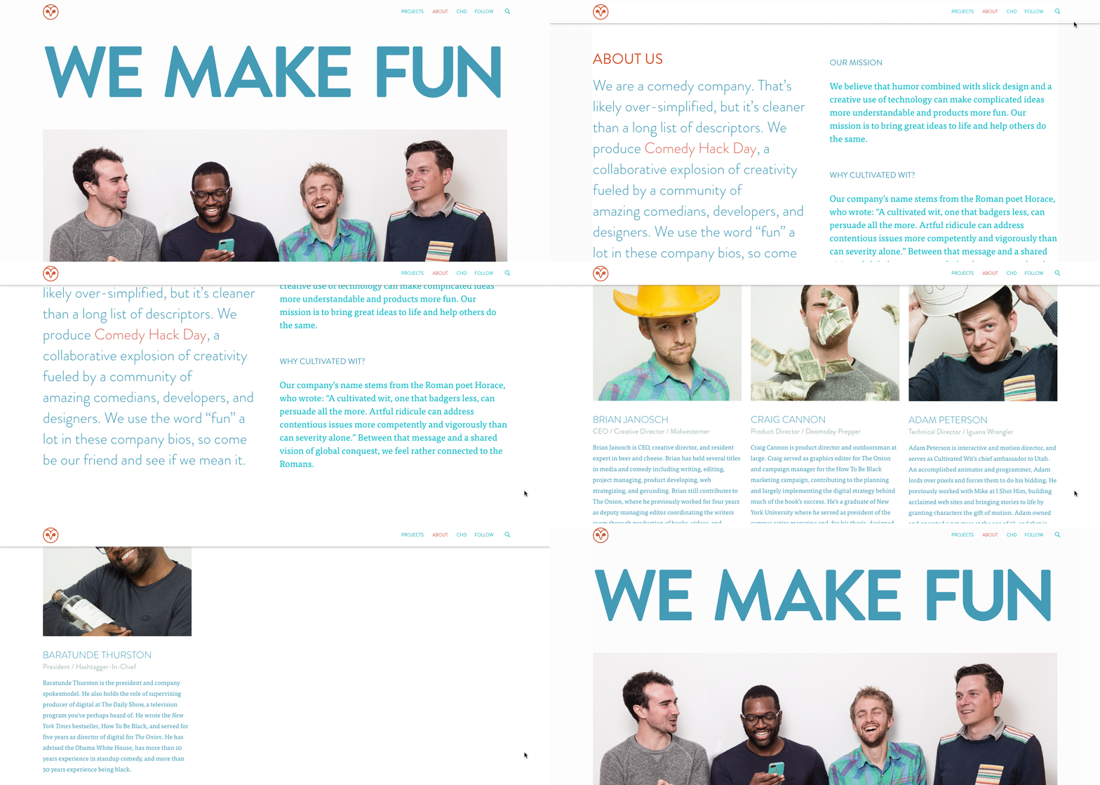
Even if you have a dedicated "About Us" page, there are plenty of ways to creatively showcase your company's personality throughout your entire website. And yeah, that's harder than filling a stock "About Us" template -- but it can have a significant payoff for your brand.
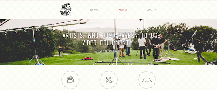
6) FortyOneTwenty
Why the "About Us" Page Rocks: It lets customers do the talking.
Who would you trust more: A company talking about how awesome it is, or a colleague raving about the company's work? I'd bet that you prefer the latter -- that colleague is more likely to be unbiased and give you a realistic understanding of what the company is like. Including customer testimonials on your "About Us" page can give prospects and leads a more down-to-earth view of your company.
Although FortyOneTwenty's "About Us" page starts out with a classic but well-designed value proposition, the key part of the page is the testimonial section below the fold. Including that -- with pictures, so users can put faces to names -- as well as a list of companies that "trust" the company, quickly makes FortyOneTwenty more likable and trustworthy.
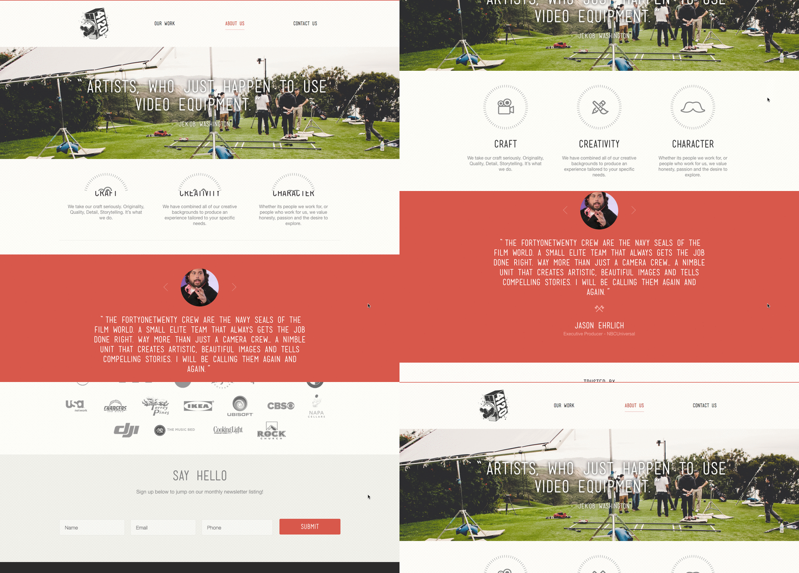
Personal testimonials build credibility and trust, making the "About Us" page a good home for them. If you have a customer who has nothing but good things to say about your company, hand them the mic and let them do the talking.
7) Refinery29
Why the "About Us" Page Rocks: It lets the employees do the talking.
Here's another instance where any area of your website -- not just the "About Us" page -- is an opportunity to break the mold.
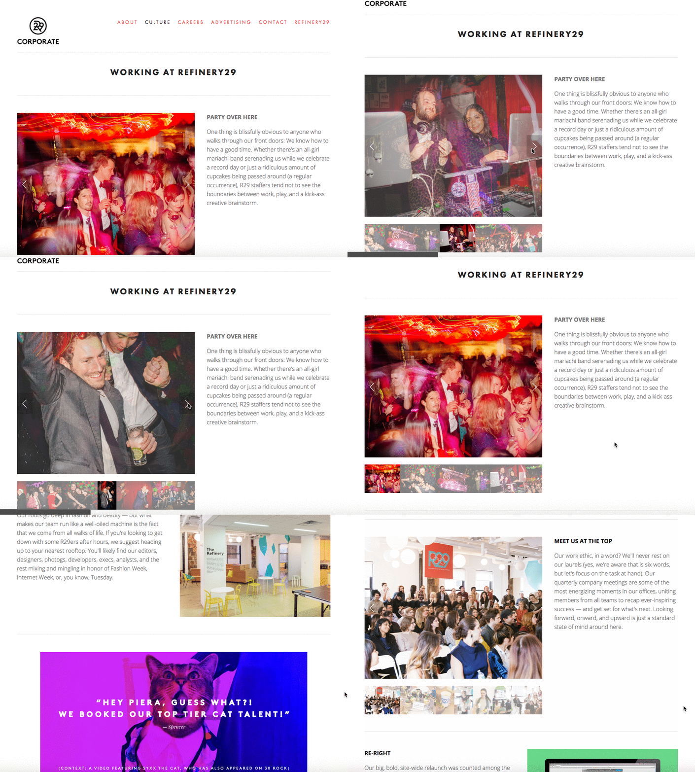
Many companies add a "Careers" section to their websites, where there might be a bit of information on the corporate culture. But Refinery29 -- like a site after our own hearts -- dedicated an entire page to that culture, and it's a highly engaging one at that.
Like customer testimonials, employee testimonials are a great way to showcase a brand's value. We love that it opens with an unconventional header -- "Party Over Here" and "You Can Sit With Us" -- and couples short pieces of texts with pictures from the company's (non)corporate life. It gives visitors a glimpse into life at Refinery29 in a fun, but not overstated way.
8) Marie Catribs
Why the "About Us" Page Rocks: It's unexpected.
There's a reason why these examples are exceptional -- "About Us" pages aren't always the most riveting parts of a company's website. In fact, they often look like an afterthought. But even if you don't have budget for juicy graphics, video, or parallax scrolling, there are other ways to make your "About Us" page unexpected with the copy alone.
Marie Catrib's is a restaurant, so you might think their "About Us" page would be your typical "here's how we started, here's what we believe in, and here's our food" story. Marie Catrib's "About Us" page does tells us that -- but it does so in an unconventional way. Immediately, the user's eyes are drawn to a header that says, "It's okay to make a mess, experiments can lead to beautiful things." Quite philosophical, for a place to have dinner.
But next comes the story about the owner, which starts in an unexpected way -- "It's hard to imagine, but at one time Marie was banned from the family kitchen." A line like that draws in the audience, because we know it's not going to be typical.
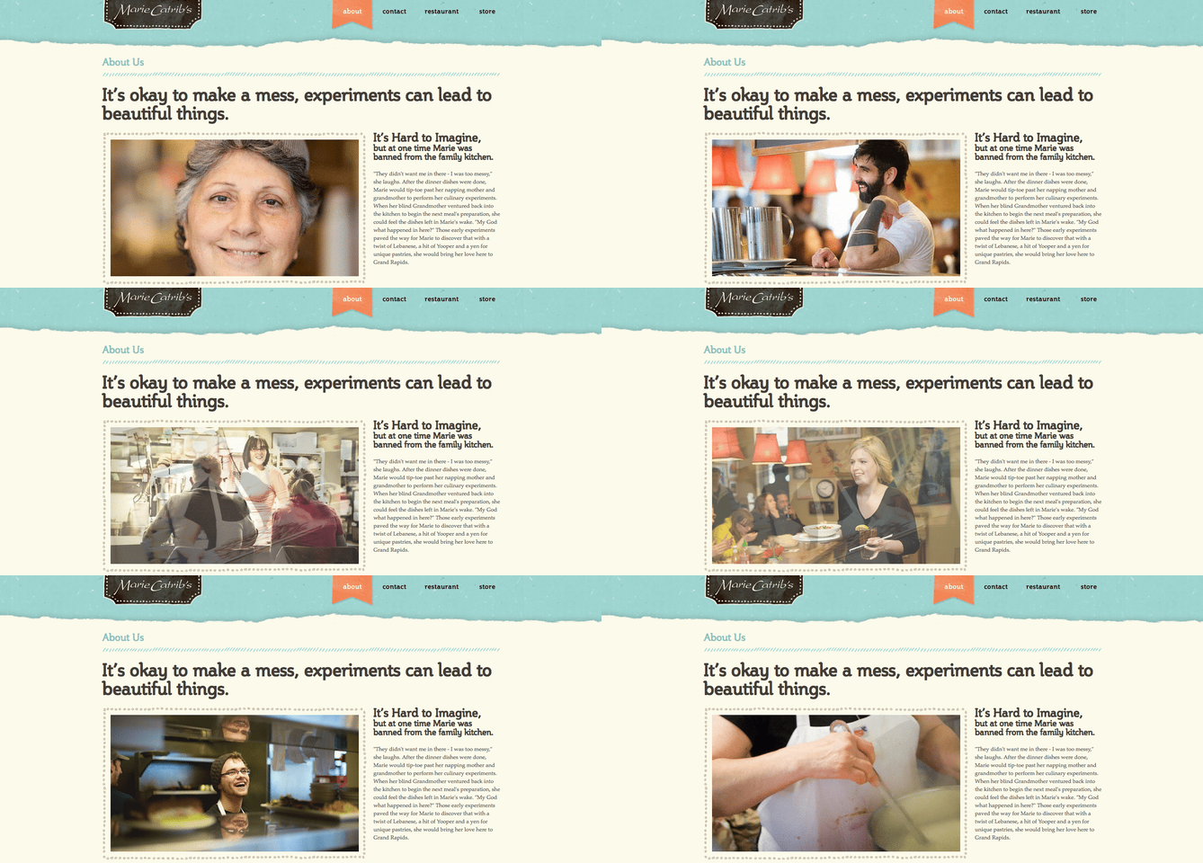
So, how will you use copy to really draw readers in? It's amazing what impression you can make on site visitors just by creatively telling your story with words alone.
9) Bulldog Skincare
Why the "About Us" Page Rocks: It's lovable and memorable.
What's the difference between "average" marketing and lovable marketing? It's the difference between creating generic webpages that provide great information, but in a straightforward, black-and-white kind of way -- versus creating webpages that provide great information and are infused with color, personality, and stay true to a company's unique brand voice. When you create lovable marketing, you can start a movement of brand evangelists and advocates who will help you grow.
Where does this fit into a company's "About Us" page? The folks at Bulldog, a men's skincare company that was named for the colloquial "man's best friend" -- a dog -- could have typed up a few paragraphs about where the brand came from and how they were one of the first in the space to redefine and eliminate stereotypes around men's grooming. But that text alone would have been a bit, well, average.
Instead, the "About Us" page is pithy, colorful, and leads with the lovable mug of an adorable bulldog -- fitting the name and the brand. And it states the purpose of the products -- to help customers from becoming "a wrinkly old beast."
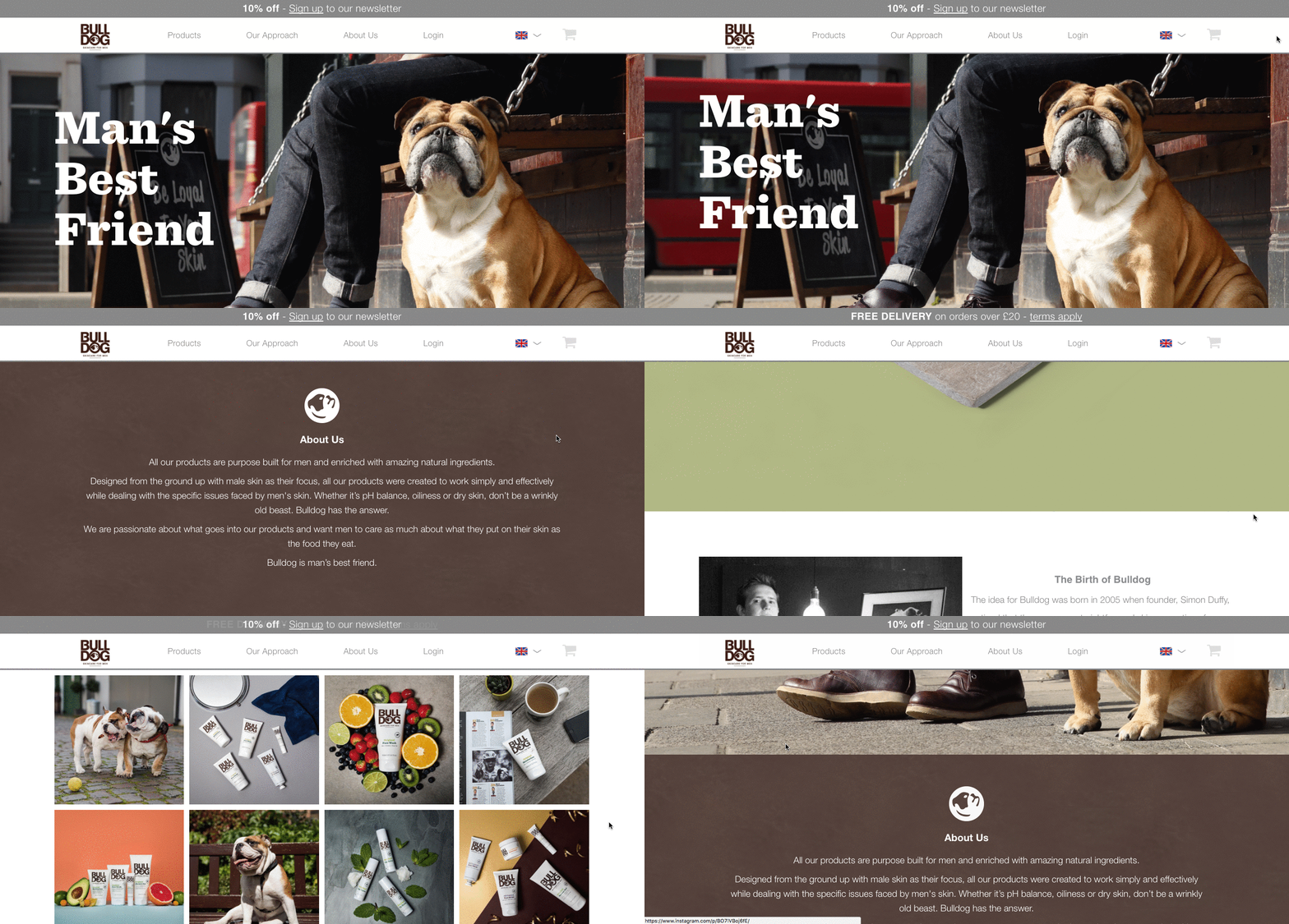
Play on your own words -- it's okay to have fun and pun with your brand, as it helps to inject personality and humor into your "About Us" page. It primes visitors for a story in a way that makes them immediately feel something. That's how you create memorable, lovable marketing.
10) Doomtree
Why the "About Us" Page Rocks: Its shows, tells, and has a soundtrack.
One minute of video is worth 1.8 million words, according to Forrester Research's Dr. James McQuivey. But what about audio and visual, too, all combined with a really cool story? Well, that's one way to tell your story in an engaging way -- through multimedia.
Doomtree is built on a bit of an innovative concept: That a group of talented artists can each have thriving solo careers, but can still come together on a regular basis to create great music. It's not a band -- it's a crew. It's an unconventional concept with an equally interesting backstory that "started as a mess of friends in Minneapolis, fooling around after school, trying to make music without reading the manual." And as soon as you arrive on Doomtree's 'About Us' page, you're greeted with big, bold photos of those friends.
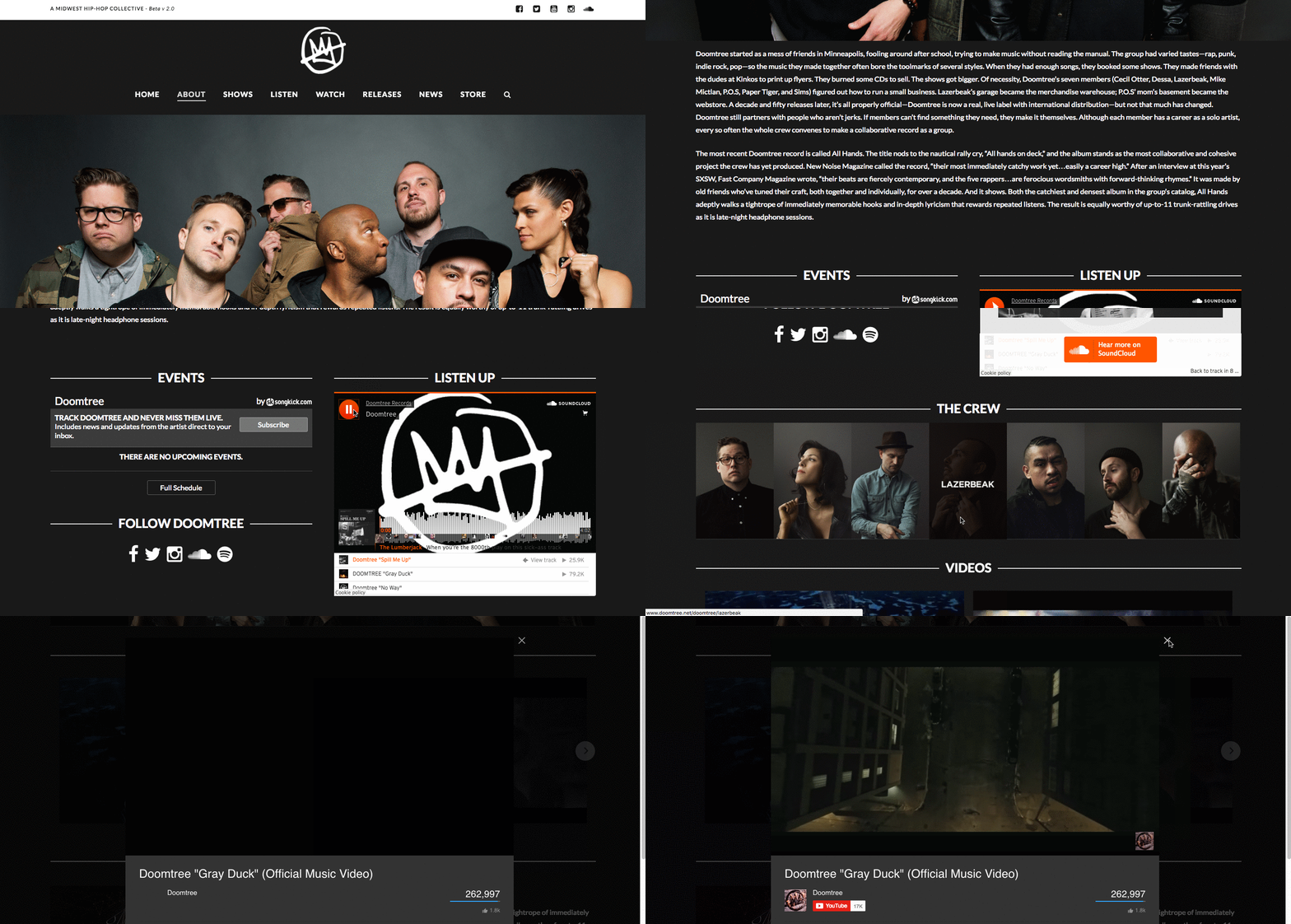
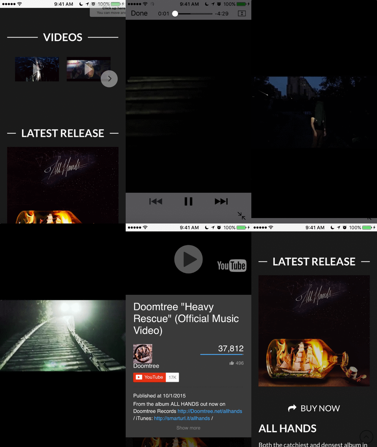
As you scroll down, users are treated to even more interaction with the crew's tracks and music videos. That makes sense, because it gives visitors an instant sample of Doomtree's product. What's more, the entire "About Us" page is responsive, including the video. That's important -- not only because it offers site visitors a great mobile experience, but also for Google search ranking -- especially now that such mobile usage has surpassed desktop.
How About You?
At this point, we hope that creating an "About Us" page doesn't seem like a daunting task -- rather, we hope you're ready to have some fun with it. With a good story to tell, creative copy, humility, and digestible visuals, you're on your way to an eye-catching user experience.
Even better? You're becoming part of the exception -- and standing out from a sea of "About Us" pages. What makes you different? We're eager to learn more ... about you.
Which companies do you think have remarkable "About Us" pages? Share your favorites in the comments
Editor's Note: This post was originally published in May 2013 and has been updated for freshness, accuracy, and comprehensiveness.
from HubSpot Marketing Blog https://blog.hubspot.com/marketing/remarkable-about-us-page-examples
No comments:
Post a Comment