Writing online content is something of a balancing act. For years, SEO experts have pointed out that Google loves longer content.
Your readers? Not necessarily.
As a writer, that means you’re kind of stuck in the middle. Write too little, and your content won’t rank. Write too much, and most people won’t read your content.
‘Tis a conundrum, no?
The good news is, Google has realized that word count and keyword density aren’t always the best predictors of relevance. People care about their on-page experience—not the keyword count.
As a result, Google has placed an increasing focus on user experience. In Moz’s 2015 report on non-keyword ranking factors, 4 of their top 10 factors relate to user experience:
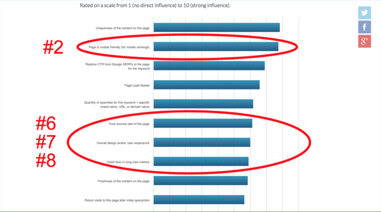
Given this trend, the odds are that as Google gets better at discerning great on-page experiences from the ho-hum ones, many pages with a lot of text but little value will start dropping through the ranks.
As a result, it’s not enough any more to write in-depth, keyword rich content—you have to optimize your content length for user experience. And, to do that, you need to know how much content your audience really wants on a page.
Fortunately, figuring that out isn’t nearly as difficult as you might think. To help you out, let’s take a look at how users interact with content and how you can test your content to maximize its effectiveness.
Is Longer Better?
Since Google has historically prioritized longer content, most companies and blogs have spent years producing long-form content. Often, this content is good, high-quality writing that delivers a lot of value (case in point, the Kissmetrics blog).
But the question is, is longer better?
For some sites, it probably is. But, to tell you the truth, I rarely read through everything on a page, even if I care a lot about the content. As it turns out, most people act the same way online.
In fact, Chartbeat ran a study to see just how far people make it through a typical blog post. Turns out, your average user only reads about half of a blog post:
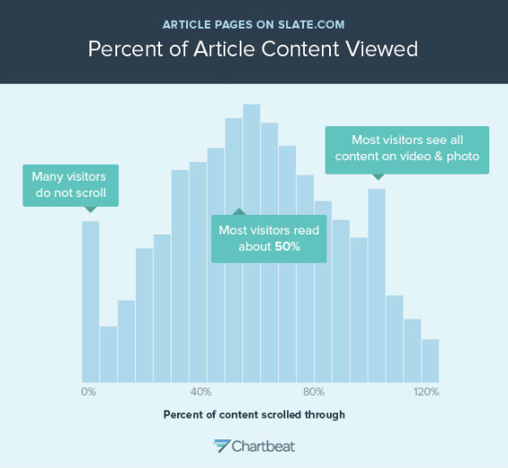
So, while you may have written an epic, 8,000-word blog post about the psychology behind the Chewbacca Mask Lady’s viral video, most people aren’t going to read the whole thing. They’re going to bail long before your oh-so-compelling conclusion.
Sure, your article might rank well, but if people don’t finish reading it, will your article help your business? That’s debatable.
This idea holds especially true for site pages and landing pages. The internet is littered with enormous pages like this one (I rearranged the page into 3 side-by-side columns to improve your reading experience—see what I did there?):
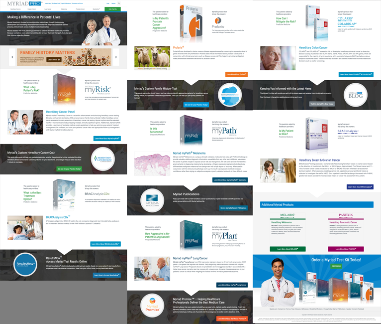
Pages like this have a lot of good content, but all of that good content gets lost in the length of the page. Yes, the information a potential customer needs is probably on the page, but if they can’t find it, they’re not going to have a very good experience.
The point here is that crafting a compelling user experience doesn’t mean writing a lot of content. In fact, depending on your audience, writing more may mean people read less and therefore convert less.
But how can you know what sort of content length your audience prefers? To answer that, you’ll need to run a simple test.
Testing Out Different Content Lengths
When it comes to conversion rate optimization, a lot of companies focus on major page elements like headlines, hero shots, form fields, CTA buttons, etc. Content length often sits at the bottom of the list.
This is a shame, because content length is a major part of your user experience—especially if you run an active blog.
For example, at Disruptive, we were recently helping OURrescue optimize their site. Now, OURrescue is an amazing group. They travel the world saving kids from sex traffickers. It’s pretty hard to top that.
To fund their rescues, OURrescue runs a regular blog that discusses the (often heart-wrenching) details of their “missions.” Each blog post ends with a call for donations to help fund further rescue efforts.
In keeping with most blogs, OURrescue’s articles were usually a minimum of 1,500 words long and very detailed. The blog was generating decent donations, but my VP of Conversion Rate Optimization, Chris Dayley, started to wonder about the length of their content.
Were they writing too much? Too little? Would OURrescue get more donations if they changed the length of their content?
To answer these questions, Chris asked OURrescue to write short, medium and long versions of a few articles. We then used Optimizely to send traffic to each of the post variants. Similar to Chartbeat, we tracked how far users scrolled through each post (using Hotjar), time on page and the donations generated from each version of the article.
On desktop, the results were about what you’d expect (note, we tested multiple articles, but for simplicity’s sake, we’re only showing the variants for one article):
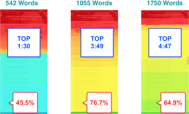
The longer the posts, the longer people spent on the page. That makes sense, since longer posts take more time to read. However, the mid-length articles actually had the highest completion rate.
So, while readers spent more time on the longest version of the posts, more people actually finished the articles and saw the donation CTA on the medium-length versions.
Things got even more interesting when we looked at our mobile users:
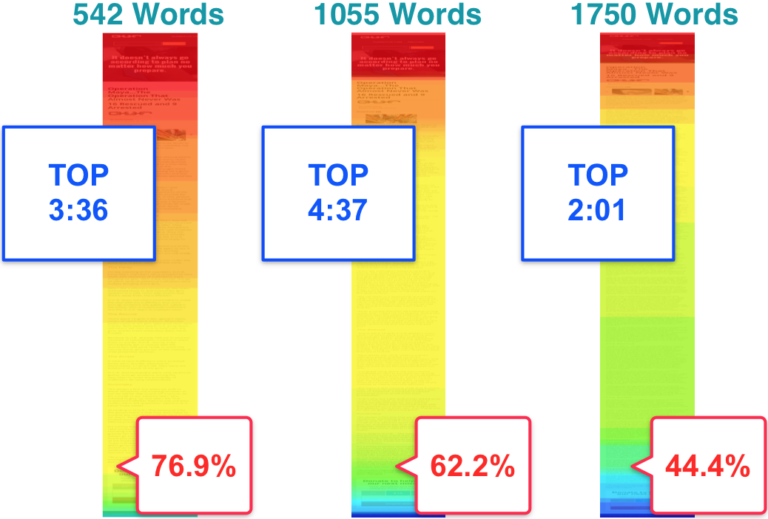
On mobile (which is where most online time is spent these days), the longest post variants had the lowest time on page. The middle-length page variants had the highest time on page.
The shortest version of the posts, however, had the highest completion rate—nearly double the completion rate of the longest variants.
Now, these stats were all very interesting, but none of them really answered the most important question: which length of content provided the best user experience?
Or, to put things in more concrete business terms, which version of the articles produced the most donations?
As it turned out, the “winning length” varied between desktop and mobile:
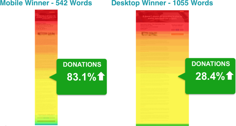
Compared with the longest version of the articles, the shortest versions drove over 80% more donations on mobile and the medium-length versions drove almost 30% more donations on desktop.
So, was longer content better for OURrescue? Not by a long shot!
What makes this data particularly interesting is the fact that time on page wasn’t a particularly good predictor of donations. Page completion rate, however, was.
If you think about it, this makes sense. After all, with a CTA at the bottom of the article, if people weren’t finishing the article, they weren’t seeing the CTA, which meant they weren’t donating.
Now, it’s possible that adding a floating CTA users could see throughout their reading experience could help improve donations further, but that’s hardly the point of this test. Since the CTA was at the bottom of the article, that meant that people who saw the CTA were having a good enough experience to get to the bottom of the article.
So, what drove donations for OURrescue? It wasn’t the articles with the most words—it was the articles with the best user experience.
All this being said, these were OURrescue’s results. Your audience will be different. It’s very possible that you could run this same sort of test and get completely different results.
But, if you don’t test the length of your content, can you really be sure that you’re providing the optimum user experience?
Conclusion
So, is longer content really better? For years, long content has been a great way to get ranked on Google, but that’s beginning to change.
These days, both Google and your readers are looking for content that provides a great experience. That means your online content needs to be the right length for your audience.
As Google continues to focus their algorithms on providing ever better user experiences, it’s time for online marketers to do the same.
Have you ever tried a test like this one? What were your results? Do you agree that online content should be optimized for user experience, rather than word count or keyword density?
About the Author: Jacob Baadsgaard is the CEO and fearless leader of Disruptive Advertising, an online marketing agency dedicated to using PPC advertising and website optimization to drive sales. His face is as big as his heart and he loves to help businesses achieve their online potential. Connect with him on LinkedIn or Twitter.
from The Kissmetrics Marketing Blog https://blog.kissmetrics.com/content-is-longer-really-better/
No comments:
Post a Comment