
You never get a second chance to make a first impression -- that’s why your homepage is undoubtedly one of the most important web pages on your website.
For any given company, the homepage is its virtual front door. If a new visitor doesn't like what they see, their knee-jerk reaction is to hit the "back" button.
That's right -- unfortunately, a lot of people still judge a book by its cover.
What makes a website's homepage design brilliant instead of blah? Well, it takes more than looks alone -- it also has to work well. That's why the most brilliant homepages on this list don't just score high in beauty, but also in brains.
But before we dive into the examples, let's dissect some of the best practices of homepage design.
What Makes a Good Website Homepage Design
All of the homepage designs shown here utilize a combination of the following elements. Not every page is perfect, but the best homepage designs get many of these right:
1) The design clearly answers "Who I am," "What I do," and/or "What can you (the visitor) do here."
If you're a well-known brand or company (i.e., Coca-Cola) you may be able to get away with not having to describe who you are and what you do; but the reality is, most businesses still need to answer these questions so that each visitor knows they are in the "right place."
Steven Krugg sums it up best in his best-selling book, Don't Make Me Think: If visitors can't identify what it is you do within seconds, they won't stick around long.
2) The design resonates with the target audience.
A homepage needs to be narrowly focused -- speaking to the right people in their language. The best homepages avoid "corporate gobbledygook," and eliminate the fluff.
3) The design communicates a compelling value proposition.
When a visitor arrives on your homepage, it needs to compel them to stick around. The homepage is the best place to nail your value proposition so that prospects choose to stay on your website and not navigate to your competitors'.
4) The design is optimized for multiple devices.
All the homepages listed here are highly usable, meaning they are easy to navigate and there aren't "flashy" objects that get in the way of browsing, such as flash banners, animations, pop-ups, or overly-complicated and unnecessary elements. Many are also mobile-optimized, which is an incredibly important must-have in today's mobile world.
5) The design includes calls-to-action (CTAs).
Every homepage listed here effectively uses primary and secondary calls-to-action to direct visitors to the next logical step. Examples include "Free Trial," "Schedule a Demo," "Buy Now," or "Learn More."
Remember, the goal of the homepage is to compel visitors to dig deeper into your website and move them further down the funnel. CTAs tell them what to do next so they don't get overwhelmed or lost. More importantly, CTAs turn your homepage into a sales or lead-generation engine, and not just brochure-wear.
6) The design is always changing.
The best homepages aren't always static. Some of them are constantly changing to reflect the needs, problems, and questions of their visitors. Some homepages also change from A/B testing or dynamic content.
7) The design is effective.
A well-designed page is important to building trust, communicating value, and navigating visitors to the next step. As such, these homepages effectively use layout, CTA placement, whitespace, colors, fonts, and other supporting elements.
Now, get ready to learn about excellent homepage design through the following 16 real-life examples.
Website Design Inspiration: 20 of the Best Homepage Designs
1) FreshBooks

Why It's Brilliant
- It's easy to consume. There is much debate on whether short or long homepages work better. If you choose to do the latter, you need to make it easy to scroll and read -- and that's exactly what this site does. It almost acts like a story.
- There's great use of contrast and positioning with the primary calls-to-action -- it's clear what the company wants you to convert on when you arrive.
- The copy used in the calls-to-action "Get Started for Free" is very compelling.
- FreshBooks uses customer testimonials on the homepage to tell real-world stories of why to use the product.
- The sub-headline is also great: "Join over 10 million small business owners using FreshBooks." FreshBooks expertly employs social proof -- 10 million is a big number -- to compel its target audience to join their peers and try the tool.
2) Airbnb

Why It's Brilliant
- It includes the destination and date search form that most visitors come looking for, right up front, guiding visitors to the logical next step.
- The search form is "smart," meaning it'll auto-fill the user's last search if they're logged in.
- The primary call-to-action ("Search") contrasts with the background and stands out; but the secondary call-to-action for hosts is visible above the fold, too.
- It offers suggestions for excursions and getaways Airbnb users can book on the same site as their lodgings to get visitors more excited about booking their trip on the site. It also shows which of these offerings are most popular among other users.
3) Mint

Why It's Brilliant
- It's a super simple design with a strong, no-jargon headline and sub-headline.
- The homepage gives off a secure but easy-going vibe, which is important for a product that handles financial information.
- It also contains simple, direct, and compelling call-to-action copy: "Sign up free." The CTA design is also brilliant -- the secured lock icon hits home the safety message once again.
4) Dropbox (Business)

Why It's Brilliant
- Dropbox carries over its simple design and branding. It includes only what is important: A large, relevant image with supporting copy, and a "Try free for 30 days" call-to-action button
- Dropbox's homepage and website is the ultimate example of simplicity. It limits its use of copy and visuals and embraces whitespace.
- Its sub-headline is simple, yet powerful: "The secure file sharing and storage solution that employees and IT admins trust." No need to decode jargon to figure out what Dropbox really does.
5) 4 Rivers Smokehouse

Why It's Brilliant
- Drool. That's what I think when I arrive at the website for 4 Rivers Smokehouse. Combined with great photography, the headline "Brisket. 18 years to master. Yours to savor." sounds like an experience worth trying.
- The parallax scrolling guides you on a tour through the services, menu, and people having a great time -- a great use of this popular design trend.
- The only negative? I don't live close enough to this place. Boo.
6) Cobb Pediatric Therapy Services

Why It's Brilliant
- The headline and sub-headline appeal to the visitors' emotional side: "Work With a Company That Gets It"; "Trust us. We've been there too! We'll find jobs where you can thrive." That value proposition is unique and compelling.
- It's hard to tell from the screenshot above, but the headline is on a rotating carousel that caters to specific personas, from job applicants to people searching for a therapist for their schools.
- There are several pathways visitors can take when they arrive on the page, but the calls-to-action are positioned well, worded simply, and contrast with the rest of the page.
7) Jill Konrath

Why It's Brilliant
- It's simple and gets straight to the point. From the headline and sub-headline, it's clear exactly what Jill Konrath does (and how she can help your business).
- It also gives easy access to Jill's thought leadership materials, which is important to establishing her credibility as a keynote speaker.
- It's easy to subscribe to the newsletter and get in touch -- two of her primary calls-to-action.
- The pop-up subscription CTA uses social proof to get you to join her thousands of other fans.
- It includes news outlet logos and testimonials as social proof.
8) Evernote

Why It's Brilliant
- Over the years, Evernote has turned from a simple note-saving app into a suite of business products. This isn't always easy to convey on a homepage, but Evernote does a nice job packaging many potential messages into a few key benefits.
- This homepage uses a combination of rich, muted colors in the video and its signature bright green and white highlights to make conversion paths stand out.
- Following a simple headline ("Remember Everything"), the eye path then leads you to its call-to-action, "Sign Up For Free."
- Evernote also offers a one-click signup process through Google to help visitors save even more time.
9) Telerik by Progress

Why It's Brilliant
- "Stuffy enterprise" isn't the feeling you get when you arrive at Telerik's website. For a company that offers many technology products, its bold colors, fun designs, and videography give off a Google-like vibe. Just one important aspect to making visitors feel welcome and letting them know they're dealing with real people.
- I love the simple, high-level overview of its six product offers. It's very clear way of communicating what the company does and how people can learn more.
- The copy is lightweight and easy to read. It speaks the language of its customers.
10) eWedding

Why It's Brilliant
- For those love birds planning their big day, eWedding is a great destination to building a custom wedding website. The homepage isn't cluttered and only includes the necessary elements to get people to starting building their websites.
- The sub-headline "Over 800,000 wedding websites built!" is great social proof.
- It's included excellent product visuals, a great headline, and a call-to-action that reduces friction with the copy, "Start website."
11) Basecamp

Why It's Brilliant
- For a long time, Basecamp has had brilliant homepages, and here you can see why. It often features awesome headlines and clever cartoons.
- The call-to-action is bold and above the fold.
- In this example, the company chose a more blog-like homepage (or single page site approach), which provides much more information on the product.
- The customer quote is a bold and emphatic testimonial speaking to the benefits and results of using the product.
12) charity: water

Why It's Brilliant
- This isn't your typical non-profit website. Lots of visuals, creative copy, and use of interactive web design make this stand out.
- The animated header image is a great way to capture attention.
- It employs great uses of video and photography, particularly in capturing emotion that causes action.
12) TechValidate

Why It's Brilliant
- This homepage is beautifully designed. I particularly love the use of whitespace, contrasting colors, and customer-centric design.
- The headline is clear and compelling, as are the calls-to-action.
- There's also a great information hierarchy, making it easy to scan and understand the page quickly.
13) Chipotle
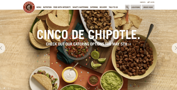
Why It's Brilliant
- The homepage is a great example of agility and constant change. Chipotle's current homepage is all about the forthcoming holiday, which it uses as a unique value proposition to get you to start clicking through your site. When I think Chipotle, I don't necessarily think about catering, but the site is a great reminder to consider different uses for the burritos you already know and love.
- The food photography is detailed and beautiful, and it actually makes me hungry looking at it. Now that's an effective use of visuals.
14) Medium
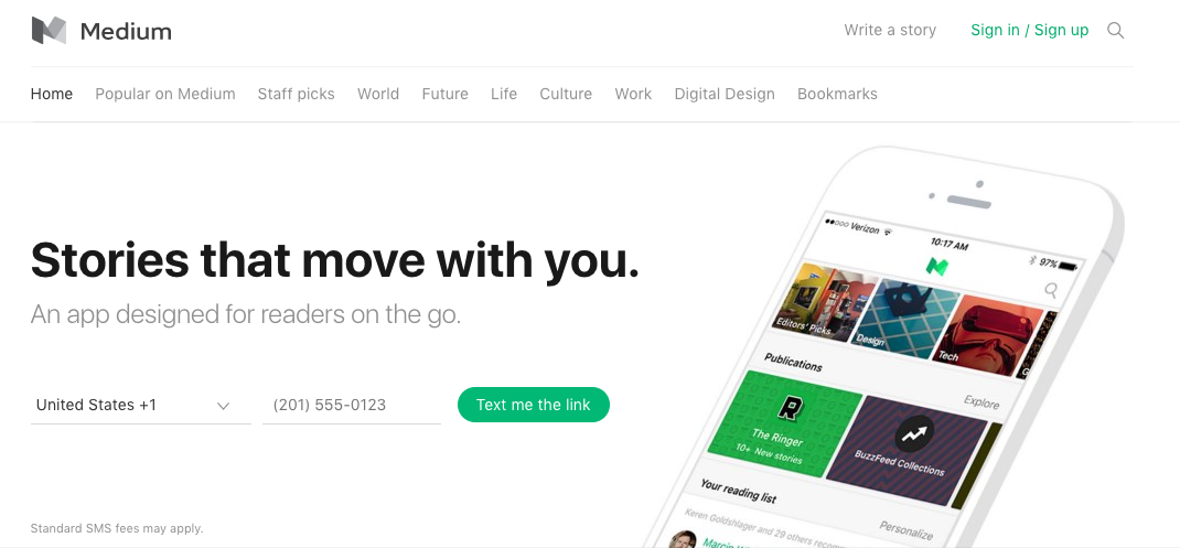
Why It's Brilliant
- This is perhaps one of the best uses of whitespace I've seen. It allows Medium's app tagline and photo to take center stage while still drawing your eye to the darker section titles on the site.
- Medium makes it easy to sign up -- on the site, or with a simple text message to your mobile phone. I'm much more responsive to a text than an email, so this is a great strategy to keep people engaged in the signup process.
- The homepage uses social proof to get visitors to start clicking around: The "Popular on Medium" and "Staff Picks" sections let me know where to find high-quality content.
15) Digiday
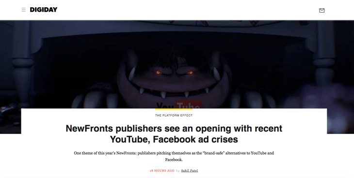
Why It's Brilliant
- Unlike other online news publications that inundate homepages with as many headlines and images as possible, Digiday's first section showcases just one article. Its featured image (in this case, a scary one) is eye-catching, and the headline is just asking to be clicked now that the visitor has an idea of what they're going to read.
- The top of the homepage, where websites normally showcase a ton of different sections and options to click through, only has one icon to click -- which leads you to a subscription page.
16) KIND Snacks

Why It's Brilliant
- The bold colors produce contrast, making the words and images stand out on the page.
- The CTA -- "Shop KIND" -- is clever. It urges the visitor to click to learn more while making a play on the word "kind" -- implying that it's a good choice to shop there.
- KIND Snacks' tagline is straight up brilliant -- when I read it, the message immediately resonated and made me want to read the snack bar's label.
17) Ahrefs
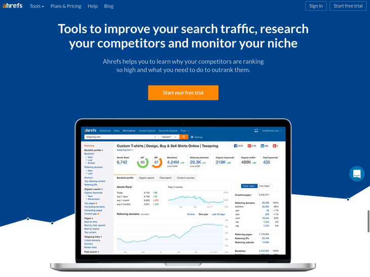
Why It's Brilliant
- The color contrast between the blue, white, and orange colors is eye-catching and makes the headline and CTA pop.
- The sub-headline and CTA are a compelling pair: To be able to start tracking and outranking competitors for free is a great offer.
- The homepage presents a multitude of options for the visitor, but it isn't cluttered thanks to the solid background and simple typography.
18) A24 Films
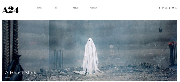
Why It's Brilliant
- The film company's homepage is made up of only trailers for its new films. We know video content is format audiences want to see more of, and this is a great strategy to showcase A24's work in a highly engaging way.
- At the top of the homepage, A24 immediately offers a myriad of ways to get in touch via social media and email -- something I appreciate as a visitor when so many other sites bury contact information at the bottom of the page.
19) Ellevest
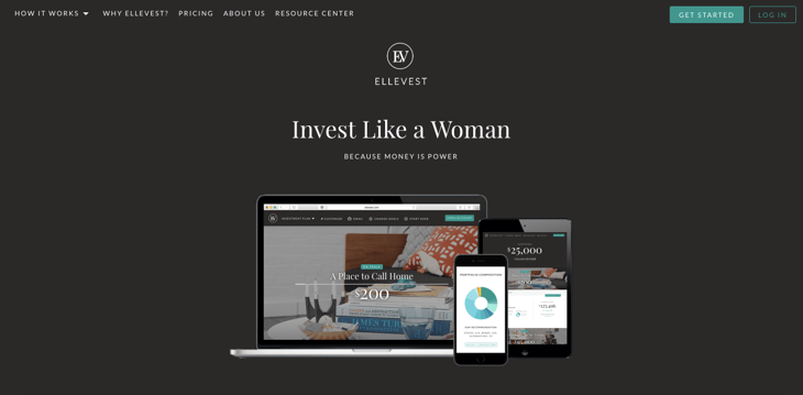
Why It's Brilliant
- "Invest Like a Woman: Because money is power." These headlines are powerful and make me want to learn more about the product -- both as a woman, and as someone interested in making smart financial choices.
- The images show, rather than tell, one of the company's value propositions: a desktop site and mobile app that move with you.
- "Get Started" is a great CTA -- in fact, we use it ourselves here at HubSpot. When clicked, it takes visitors through a few simple steps to set up a profile and start investing.
20) HubSpot
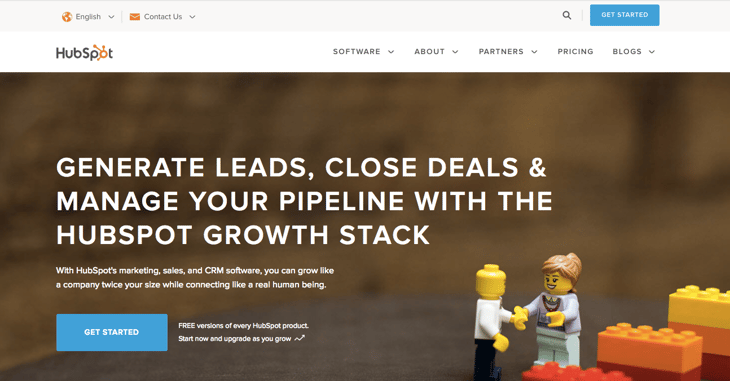
Why It's Brilliant (If We Do Say So Ourselves)
- The LEGO characters catch your attention (because they're cute), then they cleverly illustrate and reinforce the messaging in the headline and sub-headline.
- It bears another eye-catching "Get Started" CTA -- with bonus microcopy detailing our free versions users can choose to upgrade in the future.
- Throughout the homepage, our bright blue and orange color themes keep returning to draw your eye to links and CTAs.
What do you think of these homepages? Which are your favorites? Share with us in the comments below.
Editor's Note: This post was originally published in January 2013 and has been updated for accuracy and comprehensiveness.

from HubSpot Marketing Blog https://blog.hubspot.com/blog/tabid/6307/bid/34006/15-examples-of-brilliant-homepage-design.aspx
No comments:
Post a Comment