Traffic and page views are nice.
But they’re limited. In a few ways.
Site wide traffic looks nice on a blog post or meeting with your HiPPOs. But it’s not actionable. And it doesn’t tell you what’s going on beneath the surface.
For example, you have no idea if those users are returning. If they’re subscribin’ or buyin’. Or how they compare to peeps from a year ago.
In order to find out that detailed info that ultimately moves the needle, you need to dig a little deeper. And you need to be able to view these basic metrics through a more detailed lens that includes segment information.
Google Analytics cohort analysis tool can help. Here’s what it is, why it’s important, and how you can run your first cohort analysis report today.
What is a Cohort Analysis?

A cohort is “an ancient Roman military unit, comprising six centuries, equal to one tenth of a legion.”
Wait. That’s not right. Is it?
Ohhhh. It’s the second one.
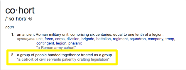
My bad. A cohort is simply a grouping; a subset of people brought together because of a similarity or shared value.
Think of a retail store. You have a cohort of customers who bought in the last week. And another that bought this same exact week, but last year.
A cohort analysis, then, is the number crunching. It’s the sleuthing to determine if the customers from this week are worth more or less than the ones from a year ago.
Things change over time. Maybe the products are different. Maybe you switched manufacturer’s and the quality is different. Or maybe you’re using a new layout in your retail store that affects how people ‘flow’ through it.

Those changes, while seemingly small, can have a big impact on the bottom line. There’s a ton of psychology behind where the eggs are in grocery store (and where they’re hiding the booze).
So analyzing trends and patterns from customers based on when they shopped (i.e. acquisition date) can provide a lot more meaningful feedback on what changes resulted in different results (and why).
Here’s why that’s important (beyond just finding out where the booze is).
Why Cohort Analyses are Better than Standard Metrics
Google Analytics provides a wealth of data.
It’s perfect for finding certain things at a glance. Like aggregate, surface level data. That’s not a knock; it’s one of the best tools to see simple site wide metrics like top visits from certain sources, or dive a little deeper on how individual pages or pieces of content are performing.
But as with the retail store example earlier, websites change. A LOT.
Each time you redesign it, come out with a new product, update your service offering, and a host of other random reasons.
When those changes happen, it’s important to put these metrics in context. Comparing traffic or Time on Site of a particular blog post from now vs. a year ago might not be super relevant if it’s undergone a tremendous visual change in the meantime.
Cohorts can help. It’s like layering on a filter to add context to data you’re looking at. Viewing those details, by segments, now should produce more accurate findings. (And not just a vanity sepia filter to hide your bald spots. Just me?)
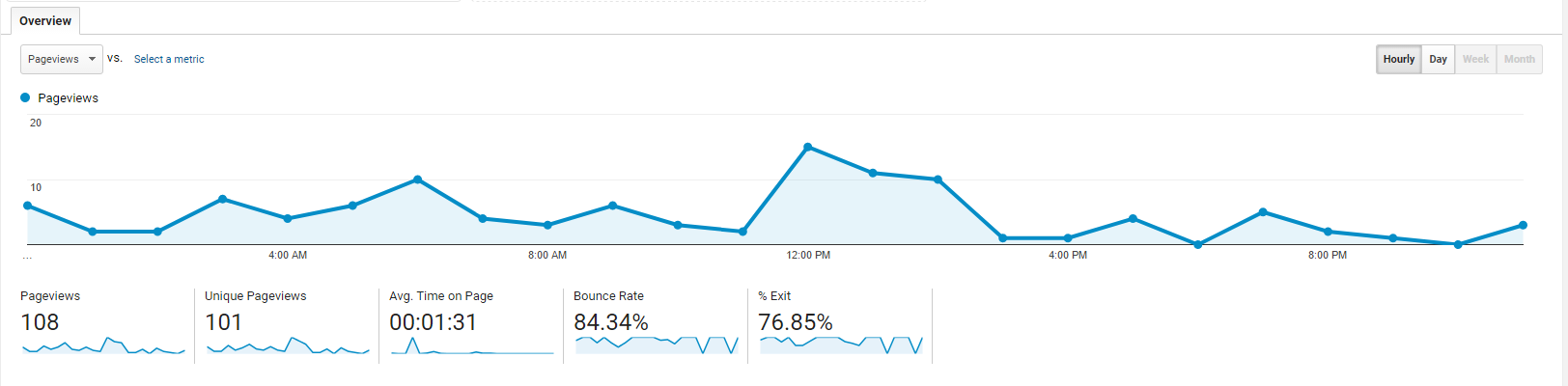
For example, let’s take a look at how tablet and mobile traffic compares to our site’s average over the course of a day.
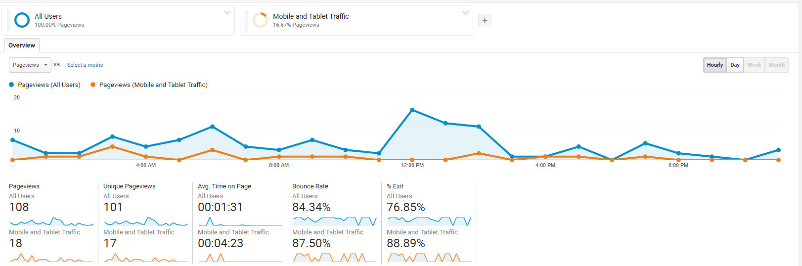
Pretty interesting right?
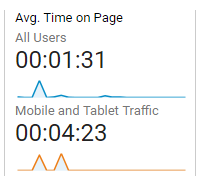
Check out that massive Time on Site difference!
This information is interesting… but not sure helpful or actionable by itself.
So let’s add a cohort. Let’s look at the number of first time visitors who’ve left our site today, and see how many of those come back the next day.
Now we can dive deeper into how many of those people are coming back to our site (within X number of days of their first visit).
This brings us closer to Activation, Retention, and all those other Pirate Metrics to obsess over.
Zooming out, you can see these changes both numerically and visually.

How about the plain English version?
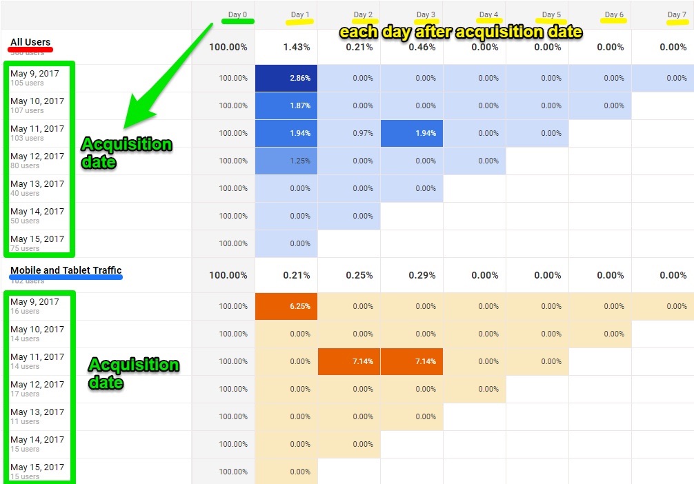
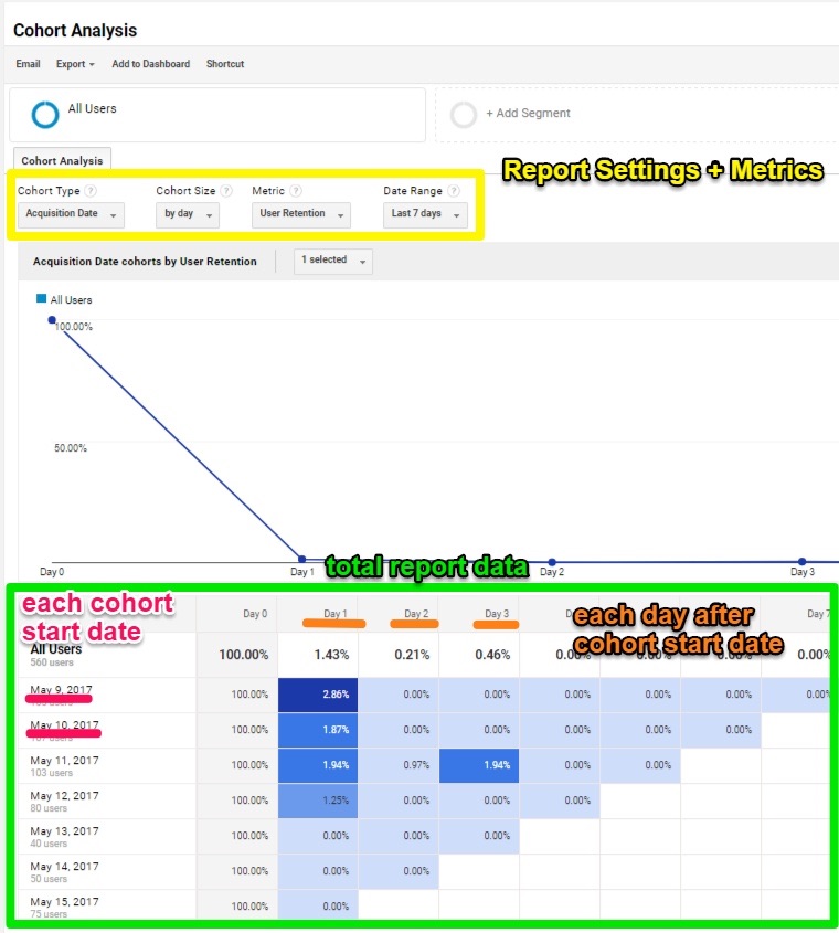
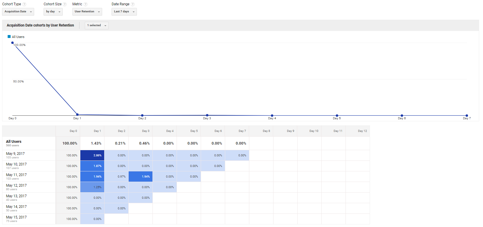
First, the graph depicts the percent of returning visits over a (default) seven day range.
The colorful, blue comparative table below the graph is where things start to heat up. (Literally.)
The table shows you what percentage of people came back to your site within seven days of their initial visit.
The second column from the left, Day 0, reflects the day on the left-hand column under all users:
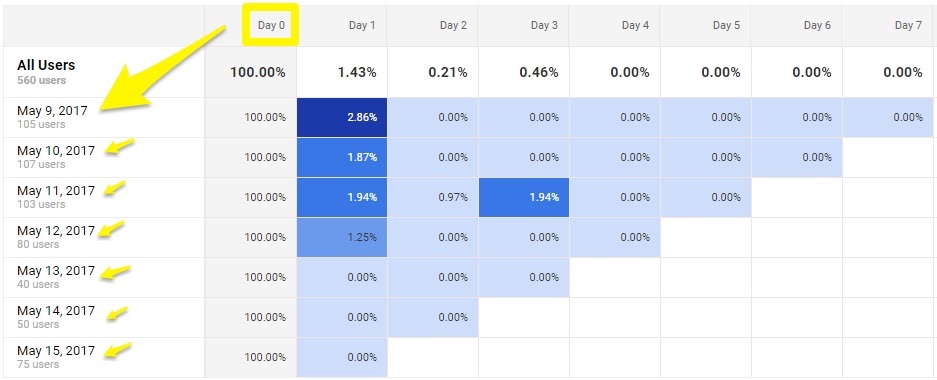
The next column, Day 1, represents the first day after this group of people visited your website on May 9th.
That means 2.86% of people who visited your website for the first time ever on May 9th returned the next day. Day 2 would be what percent of those visited again on Day 2, etc.
Each date under All Users starts a brand new cohort. So May 9th is one. May 10th another. And so on. And each has their own pattern of returning users.
According to the tiny sample size in this example, the oldest cohort, May 9th, has seen a majority of first-time visitors come back to the site.
Make sense? Kinda, sorta?
Well if that wasn’t nerdy enough for you, it’s about to get a whole lot more geeky.
How to Use Google Analytics Cohort Analysis Tool
Let’s do a step-by-step walkthrough to see how you can start using Google Analytics’ cohort analysis tool.
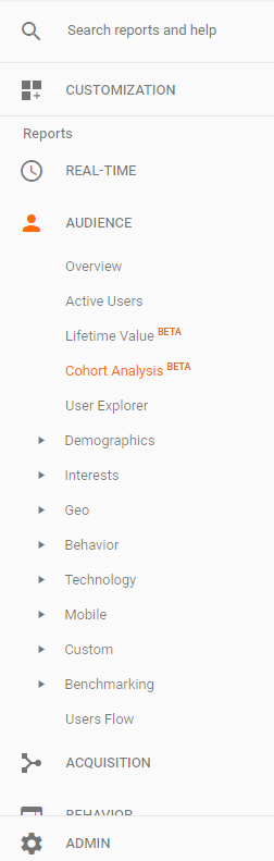
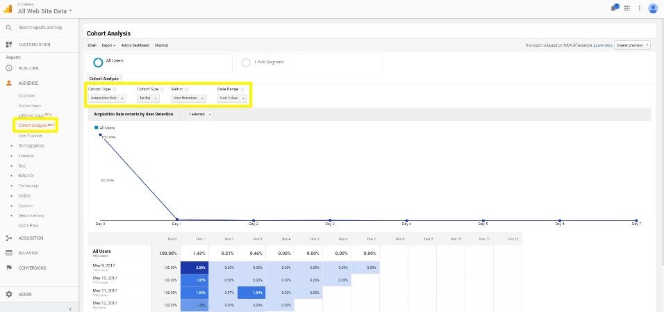
Pull up Google Analytics, click the Audience drop down in the left-hand sidebar, and look for Cohort Analysis:
Here’s how the Google Analytics cohort analysis report will look like at a glance:
- Report settings and metrics are all the way at the top
- In the middle is a giant graph (that’s kinda useful, but more for the visual peeps out there)
- While the final table at the bottom shows the results by cohort and date.
Here’s what that graph in the middle is showing:
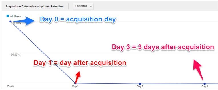
We selected Acquisition Date for our specific cohort type, so that’s how the information is sorted in this graph. Day 0 is your acquisition date. While Day 1 is one day after, Day 3 is three days after, etc.
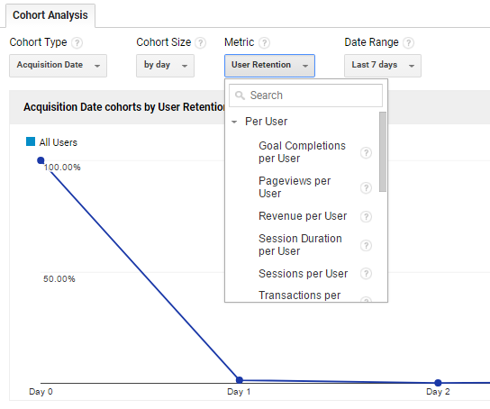
You can adjust these different cohort factors up at the top:
Here are the main factors you can analyze:
- Cohort Type: Restricted to Acquisition Date
- Cohort Size: Sort by day, week or month
- Metrics by category:
-
- Per user:
-
- Goal completions per user
- Pageviews per user
- Revenue per user
- Session duration per user
- Sessions per user
- Transactions per user
- Retention:
-
- User retention
- Total
-
- Goal completions
- Pageviews
- Revenue
- Session duration
- Sessions
- Transactions
- Users
You can access all of these in the cohort analysis drop down menus:
Here you can select to run an analysis of a group of users sorted by day, week, or month (or whatever other variable you want).
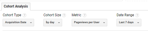
For example, if you want to know how many pageviews each user had (metric), sorted in groups by day (cohort size) for the last 7 days (date range), you simply enter the following into the drop down menu:
Then, I am presented with the following graph:
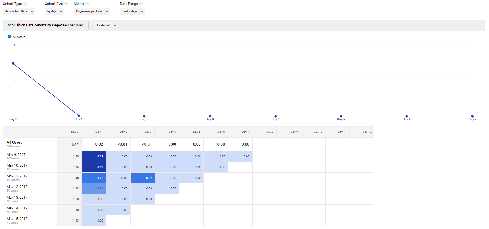
So, what we see here is:
- The May 9th cohort of users had 1.5 pageviews per user
- That same May 9th cohort also had an average of 0.03 pageviews per user the next day (Day 1).
Now, let’s jump back to our original chart, showing the following data.
You may be asking: “How the heck do I use this information?”
“What do I do (ha – you almost said doodoo) with the fact that only a tiny percent of first time visitors are returning the next day (or the one after that)?”
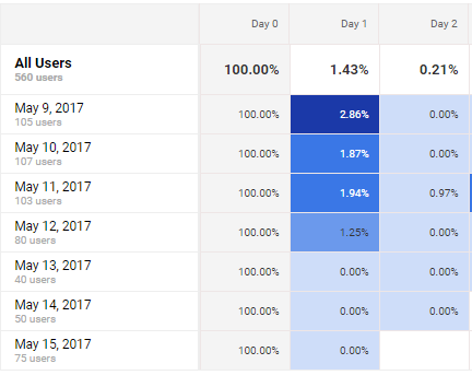
“Why did 2.86% of the cohort visit again the next day with the may 9th sample, but then a big drop off for the May 10th cohort?”
Let’s find out.
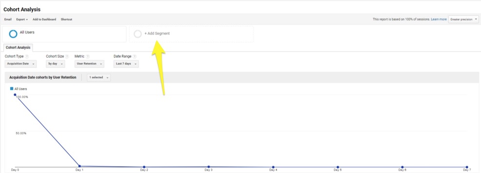
Fortunately, Google Analytics allows you to break down these reports even further. So you’re not stuck in the proverbial analytics dark.
Notice at the top, we can add different segments to break down our report further:
Now let’s go back to analyzing the Mobile and Tablet segment:
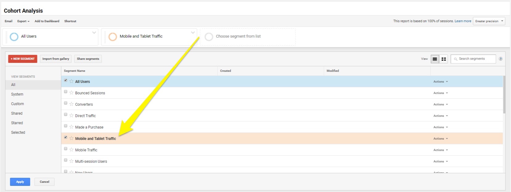
Select it, and you can now see a comparison from your original data set (all cohort users segment) vs. the Mobile and Tablet traffic:
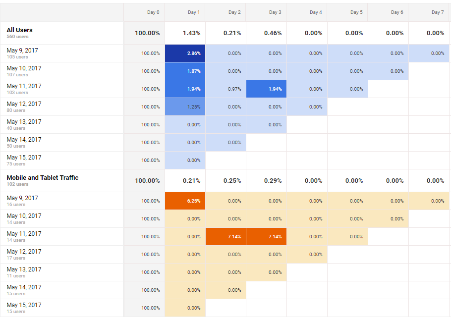
So, this data is showing us the cohorts of people sorted by date, who visited our site the next day after visiting for the first time, sorted by mobile and tablet. (Or, the very definition of a boring example.)
But check out that leap in return visits from the May 11th mobile cohort!
Obviously our conclusions in this case are limited because it’s a tiny sample of a too-limited date range. However, hopefully you can see the potential here.
If that’s not enough, you can also sort by just mobile, or even traffic sources like Organic Search, Direct, and more. (If you’re masochist.)
For example, here’s what Organic Search visitors look like:
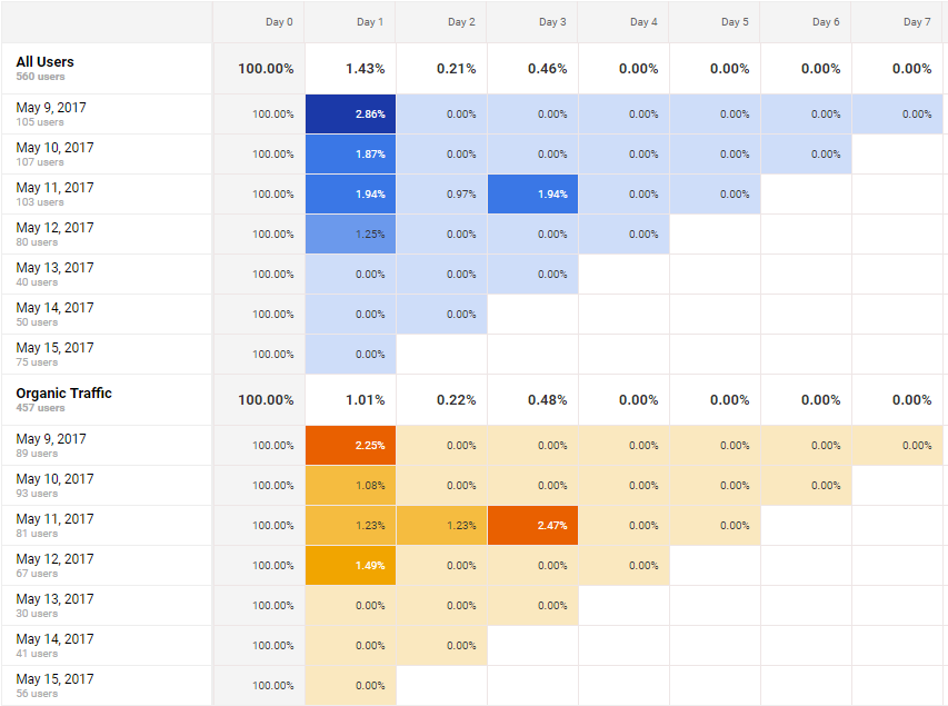
Hmmm. Interesting. Organic Search visitors from the May 11th cohort are returning more frequently than average.
Was there a new blog post that day that’s bringing them back?
Dunno. But you get the idea.
Conclusion
Cohort analyses allow you to view data by segments of people.
Businesses of all shapes and sizes and flavors can use them to determine what changes (if any) resulted in better overall performance.
Google Analytics cohort analysis tool can help you put otherwise generic, aggregate website data under the microscope.
In all of about five minutes, you can quickly compare how different cohorts compare with others. And then cross reference that information with your own actions or marketing decisions may have played a role.
They allow you to zero-in not only on who is your most profitable customers, but why (or what) influenced them to become your most profitable customers.
And how you can do more (or less) of the same to scale results accordingly.
About the Author: Brad Smith is the founder of Codeless, a B2B content creation company. Frequent contributor to Kissmetrics, Unbounce, WordStream, AdEspresso, Search Engine Journal, Autopilot, and more.
from The Kissmetrics Marketing Blog https://blog.kissmetrics.com/cohort-analysis-google-analytics/
No comments:
Post a Comment