List of Blogging Websites
- HubSpot.com
- Wordpress.com
- Squarespace.com
- Medium.com
- Wix.com
- Typepad.com
- Tumblr.com
Ah, the job search.
Some refer to it as a full-time job in itself. Others compare it to dating. And several cats over at BuzzFeed think it just plain sucks.
But it doesn't have to be that way.
When you’re applying for a job, you’re typically asked to submit a resume and cover letter, or maybe your LinkedIn profile. But there are better ways to stand out from your competition, and building a personal website is one of them.
Why You Need a Personal Website
Here's the thing about resumes and cover letters: No matter how unique you try to make your own, for the most part, they tend to read dry. And there's a good reason for it: It's supposed to be a single, no-frills page that documents your work experience. And while being concise is good, there's very little opportunity to convey your uniqueness, or for your personality to shine through at all for that matter.
While a resume is a sole, largely unchanging document, a personal website can be customized and updated according to what you're working on, or what you want to emphasize. It's both fluid and current.
Overall, a personal website can serve different goals, but perhaps what it does best is provide you with an opportunity to tell your story. And with 53% of employers reporting that the resume alone did not provide enough information to determine if the candidate would be a good fit, that storytelling element can really help to improve your odds.
If you're thinking about creating a personal website of your very own, check out the examples below that hit the nail on the head.
18 of the Best Personal Websites We've Ever Seen
Resumes
Whether you create a single-page site or a larger portfolio, the web resume serves as a more personalized option for sharing information and demonstrating your technological skills -- and it can be used by all types of job seekers.
Even if you have very little work experience, you can leverage a website to build a better picture of your capabilities and yourself as a candidate, while leaning on your traditional resume to provide the basic background information.
1) Gary Sheng

Unlike a standard resume document, Sheng's website makes it easy for him to include logos and clickable links that allow his software engineering and web development skills to shine.
We love that visitors can choose to scroll down his page to view all of the website’s categories (“About Me,” “My Passion,” etc.), or jump to a specific page using the top navigation.
The "My System" section reads like a company mission statement, and this personal touch helps humanize his work and make him more memorable.
2) Raf Derolez
-1.gif?t=1506337820681&width=600&cos_cdn=1&name=ezgif.com-optimize%20(3)-1.gif "Raf Derolez")
Derolez’s web resume is modern, cool, and informative. It shows off his personality, branding, and developing skills in a way that’s still very simple and clear. Not to mention, his use of unique fonts and geometric overlays ascribes personality to his name in an eye-catching way.
Want to get in touch with Derolez? Simply click the CTA located at the bottom of the page to open up an email that's pre-addressed directly to him. Or select one of the social media links to connect with him on platforms like Twitter -- where the look and feel of the visual assets happens to seamlessly align with the branding of his website. Well played, Derolez.

3) Brandon Johnson
.gif?t=1506337820681&width=600&cos_cdn=1&name=ezgif.com-optimize%20(4).gif "Brandon Johnson")
Johnson’s incredible resume must be seen to be believed. Beautiful images of planets help to complement his planetary science background, and animations make his resume more of an experience than a document.
In terms of design, the textured, multi-layered background adds greater depth to the two-dimensional page in a way that evokes feelings of space and the planetary systems, which Johnson's work focuses on.
4) Quinton Harris
.gif?t=1506337820681&width=600&cos_cdn=1&name=ezgif.com-optimize%20(6).gif)
Harris' resume uses photos to tell his personal story -- and it reads kind of like a cool, digital scrapbook. It covers all the bases of a resume -- and then some -- by discussing his educational background, work experience, and skills in a highly visual way.
Not to mention, the copy is fantastic. It's clear that Harris took the time to carefully choose the right words to describe each step of his personal and professional journey. For example, the section on storytelling reads:
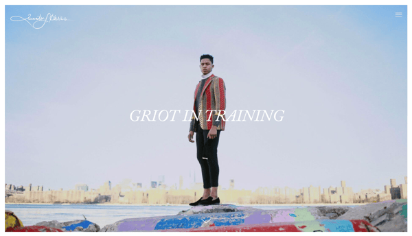
NYC, my new home, is filled with the necessary secrets to not only propel my craft forward, but my identity as an artist. With every lens snapped and every pixel laid, I am becoming me.
Finally, at the final navigational point (note the scrolling circles on the left-hand side of the page), users are redirected to quintonharris.com, where he goes on to tell his story in more detail.
5) Sean Halpin

Halpin’s resume is short, sweet, and to the point, which is authentic to his voice and personal branding outlined on the site. The white space allows his designs and copy to pop and command the reader's attention, which helps to improve readability -- especially on mobile devices:


Best Practices for Resume Websites
- Code your resume so it can be crawled by search engines.
- Offer a button to download your resume in PDF so the hiring manager can add it to your file.
- Keep branding consistent between the website and document versions: Use similar fonts, colors, and images so you’re easy to recognize.
- Be creative and authentic to yourself. Think about the colors, images, and media you want to be a part of your story that you couldn’t include in a document resume.
Portfolios
Building an online portfolio is a highly useful personal branding and marketing tool if your work experience and skill set call for content creation. In fact, photographers, graphic designers, illustrators, writers, and content marketers can all use web portfolios to show off their skills in a more user-friendly way than a resume or hard copy portfolio.
6) Tony D'Orio

It's important to keep the design of your visual portfolio simple to let images capture visitors' attention, and D'Orio accomplishes this by featuring bold photographs front-and-center on his website. His logo and navigation menu are clear and don't distract from his work. And he makes it easy for potential customers to download his work free of charge.
Want to give it a try? Click on the hamburger menu in the top left corner, then select + Create a PDF to select as many images as you'd like to download.

Once you open the PDF, you'll notice that it comes fully equipped with D'Orio's business card as the cover ... just in case you need it.

7) Gari Cruze

Cruze is a copywriter. But by turning his website into a portfolio featuring images from different campaigns he’s worked on, he makes visitors want to keep clicking to learn more about him. Also, there's a great CTA at the top of the page that leads visitors to his latest blog post.
His site’s humorous copy -- specifically in the “17 Random Things” and “Oh Yes, They’re Talking” sections -- serves to show off his skills, while making himself more memorable as well. These pages also include his contact information on the right-hand side, making it easy to reach out and connect at any point:

8) Melanie Daveid
.gif?t=1506337820681&width=669&cos_cdn=1&name=ezgif.com-optimize%20(8).gif)
Daveid’s website is a great example of “less is more.”
This developer’s portfolio features clear, well-branded imagery of campaigns and apps that Daveid worked on, and she shows off her coding skills when you click through to see the specifics of her work.
While it might seem overly minimal to only include three examples of her work, Daveid did her portfolio a service by including her best, most noteworthy campaigns. At the end of the day, it's better to have fewer examples of excellence in your portfolio than many examples of mediocrity.
9) The Beast is Back
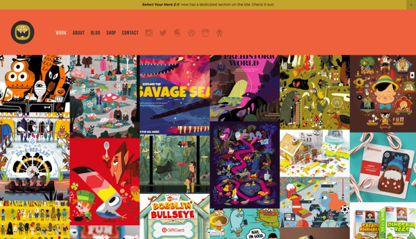
Christopher Lee's portfolio is busy and colorful in a way that works. When you read more about Lee on his easily navigable site, you realize that such a fun and vibrant homepage is perfect for an illustrator and toy designer.
His web portfolio highlights eye-catching designs with recognizable brands, such as Target and Mario, along with links to purchase his work. This is another gallery-style portfolio with pops of color that make it fun and give it personality, thus making it more memorable.
Best Practices for Portfolio Websites
- Use mainly visuals. Even if you're showcasing your written work, using logos or other branding is more eye-catching for your visitors.
- Don't be afraid to be yourself. Your personality, style, and sense of humor could be what sets you apart from other sites!
- Organization is key. If your portfolio is full of photos, logos, and other images, make sure it's easy for visitors to navigate to where they can contact you.
- Brand yourself. Choose a logo or icon to make your information easily identifiable.
Blogs
Consistently publishing on a blog is a great way to attract attention on social media and search engines -- and drive traffic to your site. Blogging is a smart way to give your work a personality, chronicle your experiences, and stretch your writing muscles. You might write a personal blog if you're a writer by trade, but virtually anyone can benefit from adding a blog to their site and providing useful content for their audience.
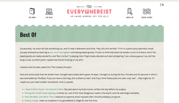
10) Everywhereist

This blog looks a bit busier, but its consistent branding helps visitors easily navigate the site. The travel blog uses globe iconography to move visitors around the site, making it easy to explore sections beyond the blog.
It also features a "Best Of" section that allows new visitors to learn about what the blog covers to get acclimated. The color scheme is warm, neutral, and free of excess clutter that could distract from the content.
11) fifty coffees
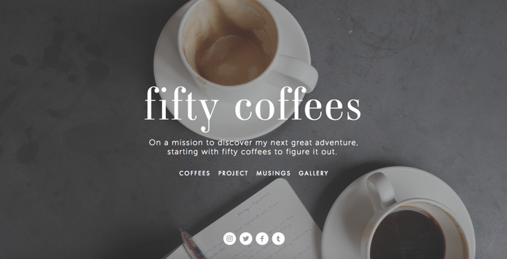
fifty coffees chronicles the author's series of coffee meetings in search of her next job opportunity, and it does a great job of using photography and visuals to assist in the telling of her lengthy stories.
The best part? Each post ends with numbered takeaways from her meetings for ease of reading comprehension. The high-quality photography used to complement the stories is like icing on the cake.
12) Minimalist Baker
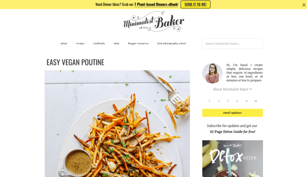
I'm not highlighting Dana's food blog just because the food looks delicious and I'm hungry. Her blog uses a simple white background to let her food photography pop, unique branding to make her memorable, and mini-bio to personalize her website.
13) Kendra Schaefer
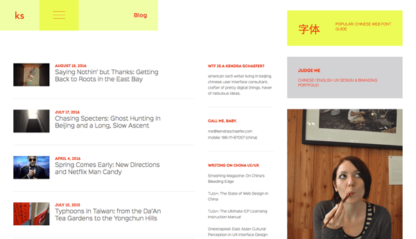
Kendra's blog is chock-full of information about her life, background, and professional experience, but she avoids overwhelming visitors by using a light background and organizing her blog's modules to minimize clutter. She also shares links to additional writing samples, which bolsters her writing authority and credibility.
Best Practices for Blogs
- Keep your site simple and clutter-free to avoid additional distractions beyond blog posts.
- Publish often. Company blogs that publish more than 16 posts per months get nearly 3.5X the web traffic of blogs that published less than four posts per month.
- Experiment with different blog styles, such as lists, interviews, graphics, and bullets.
- Employ visuals to break up text and add context to your discussion.
Demos
Another cool way to promote yourself and your skills is to create a personal website that doubles as a demonstration of your coding, design, illustration, or developer skills. These sites can be interactive and animated in a way that provides information about you and also shows hiring managers why they should work with you. This is a great website option for technical and artistic content creators such as developers, animators, UX designers, website content managers, and illustrators.
14) Albino Tonnina
.gif?t=1506337820681&width=600&cos_cdn=1&name=ezgif.com-optimize%20(9).gif)
Tonnina is showcasing advanced and complicated web development skills, but the images and icons he uses are still clear and easy to understand. He also offers a simple option to view his resume at the beginning of his site, for those who don't want to scroll through the animation.
15) Bobby Kane
.gif?t=1506337820681&width=600&cos_cdn=1&name=ezgif.com-optimize%20(11).gif)
Kane's site is aesthetically beautiful. And thanks to the cool background photo and minimalist site design, his experience really stands out. He further shows off his design and coding skills at the very bottom of his site, where he demonstrates his ability to code background design changes. This small touch makes his demo more interactive and will make visitors stop and think, "that's cool!"
Want to check it out? Pull down the arrow at the top of his site to refresh the background.
16) Robby Leonardi

Leonardi's incredible demo website uses animation and web development skills to turn his portfolio and resume into a video game for site visitors. The whimsical branding and unique way of sharing information ensure that his site is memorable to visitors.
17) Samuel Reed
.gif?t=1506337820681&width=600&cos_cdn=1&name=ezgif.com-optimize%20(10).gif)
Reed uses his page as a start-to-finish demo of how to code a website. His website starts as a blank white page and ends as a fully interactive site that visitors can watch him code themselves. The cool factor makes this website memorable, and it makes his skills extremely marketable.
18) Devon Stank
Stank's demo site does a great job of showing that he has the web design chops and it takes it a step further by telling visitors all about him, his agency, and his passions. It's the perfect balance of a demo and a mini-resume.
Plus, we love the video summary. It's a consumable summary that at once captures Stank's personality and credentials.
Best Practices for Demo Websites
- Brand yourself and use consistent logos and colors to identify your name and your skills amongst the bevy of visuals.
- Don't overwhelm your visitors with too many visuals at once -- especially if your demo is animated. Be sure to keep imagery easy to understand so visitors aren't bombarded when they visit your site.
from Marketing https://blog.hubspot.com/marketing/best-personal-websites
No comments:
Post a Comment