We don’t need things.
We might need a six-dollar, almond milk, sea salt caramel mocha (no whip) when it gets a little chilly outside.
But we don’t need-need.
The lights are on. Roof over our head. Heating or AC blasting in the background.
That applies to most things you’re trying to sell.
Doesn’t matter if we’re talkin’ ‘bout that shiny new app you deployed or the fancy new eComm product. People don’t need it.
Which makes your life tough. How are you going to move the needle, get more subscribers, and scale revenue, when the vast majority of the people you’re speaking to have zero actual need to buy your widget?
You need urgency. Or more specifically, you need to manufacture urgency out of thin air.
Here’s how a few of the web’s top converting sites create urgency out of thin air to get visitors to finally commit once and for all.
Why Urgency Works
People don’t need your stuff. But it gets worse. Because people also resist change at the same time.
So you’ve got two problems. You need to shake people out of their inertia. And then somehow get them to act.
Thankfully, the solution’s no secret. There’s a book on it. Along with countless studies.
For example, ConversionXL explains one account where just a little bit of urgency sprinkled onto a product page lifted revenue by over 27% for Bob & Lush.
They came up with the idea to that “clarity of deliver time on a product page would push more customers to convert.”
Sound familiar? It’s what some of the best in the business, from Amazon all the way down to the QVC have gone to great lengths to employ.
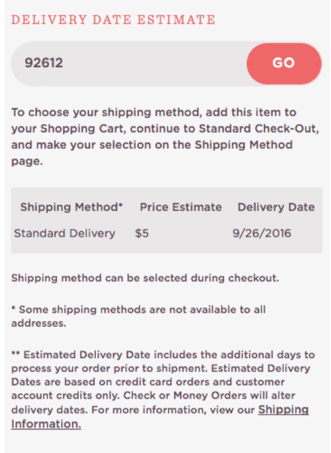
So they made one relatively small tweak to their product pages.
The new variant included a little simple text box that highlighted when someone would receive their product if they ordered within a short time frame.
Not only did revenue jump (27.1%), but the the number of purchases (9.5%) and checkout visits (10.1%) did, too.
Of course, the inclusion of this delivery date estimate wasn’t just a hunch. An epiphany. Or a ‘growth hack’ some growth hacker wrote about in their Bible to Growth Hacking on GrowthHackers.com
Instead, the hypothesis came from a place that good ideas always flow. But few rarely tend to go.
Consumer Research (AKA The Part Everyone Always Skips)
In 2012, Marcus Taylor of Venture Harbour launched a ‘Groupon deal for musicians.’ (And wrote about the experience in another excellent ConversionXL case study. Yes, I’m completely ripping them off today).
He reportedly invested months and even dipped into personal savings to fund it. The boats were burned. There was no going back. It had to churn a profit.
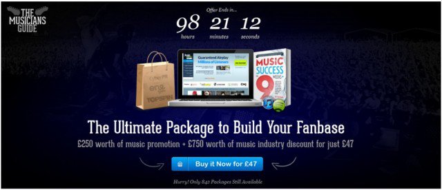
No need to bury the lead. He increased conversions from a mediocre-but-fine 2.5% up to an astonishing 10.8% by infusing urgency into every pore of the site.
That incredible conversion lift wasn’t the part that got me, though.
This was:
When people think of conversion optimization, they go to landing pages. They go to headlines. CTAs. Images. And other similarly miniscule details that kinda don’t move the f-ing needle.
But all of those elements (which we’ll touch in soon) are at the mercy of one giant thing: the audience.
All of the CTA tweaks in the world can’t save you from targeting the wrong audience in the first place.
That’s the critical difference Marcus understood. And acted on. (Emphasis, mine.)
“Prior to launch, I “tested” hundreds of traffic sources, from Reddit Ads, to specific music forums. I wanted to know was which traffic sources I need to prioritise during the real campaign.
I ended up with a custom Google Analytics dashboard like this, which made it clear which traffic sources delivered the most relevant traffic.”
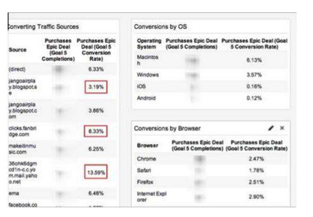
“Not only did I know where my customers would come from ahead of time, but I knew more about my audience, such as how guitarists were almost three times more likely to buy than drummers, and that my conversion rate was highest in the UK and Australia.”
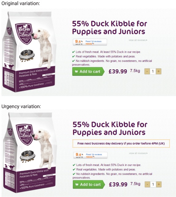
Similarly, when ConversionXL worked with Bob & Lush initially they didn’t haphazardly start throwing stuff on a DIY landing page builder. Rather, they begun with a boring, tired, old survey.
One hundred eighteen people opted in. And many agreed that their biggest fear centered around “running out of food for their dogs.”
That’s the catalyst. The trigger.
It manifested as a purchasing roadblock based on “knowing when the food would arrive.”
So that’s what ConversionXL leveraged. You’ve already seen the updated landing page variation that was a success. Just by using simple language to entice people to buy now (instead of waiting around).
The tactic – the thing you see on the screen – isn’t the point. It’s the impulse it targets. The underlying motivation that’s already preventing people from feeling like they need your thing.
It’s no coincidence that this is the exact same strategy that one of the interwebs top converters implements.
Expedia recently announced gross revenues of $16 billion. Up 8% from online sales.
Which should come as no surprise when you see what they’re doing.
How Expedia Manufactures Urgency Out of Thin Air
Visit Expedia.com.
The homepage is fairly bare. A giant reservation form takes over almost everything above the fold.
Below that, a few of “Todays Deals” are highlighted.
So far, not much is happening. It’s not until you actually search for a trip that things start to get interesting.
Vegas sounds fun. Pool season sure beats reading another blog post like this in your pajamas.
Plug in some dates. Hit Enter. And here goes.
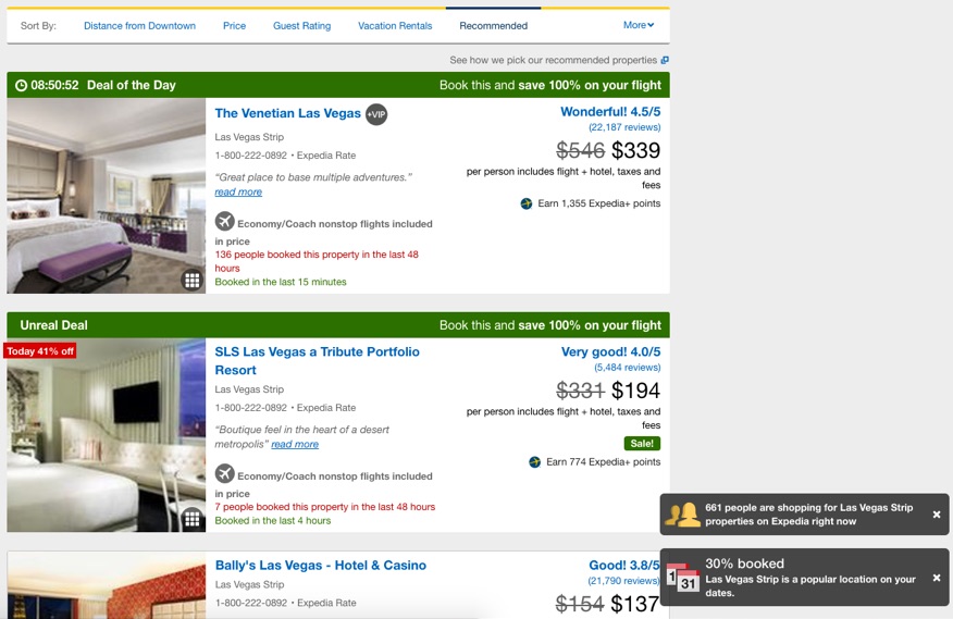
Whoa. Lots happening.
You see plenty of greens (good!) and reds (bad!) to help you instantly understand their meaning.
In the lower right-hand corner, multiple little callouts keep popping up, sliding in and out of the screen, emphasizing the same thing: a BUNCH of other people are looking at booking these deals right now – so they might not last long.
Then of course, the Daily Deal hits you at the top of the screen. A classic countdown timer that ticks away. My heart rate sped up. Palms sweaty. Despite not having any real interest in booking this initially.
Once again, that was no accident. As this case study featured on Behave.org (formerly WhichTestWon) indicates.
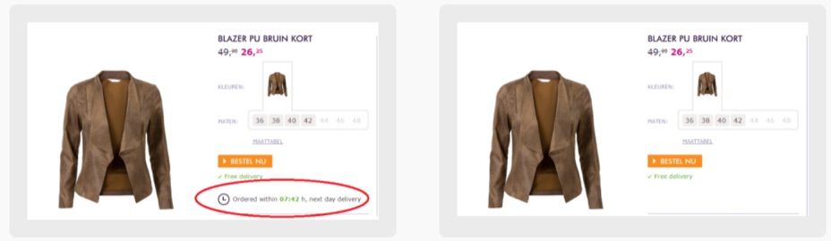
All that was added was a countdown timer. That’s it.
They even removed a few elements, including ‘free delivery’ and ‘order now’ in order to remove extraneous distractions and focus viewers on what mattered most: that countdown timer.
The result after 50,000 viewers? An instant 8% conversion lift.
Ok. Enough boring marketing stuff. Back to Vegas.
How Expedia Uses Price Anchoring & FOMO to Make this Trip Look like a Steal
Those FOMO callouts slide in and out of view.
The countdown timer continues ticking down. And then the product attributes help you decide.
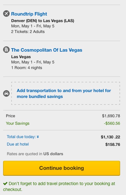
For example, scroll down a little bit until you reach Cosmo.
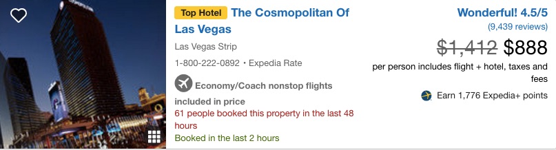
It’s garnered a little yellow “Top Hotel” badge. It literally screams “Wonderful!” with excellent ratings and reviews to match.
Price anchoring in full effect, with the ‘sales price’ slashed down to the new effective one.
Scarcity comes into view with the strip of text in red that highlights the number of people who also booked this hotel in the past forty eight hours. Along with when it was last booked.
So. If we’re even remotely serious. We need to move fast.
Let’s select Cosmo. Because c’mon: wraparound terraces!
You look at available rooms and are immediately met by an “Unreal Deal” that will “save you 100% on your flight.” That’s backed up by the pricing, which shows you’ll ‘owe’ $0.00 more to select it now.
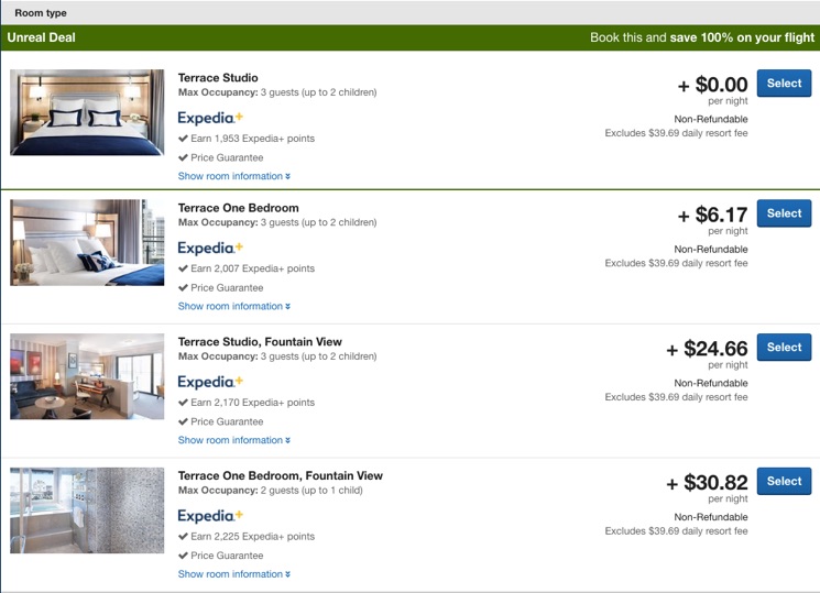
Deals like that won’t last. Don’t last. Which means you should act.
Not later, but now.
How Expedia Forces You to Take Action (Now)
Words matter.
It’s not that people absorb every letter in detail. They don’t. Hell – people don’t even read. ‘Specially not online.
But the sum is greater than the parts. It’s scanned in a moment’s notice and the meaning hits home.
For example, email marketing service AWeber ran a simple copy test on their call to action.
The only change? A single word.
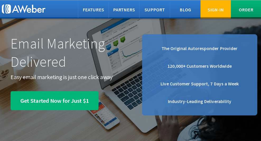
AWeber added the word “Now” to their call to action. And they saw a 12% increase in paid signups with a credit card.
An online travel booking flow is no different than any other conversion flow. Doesn’t matter if we’re talking about signing up for a new email marketing app or trying to go through a shopping cart checkout sequence.
The stats are remarkably the same, too. Online travel bookings see a 81% abandonment! While shopping cart abandonment averages right around 70%.
61% of those cart abandonments are because of ‘extra costs’ (including shipping, taxes, fees, etc.)
You know how this feels. You’re super pumped about that new pair of plastic jeans (yes, that’s a thing) you just found. Except when you head over to checkout, you see that another ~30% has been tacked on due to taxes, shipping, and fees.
Guess what Expedia does, instead?
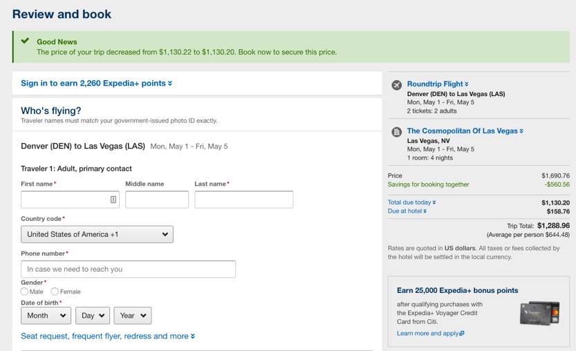
First, they ‘drop’ the price. Two cents. Literally. But it’s green and happy and there’s a check mark exclaiming “Good News.”
The other thing it says? “Book now to secure this price.”
Zooming into the pricing area on the right, you also see the savings of booking the flight and hotel together. Then, down below, you see the total price (again first – price anchoring).
And then a “Due at hotel” line item that cleverly buries all of those damn resort fees that we hate so much.
But they’re almost invisible because of how Expedia has positioned this pricing and sale.
Instead of being ‘thrown off’ the conversion scent at the moment of truth, you’re practically already packing your bags. #Humblebragging about your upcoming Vegas trip.
Conclusion
Ranchers use a cattle prod to get those big, dumb, slow moving animals to do what they want.
Whether that’s to eat, find shelter, or head to the slaughterhouse.
Consumers don’t need to do anything.
They might want lots of things. But they lack nothing. And so there’s no inherent desire to purchase your widget.
Instead, you have to create it. Manufacture it and bring it into existence.
For guidance, start with the web’s top converters. Expedia is a master at creating urgency by using countdown timers, product attributes, prince anchoring, FOMO, and a host of other psychological tactics that would make Cialdini proud.
Increasing conversions online isn’t about tricks or gimmicks or hacks. It’s about building up the value of your offering so much that people can’t help but convert.
About the Author: Brad Smith the founder of Codeless, a B2B content creation company. Frequent contributor to Kissmetrics, Unbounce, WordStream, AdEspresso, Search Engine Journal, Autopilot, and more.
from The Kissmetrics Marketing Blog https://blog.kissmetrics.com/how-to-manufacture-urgency/
No comments:
Post a Comment