Steve Jobs wore one thing.
Zuckerberg started doing it. And even Obama caught the bug.
But why? (Beyond, you know, an apparent lack of fashion sense.)
One less decision to make for these powerful decision makers. More time for everything else, according to the Zuck himself in a Q&A session.
Outfit dilemma hit former Saatchi & Saatchi art director, Matilda Kahl, too. After arriving late to an important Monday morning meeting, her sweater inside out, she adopted the same approach.
Choices are good though, right? Yes and no.
On the plus side, more choice can help bring in more attention to your wares. But on the down side, more choice can also cause analysis paralysis. It can literally freeze people (and more importantly, buyers) right at the moment of truth.
So. What on Earth are you supposed to do if you have multiple products online? How do you sell them without putting your visitors on ice and jeopardizing sales?
Let’s find out.
How to Sell Multiple Products
The jam study is infamous.
It recounts one day in a Menlo Park grocery store. (No doubt surrounded by all sorts of vegan nuts and berries. Because vegans just basically eat nuts, right? Like chipmunks. Crazy California hippies.)
Twenty-four jam varietals were set out. Muchas people came over to check them all out. But the conversion rate (of lookers to buyers) wasn’t all that impressive.
Later, they reduced that number down to only six. Less people came over, but more people ended up buying.
The theory, so it goes, was that too many choices can actually reduce conversions. Now, not everyone is convinced. There are flaws. Biases. And other scientific-sounding things.
But it still presents an issue.
Ecommerce marketers have multiple products. Even a single product page has a TON of ‘variables’ that you have to get right. For example:
- Descriptive product names
- SEO-optimized product description
- High-resolution product images
- CTA buttons that are difficult to miss
- Additional details such as price, size, availability, and cost savings
- Reviews and testimonials
- An option to buy later (or save searches) via an “Add to Wish List” button
- Related products recommendation for cross-sell and upsell opportunities
- Social media sharing buttons
- Clear shipping and return information
- Product videos
- Live chat widget
Of course, there’s the copy as well. Which, when done right, can increase clickthrough rates by an astounding 93%.
So how do you sell multiple products again without compromising the sales experience?
Thankfully, MarketingExperiments.com ran a clinic on selling multiple products online. And they found three major takeaways after performing, you know, some marketing experiments:
- Reduce the number of choices
- Prioritize product presentation
- Communicate the product’s value proposition
Cool. Let’s see how those three work.
Step #1. Reduce the number of choices
Decision fatigue is a thing afterall. Too many choices, too much analysis required, and less purchases are made. (Yes, in that order.)
Too many choices can lead people to second-guess themselves. Question their decisions. Before finally throwing up their hands and exclaim, “Screw it. We’re eating eggs again tonight.”
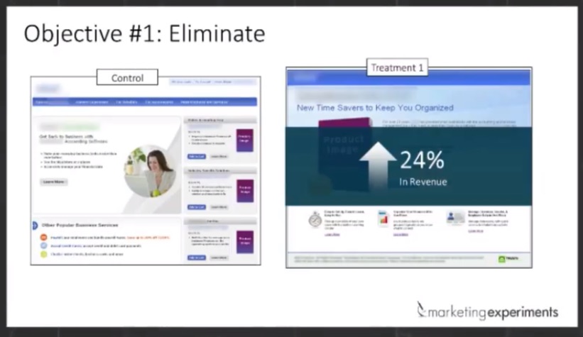
Turns out, there is some data that backs up the “too many products backfire” claim.
MarketingExperiments.com found that reducing the products on a page from three down to one increased revenue by 24%. (Not conversions — revenue.)
Ok… but how, exactly, do you do that? Especially when you’ve got a full product catalog with tons of inventory sitting in an expensive warehouse?
Here’s a few ideas they put forth.
✅ Tip #1: Prioritize the best selling products (duh)
Sounds trite and obvious. But it’s incredibly important. Funnel visitors to your best performing products.
Similar to how you’d ‘funnel’ visitors to your best converting pages or blog posts when trying to increase conversions.
But of course, you can only answer this if you actually have customer insight. Cold hard data. From analytics software. Like the one whose blog you’re reading right now.
Surveys also work. Kinda. Sorta. But only if you are asking the right questions.
✅ Tip #2: Visually streamline how people choose products
Just because you have three digits worth of products sitting on shelves somewhere (undoubtedly collecting dust), doesn’t mean you have to force all of those things onto the same page at one time.
Instead, group your products differently in order to not overwhelm people. That might apply to category (or even sub category pages). If possible, one page, one goal.
That can even apply to the entire conversion funnel on your site.
Helix is one of my favorite examples. They sell mattresses. Boring, right? Not exactly unique or different. You can’t throw a rock in a city without hitting some rundown mattress factory.
So what’s so special about them? Well, for one, they make buying a mattress sexy as hell.
Their Shop page condenses multiple mattresses down into a ‘single’ product.

Then from there, you go into a customization builder to select, add, or remove different attributes.
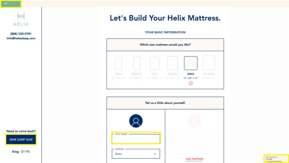
The result is a simplified, streamlined, approach. You only have one or two decisions to make on each section at a time.
✅ Tip #3: Eliminate (or deprioritize) ‘extra’ products
You can. And you should.
While the goal is to not allow them to overthink and bounce off the page or abandon the cart, you also want to make sure that the product page carries what they came there to buy.
We just saw that in the last Helix example. And here’s another similar one from EvoDesk.
You can literally add almost anything to their stand-up desks. But once again, they remove a lot of the headache and only present you with one option at a time.
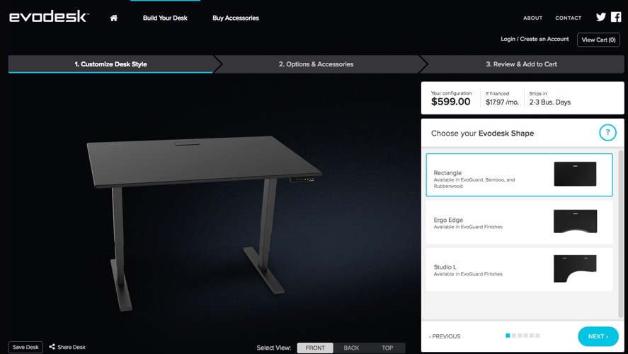
The result is that they end up de-prioritizing a lot of the ‘minor’ but cool decisions (like do you want speakers mounted to the top or not) so that they don’t get in the way of the ultimate decision: plopping down a G or two for a desk.
✅ Tip #4: Segment your traffic to tailor what they see
Personalization, yo! Buzzwords! Growth Hacking! Jargon!
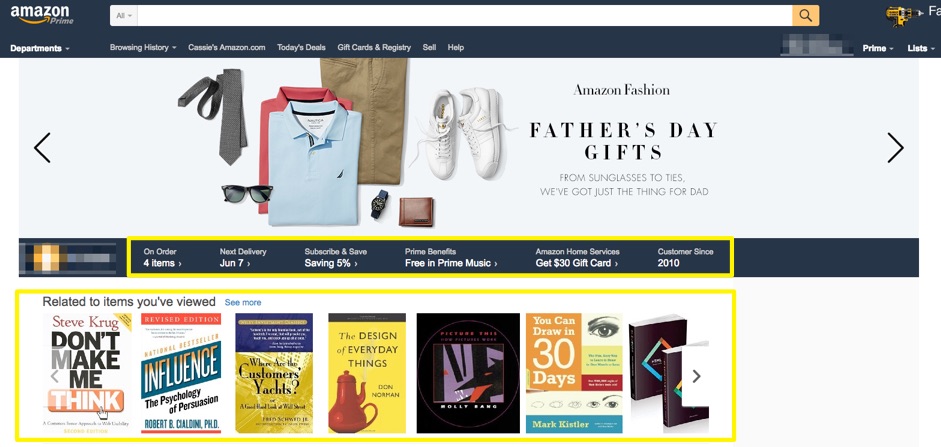
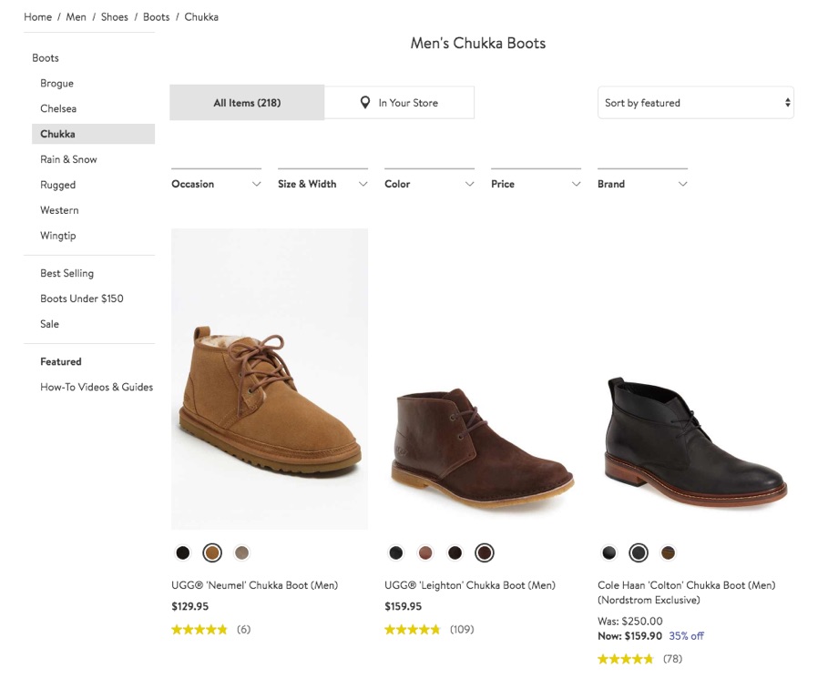
Jokes aside, don’t treat everyone the same (if you’re juggling tons of products). Show them what they’d be most interested in. Based on previous visits or purchases.
That’s what Amazon does right on their homepage:
And that’s what the high-converting QVC does, too.
You can try to personalize based on different segments of the market (i.e., financial, marketing, project management sectors, etc.), Or get more granular through targeting: behavioral, location, referring URL, ad content, device, search keywords, customer history, sessions behavior, date and even time of day.
If you can’t personalize pages like this, turn to inbound funnel segmentation. Line up the specific product pages with the source, medium, or channel someone’s coming from.
Step #2. Prioritize Product Presentation
Sometimes you can’t (or don’t want to) eliminate products from a page.
So reducing the number of choices is out.
But… your hands aren’t tied completely. You can still use a few tricks in order to prioritize products. That would give people a visual hierarchy of what’s most important through a series of images, shapes, text, etc.
Once again, MarketingExperiments.com comes through in the clutch. Through a series of product presentation prioritization points (holy Ps), they were able to increase conversions by 66%.
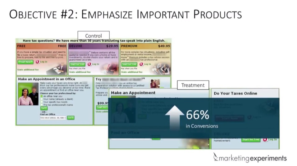
And once again, here are a few tips they outlined so you can adopt the same approach.
✅ Tip #1: Size does matter.
Product page sizing depends on a few factors. Like:
- How many products are you featuring?
- How high up the priority list is the product?
- What other elements of focus will the page contain (i.e., text, buttons, menus, etc.?)
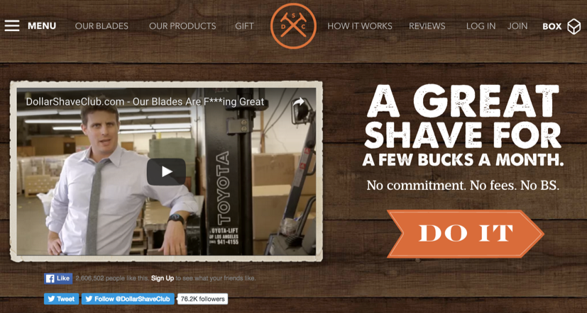
It also depends on the site aesthetic that works for your site. But here’s a good example from the Dollar Shave Club:
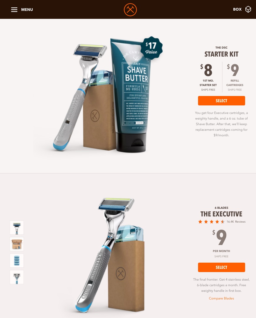
First, they’ve reduced the number of options. That much is true. But then they also have used product sizing to help you prioritize which one to go with.
✅ Tip #2: Shape can also play a role.
“Packaged products incorporating more natural shapes or motifs” are more likely to be successful, according one consumer buying study on the impact of shapes.
Shapes can mean many things online. For example, check out these product shots on Amazon:
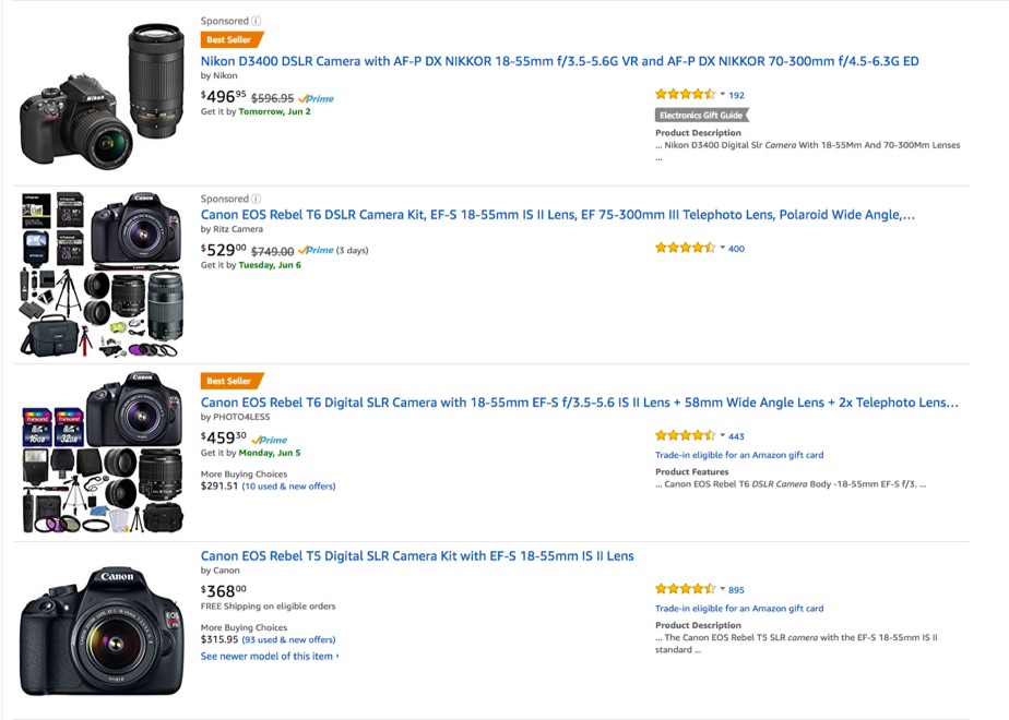
Sure. The Best Seller tags jump out. But otherwise, the product images loaded with stuff do, too.
Because as a red blooded American, your first instinct is MOAR.
Seriously though, one store saw a 320% increase in sales by making tweaks to their Amazon SEO. And what is ‘Amazon SEO’ you ask?
Basically you’re optimizing for visibility, relevance, and conversions by optimizing product pages just like you would on your own site. So title tags, images, reviews, etc.
✅ Tip #3: Time to gif.
You should probably have a video. People like product videos. According to stats.
But otherwise, design elements like blurring, motion lines, or wave effects can help add a little motion to your ocean.
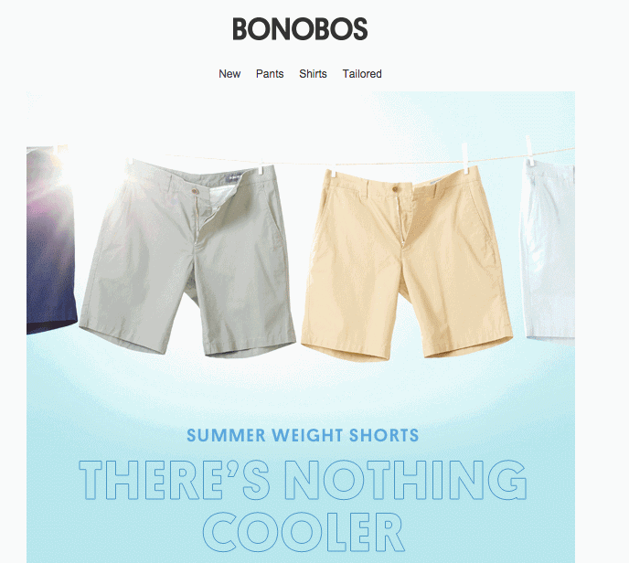
Check out this Bonobos example to see how motion catches your eye:
Obviously though, use a little discretion here. The simpler, the better.
✅ Tip #4: Use color contrasts
Colors also play a huge role on buying decisions. But how do you emphasize a product using colors alone? Answer: contrast.
For example, the first image of the three below has the least amount of reviews. But it catches your eye because of the different background image.
✅ Tip #5: Emphasize eyeliner.
Here’s how people view websites:
- The top-left corner gets people’s attention first and foremost
- People then scan in F-patterns.
- The left side of the page gets more attention than the right.
Fortunately, you can use this information to your advantage. You can use it to define your visitors’ eye path. Just remember the following:
- Media instantly attracts.
- Use the “compare and contrast principle” (example: full price vs. discounted price).
- Use directional cues (example: use arrows.)
- Be mindful of your typography (example: relevant H1/H2 tags).
- Frame/encapsulate what’s important.
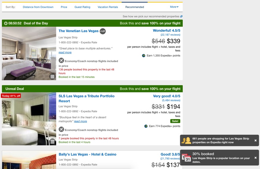
Expedia excels at these:
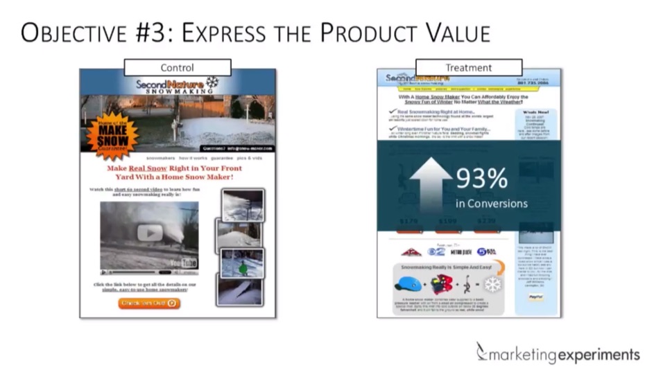
Step #3. Communicate the Product’s Value Proposition
Last but certainly not least, a clear value prop can make all the difference.
MarketingExperiments.com generated a 93% conversion increase by helping customers better understand why they should buy a particular product.
Why is your product worth buying? What are its benefits? How will it help the buyer? Your answer to those questions should be the ‘end result’ that will ultimately make someone’s life better.
Your value proposition should “boil down” your sales pitch (and all the complexities associated with it) into something the buyer can easily understand and remember, grab their attention and eventually say, “Yes, that’s the one for me.”
Because “if you’re the best in at least one way, you’re the best option for the people who value that aspect.”
Cases in point: Apple, not the largest selection of products; QVC, not necessarily prestigious; Tiffany, definitely not the cheapest. But people still buy from them.
SaaS companies regularly have good value props. Because they only have a single product to sell. They’re not burned — unencumbered — by the same flaws of those with multiple. So here are a few lessons you can draw on from SaaS companies.
✅ Tip #1: Emphasize what matters most.
Value props aren’t taglines per se, but they should still be succinct; communicating everything that needs to be said in just a few words. (Irony in action: run-on sentences touting “succinct.”)
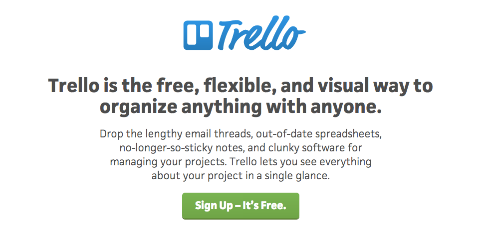
Trello’s emphasizes three main points:
- Free
- Flexible
- Visual
And you know, if you’ve used Trello before, those are the perfect three words to describe its benefit.
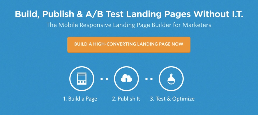
Unbounce also excels here by not just focusing on the benefit, but also removing a pain point.
Building, publishing, and testing landing pages is one thing. But to do those without the need for your I.T. department is like music to a marketer’s ears.
✅ Tip #2: Clarity trumps cleverness.
Value props run a risk.
The entire concept of it is kinda business-y. Kinda jargon-y.
So you run the risk of being too clever. Too complex. Or too MBA-y.
When in reality, the best value props are incredibly simple; requiring less than a few seconds of thought.
That means no big words. No run-on sentences. No generic garbage. No “collaboration”, or “effectiveness”, or other synergies.
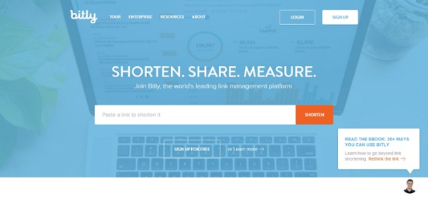
Bitly nails it with three short words that instantly communicate what it does and why you need it.
✅ Tip #3: Incorporate visuals.
If you’re still struggling, visuals can help add context. For ecommerce, think about showing the product in action.
Short videos also work well, as evidenced by Dollar Shave Club’s infamous viral one they still use front-and-center today.
Conclusion
Selling multiple products online can be a recipe for disaster.
Showing visitors too many products might get their attention. But it can also cause analysis paralysis. Too many choices may lead to no choosing at all.
Start by reducing the number of options (if possible). You don’t have to axe them completely, necessarily. But streamline how people discover them, or how you’re prioritizing which products they see (in sequence).
You should then present products strategically by using a visual hierarchy to indicate importance. Think: shapes, colors, motion, contrasts, and where you want someone’s eyeline to go first. And yes, gentlemen, size does matter.
Finally, simple, clear copy always wins. An individual product’s value prop should be instantly recognizable. And instantly communicated. That means no generic stuff or jargon that will confuse us. You and your Ivy League friends might love your Ivy League education.
But more often than not, buyers don’t. So keep it stupidly simple.
About the Author: Brad Smith is the founder of Codeless, a B2B content creation company. Frequent contributor to Kissmetrics, Unbounce, WordStream, AdEspresso, Search Engine Journal, Autopilot, and more.
from The Kissmetrics Marketing Blog https://blog.kissmetrics.com/sell-multiple-products-online/
No comments:
Post a Comment