
Want to learn how to plan, publish, and promote viral infographics?
You’re in the right place. But let’s start by making something clear: If you’re thinking, “I’m not a natural designer" or “I’ve never made an infographic before,” you’re not alone.
However, instead of making excuses, answer this: Have you ever made a presentation in PowerPoint or Keynote?
Great. Believe it or not, you’ve got the skills to make an infographic. And now that I know you can do this, I'm here to walk you through the seven steps that I take when creating infographics. 
The plan is to cover each of those steps in detail so you know exactly how to create and launch infographics for your business as well. Let's dive in.
How to Create Shareable Infographics Using PowerPoint or Keynote

Step #1: Choose topic and collect content.
If you’ve already got a blog and some content under your belt, the best place to find a topic is to look at your most popular content from the past.
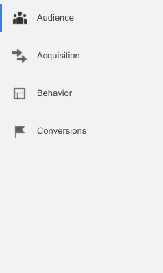
Just head over to Google Analytics (or dig into your HubSpot software) and pull up your most popular pages (from the last 6-12 months) by going to Behavior > Site Content > All Pages.
From there you’ll be able to see which topics your readers are already most interested in.
It’s a smart idea to match your infographics to the topic of your most popular blog posts because:
- First, you’ll be able to content from those blog posts in your infographic to fast-track your project.
- Second, you already know your audience is interested in those topics.
For example, one of the clients I work with owns an interior design firm and her blog has some great content on it. But the most popular blog post month after month was her article on “questions to ask when interviewing an interior designer.”

So we decided to use that content and create an infographic around that topic:

Because all of the content was already written, all we had to do was come up with the design.
Alright, so what if you don’t have a lot of content to work with?
I recommend that you head over to Google Trends, Google’s Keyword Planner, HubSpot's Keywords App, and/or BuzzSumo to research what’s being searched for and shared most often.
If you’ve never used Google Trends, then you’re in for a treat. You can use this tool to see what topics are trending and most popular in real time. Plus, you can see how popular a topic was in the past and then compare that to other topics.
Check out the popularity of “infographics” vs. “magazine ads” from 2004 - 2016:

So how do you guarantee your topic will be a home run?
Use Google’s Keyword Planner (HubSpot customers: Try HubSpot's Keyword App) to see the exact number of people who search for specific keywords and topics so you can instantly gauge the popularity of a topic. Since we’re talking about creating viral infographics in this post, don’t forget to also research your topic in BuzzSumo so you can find the most shared topics and content online to confirm people's interest.
Once you’ve got a topic, it’s time to do some research. One of the best parts about infographics is that you don’t have to write much copy by yourself -- almost every single infographic online includes quotes, data, and resources from other people and brands.
To get started, you'll want to open up an app like Evernote and write down everything you personally know about the topic you’re covering, plus every sub-topic you want to research.
After you’ve got your own notes down, head over to Google Search and start the research process. For example, type in phrases like: “best (my topic) articles," “(my topic) statistics,” “(my topic) quotes,” “(my topic) blogs,” and “(my topic) infographics.”
This will give you dozens of great resources to pull ideas and data from that you can include in your infographic. Just don’t forget to save the website address (URL) for each resource you cite.
Lastly, it’s important that you remember this is an infographic -- not a blog post. That means you should only collect the most important, focused data and resources. Ignore all the gritty details and “fluff.”
Action items for Step #1:
- Choose and validate a topic for your infographic
- Collect and cite important resources you’ll quote
Step #2: Create and re-size a blank presentation.
This step is super easy. All you need to do here is create a blank presentation deck in either PowerPoint or Keynote and resize it to the shape/size of an infographic.
Personally, I prefer Keynote. But rest assured that every single tool you need to make infographics are available in both PowerPoint and Keynote.
Let’s start with PowerPoint: Click “Design” then “Slide Size” to resize your deck.

(Note: 6.5 x 50 inches in the maximum size in PowerPoint.)
For Keynote: Go to the “Document” options, click “Slide Size” to resize your deck.

(Note: 900 x 6000 points in the maximum size in Keynote.)
Don’t agonize over getting the “perfect” height for your infographic, just give yourself enough space to work with. (You’ll learn how to crop and optimize your infographic in step #6.)
Action items for Step #2:
- Create a blank presentation in PowerPoint or Keynote.
- Resize the deck to an infographic-friendly size.
Step #3: Wireframe each section using shapes.
Both PowerPoint and Keynote have “Shape” tools which will allow you to create (you guessed it) shapes.
PowerPoint has more options for shapes than Keynote as you can see below:

In this step, our goal will be to use those shapes to create a “wireframe” and layout each section you’ll need for your infographic.
Here are the basic areas / sections that you’ll need to create:
- Header / Title Area
- Introduction
- Body / Main Argument
- Conclusion
- “Brought to you by…” Section
- Cited Resources
In most cases, each of these sections on every infographic will remain relatively the same. The only exception is the “Body / Main Argument” section, which will vary depending on your goal for the infographic.
For example, a comparison infographic would need to have a different “wireframe” and layout than a timeline infographic to effectively illustrate your point:

That’s why it’s smart (like with any creative project) to start with the end in mind. The creation process will be a lot easier if you can picture an outcome and work towards that. And I've seen too many infographics fail because they focus too much on fancy design instead of creating a solid wireframe and layout that compliments their topic.
Let’s be clear: The “design” is how your information looks, but the “layout” is how your information is organized and presented. The layout is far more important than any fancy design elements.
First, you’ll want to use rectangles and borders to define large areas of your infographic like in the example below:

Don’t worry about the colors just yet, we’ll get to those in the next step.
Next, using a combination of rectangles, squares, circles, triangles, and lines, create your subsections:

When creating your wireframe and layouts, there are two important design rules to consider:
- You need to make sure there is enough white space so your infographic is easy to read.
- You need to create hierarchy with your most important content and sections at the top.
If you’re still having an issue creating your layouts, add some wireframes to a blank presentation deck and use the “Shapes” tool to trace layouts until you get the hang of it.
Last note: If you’re using Keynote, once you’re happy with your wireframe, I recommend that you “Lock” the shapes in place, that way when you’re adding in content later, you don’t accidentally screw up the layout. (You’ve been warned!)

Action items for Step #3:
- Find layout inspiration on Pinterest.
- Use the “Shapes” tool to create your wireframe.
- Create infographic sub-sections using shapes.
Step #4: Choose a color and typography palette.
Now with your snazzy new wireframe, you’re ready to choose colors and fonts.
Let’s talk colors first: A color palette is one of the most subtle, yet crucial aspects of any creative project. Your color palette will set the tone for your infographic and tie visual elements together.
When designing an infographic, I like to choose two different color sets. The first color set is the background(s), where I typically use soft, subtle colors so I can draw attention to important elements with brighter colors.
Here are a few examples:

Of course the flip side of that is to use bold background colors. But even with white text, it can make the graphic difficult to read.

The second set of colors you choose will serve as your primary palette. These can be brighter and more eye-catching --“flat” colors are very popular for infographics.
Here are a few examples:

Keep in mind that it’s a smart idea to choose a palette that compliments your brand’s style. You can use a tool like Adobe Color to build a pallet around any color you’d like.
If you don’t want to build your own palette, I recommend that you check out Colour Lovers for endless inspiration created by other people:

Make sure that you’re not choosing too many colors as that can create “disconnect” between important areas of your infographic and overwhelm readers. If all else fails, using different shades of same color is always a safe bet.
Once you’ve got a nice color palette, it’s time to choose a font combination. The first thing you should do is avoid fancy or intricate fonts. (Even if it compliments your brand.)
Why? After you resize the infographic to a “web-friendly” size, those types of text can be extremely difficult to read. Instead, stick with easy-to-read fonts like Arial, Open Sans, Courier and Verdana.

When choosing a typography combination, you can combine two fonts, or use variations of the same font.
Check out the two examples below:

Make sure that you’re not using any fonts below 16 pts as it becomes extremely difficult to read once you resize your infographic in step #6. There is one exception when it comes to the fonts however: You don’t have to match your header’s title with the rest of your typography -- you can take a bit more creative liberty with that area of the infographic.
For example, check out these great headers that grab your attention immediately with eye-catching typography:

Want some incredible fonts for your title, sub-headers, and body text that you can download and use for free? Check out this article.
Action items for Step #4:
- Choose a background color scheme.
- Choose a primary color scheme.
- Select an easy-to-read typography combo.
Step #5: Add in your content, charts, and visuals.
Now it's time to take all the resources you collected in step #1 and extract the most focused, actionable content for your infographic.
Start by adding in your sub-headers and body text to the wireframe you created in step #3:

Make sure that your copy is short and to-the-point like the example above. You'll also need to include links to every resource you cited at the bottom of the infographic:

Now, it’s time to bring your words to life. To do this, use strong visual elements that instantly get your point across by “showing” not “telling” your readers:

You could make every single visual by yourself, or you could use my best-kept infographic design hack: Purchase community-made visual assets from online marketplaces. Websites like Graphic River, Creative Market, and Flat Icon sell visual assets made by professional designers that you can purchase and use in your projects.
For example, check out this sleek icon set you could purchase and use on any of your infographics:
![]()
There are dozens of other icons sets, illustrations, header images, and more that you can use to give your infographic a more professional look and feel immediately.
However, if you’re like me, once in awhile you want to make your own visuals from scratch. For example, one day I couldn’t find a decent “flat style” image for a fire pit, so I decided to use the “Shapes” tool in Keynote to “build” my own firepit. Check out how I made it below:

Now I realize that I might upset some people when I say this, but too bad: Data is not a requirement of a viral infographic. Of course, data makes it incredibly easy to prove your point by using indisputable numbers -- but I’ve also seen dozens of infographics go viral that don’t include a single graph or piece of data.
That being said, when you choose to include data in your infographic, there are some important things to consider.
The traditional way would be to use charts and graphs:

The second way to display your data is to use “data visualization":

For example, you could use a set of 10 “smartphone” icons where seven are colored and three are greyed out to represent the fact that 70% of Americans own a smartphone.
Or you could use a unique illustration like a ship race to visualize your data.

Just remember: Regardless of what type of infographic you’re creating, make sure that you’re using highly-engaging visuals and data visualizations to bring your content and data to life.
Action items for Step #5:
- Summarize and add in your copy.
- Add strong supporting visuals to “show” not “tell.”
- Use charts and visualizations to bring data to life.
Step #6: Export, optimize, and upload.
Once you’re happy with your infographic, it’s time to get it ready for the web. The first thing you need to do is export the “presentation deck” that you’re working on to a PDF.
In PowerPoint, just click on “File” then “Export” from your menu bar.

In Keynote, you do the same thing, except you choose “PDF…” from the menu bar.

Now that you have a PDF version of your infographic, you need to optimize the file size for fast loading online, without sacrificing quality or readability. Like I mentioned in step #2, there’s a good chance your infographic won’t fit perfectly into the resized PowerPoint or Keynote deck, so here’s a simple solution:
Open a photo editing tool (it doesn’t have to be PhotoShop) then crop and/or stitch together your PDF(s) to get the perfect height.

Next, resize your infographic to be between 700 and 900 pixels wide. Again, this will preserve the quality of the image while making the file’s size as small as possible.
Also, I recommend using a tool like Optimizilla to compress and optimize your infographic even further. Try to get the final file size to be less than 5 MB -- and be sure to save the photo file as a PNG or JPG.

The next thing you need to do is create a home for your infographic on your website. To do this, create a new page or blog post with a unique URL that you’ll upload and add the infographic image to.
This is important because when the infographic is shared around the internet, you want to make sure all the links point back to you so you get more traffic and shares.
Action items for Step #6:
- Export infographic to a PDF.
- Crop and/or “stitch” together your PDF(s).
- Resize to 700-900 pixels wide.
- Upload to a new website page or blog post.
Step #7: Go viral with strategic promotion.
Real talk: Infographics don't go viral by accident -- even if you’ve got the best infographic in the world.
Instead, strategically promoting your infographic by identifying the right people and the right websites can get your infographic in front of thousands of people fast.
But before we do that, you’ll want to make sure to optimize your infographic for search engines. SEO won’t necessarily help your infographic go viral, but it’s extremely beneficial because it will help increase your search engine rankings (which means more free traffic to your website).
Check out this infographic by Backlinko to help guide you while you’re optimizing your infographic(s) for search engines:

After that’s done, here are the next three things you should do:
#1: Find websites and blogs that share similar infographics.
For example, if I had just published an infographic on email marketing, I would go to Google at type in: “Email marketing infographic.” What you’re looking for are websites and blogs that have published similar infographics made by other people.
After you’ve got a decent list of websites who you think will be willing to share your infographic, it’s time for some email outreach. First, start by identifying the authors from each of the websites who published similar infographics. You can usually find the author’s name in the article’s byline:

Once you’ve got a list of authors, use a tool like Viola Norbert or ContentMarketer.io to find email addresses so you can start sending personal emails.
If you want to learn how the pros do email outreach, check out this article my friend Emil Shour did with Brian Dean at Backlinko. Part of that case study highlights the “Pre-Outreach” and “Content Roadshow” strategies he used to generate buzz for his content.
For example, check out Emil’s 2-step approach to email outreach. Instead of doing what most people do and asking for a backlink or share right away (1-step approach) here's what he did:

And because he wasn’t being pushy, he get’s responses like this from people asking to send his content over (2-step approach):

See the difference?
Now I’ll be the first to admit that email outreach is not the most exciting part about infographic marketing -- but it’s crucial if you want to get more eyeballs on your work.
Plus, the long-term benefits from the relationships you’ll build with influencers and bloggers will become invaluable down the road.
#2: Identify influencers who share similar infographics.
The best tool to find these influencers is BuzzSumo. Just type in a topic or copy/paste a specific link to pull up content that is sorted by number of social media shares.
For example, if I were doing an infographic on gardening, I’d type in “gardening infographic” into BuzzSumo. Next, I would go through the results one by one and click “View Sharers” on any infographics that are similar to mine:

This will give you a list of the people who have shared that infographic, which is helpful because you can sort by number of followers to identify influencers with a large number of followers who have shared infographics that are similar to yours.
Like in the last step, find their email address and start reaching out one-by-one. Aside from Viola Norbert and ContentMarketer.io, another clever way to find someone’s email address is to subscribe to their blog -- the welcome email and all future emails should come from an address that you can respond to.
As an alternative, if you can’t find someone’s email address, you can always use Twitter to reach out publically:

Sam Hurley has hundreds of thousands of followers but still responded and shared my content:

See how I used the same 2-step outreach approach like the email example from above?
- Ask if they want to see it.
- If they say yes, send the link.
Not being pushy is the key to getting responses and getting your content shared. You might also consider sending a friendly "thank you" note after an influencer shares your content to strengthen the relationship:

#3: Submit your infographic to infographic directories.
These directories are basically websites that curate infographics for other people to see. And they are the perfect place to get your infographic discovered by people who might want to share it on their website.
Trouble is, there are dozens of these directories out there, so instead of manually doing each one by yourself I recommend using Fivver to pay someone to do it for you. You don’t need to have someone submit your content to 50+ directories -- just stick with the people who only add it to the top 10-30 infographic directories.

Once you've added you infographic to the right directories, share it through all of your marketing channels:
- Share with your email lists
- Schedule multiple social media posts
- Paid ads / remarketing ads
- Add links to infographic on relevant website pages
- Share with industry partners
- Send to influencers/bloggers who’ve shared your content in the past
- Share with any brand or person you mentioned in your content
Action items for Step #7:
- Optimize your infographic for search engines.
- Share infographic with the right bloggers and influencers.
- Promote through all your digital marketing channels.
Wrapping Up
Alright, so I know this was a long one ... but be sure to bookmark this article so you can come back and refer to it at any time during the infographic creation and promotion process.
Need more help? I've put together a few bonuses to guide you along -- including a 20-step infographic checklist (we only covered seven here), as well as a handy teardown video. Click here to grab those.
What other infographic creation questions do you have? Share them in the comments below.
from HubSpot Marketing Blog http://blog.hubspot.com/marketing/create-infographic-powerpoint-keynote
Thanks for sharing this information is useful for us, also I read an article on the same theme
ReplyDeletehttps://ufo3d.com/best-e-commerce-marketing-strategies-5-actionable-tactics