Find a box with a CD-ROM in it, buy it, then learn how to use it.
That’s how I bought software as a kid. So when I first started working, I assumed that if I wanted to start using work-related software, I would have to pay for it the same way: upfront — site unseen! — just like the software of my youth.
I worried that I would have to justify the cost with only the specs, reviews, and sales guy’s word to make my case. (And if I was wrong, it would be my butt on the line.)
So I’m not exaggerating when I say that discovering I could try software for free actually improved my job performance and reduced new-on-the-job anxiety by ~62%.
Using a tool BEFORE I had to recommend it to my colleagues and pull out the corporate credit card gave me a chance to see which tools actually did what we wanted them to do.
All of a sudden, the risk that we’d pay for something that didn’t have a key feature or turned out to be a user-unfriendly nightmare shrank to almost zero.
What’s the Point of a Free Trial, Anyway?
Your serious prospects approach their free trials of your software with a mindset similar to mine circa 2000-something: they want to reduce the likelihood of buying something that doesn’t work.
They’ve got a problem to solve, they’ve discovered that your app might solve it for them, but they’re not yet certain that your app will be quite right. The free trial is a chance for new users to see for themselves what it’s like to use your app.
But. It’s not up to your free trial users to figure out how your SaaS app actually works. It’s not your new users’ job to figure out how your app will turn them into a better version of themselves.
It’s yours.
Too many SaaS apps lose free trial users with erratic, boring, or vague lifecycle emails.
If you run a SaaS app in pretty much any niche, you have an enormous opportunity to outmaneuver your competitors during the free trial process.
I sign up for free trials all the time to see how they onboard new users, and most don’t do a good job. Most onboarding emails don’t make it easy to understand what to do next. Most apps leave it up to me (the brand new user) to figure out how to get started.
Why is this a problem?
Because every time you make your new readers pause and try to figure out what to do next, you create an opportunity for them to give up and just do nothing instead.
What should you say to new free trial users?
Alas, there is no single hard and set rule. Every SaaS app is unique. What you say in your free trial, how you say it, and when you deliver your message will be specific to your app.
But if your biggest problem is that you’re sending triggered emails to new free trial users but they still aren’t signing back in after the first 10 minutes of using your app, there’s a strong chance that the copy in your emails is to blame.
To fix it, pull up your emails and see if they’re are suffering from one of these 3 engagement-killing mistakes.
Mistake 1: Your emails ask people to do too much.
When you offer more choices, you inspire less action.
The famous jam paper that explained the paradox of choice (and the TED talk that made it famous) showed us how we may be unintentionally taxing our prospects’ decision-making resources by offering too many choices.
But that’s not the whole story.
A 2015 meta-analysis of the research found that the total quantity of options is just one of many factors that can contribute to decision fatigue.
Another factor is the way that options are presented to us. When the presentation of options makes it hard to determine what choice is right for us, we’re likely to defer making a decision.
So if you’re sending your free trial users emails that look like this one, then there’s a strong chance you’re causing some serious decision-deferring choice overload.
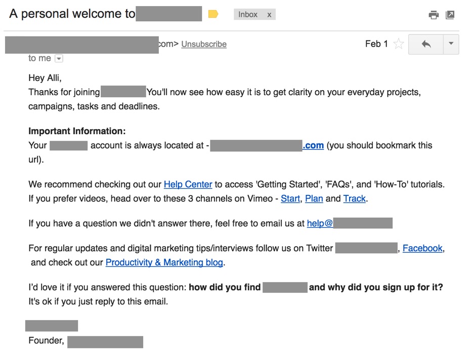
This message tosses out 9 links (including one that’s hidden by my redaction) without a clear messaging hierarchy to help me figure out what order I should click on them.
This email provides login info, asks me to read help articles, watch help videos on 3 separate channels, ask for help via email, read interviews, or read a blog that might be helpful–all under the umbrella of “important information”.
But for your trial users, the real important information is the information that helps them decide what to do next.
The Fix: Write each email for the sole purpose of getting your users to complete a single action–and remove text and links that don’t support that action.
This particular message might be rewritten to focus on getting a single reader to respond to the important request hiding at the bottom of that email:

In the now-famous experiment, sending a welcome-why-are-you-here email helped Groove get response rates of 41% while also providing juicy voice of customer data to power future messaging development and laying the foundation for more personal relationships with new users.
Whether you’re following Groove’s lead or not, your free trial emails should all follow the Rule of One for best results: get one reader to take you up on one offer.
One email, one action. That’s it.
Mistake 2: Your emails don’t ask readers to do something specific and measurable.
When you rewrite your emails so that they’re focused on a single action, make sure that action is a discrete, clearly defined task on the user’s path to activation.
Your reader should be able to complete the task you’ve asked them to complete–and they should be able to tell that they’ve completed it.
Unfortunately, lots of emails offer vague and nonspecific CTAs. Some of them even sound exciting — especially CTAs that use the word “explore”. Exploring is fun! It’s adventurous! Brave souls explore!

All true of actual exploring. But your SaaS app is not the Louisiana Purchase.
When you ask someone to “explore” something — anything, really — you put the onus on the reader to figure out what to do.
And because exploring doesn’t have a clearly defined end, it’s impossible for your reader to figure out exactly what to do next–and when they’ve actually completed the thing you’ve asked them to do.
The Fix: Reduce cognitive overwhelm with a CTA that calls for readers to complete a clearly defined single task.
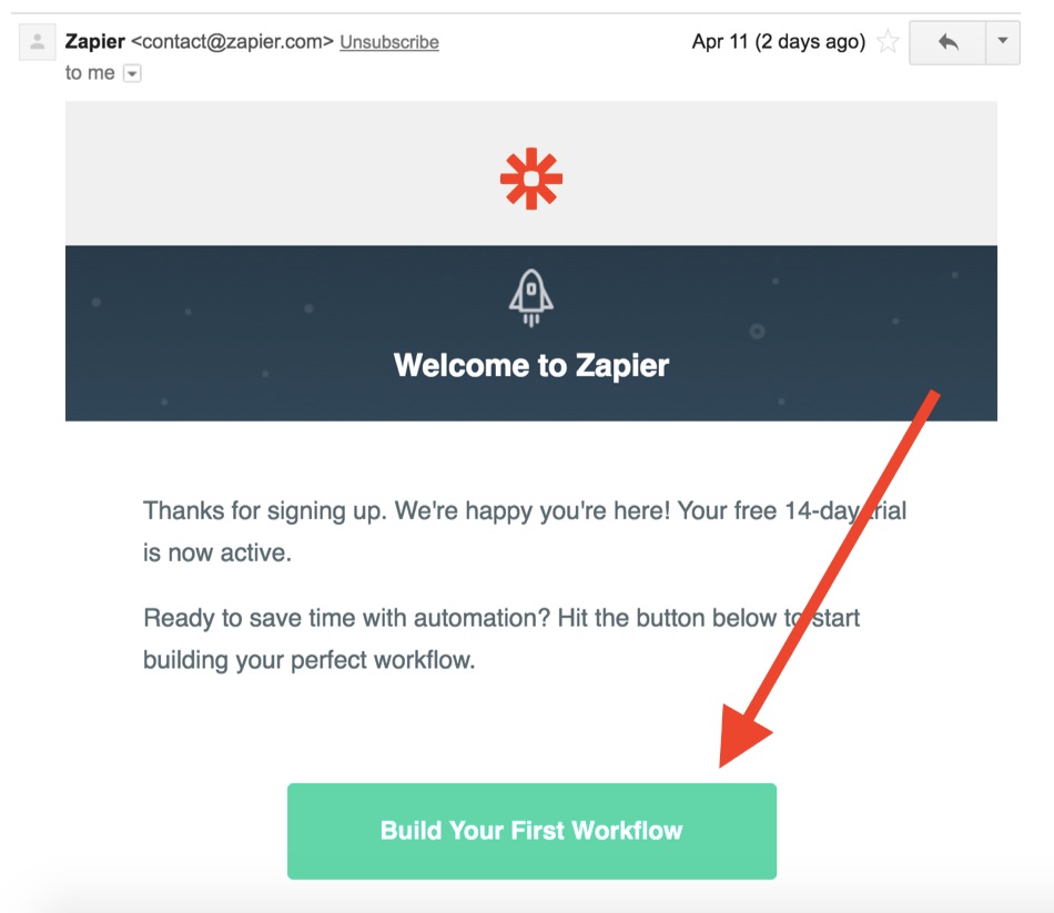
Zapier does this well. This app helps you connect what feels like an infinite number of apps to do all sorts of cool things (including powering the technical logistics behind managing your lead nurturing messaging).
With so many options, it would be easy for free trial users to get overwhelmed. They could explore their options, but then decide not to do anything.
So instead of leaving it up to new users to decide what to do next, Zapier’s first email removes some of the cognitive drain of “Shoot, how will I choose?” and offers a CTA tightly bound around completing a single task.
You already know what steps a new free trial user needs to complete to get to the point where your app suddenly becomes a can’t-live-without-it tool. You might even know the different steps different populations take to get to the point of activation.
Use your knowledge to guide your free trial users along the steps of that path.
Mistake 3: Your emails don’t connect the CTA to the outcome your free trial users want.
If you’ve rewritten your emails to get users to complete one and only specific and measurable action, that’s a great start.
Unfortunately, one of the most common grade-F CTAs I see in onboarding emails are the ones that don’t connect completing the action to solving a problem.
They make a call to action (the CTA “sign in” and its synonyms appear with devastating frequency), but they don’t make a call to value–so readers have no reason to expect that anything good will happen after they log back in.
Did logging into anything ever solve anyone’s problems? Of course not.
It’s what happens after you log back in that makes the difference.
The Fix: If your email’s CTA could easily appear in the free trial email sequence of another app outside of your category, change it.
If you’ve conducted your jobs-to-be-done research, you also know why your readers are using your app–and the outcome they hope to achieve.
Instead of “Log in to Your Account” or “Sign Back In Now”, your free trial email CTAs should make it clear that someone who clicks on this link will be moving closer to the goal they want to achieve with your app.
Buffer does a great job of sending an email that connects my click to what happens after the click.
After I signed up for a trial but didn’t finish setup, I got an email asking me to connect my accounts that also had some background info on what accounts, exactly, we’re talking about here. (In case I forgot what Buffer is.)
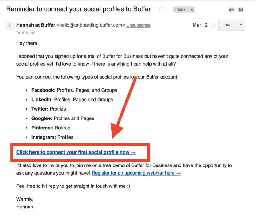
Buffer could have sent an email that said “log back in” or even “connect a profile”. But “login” = boring and “connect a profile” = kind of vague.
Instead, this email makes it abundantly clear what to do with this email (click on the link that says “click here”) and the meaningful reason why you should take that next step (because it’s what you need to do to connect your social profiles).
Are You Making it Easy for Free Trial Users to Disappear?
When I first learned about free trials for software, I was over the moon. “Look at all this stuff I get to try!” “Look at all these opinions I get to form!” “Look at how few people I have to talk to before I make my decision!”
But what are all these thoughts really about?
What are your new free trial users really thinking when they sign up for your app?
My hypothesis is this: free trial users are really thinking some version of: “Look how little risk there is to trying this software. Let’s see if it works.”
The free trial reduces the risk of having to buy before you try. Your free trial messaging is what helps your prospect understand for themselves if your software will solve a problem.
What can you do to help free trial users understand that yes, your product can change their life?
Make it easier for free trial users to evaluate your app with focused, specific, and meaningful lifecycle emails.
About the Author: Alli Blum helps SaaS apps build messages that get customers. Click to get her copywriting checklist for high-converting SaaS onboarding emails.
from The Kissmetrics Marketing Blog https://blog.kissmetrics.com/3-copywriting-mistakes/
No comments:
Post a Comment