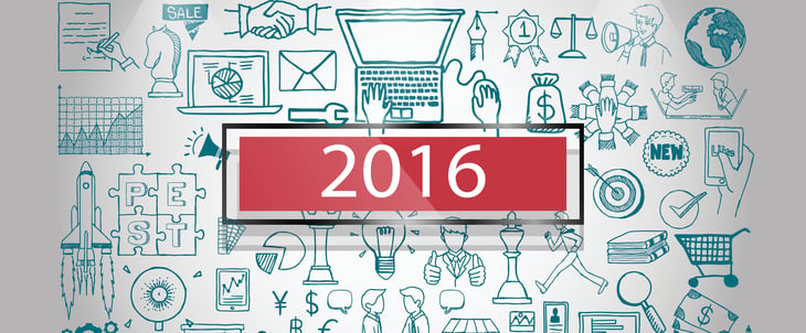
If you ask us, infographics aren't going anywhere.
This year alone, we've covered how essential they are to SEO, and the numerous resources available to create beautiful infographics of your own.
And yes -- when it comes to infographics, we do like to play favorites.
That's why we went scoured the web for some of the best infographics of 2016. Their topics are vast and their formats are many, but this year, we truly saw some excellent examples of informative design. 
Have a look and let these examples inspire you. Who knows -- with all of those resources and a new year around the corner, they might help you create of the best infographics of 2017.
10 of the Best Infographic Examples of 2016
1) Music and Productivity, by WebpageFX
Music is known to enhance many situations. It livens up a party, gets us through a brutal workout, and can make a long commute seem quicker. But did you know that it can also make you more productive? WebpageFX collected these science-backed reasons why music can help you get your work done, and worked them into an infographic that delights us.
This infographic does a nice job of balancing two different color sets -- a best practice, according to Marketing Consultant Brian Downard's infographic design playbook. Downard encourages the use of soft, subtle colors in the background, with pops of color in the foreground to highlight important elements. As you can see below, this approach results in a really clean design.
Beyond the color palette, the folks at WebpageFX did a nice job of following through with the theme, with various musical notes and other symbols that represent a melodic sound. Speaking of symbols, take note of how they used the image of the brain to break down how music stimulates and activates specific sections.

2) “15 Terrifying Statistics On Your Cellphone Addiction” by Trustmypaper
There's so much information out there about the drawbacks of overusing our mobile devices. They make us lose sleep. They facilitate email addiction. But very rarely, it seems, can we find all of this information in one place -- until now.
Trustmypaper created this infographic, which packs 15 eye-opening statistics in a condensed yet engaging format. Plus, the accompanying images help us to process exactly what each number conveys, and reinforces the danger of each fact.
As for the font, it's more than legible, but isn't so big that it doesn't fit in with the overall design scheme. According to a Kissmetrics article from Henneke Duistermaat and Neo Mammalian Studios, poor font choice is one of 19 infographic red flags, and while it may seem obvious, you'd be surprised how many brands just don't get it right.

3) “Vacations Are a Must” Quill
We are definitely preachers of vacation -- how to relax when you're there, how to catch up on email when you're back, and how many of us feel too guilty to take one. But it's a must -- and this infographic explains why.
From the good, to the bad, to the ugly, Quill makes great use of imagery here. The infographic uses a generally bright color palette, to reflect the lightness of vacation. The "happier" images incorporate the benefits, too. But when it comes to the negative impacts of not taking time off, the pictures don't hide them -- even if it's a cartoon, we can sense the annoyance of the characters that work or receive a call from the office during their time away.

4) “How to Leave Your Worries Behind,” by Happify
Some of us have a tendency to chronically expect the worst. (Cough -- guilty.) But chronically worrying isn’t good for you -- from heart disease to memory loss, all of that stress can take a toll on one’s health.
So how do we knock that off? It turns out that there are some fairly simple, science-backed steps to decreasing our anxiety and worry, which Happify has organized into an easy-to-follow infographic. It even has a delightfully helpfully step on figuring out when and how to let go of our negative thoughts, and when they (rarely) deserve merit.
Not to mention, we love the design, especially the combination of bold colors and white space. This infographic manages to work in a vast palette, without seeming to be all over the place with its design scheme -- but its brightness reflects the overall theme of happiness.

5) “The 2016 #GivingTuesday Infographic,” by Classy
When it comes to color, sometimes less is more. In fact, according to an analysis of over 200+ infographics on Pinterest, Venngage found that infographics with only two colors earned the highest number of Pins and Likes. While Classy snuck in a few highlights into this infographic on #GivingTuesday, the primary color scheme is a festive red and green combination -- which aligns perfectly with the "Home Alone" theme.
Speaking of the "Home Alone" theme, the designer of this infographic did an amazing job incorporating subtle, nostalgia-inducing nods to the classic movie -- from the tar-covered staircase to the silly microcopy on the VHS tape. According to Psychology Today, nostalgia memories are social in nature and have the power to inspire social behavior, making this infographic inevitably more sharable.

6) “The Female Entrepreneur: Women Who Run Their World,” by USC Marshall
Female entrepreneurs are taking the world by storm. In fact, among Generation Y entrepreneurs, women are more successful than men. But what makes them so successful? And how are they improving the business landscape as a whole? This infographic from USC Marshall outlines those positive points, from job creation to career growth.
The infographic also includes other fun facts about female entrepreneurship, like the geographic regions where it’s most concentrated, and other tidbits on revenue and valuation. It look a somewhat difficult-to-broach topic around which there's a lot of conflicting information, and incorporated the facts into a well-designed visual.
It has consistent style and lighting, and we love infographics than can seamlessly incorporate a map. Being able to share geographic statistics in visual way is key -- and, it helps people digest a big chunk of data. But our favorite part has to be the use of pictogram charts -- where each icon represents a specific value -- to make it easier for the viewer to visual the data. Pictogram charts can help you achieve a more representational view of your data, and even overcome differences in language, culture, or education, according to The Data Visualization Catalogue.

7) “How to Avoid a Hangover” by Fix
As you might be aware, there's a new year around the corner. With that comes New Year's Eve, which brings a lot of partying. In other words, January 1st might be known as the most hungover day of the year.
Knowing that, Fix provided yet another helpful infographic that breaks down all things hangover. We're delighted by the design of this visual. It incorporates a ton of helpful information, ranging from what a hangover really is, to how to prevent them, to how to cure them the next day. And the images? We don't know about you, but we're craving a full English breakfast.
What we really like about this infographic is the ability to condense important details that, were they in the format of a full article, may not have been as easy to process. We'll drink to that.

8) “Typography And Font Deconstruction” by The Logo Company
When it comes to design and text, there are two things we know to be certain:
- Comic Sans is bad.
- We have to be able to read it.
As for the rest, it seems like learning typography is like learning a second language for many marketers. It has to be on brand, it has to be legible, and what the heck is a ligature?
The Logo Company took some fundamental pieces of the typography vocabulary and compiled it into this well-designed infographic. Following its own advice, the text is perfect. It's readable, but considering there aren't a ton of pictures in there, it doesn't leave us feeling overwhelmed by text. At the same time, each vocabulary word has a clever visual representation next to the written definition, which helps to keep the image from looking too text-heavy.
![]()
9) “Why a Website Redesign Doesn’t Always Work,” by VWO
Sometimes, a website redesign is necessary. User preferences change, as do brands themselves -- that should be reflected in your public-facing content. But are you going about it the right way?
According to this infographic from VWO, many marketers aren't. And while we don't love the errors of website redesign outlined in this visual, we do like the way they're represented. It's thematic -- there's a recurring use of contrasting red and green, for example, to symbolize the necessary A/B testing that, evidently, 57% of website redesign projects lack. Plus, we enjoy how literal the imagery is, without going over the top. A burger represents "food for thought," and a brain accompanies the statistic on psychological factors in design.

10) “12 Classic Sauces and How To Make Them” by Quid Corner
When the holidays roll around, one of our favorite parts is the food. And what enhances any dish -- besides wine? An accompanying sauce, of course.
So when Quid Corner combined two of our greatest loves -- food and infographics -- we were thrilled. It's not often that actual photos appear on infographics, but when they do, it can be tricky to pull off. The lighting has to be just right, and the coloring has to match the overall design scheme of the infographic at large. This infographic manages to pull that off, by using a backdrop that's ample in white space, and a specific color theme according to each recipe -- red for tomato and green for parsley, for example. Is anyone else feeling hungry?

Let’s Get Visual
Okay, so maybe we have a thing for infographics. But it’s easy to see why -- they’re such a concise, comprehensive device for conveying detailed statistics and facts in a visual way that makes them easy to follow.
So as you plan your marketing for 2017, don’t leave out the visuals -- and certainly don’t leave the infographics behind. Need some help creating your own? Be sure to check out these free, pre-made Infographic templates.
What were some of your favorite infographics of 2016? Let us know in the comments.

)
)
)
)
)
)
)
)
)
from HubSpot Marketing Blog https://blog.hubspot.com/marketing/best-infographics-2016
Hi,
ReplyDeleteIf you are looking for smart solutions, business consultations: SI Global Solutions Pvt. Ltd is located in Elgin, Illinois, working in Research, development and testing services, Electronic store activities. You can contact the company at (847) 857-6055. You can find more information about: SI Global Solutions Pvt. Ltd at.
Almost all the people who are with you in classes come to us all the time to do my essay cheap online.
ReplyDelete