We’re living in a mobile-first world. For most of us, that means from the moment you wake up in the morning, your phone becomes a part of your daily routine -- from silencing your alarm, to reviewing the daily news, to checking email, and so on.
And search engines are seeing the result of this trend: search queries on mobile have now surpassed desktop-based queries.
Now you may be thinking, my website is already mobile-friendly … so I’m set, right?
Sure, you are ready for mobile visitors, but your content may not be optimized for the new realities of search. What exactly do we mean by that? 
Well, Google recently announced that its search results index is essentially being flipped and will prioritize mobile results first:
This is big, so send us your questions so we know what's not clear & what we need to communicate more about
— Gary Illyes (@methode) November 5, 2016
https://t.co/i4krA3cgqN
With Google currently experimenting with this change, there's a lot you need to know to ensure you're prepared. But don't panic, we'll walk through it all below.
What Is Mobile-First Indexing?
As Google's Gary Illyes said, this is a big change, so let's start by discussing some of the details first. Keep in mind this update is currently in testing so you may not notice any differences at the moment.
- Mobile-friendly websites matter, regardless of technology. Google has previously stated their preferred method of a mobile-friendly website was responsive design. For this change to mobile-first indexing, Illyes stated that specific mobile site versions and responsive design will work.
- SERPs will now be primarily based on mobile content. Today, if you have a page that shows some specific content to desktop-based visitors, but excludes content for mobile visitors, you may notice a change in results because of the mobile-specific content. Because results will start to primarily use mobile content first, you should consider what, and how much content, to add to your mobile version.
- AMP-enabled pages are treated as mobile content. If you have Accelerated Mobile Pages (AMP) for your website, or blog, these pages will be treated as other mobile pages and will be indexed first.
Again, this update is still being tested and is likely still "months away" so many details are still emerging and being worked out. In the meantime, it's worth starting to prepare for mobile-first indexing.
What About #Mobilegeddon?
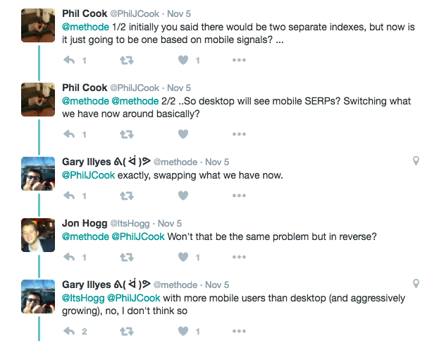
One of the primary premises behind the mobile algorithm update, affectionately referred to as Mobilegeddon, was that Google was beginning to establish a separate mobile-index for results.
While it seems that Google may continue to build a separate mobile index, the key part here is that they will flip the indexing from desktop-first to mobile-first.
See the below conversation with Illyes for more:

How You Can Prepare For the Mobile-First World
1) Ensure you have a mobile-friendly website.
Google's preferred technology utilizes responsive design so your website adapts to the screen-size of the visitor, but if you have a dedicated mobile website (m.example.com) that is fine, too.
HubSpot Customers: Any of your content created using the HubSpot software will utilize responsive design and, as a result, you should be prepared for mobile-first content indexing.
2) Consider if content should be adjusted for mobile.
Most content created specifically for mobile is naturally shorter. You should ensure that your page is still seen as the authoritative source on the content topic you’re writing about, but that doesn’t necessarily mean it has to be long-form content.
Don't be afraid to consider other types of content -- like video and audio -- that you can integrate into your strategy. These additional content types can be better for the user experience, and a transcript can be included on the page to ensure the maximum impact for SEO.
Any content you have on pages that is incompatible with mobile devices -- i.e., Flash videos -- should be replaced as soon as possible.
If you do not have a mobile-friendly website, Google will still index your website but the mobile crawler may appear in your Search Console. Not sure if your website is mobile-friendly? Get your website graded to find out.
3) Prioritize the factors that are important in this new mobile-first index.
What are those factors? Here are two you'll want to keep a close eye on:
- Site speed has always been important, but now with a mobile-first index, it's become even more crucial. This also means you need to be aware of the weight of content on a page, which can drastically affect page speed and has a cascading effect on user experience. More on that here.
- User experience and engagement have become increasingly important signals for search engines. If a visitor comes to your page and leaves within a few seconds, it's an indication they didn't quite find what they were looking for. On the opposite end of the spectrum, if the visitor stays on your page and engages with various links and resources, they are likely highly engaged. In a mobile-first world, consider the experience of that one page, but also how users travel between pages and their experience between each step.
Again, these updates are still actively being discussed, but in the meantime, get involved in the discussion and ensure your website is mobile-friendly.
What questions do you have about the mobile-first shift? Share them in the comments below.

from HubSpot Marketing Blog https://blog.hubspot.com/marketing/mobile-first-google-index
No comments:
Post a Comment