The transition from text-based to visual marketing is already well underway, as customer demand drives organizations to rethink how people communicate on the most basic level.
Cisco estimates video will constitute 80% of all consumer Internet traffic by 2019, and although marketers are racing to catch up, they’re still behind the times: in 2015, 52% of senior marketing executives believed that visual assets such as infographics, photos, videos and illustration could help them tell their brand story. But given that human attention spans dropped a whopping 33% between 2000 and 2015, from 12 to 8 seconds — and some report its dropped even lower — marketers no longer have any choice in the matter: eye-catching visuals that are quick to digest and easy to share will be an essential tool for any brand moving forward.
But what’s a brand to do when you have no idea what visual assets will be both effective and the right fit for your organization? This post will explain a few essential terms and tips you’ll need to get started.
1. Visual Communication
Visual communication may be the most form of all.
It may sound simple enough: visual communication uses images and visuals to create meaning.
Why?
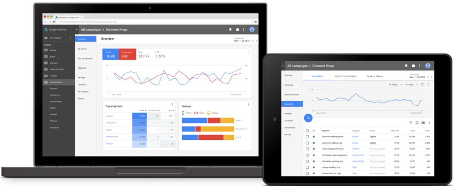
Because it is likely to become the only way that the majority of marketers communicate with their audiences — so you need to know it when you see it. This isn’t just because people prefer video to text, and are more likely to share photos. It’s also easier than ever for any brand to reach an international audience. Just take a look at Google AdWords, which (finally!) launched a redesign in March, of which an essential part of the design was making it language-agnostic to remove obstacles for audiences with a wide variety of backgrounds and skill sets.
When necessary, limited text is included to explicate the meaning. Take a look at Starbucks’ visual communication strategy: one tweeted image incorporates autumn leaves combined with moss emblematic of their Pacific Northwest roots, announcing that the drink in hand is both seasonal and rooted in Starbucks’ larger tradition.
The holidays. When everything shows its heart. #HolidaySpiceFlatWhite pic.twitter.com/XIvy1ZFQMG
— Starbucks Coffee (@Starbucks) November 23, 2016
Starbucks’ visual communication strategy ensures every piece of visual content is immediately identifiable with their brand. In one of Starbucks’ most-liked tweets of the last few months, autumn leaves communicate the seasonality of the drink while moss connects to the company’s Pacific Northwest roots — no text necessary.
Another tweet reminds customers (without using a single word) that the brand is famous for just how personalizable their products are. Their stores and products project the same visual identity as their social pages. You know a Starbucks image immediately when you see it. That’s effective visual communication.
Find your holiday favorite: https://t.co/DgCc0G1fIS #RedCups pic.twitter.com/aXW1vNrYuz
— Starbucks Coffee (@Starbucks) November 12, 2016
Starbucks communicates its reputation for personalized drinks, the breadth of its product offerings, and its release of seasonal cups — all in a single, text-free illustration.
But it’s easy to fall short of this goal. A great piece of visual communication should communicate in just the same way as the AdWords interface now strives to: without reading a word, you should be able to look at the design and tell what the graphic is about — what message it’s trying to send.
Here are a few questions to ask to determine whether your visual content meets the standards that your audiences will hold you to. If the answer is “no” to any of these, rethink whether your content is really communicating effectively:
- Ask someone unfamiliar with the graphic or video to glance at it for 5 seconds. Can she tell you what the theme is?
- Are you using illustrations and assets custom-made for the content, as opposed to cookie-cutter graphics or clip art?
- Is the content targeted toward achieving a single goal?
- Are both the design and the copy calibrated to attract and interest your target audience?
- Have you kept text to a minimum?
2. Visual Storytelling
Every brand has a story to tell, but with more stories to choose from than ever before, keeping an audience engaged can be a challenge.
The answer lies in what’s already interesting to your viewers: we’re living in the golden age of television and online video; game and virtual realities are becoming more complex every day; and websites encourage visitors to interact actively with their content. Storytelling today has to be something users can see, interact with or hear before they’ll share.
Take a look at Carrington College’s informational motion graphic on springtime allergies:
It transforms pollen, white blood cells, and even mast cells into humorous characters to reframe what could otherwise be a boring explanation as a story. Every audience is attracted to stories — it seems to be a part of our human DNA. And with the help of clever visual storytelling strategies, anything can become a story.
Visual storytelling uses visual communication to craft a narrative that explains a concept and often evokes an emotional response. It’s ideal for those marketers seeking to share an idea, promote a point of view, or convince potential customers of the quality and effectiveness of their product. As with visual communication, education is one of the end goals, but this approach aims to persuade the viewer to reach a specific conclusion.
Here are a few elements that make for a great visual story:
- Plot: You should carefully guide your viewers from beginning to end.
- Priorities: Only use the strongest data and arguments. Too much information is overwhelming.
- Audience: Identify a single target audience and create a story they can relate to.
- Goal setting: If you’re trying to make too many points at once, or share too many ideas, you’ll end up turning viewers away. A targeted, single goal promotes shareability and engagement.
3. Information Visualization
You’ve got more data than ever and no idea how to cull meaning from that data. Or maybe you do know what it means, but it’s nearly impossible to get your colleagues interested in what that data has to say — much less get your customers so excited that they’re willing to retweet that data to their followers. This is where quality information visualization comes in — and “quality” is the keyword.
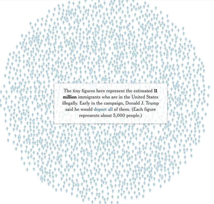
Information visualization aims to convey meaning as quickly as possible. The primary focus is to educate the viewer, not to persuade them to form a specific opinion. Information visualization can also be aesthetically engaging and even interactive, as The New York Times proves with its visualization of deportation numbers.
But to be effective, you need to use visualizations that stand up to scrutiny, follow mathematical and scientific best practices, and quickly communicate the big picture. Not everyone is up to this task. Here are a few essentials for when you’re visualizing information:
- Check your graphs: Using a pie chart for something that’s not a percentage or setting inconsistent scales for your graphs are both big errors that could take center stage instead of your actual message.
- Keep it simple: Don’t try to pack too much information into one image. One graph should have one takeaway.
- Focus on the message: Getting lost in the data is the opposite of the point. Help readers understand what’s important and why through careful organization of the content, as well as icons and illustrations when necessary.
4. Visual Campaigns
What if you have a more complex story to tell? Most companies do. One piece of content just can’t say everything you need to say.
One piece of content — even if it’s a social post that goes viral or a video that gets thousands of likes — also isn’t likely to assure the long-term success of your company. That’s why more and more organizations are looking at improving their branding by placing more emphasis on visual content and creating a consistent look and feel that will span multiple marketing campaigns and a variety of content types, from motion graphics and interactive pages to infographics and social posts. At the same time, marketing campaigns are now expected to have a consistent and recognizable visual element — something that can be recognized instantly.
Take a look at how Coca-Cola’s one brand campaign launched this year. Its products were available in dozens of countries, with dozens of looks designed for maximum appeal wherever they were sold. It was a massive undertaking, but the company pared down its product design to just four universally recognizable packages.
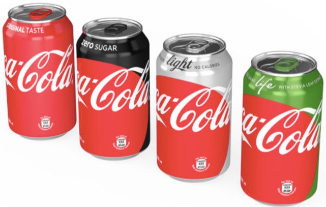
Coca-Cola’s old strategy was to create new branding for each new product. Now, they’ve united their global branding with four consistent, and instantly recognizable, colors, each of which is visible on all sides, no matter which way the bottle or can is turned on the shelf.
“When people see this new brand identity, they’ll know they’re buying a Coca-Cola,” explained James Sommerville, vice president of global design.
This is all to say that companies are redesigning all their customer-facing content to offer up a consistent visual message. Here are just a few of the benefits of undertaking a visual campaign:
- The consistent use of quality assets across your brand communicates an overall dedication to quality that customers today are equipped to recognize and prepared to appreciate through engagement and sharing.
- A single face for your visual content communicates that you’re committed to authentic and honest communication — not changing your stripes with every new piece of content.
- Multiple visual assets can reach a broader audience because of their adaptability to different platforms.
- A consistent look builds brand awareness.
Conclusion
In the end, visual communication is an indispensable tool for any marketer, but execution is key. Not just any visual content will do the job. Consumers ignore sloppily designed or cookie-cutter graphics in favor of those that inspire — not only in how they look but also in how they deliver their primary message. Armed with these essential terms and a list of dos and don’ts, you’ll be well prepared to avoid the pitfalls as you navigate to the visual communications agency that’s right for your brand.
About the Author: Erin McCoy is the Public Relations Manager for Killer Infographics.
from The Kissmetrics Marketing Blog https://blog.kissmetrics.com/design-terms-marketer-needs-to-know/
No comments:
Post a Comment