Most pricing pages have three plans laid out horizontally across the page.
But why?
And in what order?
Simply copying what everyone else is doing, without understanding the purpose behind certain features or the research that shows which features convert the best, will give you a hollow page that fails to convert.
Here is a breakdown of five research-backed steps to create your own high converting pricing page.
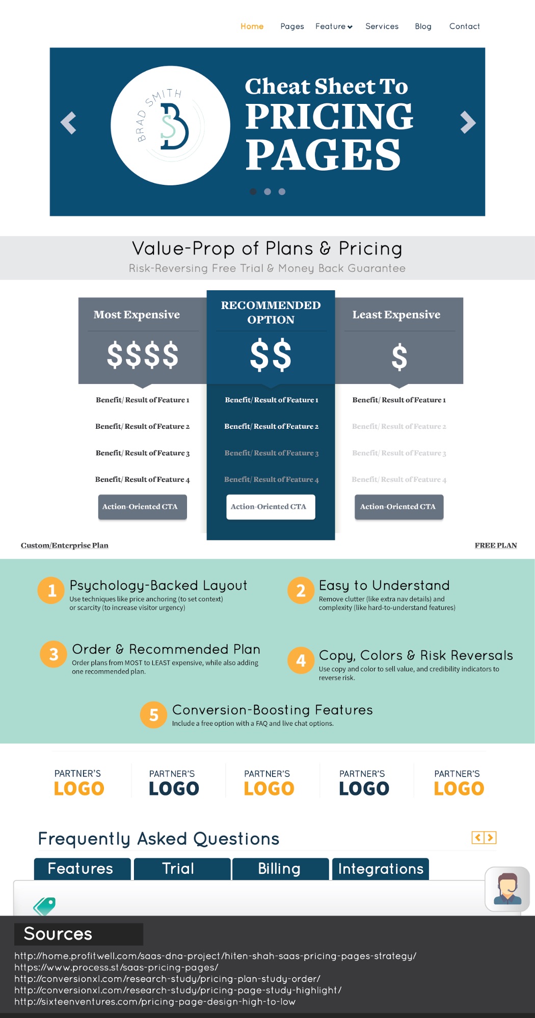
Overview of the Five Steps for a High Converting Landing Page
This post is long, with tons of research and additional recommendations for high converting landing pages. So here’s a few of the highlights:
- Psychology-Backed Layout: Use techniques like price anchoring (to set context) or scarcity (to increase visitor urgency).
- Easy to Understand: Remove clutter (like extra nav details) and complexity (like hard-to-understand features).
- Order & Recommended Plan: Order plans from MOST to LEAST expensive, while also adding one recommended plan.
- Copy, Colors & Risk Reversals: Use copy and color to sell value, and credibility indicators to reverse risk.
- Conversion-Boosting Features: Include a free option with FAQ and live chat options.
Step #1. Understand the Psychology Behind High Converting Landing Pages Design, Layout, and Tactics
People hit the Pricing page for one of two reasons.
Either they’re getting a quick spot check; finding out if this option fits within their expected potential budget range.
Or they’re deep in the weeds by this point, actively evaluating this option against a few others and deciding whether or not to click that button and give the free trial a spin.
This last group has already put in at least a modicum of thought by now, and they’re trying to make a decision one way or another.
That means your pricing page can either be greased to send people directly into a free trial, or become a bottleneck to growth by stopping people dead in the tracks.
The best converting pages are created with user psychology in mind. This is well tread territory, with much longer (and more exhaustive) resources available for your viewing pleasure.
But here’s a sample of the problems (and their psychological solutions):
Problem #1. We don’t understand context.
People always think something’s “expensive” if they lack a detailed understanding of the problem or pain point your solution solves.
So instead, the better retort is… compared to what?
Price anchoring takes your expected or preferred options and compares them to a much more expensive one to make them appear more palatable in comparison.
Problem #2. We’re stressed and overwhelmed.
President Obama wears the same color suit everyday. Sartorial statement? Not really… it has more to do with attempting to limit the amount of decisions he has to make on a given day. He (and we) are so overwhelmed with choices throughout the day that it’s easy to suffer from decision fatigue.
A side-product of this is analysis paralysis; where someone has already looked at 10 other pricing pages exactly like yours and is now staring glassy eyed.
Problem #3. We sometimes need a kick in the pants.
The first two problems lead to stagnation. We do all the research and analysis, and then… stop – failing to cross the proverbial finish line.
Introducing urgency into the equation is one of the most powerful ways to persuade and influence those stuck.
How exactly? By emphasizing scarcity; a shorter timeline, or limiting the availability, you can increase pressure on those to take action before it’s too late.
Step #2. Improve Information Presentation Before Tactical Decisions
Pricing pages are difficult to construct because they’re complex.
They’re trying to whittle down all of the possible information a user might need to make a purchasing decision and present it in a coherent manner.
Sometimes that’s easier said than done. And the results heavily dictate the ultimate success or failure (more so than the number of pricing plans you’re highlighting and other tactical considerations that follow).
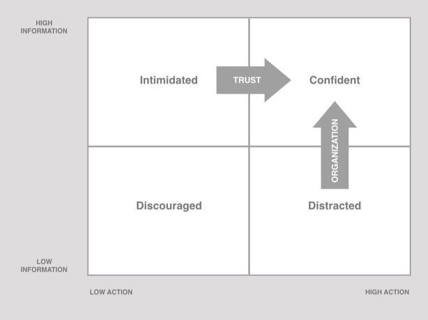
Hiten Shah and ProfitWell did a study to determine which pricing pages got this right, splitting popular apps you know and love into different categories based on the level of information they’re providing, along with how actionable they were.
Their findings showed that pricing pages that packed the most information with the most action resulted in confident users (who converted more because of their proportionally higher level of trust and information understanding).
That compared with other pages which got one of these key elements incorrect, results in a mix of intimated, distracted, or discouraged users.
Let’s look at a few examples.
ZenDesk’s pricing page was one of those that left user’s overwhelmed.
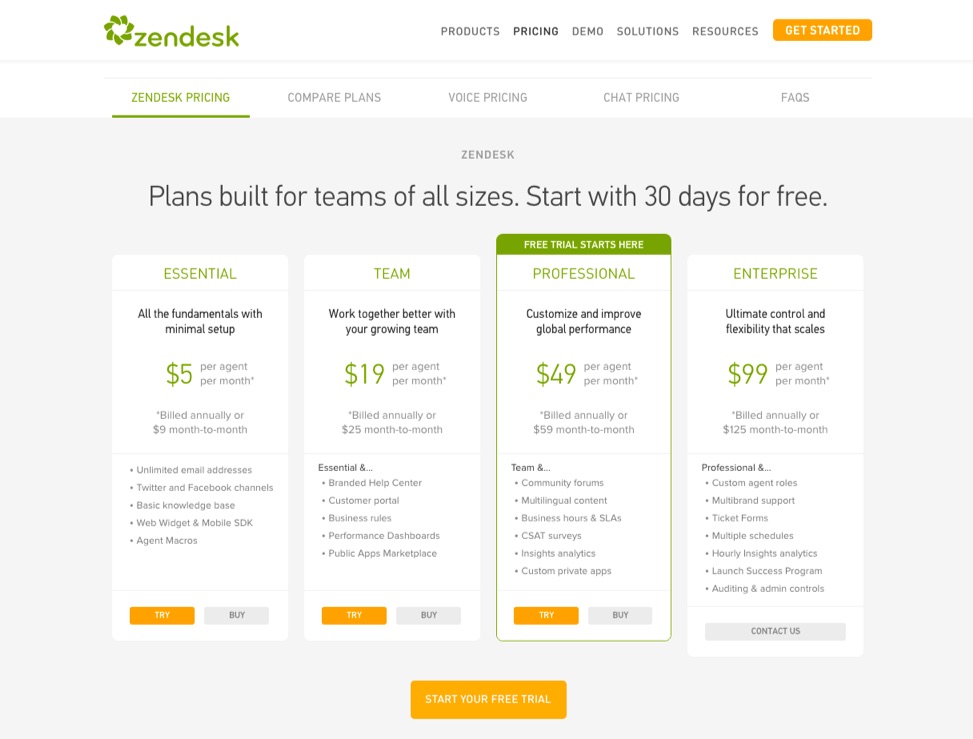
On first blush, it looks like they nail all the basics. It appears like any other standard pricing page.
However, look at two plans and try to determine what makes them different.
There’s no simple, easy way to spot the difference, because there’s a TON of differences. It’s only after you click on the Compare Plans option above and methodically comb through each individual feature set like a forensic accountant that you begin to grok which plan may or may not have your specific features.
This page could benefit from some of the specific improvements listed below, but the main point here is that the information needs to be organized and translated better first.
Now compare that with Campaign Monitor which succeeded in both high information and high action:
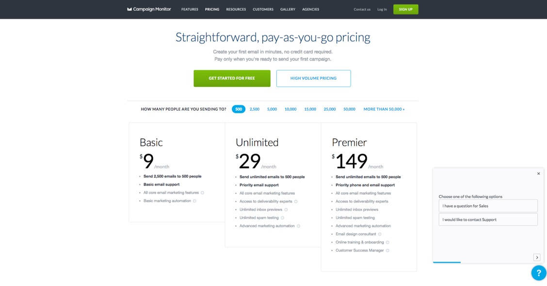
Three plans with easy-to-understand features for each, with a sliding scale above to determine which pricing range you fall into.
It’s simple and clear-cut, helping users feel confident that the decision they’re about to take is the right one.
Step #3. List Your Most Expensive Plans First, and Highlight a Recommended Option
Process.st analyzed the pricing pages from the Montclare 250 – a ranking of the most successful SaaS companies.
Unsurprisingly, 81% of those with pricing pages listed the least expensive pricing plan on the left-hand side before moving up to the most expensive.
In fact, BOTH examples we just looked at (Campaign Monitor and ZenDesk) followed suit.
But here’s the thing.
Some experts recommend the exact opposite, and ConversionXL just proved why in a recent original research study:
“Participants choose more expensive packages more often when they are listed first, or furthest left in left-right order.”
To figure this out, they ran through different task scenarios, conducted eye-tracking studies, and used survey tools to gather feedback.
While people generally consumed or “processed” the information the same, listing the expensive plans first on the left resulted in longer ‘dwell times’ on the page. The first two positions tended to receive the most attention.
This is price anchoring in full effect; plain and simple. The initial expensive options might provide a bit of sticker shock, but your middle and lower tier plans look excellent in perspective.
Inserting a ‘Contact Us’ pricing tier for more complex, enterprise options is a good idea (38% of the Montclare pricing pages feature this), but consider locating it somewhere else (like in plain text underneath) so that you don’t interfere or sabotage this powerful price anchoring effect.
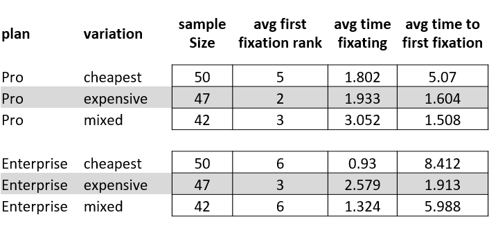
The second research study ConversionXL conducted focused on how ‘calling out’ a preferred or recommended plan impacted results.
They ran the same study as above, manipulating the pricing tier order for SurveyGizmo’s pricing page, along with highlighting a recommended option with a different color.
Here’s what they found using the same task scenario, eye-tracking, and post-survey feedback methods:
Ordering your pricing tiers from most expensive to least expensive results in higher revenue. And highlighting one of those options results in even greater results.
Step #4. Pricing Page Tactics 101: The Five Features All Good Pricing Pages Have in Common
Pricing pages typically fail because they’re missing the mark on one of the first three steps above.
However once you get beyond those, it’s all downhill from there.
Because pricing page principles or tactics rarely differ much, no matter if we’re talking B2B or B2C, SMB vs. enterprise, or CRM vs. help desk app.
Here’s some of the most common tactical elements that all good pricing pages have in common (pulling from both the process.st Montclare study and the ProfitWell + Hiten Shah study):
Feature #1. Include a Free Option
Almost every single pricing page featured at least one ‘free’ option, whether that was a free trial or freemium plan.
The benefits are obvious. You want to give people an easy, ‘next step’ that requires zero thought.
It’s low risk, removing any barriers to entry or possible doubts and suspicions that might prevent them from giving your product a fair evaluation.
Another spin on this for larger-ticket items is “concierge onboarding”, which is like a guided walkthrough or one-on-one demonstration to help enterprise clients get a feeling for how their setup will work within your app.
Feature #2. Keep Package Tiers to Three Max
The average number of most pricing pages comes out to around 3.5.
If you didn’t skip over the first few steps above, the reasoning should be obvious.
You want to provide people enough information and context so that they can quickly understand which option is right for them, while also avoid presenting too many options which might induce decision fatigue or analysis paralysis.
Feature #3. Allow for Flexibility & Customization
Limiting plans to only three options might sound like a tall order if your product is complex or expensive.
Two ways to combat this:
First, simply offer an ‘enterprise’, customizable plan as mentioned before where people can get in touch for a tailored approach.
The second, is to borrow from the Campaign Monitor example earlier where you incorporate a sliding scale option that will dynamically change or update your pricing tiers as you go. That way, you can use a very simple interactive element to condense a TON of possibilities into an easily digestible format.
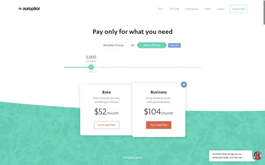
For example, Autopilot uses a selector (monthly vs. annual) and a sliding scale (based on the number of contacts) to help users quickly demystify an otherwise complex pricing system.
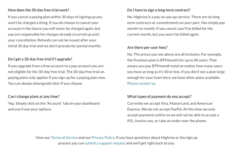
Feature #4. Add a FAQ Under the Pricing Tiers
66% of the most successful pricing pages proactive answer questions before they pop-up, with a convenient FAQ section under the pricing tiers.
The goal is to head-off the most common potential sales objections you get before they happen. (Essentially anything that might stand in the way of someone signing up for a free trial.)
This section becomes especially helpful if you require payment information upon free trial sign-up for example, to make sure there’s no confusion around how billing might work or change depending on if someone cancels their account.
When done correctly, you can also use this section to help differentiate you from the competition. For example, many CRM tools will charge per-user. But not Highrise, which they’re quick to point out on the right hand side of the FAQ section on their pricing page.
Feature #5. Provide Multiple Contact Options
One final way to further reduce friction on a pricing page is to provide convenient ways to get in touch with sales and support.
According to one study, 76% of companies had at least one option, with 13% of those coming in the form of a live chat popup.
One increasingly common option is Drift, which powers a little widget in the lower right hand corner of someone’s screen.
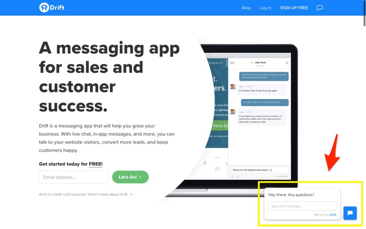
The added benefit of a tool like this is that you can also use it for in-app messaging, and for behavioral or segment-based targeting (to aid your other retention-based strategies).
Step #5. Pricing Pages 201: Copy, Colors and Risk Reversals
Incorporating each of the first five features is good, but just a start. They’re table stakes.
Here’s five tips to enhance those essential ingredients to get more bang for your buck.
Tip #1. Sell the Value & Benefits
Every single line of copy on your pricing page needs to reinforce the value and benefits you’re delivering.
That sounds obvious and trite, but there’s a few common missteps many pages still make.
The first, is incorporating “lazy ass messaging” in your headline with overly general or clichéd phrase like “save time and money”.
The second, is over-emphasizing the features of each plan (as opposed to the benefits those features produce).
A final example involves plan names with meaningless words like “Essential” that don’t do enough to (a) translate value or (b) differentiate one package from the next.
Bad example: the oft-mentioned ProfitWell uses trademarked product names for their plans that curiously doesn’t do a great job explaining the value a user is supposed to get.
Instead, you should try this…
Tip #2. Name Your Packages Based on Customer Segments
Naming your package tiers can help people self-select faster. Ideally, your packages should align with specific customer segments too.
For example, BidSketch uses package names like Team and Solo to instantly communicate which plan is for which type of customer.
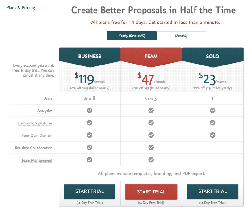
Introducing segmented plans like this helped BidSketch see the biggest increase in monthly revenue they’ve had, in addition to increasing the average revenue per user.
Tip #3. CTA Language
The word ‘submit’ commonly underperforms in conversion tests because it has a negative connotation (submission). In addition, it’s generic and not particularly inspiring (see also: ‘download’ and ‘buy now‘).
Instead, try using more specific language that emphasizes the next action (like ‘Add to Cart’) or the benefit someone is about to get (like ‘Download My Report’).
The BidSketch example above uses ‘Start Trial’ as a way for the user to reaffirm the next step a user’s about to take next.
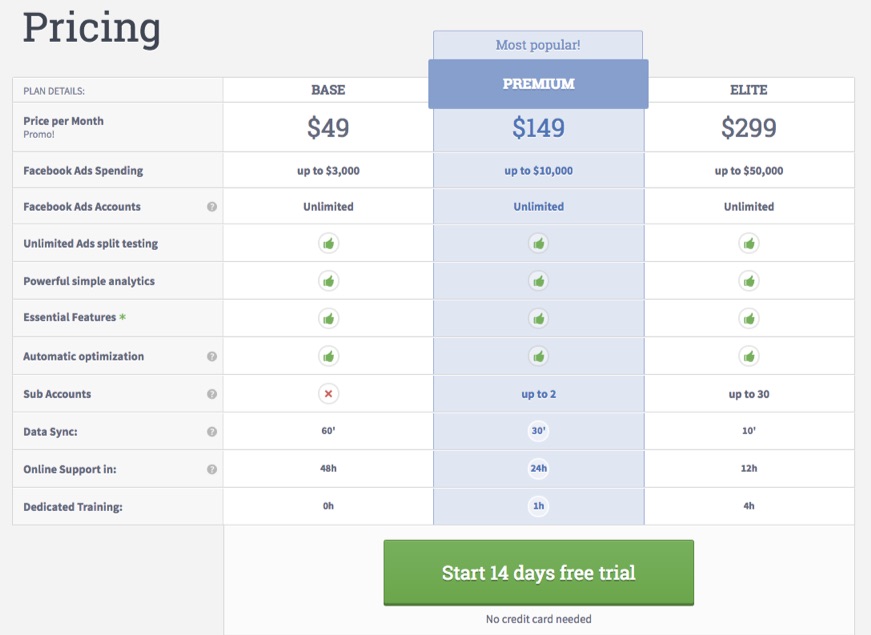
Tip #4. Use a Contrasting Color
We’ve already seen that you should be highlighting a recommended plan.
The two most common ways to do that are through (1) color and (2) sizing.
AdEspresso uses a color variation, shading the entire recommended plan before using a HUGE green button to simply get people into the trial first (which is obvious based on the specific CTA language).
Tip #5. Credibility Indicators
Last but not least, you want to reverse the risk (from the user back to your company) to limit any other potential barriers to entry.
A free trial is the first obvious example, or it’s money back guarantee alternative that provides people the ability to ‘test drive’ the product to determine whether or not it’s going to be a good fit.
Conclusion
Most pricing pages look similar.
Many have the same surface-level features.
But simply slapping a few generic options across the page with little understanding of how to organize them or what you’re calling them won’t give you the results you’re looking for.
Instead, start by understanding the psychology behind what users want when they hit your page. Then focus on presenting and organizing your pricing information as simply as possible, from most expensive to least, with a recommended or highlighted product to prevent decision fatigue.
Then you can dive into the common tactical features, like limiting your plan features or incorporating a FAQ to ‘tick all the boxes’ users will expect.
Once you’ve gotten this far, you can switch attention over to the advanced stuff like what you’re calling each plan, or how your CTA language and color choices are helping (or hurting) conversions.
The best pricing pages somehow walk a fine line between giving people everything they need to make a decision, while also reducing any extra friction that might disorient, discourage or dissuade someone from signing up.
About the Author: Brad Smith is a founding partner at Codeless Interactive, a digital agency specializing in creating personalized customer experiences. Brad’s blog also features more marketing thoughts, opinions and the occasional insight.
from The Kissmetrics Marketing Blog https://blog.kissmetrics.com/pricing-page-that-converts/
No comments:
Post a Comment